.}

Thursday, July 30, 2009

Inspirational Architecture: William T. Baker & Associates


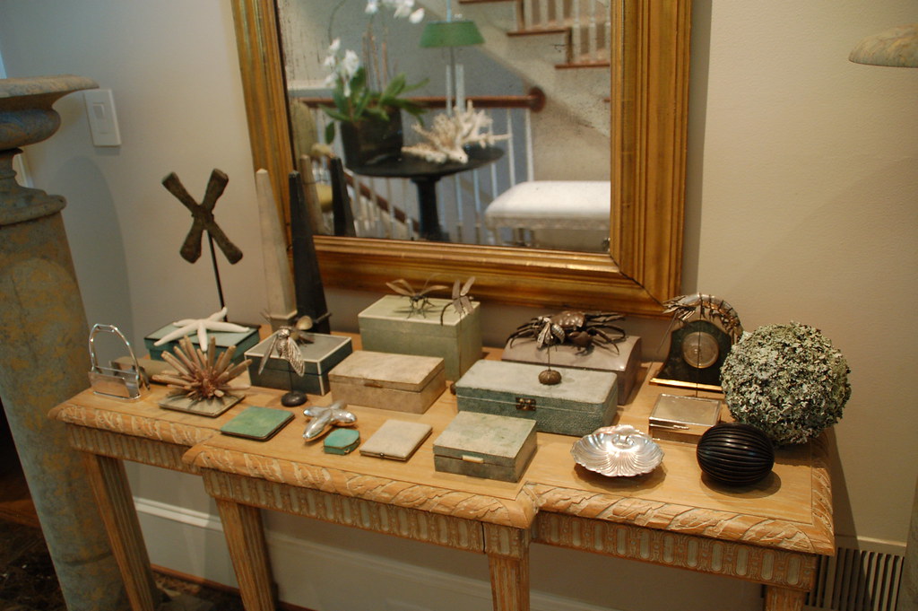
I have a deep appreciation for architecture, and a sincere admiration for those who design and create spectacular homes. Through my blog, I have found quite a few kindred spirits who love architecture as much as I do. One of these kindred spirits suggested that I begin a series in which I interview architects and architectural designers and get their perspective on what is happening in the architectural scene of the 21st century.
The first architectural designer that I am profiling is based in Atlanta, Georgia. His name is William T. Baker, although he goes by Bill. Whenever I see a 'William T. Baker' sign up on an empty lot or on the lawn of a home that is being renovated, I know that it is going to be a spectacular project. Bill is known for his classic style and exquisite attention to detail. He is extremely versatile and has one of the best eyes for scale and proportion in Atlanta. It is interesting to note that designer Suzanne Kasler, who also has an amazing eye for scale, proportion, and detail, selected William T. Baker & Associates as the architectural firm on her recent remodel of a classic 1930s Buckhead estate.
The following contains the questions I posed to Bill, and his beautifully worded answers. Interspersed with the questions are examples of some of the houses that have inspired him, as well as examples of homes that he and his firm have designed over the past 20 years (unless noted as otherwise).
William T. Baker
Q: How did you decide to pursue a career in architecture?
A: In retrospect, my childhood was very rich visually. My father was a nationally acclaimed furniture designer, and I would watch him draw his designs on thick ivory-colored paper at his drafting table. Sometimes when he would let me, I’d climb up onto the tall wooden stool next to his chair and trace around his French curve templates or carefully inscribe circles with a compass. I developed a love for drawing and an eye for detail at an early age. My father taught me how to draw cubes and rectangles in three dimension. In fact, I was the only child in my kindergarten class who knew how to draw objects in perspective! By the time I entered second grade, I was able to sketch a farmyard scene and show the barn in correct perspective with its shadows.
In 1975, I enrolled at Auburn University planning to major in architecture after my second year. This seemed to be a good plan given my lifelong love of architecture and the artistic talent I had demonstrated. However, I was disappointed to find that the curriculum had largely abandoned its classical foundations and had embarked on a new aesthetic direction that didn’t appeal to me. Furthermore, during my sophomore year, many of the graduating architecture students began sharing stories of firms laying off architects rather than hiring new ones. The country was still reeling from the effects of the Arab oil embargo, inflation was rampant, and construction-related businesses had few entry-level openings. So, I declared a major in business finance, thinking this would result in better job prospects.
After graduating in 1979, I found that the prolonged recession had affected the job market for business graduates, and my best efforts were for naught. I was in exactly the situation I had hoped to avoid! I accepted a job selling insurance but this company soon went out of business. My career seemed to be off-track, and I searched for a new direction. During this time, I received an unexpected and much-needed word of encouragement. I casually mentioned to someone that if these were the best days of my life, as the old saying goes, then I was in trouble. This wise person responded, “The early years of a young person’s life are not the best years, but rather the most fun. The best days are still ahead.” I held onto these words as I wondered what the future held in store for me.
Like many of my peers during this time, I applied to a graduate school of business to earn a master’s in business administration. Surely with an M.B.A. from a good school, I would have success securing a better job. But, shortly after applying to Vanderbilt University in Nashville, a chance meeting completely changed my plans. On a whim, I went to see an executive recruiter to find out which major within the M.B.A. program was most in demand. He confirmed my strategy of pursuing a graduate degree, but suggested I attend Emory University in Atlanta. He said registration for the fall class was still open and that I should apply immediately. This short conversation would impact the course of my life in a way I could never have imagined at the time.
Moving to a large city where I had no family contacts and I knew no one was a daunting task. But I had the hope of a new beginning and new opportunities. My spirits were high as I entered the fall class of Emory’s Graduate School of Business in 1980.
wtb3
This beautiful home was an award winning design for Bill Baker. I admire it every time I pass it, and sometimes plan my daily dog walks so I can walk by and admire the home with the morning light shining on the front.
Q: How did you make the transition from Business to Architecture?
A: After graduating two years later, I obtained that all-important job for which I had worked so hard. As an in-house consultant for Trust Company Bank, I was engaged in projects for senior executives that allowed me to see many sides of the banking business. I was promoted to officer of the bank after one year, but something wasn’t right. My first love was still architecture, and deep inside I knew that I was wasting my real talent. I was restless.
One morning in the summer of 1984, the major Atlanta newspaper ran an article about a local real estate developer, Martin Marchman. He was making a name for himself by building million-dollar speculative homes. This was the first time the city had seen anything like this on such a large scale. Job growth among Atlanta’s corporate community was strong, and Marchman was building new homes to meet the needs of the Fortune 500 executives moving to Atlanta. Suddenly, I had an idea! Why not contact Marchman to inquire if I could work for him as a business consultant? At least that way I could be around architecture. Marchman suggested that I might work in his in-house architecture department, which was run by Steven Fuller. After meeting with him, Fuller decided the best fit would be for me to administrate the architectural control committees for Marchman’s numerous subdivisions. I was happy to accept the job and began to learn all I could about reading working drawings and the construction of houses.
I could not have asked for a better education than the one I received in my daily conversations with builders and tradesmen. My job was to confirm that the houses were being built according to the approved plans. When I would question why a particular detail didn’t look like the approved plan, the builder or carpenter would review the drawings with me, and in some cases, thank me for my keen eye. In a very short period of time, I learned a great deal about construction drawings and developed a respect for the people in the field who are responsible for turning those drawings into the reality of a finished home.
Back in the office, I got to use my drafting skills. I received the necessary critiquing to help me develop good lettering and line quality. Within a couple of weeks, I was able to draw exterior facades and make revisions to floor plans. I learned the fundamentals of dimensioning and standard sizes for doors, windows and plumbing fixtures. I enjoyed drafting and practiced in the evenings to further develop my skills. By the end of the first year, I moved on to begin a consulting business administrating architectural control committees for developers in Cobb County, Georgia. The builders and real estate agents in these subdivisions sought my opinion about ways to improve the layout and overall aesthetics of their plans. My suggestions were well received, and I was asked to revise kitchens, bathrooms and exterior facades.
Wishing to gain even more knowledge, I studied Edward Muller’s classic textbook Reading Architectural Working Drawings, memorizing the terminology and construction standards. In addition, I retained the services of a structural engineer to help me properly detail my foundation and wall sections. My reputation grew, and within the year, I was drawing complete home plans. These early houses were relatively simple, but they were perfect for my level of experience. The knowledge I learned from the builders, combined with my self-study and inherent abilities, allowed me to succeed. I remain indebted to those first builders who gave me the chance to prove myself.
wtb
A magnificent William T. Baker & Associates Tudor style estate in Greenwich, Connecticut
Q: What has inspired you as a designer?
A: We lived in a beautiful Georgian-style house that my father had built in Nashville, Tennessee. It was full of details that caught the attention of my young eyes. Whether it was the graceful curved staircase in our foyer or the dentils in the paneled library, the unique details of this house always provided me with something of interest to contemplate.
My hometown of Nashville was filled with important architecture. My parents and I visited Centennial Park, where I climbed the oversized steps of its replica of the Athenian Parthenon. I was impressed by its huge bronze doors, painted friezes, classical statuary and the grandeur of Greek architecture. It was a most memorable introduction to classical architecture.
When I was a teenager, I had the pleasure of visiting Cheekwood, one of America’s great treasure houses. Built in 1929, it was like a grand dame sitting high on a hill, overlooking the rolling hills and meadows of the surrounding countryside. My interest in this house consumed me for years. It was so large, so exquisitely designed, and so perfect in its setting and gardens, that I found myself exploring it whenever I could. I eventually served as a guide for the Nashville Public School’s Christmas tour of Cheekwood. I took great delight in opening the children’s eyes to the things that made the house so special. I wanted them to leave with more than just the memory of the seasonal decorations. I wanted them to recognize an egg-and-dart molding or a Palladian window. I knew firsthand the excitement that could come with an early love of exceptional architecture.
I was also significantly influenced by two books, American Vignola by William Ware and Edith Wharton’s The Decoration of Houses. These two books opened the mysteries of classical architecture, proportions, and scale to me. I referred to these books over the years and through them came to understand the principles of classicism and to develop a discerning eye for what is, or is not, in “good taste.”
cheekwood
Cheekwood, the limestone mansion in Nashville that was modeled after the grand English houses of the 18th century, was an inspiration for the young Bill Baker.
Q: What is one of your favorite styles of architecture?
A: One of my favorite styles of architecture in America is 18th century French Colonial. About a century after the English had begun to settle the Northeastern territories, the French were busily populating the rich agricultural lands along the great Mississippi River and establishing what would become the port of New Orleans. The Frenchmen who settled these lands in the 1700’s built cottages that differed from their New England counterparts in several distinctive ways. These houses usually had hipped roof with extended porches. In addition to hinged casement windows, these homes have double French doors opening out onto the porches. Because heat, rather than cold, was the environmental challenge of this region, windows were larger and doors more numerous to aid in the ventilation of the interiors. The chimneys were still centrally located within the plan, but are not as massive as those of the Northeast and Virginia.
These colonial French homes were often raised above the ground in order to avoid the dampness of the soil. Sometimes, the main floor is raised a full story on wood or brick piers with the resulting lower level devoted to cooking, storage, and servants quarters. Two good examples from this period are the Bolduc House (1785) and Amoureaux House (1792) of Saint Genevieve, Missouri. The floor plans of these homes range from two rooms with a central chimney to the more elaborate center hall plan flanked by rooms of equal size on both sides. In this later plan, the chimney moves to the outside walls and is duplicated in each room to provide warmth in the short winters. An example of this form is illustrated in the Felix Valle House (1818), also of Saint Genevieve.
While the majority of these homes are wood clad in cypress, others have masonry walls clad in concrete or tabby stucco. The roofs are generally of a less steep pitch than those of the Northeast and have deeper eave overhangs to cast shadows in the hot summers and throw the rain water away from the foundation. In more elaborate homes, the columns of the porches were built of brick and veneered in stucco and white washed to resemble the columns of the classical orders. Colonial French architecture was conscious of the classicism of France but tended to express it most frequently in the columns of the exterior porches rather than in elaborate door surrounds or entablatures under the rooflines.
Rear view of Bolduc House, St. Genevieve, Missouri, circa 1770, one of the best preserved examples of French Colonial style architecture
Q: What type of projects do you work on?
A: I concentrate on designing modern classics, whether they are houses, furniture, books, and, more recently, interiors- all of impeccable taste and quality. These two factors – taste and quality- are the keys to my success. Above all, I design for the consumer’s needs first, not my own. I approach each design as a unique expression of artistic merit. I feel confident that my reluctance to follow the latest trend has positioned me for these lean times because my designs are timeless and will hold their own.
A recent renovation project by Bill Baker; the home was taken down to the studs, and the exterior was completely transformed. I love the classic details such as the portico, the gable, the trim above the doors.
Q: What projects are you working on now?
A: One of my most interesting projects right now is a five unit townhouse group at 39 West Wesley Road NW half a block off Peachtree Street in Atlanta. The façade of the building is made up of hand-carved limestone and brick with a slate roof in the style of a Regency period building. It is an excellent example of the type of building that makes a smooth transition from a high-rise urban corridor into a residential neighborhood. The detailing and scale of the building is of a very high caliber. Another project of interest is the house located at 1795 West Wesley Road NW. This charming New England shake style home has been chosen to be the 2009 Christmas Show House benefiting the Alliance Theater. In addition to these projects, we are working on two equestrian estates, a remodel of a historic Druid Hills home, and a new home to be built on the lake at Reynolds Plantation. Even in this challenging economy, some people are taking advantage of the downturn to build now.
2009_AHLChristmas-House
The Connecticut Back Country style home designed by Bill Baker is going to be the Atlanta Homes and Lifestyles 2009 Christmas House. This AH&L showhouse is always my favorite showhouse of the year, and this year's showhouse features a top notch roster of talent, including Suzanne Kasler, Phoebe Howard, Bob Brown, John Oetgen, Beth Webb, Barbara Howard, and Mimi Williams (for full list, please see the AH&L blog). The home is on the market; to see the listing, please go here.
Q: What’s something you shouldn’t skimp on when designing a home?
A: Families should always concentrate on getting their room sizes correct from the beginning of the project. That is the one thing that can’t be changed later once the house is built. There’s nothing more tragic than seeing a family undersize their home only to find that it doesn’t meet their needs later. This is the one area I always encourage my clients not to skimp on.
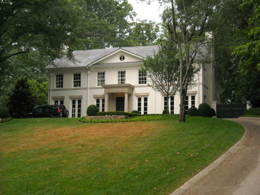
This home was completed recently, and is one of my favorite Bill Baker's designs. So lovely is the home, and so well designed for its lot, it elevates the entire feel of the neighborhood.
Q: Is there a fad you hope you never see again?
A: Yes, the houses built in the 1950’s and 60’s that we refer to as “Ranches”. These houses, for the most part, have proven to be a design that has not stood the test of time. Their floor plans are inevitably obsolete for today’s lifestyle with their low ceilings, small bathrooms and closets, and kitchens usually located on the front of the house. Who thought that was a good idea? Over time, these houses are torn down rather than remodeled. As such, they have proven to be the ultimate anti-green architecture as the resources used to build them end up in the local land fill.
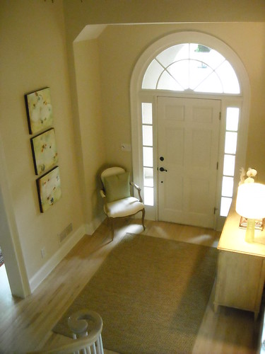
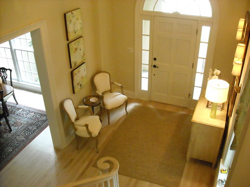
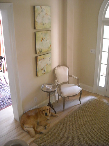
Here are some more William T. Baker & Associates designed homes that captured my eye:
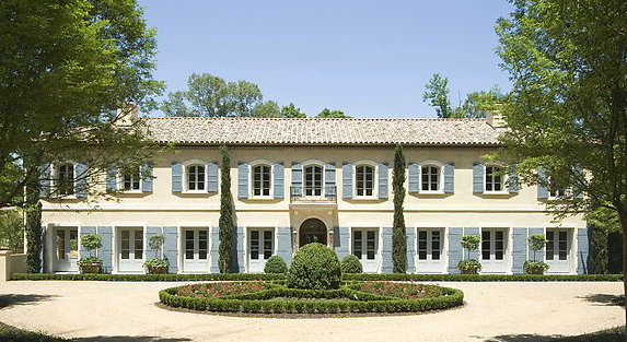
A French enfilade style home designed by William T. Baker and Associates
wtb2
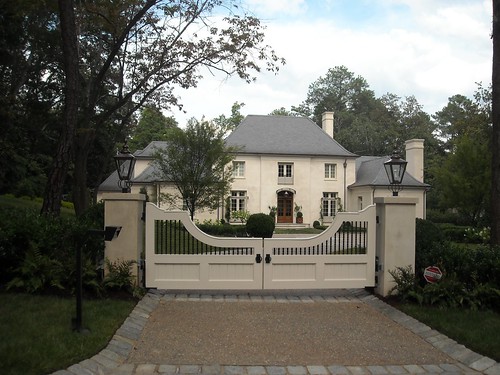
Homes designed by Bill Baker and his team always seem to work so beautifully with the specific features of their landscape, and because of this they never look forced.
wtb4
This beautiful home sits atop a crest, and fits in so well to the curves of the lot. The landscape design is by LandPlus, one of the premiere landscape architecture firms in Atlanta.
I hope you enjoyed this interview with William T. Baker, Principal of William T. Baker & Associates, an Atlanta based architecture firm. As you can see in example after example contained in this post, Bill Baker's designs are classic and timeless, rooted in the architectural principles and details that stand the test of time. For more information on his firm, please see his website. Bill also has a blog with a lot of interesting perspectives on architecture and design.

Monday, July 27, 2009

A Beautiful Tablescape


Recently, while in the Washington DC area to visit family, I was invited over to the beautiful Northern Virginia home of nationally acclaimed designer Jim Hawes Beebe, of the firm Caldwell-Beebe. I wish I could have taken pictures, but it seemed a bit rude as Jim's house is going to be published in two major magazines over the next year. Suffice it to say that his home is absolutely exquisite. One of my favorite rooms was the guest bedroom, a lovely space filled with beautiful fabrics and antiques. I immediately noticed the side table in the guest room, and Jim noted that it is an antique that served as the model for one of my favorite pieces by Niermann Weeks, the 'Lucien' table. In fact, the name for the table was inspired by Jim's beloved departed King Charles Cavelier "Lucius'. I should stop writing about Jim's home, it is not fair to go on and on given that I do not have many photos!
I asked Jim whether I could take a photo of the tablescape in his lovely entry hall. Jim is a big believer in beautiful entries, as they welcome visitors in and set the tone for the rest of the home. Jim's entry is always changing based on his recent acquisitions, and he is constantly rotating his selection of treasures on display. The foundation for Jim's entry is the beautiful architectural space of Jim's elegant townhouse, the richly colored marble on the floor, and the Niermann Weeks Baldwin console in rift oak with a light whitewash applied to the finish. The mirror is an antique, 1820s American, with its original glass.
The 'urns' on pedestals are called 'Tazzas' or 'Tazza en suite colonne' - it's a classical form that dates back to the Etruscans. They are in three separate pieces - the base, column, and urn - and are made of carved stone. Jim found them at David Bell Antiques in Georgetown; they are circa 1800 and they came from a Bellevue Avenue 'cottage' in Newport, Rhode Island.
My favorite part of the entry was the collection of shagreen items and Meiji and Edo period Japanese sterling silver and articulated models, collected over decades of travel and focused searches. This is truly a one of a kind tablescape! The articulated items are a mix of insects (dragon fly, scarab beetle, praying mantis) and crustacea (crabs, lobsters), made of copper, bronze, or sterling silver. They range in age from 80 to 300 years old, and are predominantly Japanese (a few of the pieces are Russian). Legend has it that the Samurai armor and sword makers made them to demonstrate their meticulous metalworking craftsmanship (every part moves naturally, and the anatomical details are perfect). Jim particularly treasures his collection as they are quite rare and hard to come by as so many bronze and copper Japanese items did not survive World War II.
The boxes and obelisks are shagreen, from the 1920s and 1930s. Shagreen is the finely granulated skin of sharks and rayfish, ground flat so that the pearl like structures make a granulated pattern. It has been used since the 17th century for covering small boxes, tea caddies, and such. It is called 'galuchat' in France, and was a favorite material for mirrors and decorative furniture by the great French designer Jean-Michel Frank (who died in 1941). Jim's collection of shagreen items includes cigarette cases, card cases, compacts, obelisks, and clocks. Jim often uses the boxes as bases for displaying smaller objects, like the articulates and a starfish.
The tablescape also has a mixture of natural items such as a spiny sea urchin, a hand made (by Jim) tree lichen ball. The 'X' bronze on the stand is a piece of African currency, and the letter holder is vintage Hermes.

I asked Jim how his collections begin, and whether he has an approach to expanding the collections. For the articulates collection, Jim recalls that he kind of grew into it. He saw one 'bug' articulate at an antique show and was intrigued with it, and that was the start of the collection. Next came the fixation on shagreen; he loves the soft colors, the form and the use in display. He also loves things that are of the sea, and the fact that the collection feels so 'French'. All of the items that are seen in the tablescape came from a variety of sources: private dealers, a private collector or tow, antique stores/markets, and even ebay auctions!
Jim notes that he is a serial collector. He usually concentrates on four things at a time, and likes to acquire great pieces as he comes across them, knowing that they are one of a kind and once they are gone, he will never find them again. He always looks for things that resonate with him personally, and often they are items that are wonderfully crafted, and are usually an art that is no longer crafted in today's world. He does not go for new glitz, but for things that evoke nature, craft, and craftsmanship. To Jim, a big part of interior decoration are the accessories - it is the intensely personal part - and for him, they are the 'soul' of the home.
Although difficult to convey in this picture, the color on the wall was really beautiful. It is one of Jim's favorite colors - DK16 by Donald Kaufman paint. As is characteristic of Donald Kaufman paint, it appears to be a different color based on the light. Jim uses this paint throughout his home.
Please make sure to look at the updated website for Jim's design firm, Caldwell-Beebe. There are some new project photos, and of particular note are the new sections - 'buzz', which features Caldwell-Beebe in the news and the blogs (including a link to yours truly), and 'our favorite things', which includes Jim's favorite paint colors among other things!

Sunday, July 26, 2009

You Speak, I Listen


A few weeks ago, I did a post on my entry transformation. I invited readers to give me honest feedback, and I heard from at least a dozen of my readers with constructive tips on how to improve the space. Most of the feedback from my readers was about the disconnect between the chair in the corner of the entry, and the art that is on the wall nearby. There was a sense that the two should be connected in some way.

This was how I started out. The chair is in the corner, all alone.


At first I tried this set up. The small table is an antique that belonged to my husband's great-grandmother; it was in the living room next to a large bergère chair. The small table is not in great shape, as Ben the dog has knocked it over at least four times with his tail. Perhaps this new location will protect it a bit more! I like how this looks, but wonder whether two chairs makes my entry too crowded.


This is how it looks with one chair and the side table (I polished up the silver top for this picture!). I prefer this look because it does not crowd the entry, but this might be because I am only used to seeing one chair in this space. What do you think?


Look at this...I move the table, and Ben follows!


Update: here is the chair on the other side, requested by a reader!

At this point, you are probably tired of reading about my entry (I am too!). My next home transformation post will be my bedroom; I am having some pillows made, then the bedroom will be in good enough shape to post.

Please come visit Between Naps on the Porch for Metamorphosis Monday!

Friday, July 24, 2009

Beautiful Antique French Tapestry Pillows

One of the best things about blogging has been connecting with so many great people around the world. I have also become friends with some wonderful bloggers and readers in my own back yard! One of my Atlanta readers, Gigi, shares my passion for real estate, and we are always emailing back and forth about what houses are new on the market (she has provided more than one lead for my blog posts), and what we think about the renovations and new construction projects that are going on around Buckhead.

I recently learned that not only is Gigi an avid real estate afficionado, but she is also an antique dealer who travels to Europe to find beautiful pieces to sell to customers far and wide. Here are two pieces that caught my eye when looking at her inventory. This pillow is made from a fragment of 18th century French tapestry that was hand woven in a color palette typical of early 18th century textile design. The tapestry is framed in a brown velvet ribbon from France, and finished off with high quality linen. It measures 10 inches by 20 inches, and is priced at $395.


There is another similar pillow, also made with a fragment of 18th century French tapestry. The tapestry on this pillow is framed in a neutral color gimp, as well as high quality linen. It measures 10 inches x 20 inches, and is priced at $395.

For more information or to purchase one of these beautiful and unique pillows, please email me at thingsthatinspire@gmail.com (preferably with antique tapestry pillow as the subject), and I will make sure to forward the email to Gigi. She ships all over the United States; international sales and shipping are possible, but must be discussed ahead of time.

Thursday, July 23, 2009

New on the Market: a French Style Home Featured in Veranda

For more inspirational finds, please visit www.quatrefoildesign.com

In 2006, one of the most beautiful homes in Atlanta graced the cover of Veranda magazine. I always try to catch a glimpse of the house when I walk or drive by, no easy task given that the landscaping and topography of the lot make the house virtually hidden from view when at street level.
02707056_00
The house is described as 'hôtel particulier' style, which is defined as a French townhouse of considerable grandeur. According to Wikipedia, a hôtel particulier was often free standing (quite a luxury in a European city); by the 18th century, a hôtel particulier usually stood between an entrance court (like the one in this home) and the garden behind. The house was designed by Yong Pak of Pak Heydt and Associates; Pak Heydt are truly among the finest classical architects in the Southeast. The original owner of the house was Ginny Magher, an interior designer, and the home graced the cover of Veranda in the March/April 2006 issue (more on that later).
I am always thrilled when a beautiful house comes on the market in Atlanta, particularly one that has been published. It is even more interesting to see how a new owner has made their mark on the house. In this case, anyone who buys a house that is so clearly French in style probably has a love of all things French, including French interior design. The new owners did a wonderful job making the interiors their own, yet complimenting the beauty of the French style of the home. Let's take a look inside!
02707056_01
The dining room - look at those beautiful floors! This is quite a large dining room, and is one of the largest rooms in the house.
02707056_02
I love the soft feel of this formal living room, definitely designed for a lot of entertaining with its two seating areas. If I were to guess, I would say that this room is along the front of the house based on the fact that the iron grillwork can be seen in front of the French door (which can be seen in the front of the house).
02707056_03
The kitchen, which is quite elegant with its crystal chandeliers. I love the look of this kitchen; it has very few overhead cabinets, an arched window over the sink, and look at the glass front refrigerator to the left of the sink! Do you think the freezer is to the right of the sink? Although I really like wood on the floor of a kitchen, I also like the look of antique hexagon shaped terracotta tiles.
02707056_04
The arched windows and doors are definitely something that catches my eye when I look through this house, although looking at the other pictures, not every door or every window has an arch. This is the family room, adjacent to the kitchen (the table and chairs can also be seen in the kitchen picture), and it strikes me as overall formal (due to the crystal chandelier, ornate rug, and chairs), but the informal nature of the large scale check fabric on the curtains, chairs, and sofa helps balance out the room. I suspect that this room is one of the wings off the back, although I would need a floor plan expert like Joni to weigh in with her opinion!
02707056_05
This looks like a library. Truthfully, I have no idea where this is in the home. Perhaps on one side off the entry? The window looks like it could be one of the front windows/French doors.
02707056_06
The master bedroom, very French in feel with the built in trumeau above the fireplace, the settee, French commode as a side table, and of course the fabric and wallpaper (or perhaps, fabric on the walls). Even the duvet cover has this fabric. I think this is a wing off the back of the house.
02707056_07
A beautiful and very feminine 'hers' bathroom.
02707056_08
The requisite wine cellar, in the basement.
02707056_09
A media room, also in the basement - but I like how this one is decorated in French style as well! Also, note the paneling on the walls. Only the finest of homes finish the basement to such a high standard.
02707056_10
The downstairs office and exercise room, also finished with paneling and hard wood floors.
02707056_11
This must be one of the rooms upstairs! Although this is not my style, it is very French, no?
02707056_14
My favorite kind of back elevation - two wings that make a courtyard. In Atlanta, flat walk out back yards are very desirable, but not that common given our hilly terrain. This back yard is absolutely beautiful with 8 sets of French doors opening to the back. How I would love to actually go in this house in person - I wonder which room is along the back of the house? I am beginning to think that it might be the dining room, which would mean that the left wing is the family room, the right wing is the master bedroom.
02707056_13
A little pavilion, which houses the garage on the other side, sits at the end of the yard.02707056_12
The pavilion has an outdoor entertainment area.
02707056_15
One of the best landscape firms in Atlanta helped to create the sculpted garden in the back. I just noticed the Versailles planters in the back yard - I love those!
veranda_cover
This home graced the cover of Veranda in March/April 2006, and provides more clues to the layout as well as additional pictures of the beautiful interior. The home was photographed when designer Ginny Magher lived there; just a few months after publication, the home was sold to the new owners. What a great marketing brochure for the home - to have it on the market as a Veranda cover story! Even now, with the new listing, the fact that this home was on the cover of Veranda is a major marketing point. The cover featured the dining room - and I think my theory about the dining room spanning the back of the house was correct. The dining room doors open onto an expanse of green, which almost certainly is the manicured lawn of the back yard. A closer view of the floors can be seen, and the intricate molding in the walls.
veranda3 02707056_01
Here is a side by side comparison. Interesting, it looks like the table and chairs might have been sold with the house - the chairs are the same. It looks like the window treatments stayed as well. The new owners (on the right) put an antique mirror on the wall, as well as a rug on the floor. The trumeau over the fireplace was probably built in.
veranda2 02707056_02
On the left, the living room as it was when Magher lived there; there are two seating areas, but Magher seems to have filled the room with more accessories and such. On the right, the current real estate listing. Some of the furnishings seem the same - the slipper chairs and some of the other seating, as well as the window treatments. The new owners have certainly stayed true to the French feel of the house, but in a more streamlined way. It does make me wonder whether they used Magher to help them decorate the home when they moved in.
veranda4 02707056_05
Here is the library/study - it looks like some of this furniture stayed with the house as well. The loveseats are certainly the same (the photographer for the real estate listing clearly modeled his shot off the Veranda spread). Again, the new owners have pared down the furnishings and accessories - even the loveseat is pared down, with just one pillow instead of four. As much as I admire both rooms, I do like the more pared down look that is going on.
veranda7 02707056_04
The family room has gone through quite a change. No longer is it lavender, and the curtains have been changed to the check instead of the toile. Again, fewer furniture pieces makes the room a bit less 'full'. I wonder if that painting on the wall (on the left) hid a TV? The TV is out in full view now, but I like how the new owners recessed it into the wall.
veranda5 02707056_06
The bedroom as it appeared in Veranda, with a dramatic canopy covered with the same material used on the walls and the curtains. I adore those large scale monograms on the shams on the bed. To the right, the room as the current owners have it decorated - again, using the same foundations, but in a more streamlined way. The new owner clearly has a love for Oriental rugs, which appear in most of the rooms now. The trumeau was either built in, or came with the house! Even the little bench in front of the fireplace seems to be the same.
veranda6 02707056_07
On the left, the bathroom as it appeared when Magher lived in the home. On the right, the more streamlined style of the new owners. I like how the new owners hung their own plates above the vanity; unusual in a bathroom, but such a lovely touch. It is also nice to see the beautiful stairs. When I saw the Veranda spread, I assumed that they were tucked to the side of the house. But now I think they might be right when you enter the house, based on the window on the landing. Does this mean that you have to go up to the main level - kind of like a split level home? I wonder.
veranda8 02707056_03
The Veranda spread shows a small picture of the kitchen, which is a bit less formal with the plaid shades over the island. Peeking through the door to the right, it looks like these are the double doors that lead out of the library. To the left - perhaps a big pantry and/or small kitchen office? Looking at the outdoor pavilion, it looks like the outdoor furniture stayed with the house, as it is the same as in the real estate listing.

Sometimes I wonder why I am interested in this kind of stuff. But I do like to see how two different owners decorate the same house, particularly when it is a house that was published in a national magazine! I like that the home is decorated in such a beautiful way, really in tune with the French style of the house. For more information on this home, please see the real estate listing.

All images via Veranda Magazine and the real estate listing.
Please visit Quatrefoil Design for more inspirational images.


Things That Inspire Favorites: Cape Cod Metal Polishing Cloths

Things That Inspire Favorites: Oz Naturals Vitamin C Serum

Things That Inspire Favorites: Thera Breath Oral Rinse


To subscribe to my blog by email, click here. 
To follow my blog on Facebook, click here. 
Twitter: @TTIBlog 
Pinterest: http://pinterest.com/ttiblog/ 
Visit my online store, Quatrefoil Designwww.quatrefoildesign.bigcartel.com 
To see design, architecture, art, and decorative books that I recommend, please visit the Things That Inspire Amazon store.

LinkWithin

Related Posts with Thumbnails