.}

Wednesday, May 20, 2015

Finally finishing the living room decor


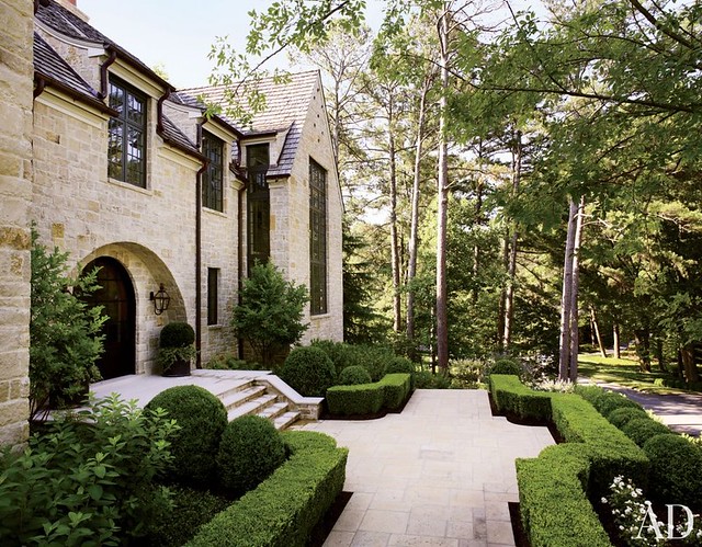
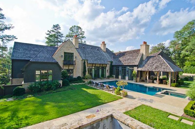
It’s hard to believe we have been in our “new” house for three and a half years now! We have slowly but surely worked on the décor since we moved in, with a big project every year. Now, we are finally ready to finish the main floor, including the central room in the house, the living room.

I wanted a living room that was at the heart of the house, not tucked to the side. This room functions as a living room, a music room (our grand piano is located here), and a passageway from one side of the house to another.  This is a room that is used in some capacity every day.

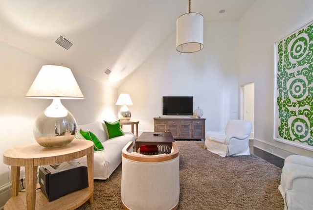
Right now, the only things in the room are the piano, a custom rug, and an old wing chair that I use primarily in the winter to sit by the fire.  Honestly, the lack of furniture has not bothered me in the slightest, as I like the airy feel of the room and the unobstructed view of the outdoors. Also, we tend to use this room more as a salon than a living room, so it is a great entertaining space when we have functions at our house – in the winter months, we usually set up a bar in the living room and it makes a great cocktail hour space. In nicer weather, we set up a bar on the stone patio outside the living room, and we throw open the living room doors. Guests go back and forth between the two spaces.

I have had plenty of time to think about how this space might be furnished based on how we use the room and live in the house, and I have been collecting pictures that reflect the “feel” that I would like in this room. Of course, furniture layout is often dictated by architecture and space planning needs, but there is something about this collection of  living rooms that really captures my eye.

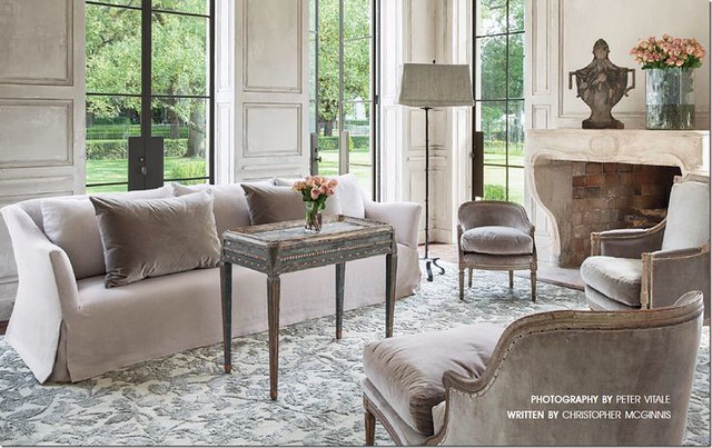
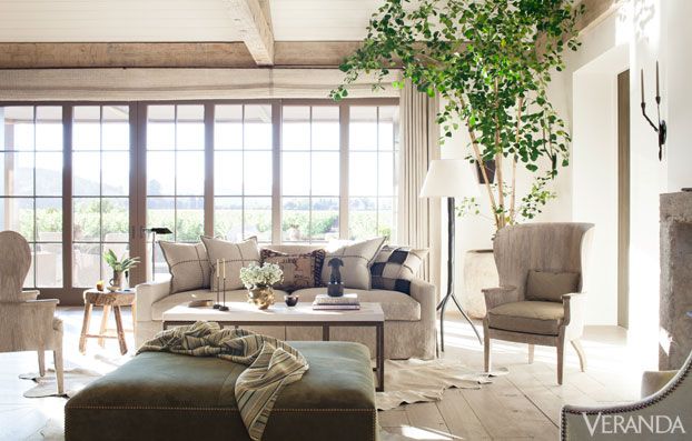
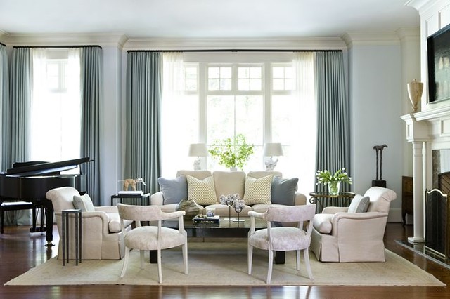
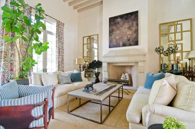
This living room has always been one of my favorites. I like the lack of clutter and the leggy nature of the furnishings. This Houston house was featured in Veranda, and the interior design is by Eleanor Cummings.

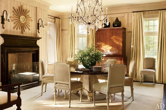
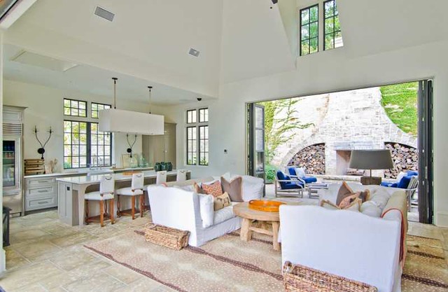
Another favorite, and another Houston house, featured in Milieu Magazine. The beautiful architecture, steel windows, paneled walls, and antique fireplace create a stunning backdrop, and I like that the furnishings are minimal and quiet both in style, line, and color. The different size chairs are a pleasing and interesting touch, and are all unified by the same fabric.

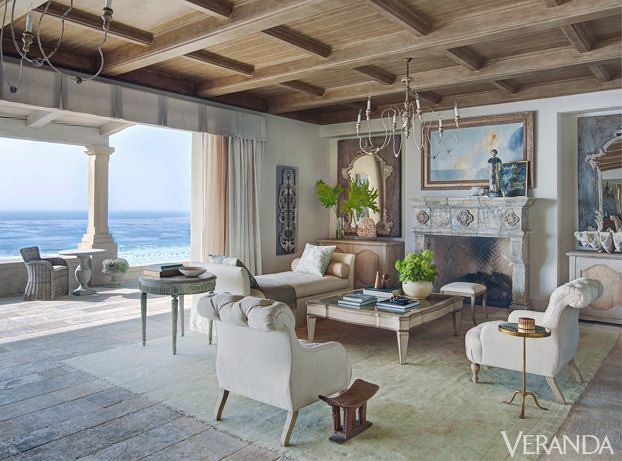
Another living room whose furniture is quiet and lets the architecture and the amazing view take center stage. I love the idea of a bench/chaise instead of a sofa; it keeps the room feeling light, and can be moved easily if the room needs to serve as an entertaining space.  I wrote about my love for benches in design in a post last year, click here to see it. Design by Ohara Davies-Gaetano.

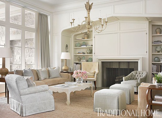
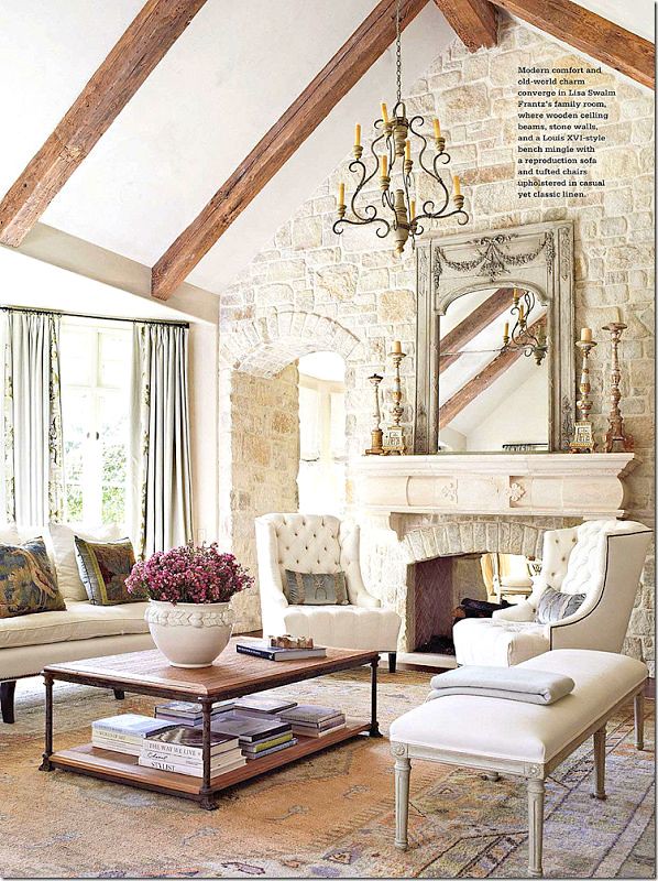
This beautiful living room has been one of my favorites for a while. The design is by Phoebe Howard.

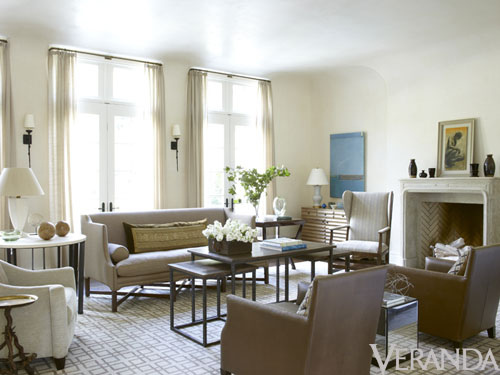
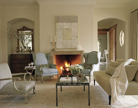
I like how this living room is designed around the space of the room itself, rather than focused on the fireplace. Design by Jim Howard.

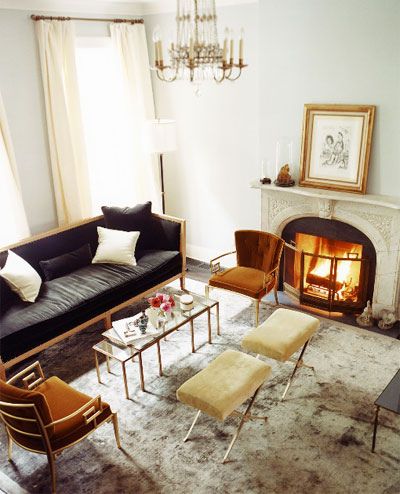
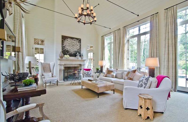
Another space where the furniture arrangement is not focused specifically on the fireplace. The chairs can be placed in relation to the fireplace, but they are somewhat free-floating and also relate to the sofa and to the volume of the room. The square ottoman is also a nice touch, instead of another sofa.

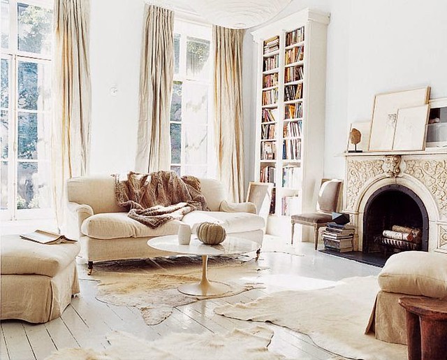
I am a fan on minimal furnishings, and this very European style room has a spare feel. Because there is just one sofa, and what appears to be a few ottomans instead of chairs, the space feels very streamlined.

Another pretty room where the furniture seems to be centered in the room rather than focused on the fireplace.  This seems to be a common theme in the pictures I am showing; I think it creates a pleasing perspective when the room is mainly viewed from front to back, and creates a less cluttered look. I also don’t like to see the back of a sofa when looking into a room, so the use of a bench appeals to me.

Two stools are also a  great alternative to a sofa. Design by Suzanne Kasler.

I saved this picture because I liked the furniture arrangement, and the use of stools.

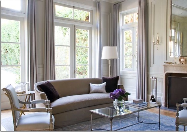
A room by Phoebe Howard, which caught my eye both because of the grand piano, and also because the seating arrangement is centered on the window rather than in alignment with the fireplace.

A living room by Suzanne Kasler has an interesting assortment of chairs and an armless sofa, rather than two sofas flanking the fireplace. This room is actually quite large and there is a sofa against the wall on the other side of the room, creating another seating area.

Another one of my favorite living room scenes, from my Pinterest files. The distinctive curved sofa holds its own, with a few beautiful chairs for extra seating.

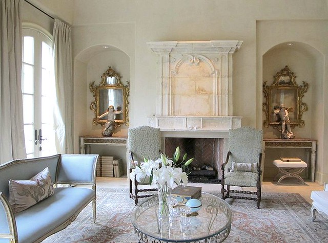
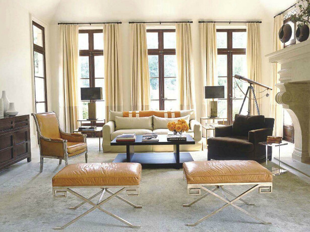
A light furniture arrangement with two chairs flanking the fireplace.

A room on my living room pinterest files that caught me eye. I like the idea of a bench, two chairs, and a sofa with exposed wood legs.

I also have a fondness for a sofa that faces the fireplace, as seen in this room. I’m not sure how it would look to have a sofa with its back to the piano, but in a room without a piano this is a lovely arrangement.

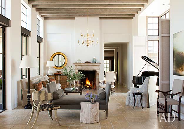
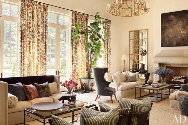
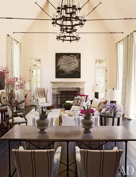
I will conclude with one of my favorite living rooms, via Architectural Digest, design by Rela Gleason and architecture by McAlpine Tankersley.  I never tire of looking at this living room. Note how the room has an alcove for the grand piano, and is also used as a passageway as well as a seating area. Although this is nothing like my house, the space resonates with me. I love how a bench is used in the middle of the space to define one side of the room from another, and that the seating arrangement is tucked against the windows, with comfortable chairs adjacent to the piano and to the fireplace, so they each can be enjoyed. The cased opening to the right of the fireplace is loosely reflected in the paneling of the wall to the left of the fireplace, and a round mirror adds an interesting shape to the space. The chandelier is not centered in the room, but is focused over the seating  area. I wonder if there is a matching chandelier on the other side of the room.

I am looking forward to seeing what my designer comes up with after we meet to discuss the space! So many possibilities.

To see my latest blog post, click here.
To subscribe to my blog by email, click here.
To follow my blog on Facebook, click here.
Twitter: @TTIBlog
Instagram: http://instagram.com/ttiblog
Pinterest: http://pinterest.com/ttiblog/
Visit my online store, Quatrefoil Design: www.quatrefoildesign.bigcartel.com

To see design, architecture, art, and decorative books that I recommend, please visit the Things That Inspire Amazon store.


Wednesday, April 15, 2015

Five Beautiful Houses: Brookwood Hills Redefined–2015 Home Tour


There is a wonderful tour of homes this Saturday (April 18, 2015), taking place in one of Atlanta's most charming neighborhoods, Brookwood Hills.  The theme of this year's tour is “Redefined”, and here is information on the tour and sneak peek of the houses!

The Home Tour takes place this Saturday, April 18, from 10 am to 4 pm.  Tickets are $35 each in advance, $40 at the door, and proceeds benefit Children’s Healthcare of Atlanta.  Tickets can be purchased online through the Children’s Healthcare of Atlanta website:
Or, tickets can be purchased at any of the houses on tour (on the day of the tour).

Here is a sneak preview of the houses…

This house has been called “one of the most classical houses in Brookwood Hills”, and only three families have lived in 61 Brighton since it was built in 1928.  The new homeowners purchased the house from the estate of the Hale family, who had lived there for almost fifty years. The homewoners have young children and bring a youthful energy to the house.

Many of the leaders of the 20th century design and architecture community touched this house in some way over the past 85 years.  The original architect was Lewis Crook, and Norman Askins led a renovation and expansion in the 1990s after fire damaged the interiors.  Legendary landscape architect Edward Daugherty worked on the property, and Andrew Crawford crafted the ironwork in the front.  Marie Warren was the interior designer during the 90s renovation, and some of the furnishings and window treatments that she selected remain in the house today.

The homeowners look forward to making memories in their new home and hope to honor its history by cherishing it as much as the past homeowners did.

This striking new construction, a modern day take on Dutch West Indies style, is an incredible addition to Brookwood Hills.  The homeowners, Lee and Kevin Kleinhelter, worked collaboratively with architect Yong Pak to bring to life their vision of a house that uses space efficiently and reflects their modern lifestyle.

The home’s interior continues the crisp black and white color scheme of the exterior, making the transition from outside to inside seamless. The connection with the outdoors is emphasized with a dramatic wall of iron windows across the back of the house that showcases the treehouse view and offers abundant natural light.

Every item and surface in the house was carefully curated for the space. Lee is a nationally published designer and owner of the store Pieces, and this is Lee’s art – the details, textures, and finishes, the balance of light and dark, the contrast of contemporary and rustic.

The Kleinhelters’ house truly represents Brookwood Hills in the 21st century. The architecture and design interpret classic elements in a refreshingly modern way, and the result is a home that is an extraordinary addition the architectural landscape of Brookwood Hills.


The homeowner purchased this classic 1920’s bungalow in 1992, and through the years he has updated and modernized virtually every dimension of the house, while also respecting the house’s history and maintaining its architectural integrity.

The homeowner’s passion for landscape is evident in the beautiful front and back yards that he personally designed. On the interior, the homeowner worked with Bill Peace of Peace Designs to create a comfortable and updated space that is interesting, eclectic, and very livable.

The most significantly updated space in the house is the recently renovated kitchen, designed by architect Stan Dixon and Mary Kathryn Timoney of Design Galleria.   The beautiful cabinetry, the versatile floor plan, and the flood of natural light from expansive painted steel windows make the kitchen an exceptional space that is modern and spacious.  The kitchen won an Atlanta Homes & Lifestyles Kitchen of the Year Award in 2014.

The homeowner looks forward to many more years living in this wonderful house that is perfectly suited for modern day life, but still full of original charm and character.


Liz and Rob Davies purchased this 1960 Colonial style cottage from the original owner, and knew immediately that it had great potential.  Liz is a general contractor and managing director of ESD Homes, and understands how an older home can be updated to meet the needs of 21st century life.

The Davies, working with architect Ross Piper and designer Karla Morris, took the house down to the studs and extended the back of the house to create more functional spaces and better flow.  On the exterior, a new wide open front entry, custom shutters, and a fresh color palette updated the look of the house.  Inside, walls were removed to create a modern kitchen and casual dining space. A screened porch was enclosed to create the most dramatic space in the house, the “iron window room”. Floor to ceiling iron windows flood the room with natural light and complement the chic, transitional style of the décor.
 
This Brookwood Hills house maintains the charm of a traditional exterior, and the function of a modernized interior.  The result is a highly livable home that can be enjoyed for many years to come.


The homeowners purchased this storybook perfect 1920s house in 2011, and have brought the house to full potential by adding charming details that are characteristic of classic Brookwood Hills homes.

Architect Ross Piper designed the refreshed façade, which features a new portico and welcoming front entrance. The brick was painted a soft color, and custom shutters and window boxes add a special touch. The result is classic Georgian with a twist, elegant but also welcoming.

The homeowners worked with Bellwether Landscape Architects to transform the front and back landscape into a more aesthetically pleasing and usable design. Most notable is an outdoor entertaining area that has a fountain as a unifying feature.

The interiors were updated with the assistance of designer Laura Walker. The soft blue color palette throughout the house creates a peaceful feel, and the artwork plays into the color palette of each room. All of the lighting was updated; the overscale chandelier in the dining room is a particular favorite.

This special house is a peaceful retreat, a wonderful place to raise a young family, and a beautiful reflection of the homeowners’ taste and lifestyle.


We hope you can come!


To see my latest blog post, click here.
To subscribe to my blog by email, click here.
To follow my blog on Facebook, click here.
Twitter: @TTIBlog
Instagram: http://instagram.com/ttiblog
Pinterest: http://pinterest.com/ttiblog/
Visit my online store, Quatrefoil Design: www.quatrefoildesign.bigcartel.com

To see design, architecture, art, and decorative books that I recommend, please visit the Things That Inspire Amazon store.


Saturday, February 21, 2015

On the market: a Suzanne Kasler house featured in Architectural Digest

Several years ago, I noticed a house come on the market that was truly exceptional. The architecture, landscape, and interior design were all exquisitely done, and had a very special quality. I was eager to post on this house, which had been designed by residential designer Bill Baker, interior designer Suzanne Kasler, and landscape architect Land Plus. However, I soon learned that it had been photographed for Architectural Digest, and I received a request to not post any pictures until after the article came out.

When the article came out in the July 2013 Architectural Digest, the house was no longer on the market. Now, it is back on the market, with new real estate pictures that really showcase the beauty of the house and its décor.  In my opinion, this is one of the best houses currently for sale in Atlanta. It’s a big house (almost 18,000 square feet) and includes just about every amenity you can think of – 6 bedrooms, 13 bathrooms (9 full, 4 half),  indoor golf putting room, indoor sport court, indoor and outdoor pools, wine cellar, home theater, dog run, his and her fitness studios, multiple outdoor entertainment areas, 7 fireplaces,  4 car garage.  The architecture is classic and tasteful, and since the house is only 6 years old, everything is fresh and up to date.

Here is a tour of the house, with pictures from the real estate listings (current and past) and Architectural Digest. Enjoy!

Front and Back Exterior

The house is described as inspired by the work of the late 19th century English architect Edwin Lutyens. In the AD article, architectural Designer Bill Baker describes the style as appealing to our time “because of the effect it achieves through form and asymmetrical massing rather than through elaborate details”. I thought this was an interesting insight, because many of the new homes in Atlanta seem to reflect this aesthetic rather than the classic French and English styles that have traditionally been popular in Atlanta custom homes. (Image above from real estate listing)

The house is perched on top of a hill. In Atlanta, many houses have a slope in the front, and a relatively flat back yard, so the back of the house is on level with the yard.  Other houses have a flat front yard, and a sloped backyard, which means that in the back,  the main level of the house has a deck or terrace. Personally, I prefer having the slope in the front and a flat back yard.

Regardless of the lot in Atlanta, a good landscape architect is a must as there are so many grading and draining issues associated with many Atlanta lots. The landscape architect on this project was Land Plus

The online AD article has this wonderful perspective of the front of the house, and gives an appreciation of the wonderful landscape design by Land Plus. I love that the Korean boxwoods are trimmed to reflect the contours of the paving.

A broad view of the back of the house, from an old real estate photo.  This house was made for entertaining, and the back yard space extends the options for entertaining. There is a wonderful indoor/outdoor connection with this house.
A different perspective on the back yard shows a stand alone structure that serves as an outdoor living room/kitchen. There is an outdoor fireplace with seating area beyond the outdoor living room. More on these spaces later in the post.

Main floor public areas

In the AD article, Suzanne noted that “this house is all about juxtaposition; town and country, formal and informal, elegant and rustic, dressed up and dressed down”. This comes through clearly in the AD pictures, but the real estate pictures give an additional perspective on the house that makes it all come together.

Not pictured in the AD article is the entry hall. Beautiful lighting is a hallmark of this house, as is plentiful seating. Note the chairs in the entry. The juxtaposition of styles noted by Kasler is clearly seen in this space.

One of the most pinned images from this article is the great room, which appears soft and muted in this image. It’s a large room, and has two seating areas. Apparently the Robert Kime curtain fabric was the starting point for the color scheme of the room, and individual colors from the fabric were used as accents throughout the room. The Dessin Fournir Duveaux chandelier is one of my favorites.

The old real estate photos (from the original listing a few years ago) show more color and a wider view. Note that the chair on the left is part of the opposite seating area in the AD picture. I suspect the color has been enhanced in this picture, as it’s so much more vivid than the AD picture. It’s interesting to see the other side of the fireplace, which has a matching mirror.

The other side of the room, from an old real estate photo. Note that the Dennis & Leen wing chair resides by the fireplace on this side of the room. The paintings above both fireplaces are by Raphaëlle Goethals. This picture shows a glimpse of what is on the wall on the left side of the room. If I had to guess, I would say that the opening to the left of the fireplace leads to a transition area and the dining room, and the opening to the right of the fireplace leads to the kitchen and family room (with the kitchen positioned on the other side of the wall where the fireplace is located).

This image is from the current real estate listing. My guess is that the colors in this are more reflective on how it looks in real life. This is a wonderful picture that gives a good feel for the space of the room and the way in which the two seating areas interrelate. Looking at the picture of the back of the house, I think that this room is along the back of the house.

This beautiful dining room is just the right size, and has another one of my favorite chandeliers – the Fontaine chandelier by Dennis & Leen. It looks like the dining room is located on the left side of the house, in a bump out section along the front.

The next room on the left side of the house, in the juncture between the main body of the house and the wing, is the kitchen. Note the lamps on either side of the range, the X pattern in the island, and the metal range hood.

This old real estate image of the kitchen gives a fuller view, and emphasizes the extensive use of shiplap on the walls and ceiling. To the left is an opening that leads to the great room.

Just beyond the kitchen, in the wing of the house, is the family room. A kitchen dining table is positioned in the transition space.

This old real estate photo of the room gives a better view of the family room itself. I like the asymmetrical furntirure arrangement, possibly designed this way as there is a TV on the wall.  The volume of space in this room really appeals to me – the vaulted celings, the beautiful and dramatic light fixtures, and the subtle art by Stefany Hemming - all enhance the look and feel of the room. I particularly like the interesting RH wing chair to the left of the fireplace. The doors on either side of the fireplace lead to one of the outdoor entertaining spaces, which will be featured later in the post.

Master bedroom and bathroom

Also on the main floor is the master bedroom, and this picture from the real estate listing shows that the room is identical to layout and design as the room is portrayed in AD. In fact, it’s reassuring that this house in its every day state is pretty much identical to the house as it is portrayed in AD, with the exception of a piece of furniture moved here and there.  The arm lights over the headboard are an interesting touch.

The master bathroom received a lot of attention, because of the beautiful lavender color of the walls, and the detailed shape and design of the niche that the freestanding tub is located in.

A wider view of the master bathroom gives an appreciation for the combination of all of the elements in this room, including the panelled mirror wall and the Venetian glass mirror mounted on the wall. Note the TV mounted on the wall. It appears to be on a swiveling stand so that TV can be watched while someone is bathing. I love real estate photos, as this detail would never be shown in a magazine (and in fact, was airbrushed out of the AD photo).

Second floor and basement

Another space not seen in the AD article - the dramatic and beautiful main stairs, which are in the front of the house. Again, show stopping lighting define the space, as does a bold geometric carpet and runner and huge dramatic windows. Note the detailed opening in the ceiling for the chandelier base, and the paneling in the room on the right.

A view from the end of the hall shows the unique interior windows in the upstairs rooms, the chevron pattern of the dark floor, and the shiplap siding on the walls and ceiling.

A secondary bedroom that was featured in the AD article, but this view gives an appreciation for the entire room and the way in which the bathroom relates to the room.

A closer view of the bathroom. The shower is on the right.

A pretty and sophisticated teen room. Note the sleeping niche built into the wall.

I like it when real estate photos feature lower key rooms in the house, as it is interesting to see the design choices. This secondary bathroom is beautifully done, with gray walls and cabinety, and a detailed basketweave floor with a dark accent stone.

Based on the ceiling shape, I suspect this is an upstairs sitting room. Most of the upstairs rooms appear to be built into the roofline and have vaulted ceilings.

Believe it or not, there’s more! On to the basement.

An ebony floor sports court.

A mini putting range with golf simulation screen.

An indoor spa area with lap pool (I suspect this has one of those contraptions that allows someone to swim in place).

A basement game and recreation room, with a home gym seen through the glass doors on the left.

Of course, the house has its own home theater, complete with hot pink throws and custom sconces.

Outdoor entertaining areas

There is still more (after all, this house is almost 18,000 square feet)!  The outdoor spaces are show stopping too.

An outdoor sitting area and dining area are off the family room, and face the pool. The AD article notes that the homeowners regularly entertain, and can accommodate more than 200 people – spaces like this would be ideal for entertaining, even if it is raining.

Just beyond the pool is an outdoor structure that houses a living area and full kitchen. It features fully folding French doors on both sides.

A view from the other side, which reveals the outdoor fireplace and yet another seating area on the other side of the doors. I don’t think this space was featured at all in AD, but it is one of my favorite parts of the house.

The house is listed by Atlanta Fine Homes/Sotheby’s International Realty. The listing can be seen here.

So, what do you think? I really love this house. I wonder which rooms the owners use the most, and whether they even use some of the rooms in the house. I would probably spend a lot of time in the outdoor living area/kitchen and the family room, as they are so light and airy and have such a great look and feel to them. Do you have a favorite room?

To comment, click here


To see my latest blog post, click here.
To subscribe to my blog by email, click here.
To follow my blog on Facebook, click here.
Twitter: @TTIBlog
Instagram: http://instagram.com/ttiblog
Pinterest: http://pinterest.com/ttiblog/
Visit my online store, Quatrefoil Design: www.quatrefoildesign.bigcartel.com

To see design, architecture, art, and decorative books that I recommend, please visit the Things That Inspire Amazon store.


Things That Inspire Favorites: Cape Cod Metal Polishing Cloths

Things That Inspire Favorites: Oz Naturals Vitamin C Serum

Things That Inspire Favorites: Thera Breath Oral Rinse


LinkWithin

Related Posts with Thumbnails