

I always love to check the real estate listings in Atlanta, and thought it would be interesting to take a look at the one of the most expensive properties on the market in Atlanta proper (not the suburbs). This house has been on and off the market for years, and recently went back on the market at $16,500,000, which makes it the second most expensive listing within the city limits (the most expensive is listed at $19,000,000). When this house was on the market a few years ago, the listing indicated that the interior design was by Lady Henrietta Spencer-Churchill, the eldest daughter of the 11th Duke of Marlborough.
This home sits on 17+ acres in a prime area in Atlanta, which is very rare for a private property within the city limits. It is described as a 'classic Georgian limestone masterpiece' with over 15,000 square feet of living space. On the property are two small lakes, horse paddocks and a stable. The grounds include a sculpted English garden, two greenhouses and a terrarium.


What is the most expensive listing where you live?
Friday, September 28, 2007
Most expensive real estate in Atlanta
Thursday, September 27, 2007
More ways to use fabric?
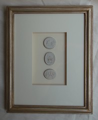
Although I am generally an advocate of original art on the wall, I thought that this was a clever idea. Take your favorite fabric, mount it to a board, and frame it! If you use a standard size frame, this is actually a reasonably priced way to make a design statement and enjoy your favorite patterns.

To subscribe to my blog by email, click here.
To follow my blog on facebook, click here.
To visit my blog's store, click here.
Tuesday, September 25, 2007
Another inspirational Suzanne Kasler home

 The two story entry features an unusual arrangement -two ottomans and an antique Spanish table.
 The great room features beams from a 200 year old Georgia barn. Botanicals were used on the walls for their architectural feel, and to keep the mood casual. (This is the other side of the great room - it is a very large room. The sofas on the cover can be seen on the right of this photo).
 Waterworks tortoiseshell tiles line the back of the bar, which adds a furniturelike quality to the space (and is echoed in the glasses on the concrete countertop). A Scott Ingram painting is featured (this is the second Kasler designed home I have seen a Scott Ingram in - she must like his style!).
 This room is decribed as the family dining room. I love the combination of the traditional bench and the more contemporary styled chairs. The band on the bottom of the chairs is an elegant detail.
 A neutral kitchen with a great balance of light and darks. Even the ceramics have light and dark elements to echo the cabinets and countertops.
To subscribe to my blog by email, click here.
To follow my blog on facebook, click here.
To visit my blog's store, click here.
Monday, September 24, 2007
Inspirational Artist - Dusty Griffith
 Artwork by Dusty Griffith, interior by Suzanne Kasler, 2004 Southern Accents Showhouse
Atlanta artist Dusty Griffith creates art that has a profound appeal to me. He creates beautiful and original works of art, but his paintings also have echoes of some of my favorite artists - Cy Twombly (some of Griffith's pieces have small, subtle graffiti like markings) and Mark Rothko. The soothing colors and layers of pigment, wax, and found objects, create a luminous and interesting surface, but there is something about these paintings that causes the viewer to think about what lies beneath the surface, not just of the art work but of life in general. Perhaps the spiritual titles elicit this response in me personally, but many observers would not necessarily interpret these works as spiritual works. Beauty and interpretation are truly in the eyes and psyche of the beholder when it comes to Griffith's art.
To me, the best and most enduring art is that which looks a little different every time you look at the painting. This is certainly the case with Griffith's work. Of Griffith's work, one reviewer wrote that " the intrinsic structure of [Griffith's] work is meant to seize the viewer’s attention and make transformation possible". What a wonderful achievement for an artist!
Dusty Griffith is a favorite of many top notch Atlanta designers, including Suzanne Kasler. His work was featured prominently in the Southern Accents Watersound Showhouse in Florida, shown in the top image (I think his art made the room). He is exclusively sold through the Lowe Gallery in Atlanta and Los Angeles.
 Dusty Griffith - The Coming, available through the Lowe Gallery
 Dusty Griffith - Genesis 8:8, through the Lowe Gallery
 Dusty Griffith, I Will Pour Out My Spirit II, through the Lowe Gallery
 Dusty Griffith, Sea of Grace, through the Lowe Gallery
 Dusty Griffith, At Peace with Nancy II, thought the Lowe Gallery
 Dusty Griffith, Green Pastures, through the Lowe Gallery
To visit my store, Quatrefoil Design, click here.
To subscribe to my blog by email, click here.
To follow my blog on Facebook, click here.


Saturday, September 22, 2007
A little sleuth work
 Photography by John Gruen.
I then turned to my Traditional Home stack. Nothing. It did not look like House Beautiful or Veranda. I knew that I had saved this from a blog, so I looked through quite a few of my favorite blogs. Nothing.
Then, I turned to a blog that I had not read in a while. I am not sure why it had gotten out of my rotation, as it is a great blog: An Eye for an I:nterior, one of my first design blog discoveries. A few months ago, she featured the amazing photographer John Gruen, whose images are featured below. He has an amazing eye and his compositions are beautiful. It turns out that his picture is from a magazine called At Home, which is a Fairfield County Connecticut local publication. Mystery solved!
Coincidentally, a few days ago An Eye for an I:nterior posted about the importance of professional interior photography in the design profession. There is truly an artform to capturing interiors, and John Gruen is a master of his profession.
 I have been seeing a lot of branches used as decor lately. It is a beautiful, sculptural look. Love the wallpaper too. Photography by John Gruen.
 Light filled room - so hard to photograph well - architectural simplicity. Photography by John Gruen.
 These stairs make a statement! I love the runner...usually you see the dark part framing the light part, but this is the reverse. Photography by John Gruen.
 This looks like a very elegant artist studio; notice the paintbrushes in jars on the chest. Photography by John Gruen.
To subscribe to my blog by email, click here.
To follow my blog on facebook, click here.
To visit my blog's store, click here.
Tuesday, September 18, 2007
Entryways
Last month, Mrs. Blandings did a nice post on 'First Impressions' - her favorite entries. Given that my entryway has been in a sad unfinished state for so long, I was very interested to see her post, and realized that at least 25% of the pictures in my computer 'design file' were devoted to entries.
I quickly created a folder just for my entry pictures. After posting my favorites on this post, I realize that my favorite look is a beautiful antique bench (perhaps Swedish) with an amazing piece of contempory art (vertically oriented), flanked with sconces. Hmmmm......maybe I should rethink my front hall! I love my mirror, but I could always find a new place for it....
 Suzanne Kasler design - entryway
 From Traditional Home. I thought this was an interesting front hall arrangement...a bench, a mirror, and two lamps (or are they candles?).
 On the left...from Charleston Home Magazine, the entryway of designer Jenny Miller's home.
 My absolute favorite. To me, this is perfection - the beautiful love seat, pillows, sconces, and a fabulous piece of contemporary art to balance everything out. I imagine that this seat is antique, but if anyone knows of a company that makes a good reproduction in this scale, please let me know! (Edit: this is from a Connecticut magazine called At Home)
 Phillip Sides
 Jan Showers. This is so beautiful - a silvery chest with a sunburst mirror on top.
 I believe this was designed by Joni at Cote de Texas....it was from her blog
 Liz Williams
Do you see a trend here???
To visit my store, Quatrefoil Design, click here.
To subscribe to my blog by email, click here.
To follow my blog on Facebook, click here.
Friday, September 14, 2007
A little help from my friends
I simply cannot make a decision, and would love input from anyone who sees this post....
The dilemma: my foyer/front hall has been barely decorated for two years now. I purchased a beautiful Niermann Weeks mirror, and the chest that I originally had in the front hall was hopelessly wrong (a Hickory Chair French chest). So, the mirror has been hanging ALONE for all of this time! I am tired of not having something there, and am ready to make a purchase.
 The mirror stands alone....and measures 57"h x 35"w
I love the look of a mirror in a front hall. It is great to do a quick once over before leaving the house. Also, the mirror reflects two beautiful art pieces (which are directly across from it) and works well in the space. Because of the lightness of the floors (I am not taking on that project right now!) and the mellow gold of the mirror, I feel that something dark would work well.
What I can't decide upon is whether to purchase a chest to go under the mirror - very functional and useful (I have plenty of storage in the house, though, and do not need the storage). But the appeal of a console is definitely there for me. I have also considered a bench, but I have so much seating in the living room and dining room, plus I have an antique French bergere to the left of the front door. There really is not a need for more seating!
So, if you take out space planning (20 foot double height ceiling), and look purely at what would go well with the lines and color of the mirror, what do you think? Should I look at something with straight lines to contrast with the curves of the mirror? Or, should I look for something curvy to repeat the curves of the mirror? Any other piece of furniture come to mind? Any other finish?
Here are some of the candidates:
 Murano chest by Hickory Chair. I think that a black or dark piece of furniture would be a nice contrast with the mirror. I have seen this chest in French gray, but I have never seen it in black. The scale of this mirror is similar to the scale of my mirror (but a different shape, of course). Size of chest is 36.25"h x 47.5"w x 20.5"d
.

 Niermann Weeks Baltic console. I have seen this in person, and it is stunning. Dimensions are 70w x 25d x 34h (also comes in 16d version).
 Christine console by Oly. I have also seen this in person, and I love it. The gold accents are really nice. However, the top is mirror - which I love - but I think it would look better with a great piece of contemporary art above it, not another mirror. Size is 71"W x 18"D x 33"H.
Nancy Corzine Svea Demilune - this piece is really gorgeous in person. It is a demilune table, but a large size. The finish is beautiful...I saw it in Tetre Negre, with burnished gold. The size I am considering is 60"W x20"D x 34"H.
 This is from Ethan Allen, in their new Modern Glamor collection. I love the lines of the piece, and the mirror above seems to be the same scale. However, I saw it in person, and the 'zebra pattern' veneer did not appeal to me. I really like a smoother finish. I still like the shape...I even thought about buying it and painting it a chocolate-black! It is very reasonably priced.
Many thanks in advance! You can see that my thoughts are all over the place. Generally I have softer style than the Oly piece, and the dining room that opens to the front hall is very traditional (inherited furniture....not what I would have picked, but beautiful quality and style).
To subscribe to my blog by email, click here.
To follow my blog on facebook, click here.
To visit my blog's store, click here.


.webp)


