.}

Thursday, October 29, 2009

A follow up post to the 'Trends the scream 2000s'.


Image via Style Chronicles -
an example of am entry in a home that is charming and cozy rather than large and cold

I thoroughly enjoyed reading each and every comment on my post on 'Trends that scream 2000s'; there was a lively and interactive discussion about what is trendy, what is classic, and the emerging trends in the homes that we are liking these days . I would also like to thank the Washington Post for selecting this post on their weekly 'Blog Watch' in the Home & Garden section (click here to go to the Blog Watch post).

One of my readers, the author of Style Chronicle, wrote a fantastic follow up post about possible directions for what will be in houses in the 2010s. I encourage you to go over and read her post, and throw in your opinion about emerging trends in architecture and design.

One of Style Chronicles' predictions: the scale of homes that are built over the next decade will be smaller and more intimate. Given the current economic climate, and the difficulty in attaining financing, homes that are being built now and over the next few years will surely be more thoughtfully considered, as they are being built with 'real money' (or at least a hefty down payment), not zero percent down, endless credit lines, credit card debt, or 110% financing offers. In Atlanta (inside the perimeter), there are very, very few builder spec homes that are in process right now.

Also, there has been a definite movement away from excess, and there is a certain cache to living frugally, or at a minimum living within your means (or for those with comfortable means, living a 'normal' lifestyle). The New York Times had an article about this subject recently: 'A Reluctance to Spend May Be Legacy of Recession'.

My question is this: what is your idea of a 'smaller and more intimate' home? When answering, make sure to note your geographic area. What is smaller and more intimate in New York City will certainly be different than something considered small and intimate in Atlanta, for example.

This home, at just over 5000 square feet, is certainly not a cottage, but neither is it a 'McMansion' despite its size. This is an older home that was beautifully made with architectural integrity, on a lot that is the right size for the home, and it adds a beautiful dimension to the Atlanta architectural landscape.

Related to this, there was a heated discussion about McMansions in the comment section of my recent post. In the Buckhead section of Atlanta, where a house that is 3500 square feet is considered a cottage, the McMansion definition seems to be quite different than what it might be in another area of the country. In the end, many of the readers agreed that it is not just the size of a house that defines it as a McMansion, but the poor craftsmanship, the emphasis on size over architectural integrity, the use of classic architectural features that are exaggerated, executed poorly, combined with other disparate architectural genres, and turned into a caricature. Another component of a McMansion home is that it often takes up virtually all of the land on its lot, and is clustered in close proximity with other brand spanking new overscale homes.

A very large home with a mixture of architectural styles (if it looks like a duck...)


This is a home (pictured above) that is large, but was designed by one of the nation's top architects, with an awareness of historical correctness, scale, and proportion. This property sits on two acres of land, which is in proportion to its size. The front fascade is decidedly French Norman (even the color of the shutters was meticulously researched and given a chalky gray green that is so often seen on shutters in Normandy), whereas the back is looser and reflects the needs of a 21st century family. A McMansion? Definitely not. As one of my readers pleaded "Please people, can we stop misusing this word. Just because a home is large or has a lot of square feet does not make it a "McMansion". The definition of McMansion is a large, architecturally dull, low quality house often times on a small lot. Thus the "Mc" part of the word which alludes to the cheapness of McDonalds. Does anyone believe that a large beautiful well executed design by a top tier architect such as McAlpine, Summerour, William T. Baker, etc. etc is a McMansion? I certainly don't."

Great discussion - this is the reason why I love to blog so much, because it enables me to find people out there who are actually interested in these kind of topics!

To subscribe to my blog by email, click here.

To follow my blog on facebook, click here.

To visit my online store, click here.

http://www.quatrefoildesign.com/

Tuesday, October 27, 2009

Trendy elements that scream 2000s?

For more inspirational finds, please visit www.quatrefoildesign.com

Thank you to
the Washington Post for including this post in your Blog Watch, October 29, 2009!


Before I started my blog, I was a frequent visitor on the Gardenweb home forums. When I discovered the world of design blogs, the magazine like format of blogs appealed to me and I stopped frequenting the Gardenweb forums. However, one of my readers pointed me back to Gardenweb recently, and I have been enjoying some of the posts.

My favorite forums are the decorating forum (no surprise there) and the building a house forum; I find the analysis of floorplans and the decision points that people make while building houses to be fascinating. More than anyone else, a person who is building a house watches the trends like a hawk, trying to make sure that they do not put something in their home that will be dated just a few years later. Recently, a reader on Gardenweb asked the question - what home elements will scream '2000s' when we look back at them in a few years. Not long before this thread was created, the New York Times had an article on 'Living in a Time Capsule', and the phenomenon of homes that were decorated at a certain point in time, and never updated. Reading both of these sources made me wonder - what are the things that people are doing now when they renovate or build that will be part of this decade's 'time capsule'? The New York Time argues that with credit tight, and 'mortgage strapped Americans bunkering down, there may be a new generation of time capsules in the making' given that people are not gutting and redoing homes as much these days, and the activity is not anticipated to resume anytime soon. The Times cites 'garage size family rooms and stainless steel appliances' as early 21st century equivalents of the conversation pit and the avocado colored refrigerator.

Here is a run down of the top elements that the Gardenweb readers said might very well be 'trendy elements that will scream 2000s'. All of these elements are architectural or a part of the house, which is more of a commitment than a trendy pillow or lamp. I thought I would present a few of the recurring items to my readers to see whether you concur with the opinions of the Gardenweb readers. For the record: I love most of these elements, but of course part of the appeal is that they are a sign of the times, times in which we are still living!

Oil rubbed bronze
egg
Just as brass fixtures seem to date a house to the 80s, some people wonder whether oil rubbed bronze will date a house to the early 2000s. I personally love the look of oil rubbed bronze, particularly in doorknobs, for the nice contrast it provides to light colored walls and decor.

White kitchens

whitekitchen
I love white kitchens, and consider them to be a classic. In my mind, you can never go wrong with a white kitchen! However, I wonder if there is an all white kitchen backlash brewing...it seems like there are more colors being introduced to kitchens, whether it be black or gray or even blue. (Commercial style ranges is another one that a few readers predicted would be a dated look - I love this look too, though - doesn't the range look great in this kitchen?)

Stainless appliances

Stainless is another style that has had real staying power; people keep trying to look for the next big thing, but nothing else seems to have the look that works as well in a variety of kitchens. One Gardenweb reader declared that stainless has surpassed the trend, and is now the new standard. Image via House Beautiful, photo credit: John M. Hall.

Maple kitchens with granite

My thoughts: I will admit, this is a look that seems to be a bit dated, but I also admit that this is not my style at all (I had to dig around to even find this image, as I seem to only have white or gray kitchens saved on my computer!). Image via Cote de Texas.

Interior columns

Joni of Cote de Texas did a post on the transformation of her friend's living room. The friend used interior columns to keep the room open, but define the space between the hall and the living room - there is certainly a time and a place for interior columns. I really don't consider these to be a 'trend'.
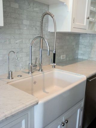
Arched faucets

Who knows, they seem pretty functional to me, but maybe the industrial look is something that will date this decade. I love that farmhouse style sink...which leads us to the next item...

Farmhouse style sink

Again, since this is an element that I love, I see it as a classic, and can't imagine how this would be considered a trend of the decade. Image via Cote de Texas.

Full body spray showers

fulbodyspray
There certainly seems to be a trend to make master bathrooms as spa-like as possible. I am not sure if this will 'date' a house to the 2000s, though. I have not given this area much thought! I have a friend who recently built a house, and she got a full body spray shower because she was not able to fit a large bathtub into the master (and the bathtub would never be used), so she opted to get a luxurious shower instead. Image via contractortalk.com.

Two story rooms

3802841_1
This is an extreme example of the two story phenomenon (I spy some interior columns too), which has never been my favorite look, but I would not necessarily associate it with the 2000s - more the 80s and 90s.

Granite

It seems like designers have been trying to move away from granite for a while now - always searching for the next best thing. Here in Atlanta, a lot of people are now doing marble, and have been for the past few years. I have never been a fan of the busyness of many granites, but I like how durable it is.
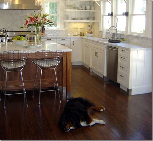
Open floor plans

When I think about an open floor plan, it doesn't get any more open than this! Ina Garten created this barn as a kitchen and guest house. In today's homes, the combination of kitchen and family room in a very open floor plan is very popular, as life and entertaining get even more casual. Image via House Beautiful, photo credit Simon Upton.

Metal staircase balusters

3228121_2
This is from an old real estate listing - the home was remodeled in the early 2000s. I really like the look of iron balusters, and will probably do them in my next house - but I also think that this style suits some of the houses being built today. Who knows, maybe this is a design feature that will look dated in a few years.

Arched doorways

arch3
I always love a good arch, but I must admit that some houses overdo them. I like the shape of the arch in this picture.

Minimal overhead cabinets

This is a look that I love - very few overhead cabinets. Although it has been a lot more common in kitchens this decade, it is really much more of a European kitchen look that is also classic. This beautiful kitchen belongs to blogger Katiedid. My guess: if you look at this kitchen many years from now, it will still look fresh and timeless.

Vessel sinks

saladina_powder.jpg
I can see how vessel sinks might be a trend that can be defined as a style of the '00s, but then I see a picture of the powder room of the great designer John Saladino, and it is exquisitely beautiful and timeless.

Subway tile

v_l_bathroom
Maybe this will be consider a phenomenon of the 2000s, but this seems like such a classic, non-intrusive style that I don't see how it can be considered something that will date to this decade. I went to a house in Newport, Rhodes Island that was built at the turn of the century, and all of the bathrooms and the kitchen had subway tile. This bathroom image, interior design by Brooke Giannetti, shows how the classic subway tile does not have to be white - and I think this is one of the prettiest bathrooms I have seen this year.

Multiple cabinet finishes in the kitchen

This was another one I struggled with, as I could not find a great picture. I wonder if the Gardenweb readers mean the style where the island is painted a contrasting color, as shown in this picture? It does seem as if this is a style that started to come into vogue early in the 2000s. Another thing I notice in this picture is the wood paneling on the walls, which is very popular in newly built homes in Atlanta. I wonder if this is something that will define the architectural detail of this decade.
Readers, I would love for you to weigh in. To you, what defines this decade in architecture and decor? Many of the examples above seem to be related to kitchens and bathrooms, which are rooms that are often redone every 20 years or so. In general, I believe that good, functional architecture, decor, and design will always have a place and be considered classic. In the end it is important to pick what you love, with materials you like (and, if it suits you, the expert eye and guidance of a design professional), and you will think it is beautiful for years to come. I am not a fan of 'disposable decorating', so this kind of approach resonates with me.


To see my latest blog post, click here.
To subscribe to my blog by email, click here.
To follow my blog on Facebook, click here.
Twitter: @TTIBlog
Instagram: http://instagram.com/ttiblog
Pinteresthttp://pinterest.com/ttiblog/
Visit my online store, Quatrefoil Designwww.quatrefoildesign.bigcartel.com
To see design, architecture, art, and decorative books that I recommend, please visit the Things That Inspire Amazon store.


Things That Inspire Favorites: Cape Cod Metal Polishing Cloths

Things That Inspire Favorites: Oz Naturals Vitamin C Serum

Things That Inspire Favorites: Thera Breath Oral Rinse


Monday, October 19, 2009

A Kitchen Post

For more inspirational finds, please visit www.quatrefoildesign.com


Although I have certainly posted my fair share of kitchen pictures on the blog, I have never devoted a post to my favorite kitchens. Yet, it is one of the most popular search terms on my blog. Perhaps I have not focused extensively on kitchens because I have been relatively satisfied with my own kitchen; despite the fact that my home was designed in the late 80s and my kitchen bears many of the hallmarks of that time, the appliances were top of the line at the time, and the layout is quite good.

However, now that some of the appliances are getting old and I am thinking more and more of my 'dream home', I have started to pay close attention to kitchens. This post is a compilation of the kitchens I love, and a recent kitchen post at one of my favorite blogs - the Material Girls - inspired me to go ahead and post on the room where I spend the most amount of time in my own house. When compiling this post, I found it interesting that the kitchen pictures I like the most are the ones that I have saved over the past 9 months. Kitchens become dated much faster than any other room in the house, and seem to be susceptible to the latest and greatest in trends. Although I like to think of myself as classic, traditional with a twist, I wonder whether I am influenced by the trends of the day? Take a look at these pictures, and let me know what you think.

design_galleria_matthewquinn
This is my current favorite kitchen - a departure from my usual love of white cabinets, but there is something about it that really speaks to me.

design_galleria_matthewquinn2
This kitchen was in an Atlanta showhouse a few years ago, and it is incredibly beautiful. Kitchen design was by Matthew Quinn of Design Galleria, one of the lead kitchen designers in the Southeast. The beautiful stone range hood is by Francois & Company. I really love the layout and design of this kitchen - it has a moody elegance due to its color scheme, and has beautiful details. Image via Better Homes and Gardens Kitchen and Bath Ideas, photography by Michael Partenio. (Check out the Design Galleria blog - it is very clever. A word is selected for each post, and a design element is selected that reflects the word.)

SK_WPF
The people who bought the showhouse hired designer Suzanne Kasler when they moved in; Suzanne put her own touch on the space with a zinc table and antique chairs with original leather upholstery. I love those fridges - two subzeros with a custom cabinet face to match the rest of the kitchen. It makes the fridge look like a piece of furniture, an impression further enhanced because of the height. This image is in Suzanne's new book, just released last week; the book can be purchased wherever books are sold, and a signed copy can be purchased on her website (click here).

This kitchen is a recent addition to my picture files; there is something about it that has great appeal to me. It has a very elegant French feel. One side of the kitchen is windows, an unusual arrangement in a kitchen where wall space for appliances and storage is usually at a premium. Design by Beverly Ellesley, via Decorati blog, a great design blog worth checking out.

I immediately noticed the Niermann Weeks Avignon chandelier, however, my favorite feature is the antique French flooring used on the island. As the designer said, flooring is strong enough for foot traffic, so it is definitely strong enough to take the wear and tear of a kitchen counter.

arsl07_hagan
This is a Victoria Hagan designed kitchen, and there is so much to love in this space: the beautiful quality of the light that flows through the windows, the streamlined and simple lines of the counters and cabinetry, the crisp white contrasted with the dark countertops, the sophisticated lighting.

design_galleria_marykathryncalonje
design_galleria_marykathryncalonje2
This kitchen was one of the winners of the 2008 Atlanta Homes and Lifestyles kitchen design contest, and was designed by Mary Kathryn Timoney of Design Galleria, one of the top kitchen studios in Atlanta. Image via AH&L. I can see a theme emerging - the light and dark contrast really appeals to me in a kitchen. I love the herringbone pattern of the tile behind the range - simple, but elegant.

realestate_kitchen3
I promised myself not to post this kitchen on my blog again - but how can I do a kitchen post without one of the most charming kitchens I have seen this year? It is the winner of the Southern Accents Kitchen Award 2009. What appeals to me about this kitchen? I love the colors of the walls and cabinets, the vent hood (one of the prettiest I have seen), the decorative medallion, the furniture-like look of the cabinets and the storage, the fact that there it is a happy medium between the desire to have very few overhead cabinets, but the practical need to have a few well placed cabinets. Generally, I prefer to have the casual dining area in its own nook, but I love how designer Gwyn Duggan has integrated the seating into the island; instead of bar stools, the table is placed quite close to the island so it does not disrupt the flow between the kitchen and the adjoining family room.

cathykincaid
There is something so appealing about this relatively compact kitchen. Perhaps it is the soothing tones, the sheen of the tiles and the ceiling. It has many of the elements I admire - a nice big window over the sink, a range with pretty architectural vent hood. The floors look beautiful too - it looks like a chevron or herringbone pattern using bleached wood.

kit9_kincaid
Another view of this kitchen. It looks like the counters are made of polished marble.

image26
A kitchen designed by Jim Howard. I had the pleasure of seeing this house in person with Jim as the tour guide, and it was amazing to hear about the design decisions behind each room. I love the clean lines in this space, and the elegant clear pendant lights over the island. In Atlanta, most custom kitchens these days have marble countertops. When I asked Jim about this, he said that European kitchens have used marble for decades (even centuries), and part of the beauty is in the patina that they acquire over time.

christy_dillard
Earlier this year, I declared this to be my 'dream kitchen'. I love how it looks - with its soft cream and brown palette, the random pattern on the stone floors, the enormous window. In reality, this kitchen is a bit big for me (it is in a house that is almost 14,000 square feet, so it is in scale for the house), but its size is part of the drama. The large window that lets the light stream into the room is simply breathtaking. I also like the color scheme - cream with dark accents - and the random pattern of the floor. Of course, the Barbara Barry script chairs are one of my all time favorite bar stool designs. Kitchen design by Christy Dillard.

brooksfalotico3
Lighting seems to be something that can make or break a kitchen. Elegant and simple globe lighting like this allows the kitchen to be the star of the show, with a little sparkle. This kitchen meets all of the criteria: nice big window, beautiful range and vent, large island (although, I am too practical to have an open island like this - I want to maximize storage). Image via Brooks & Falotico Associates.

vandl_hood
Brooke of Velvet & Linen did a post on vent hoods recently - and it was eye opening to me. I think this post made me realize how much I like a decorative vent hood that is the focal point of the kitchen.

Bild 4
My Aunt in Scotland has an Aga range like this - she swears by it. I have only seen an Aga once in an Atlanta home. I didn't save this picture for the range, though; I liked the light and dark contrast, the farmhouse sink, and the huge window. To me, a bright and sunny kitchen is of utmost importance.

jpalmer
I love the colors in this kitchen - the cream and black (or is it dark, dark brown) theme is cleverly done, with black counters, oil rubbed bronze cabinet hardware, then a cream counter over a dark island base, and finally the combination of the two colors in the tile behind the range. The range hood is large and very dramatic. Via the Jack Arnold, architect web site.

kim2_cdt
kim_cdt
A reader of Cote de Texas sent in pictures of her kitchen, and the simple beauty and soft color scheme really appealed to me. Look at those beautiful marble countertops - the colors in the marble veins are picked up in the variation of colors in the subway tile backsplash. I think that marble is the most beautiful countertop out there - but I am trying to talk myself out of using marble in my next house because I cook every day, and I am a very messy cook. I just don't think I can handle a high maintenance countertop. Anyone with marble counters want to weigh in on this?

heidi_friedler
Another white kitchen - these really seem to speak to me - and I love the sparkle of the chandelier in this space. Design by Heidi Friedler.

When looking at these pictures, it is clear what elements appeal to me in a kitchen: lots of natural light, either a combination of light and dark contrasts, or a tone on tone with creams or whites. Many of the pictures seem to have a wood surface on the island, although marble is also prevalent in all of these kitchens. Given how my taste in kitchens has shifted over the past year, it makes me nervous about the choices that I will be making in designing my next kitchen. I guess the important thing is to keep the design simple and streamlined, with an emphasis on function first (I love a good work triangle), as well as color (not pattern - I always tire of a pattern) - this always seems to serve me well.

Please visit Quatrefoil Design for more inspirational images.


To see my latest blog post, click here.
To subscribe to my blog by email, click here.
To follow my blog on Facebook, click here.
Twitter: @TTIBlog
Instagram: http://instagram.com/ttiblog
Pinteresthttp://pinterest.com/ttiblog/
Visit my online store, Quatrefoil Designwww.quatrefoildesign.bigcartel.com
To see design, architecture, art, and decorative books that I recommend, please visit the Things That Inspire Amazon store.


Things That Inspire Favorites: Cape Cod Metal Polishing Cloths

Things That Inspire Favorites: Oz Naturals Vitamin C Serum

Things That Inspire Favorites: Thera Breath Oral Rinse


Wednesday, October 14, 2009

Architectural Digest Kitchen Contest


Did you know that Architectural Digest has a kitchen contest going on? Apparently there was already a preliminary round, which consisted of kitchens sent in by Architectural Digest (AD) readers. Based on the preliminary round of voting, six kitchens have made it into the finals. I was particularly thrilled to see that a kitchen I had featured on my blog was in the finals - it is an Atlanta home designed by Melanie Turner of Turner Davis Interiors. I had the pleasure of seeing this kitchen in person, and it is one of the most beautiful kitchens I have ever seen.

Here are the finalists:


Kitchen by Turner Davis Interiors. I love this kitchen - it is both modern and classic at the same time. This is one of my all time favorite kitchens, and it is well deserving of this honor!


I love the lanterns - large scale and beautiful. Seeing this kitchen makes me want to see the rest of the home. Kitchen by Phil Kean Designs.


It seems to be the lighting that catches my eye in all of these kitchen designs! I love the delicate globe lanterns used in this kitchen, and the smart use of space. Kitchen by Amy Meckfessel of Orinda, California.


The combination of the chevron floors and the sleek contemporary design is striking in this kitchen by Traci Taylor of Design Studio West.


The light fron the wall of windows in this kitchen really appeals to me. The kitchen itself is contemporary and beautifully suited to the space. Kitchen by Brittany Drennen of Kansas City, Missouri.


The details in this kitchen are what immediately catch my eye - the bookcase in the island, the combination of countertops, the artful arrangement of sinks. Kitchen by William Noval of Hopewell, New Jersey.

Please visit the Architectural Digest website to cast your vote (for my email readers, please click here)! You can vote once per day (if you feel particularly passionate about one of these kitchens), and voting continues through October 26. The winner will be announced on October 27! Good luck to all of the designers behind these beautiful kitchens. My vote is for local talent Melanie Turner!

LinkWithin

Related Posts with Thumbnails