.}

Monday, June 29, 2009

The Houses of Newport, Rhode Island


Newport, Rhode Island is perhaps best known as the summer escape for the barons of the late 19th/early 20th century. The 'summer cottages' that they built are marvels of architecture and monuments to the excess of the wealthy families who built them for use only 8-12 weeks a year. I first visited Newport as a teenager; I remember being in awe of the mansions when I saw them for the first time over 20 years ago. Ten years after my first visit, when in my mid-twenties, I visited Newport again while my husband was attending graduate school in Boston. It was a tradition for the students to celebrate the end of the year at the 'Newport Ball', held in one of the mansions of Newport. I seem to recall that the students of my husband's class year were so raucous that they were banned from renting a mansion in Newport the following year. I don't have many fond memories of my visit to Newport on that trip!
I revisited Newport last week, 13 years after my last trip, and had an amazing time despite the fact that the weather was rainy and cold. I now have such an appreciation for the beauty of the town and its architecture. Although I loved seeing the mansions and taking a walk along the Cliff Walk (a walking trail that skirts the coast and goes right by many of the beautiful mansions), I actually found the humble houses of the Colonial craftsman in the town to be just as interesting. Newport has dozens of houses from the 1700s and 1800s that are intact, thanks in large part to the Preservation Society of Newport and the Newport Restoration Foundation (NRF), established by heiress Doris Duke. Through the combined efforts of these two organizations, the architectural and social history of Newport from Colonial Times through the Gilded Age has been meticulously preserved.
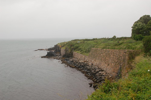
The Cliff Walk skirts along the eastern shore of Newport.
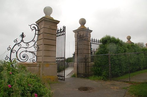
The entire walk is open to the public, yet cuts across the back yards of many of the mansions on the prime waterfront property. Many of the borders of the individual properties are flanked with large gates, which are open all day.
A view of a property on that is perched at the edge of the shore. The weather was quite moody as you can see.
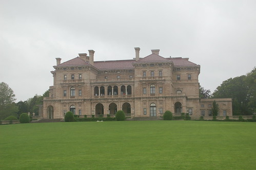
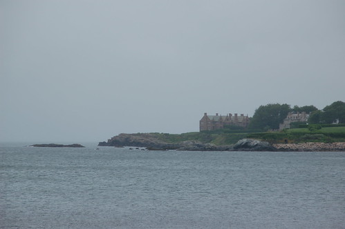
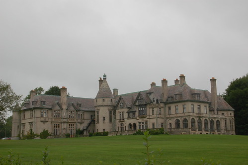
One of the mansions that can be seen on the walk - this one is the Breakers, perhaps the most famous of the Newport mansions. The Breakers was built by the Vanderbilt family, and is over 138,000 square feet - the largest home in New England. Rumor has it that the Vanderbilt family still uses the entire upper level of the Breakers.
This is Carey Mansion, part of Salve Regina University, also along the Cliff Walk. I love the turret in the center of the mansion.
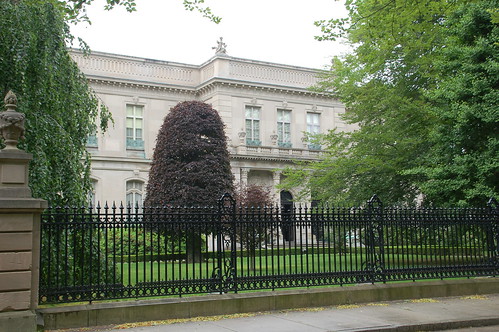
Another one of the Newport Mansions, called 'The Elms'; this one is not waterfront. Unfortunately, no photography was allowed inside any of the mansions, but as you can imagine the interiors were fascinating. I thought that some of the bathrooms in the Elms were particularly interesting - two of them were done in white subway tile, and small hexagon tile on the floor. I have seen this in quite a few bathrooms renovated or built over the past few years; I guess it is a truly classic look! The Elms is the second largest home in Newport, and is just over 60,000 square feet.
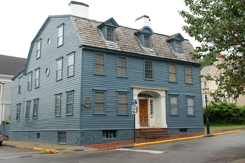
The more humble buildings were found in the town center of Newport. Notice the dormers on this house; the middle dormer is a different shape. This is a historical property, although not one owned by the Newport Restoration Foundation.
In the late 1960s the NRF, under the guidance of Duke, set about buying and preserving buildings and homes from the 18th and 19th centuries. This was necessary as Newport was undergoing an urban renewal that threatened the older buildings; many older buildings were razed in order to build America's Cup Avenue, which brought an urgency to the formation of the NRF.
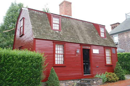
What is striking about this preservation effort was that many, if not most of these homes did not have the grandeur of the large historical properties; many of them were dilapidated and the humble abodes of the craftsmen and average townsmen built in the 1700s and 1800s.
The NRF preserved and restored these homes (71 in total), and in an interesting twist, rents many of these homes to 'tenant-stewards' so that the homes will continue to have a life instead of becoming sterile museums. The tenant-stewards are under strict order to maintain the homes as-is; the homes have been modernized with plumbing and electricity, but no additional changes can be made without permission from the NRF. The waiting list to rent a historical home owned by the NRF can be very long, and it often takes years to get to the top of the list!
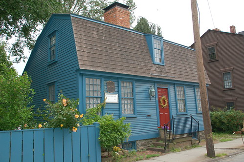
The homes owned by the NRF have a white plaque with the name of the house and the date it was constructed. Interestingly, many of the homes have been moved from where they were originally built and moved to streets where they will not be disturbed. All painting on the exterior and in the interior must adhere to a strict color palette, inspired by the color palette from Colonial Williamsburg. The pictures above show the big variety in the color palette used by the original builders of these charming homes.
Largely because of the efforts of the Newport Restoration Foundation and the Preservation Society of Newport, the town of Newport maintains a charming feel of the past without any of the feel of a theme park. I highly recommend it as a destination for any of my readers with an interest in history and architecture! In my next post, I will reveal my favorite house from Newport - I saw it when I was on the trolley tour. It is not one of the famous mansions, but is instead a privately owned home with beautiful architectural details. Stay tuned!

Sunday, June 21, 2009

Chair Transformation

Thank you to the Washington Post for including this post in your Blog Watch, June 25, 2009! 


Six years ago, I purchased a set of chairs from Scott's, a monthly antique market in Atlanta. They were in good shape, although the upholstery needed to be redone. However, I had spent my budget on the chairs, so one of them sat in my front hall 'as-is' for years, and the other one was relegated to the attic. On occasion, my husband complained about having a ratty looking chair in the front hall, but to me there was a certain charm about the chair in its original upholstery.


I finally decided to take action on the chairs in late 2007, and posted about it here. I received some tremendously helpful recommendations from my readers, and had the chair stripped of its old brown finish and repaired. The chair then went to a fantastic decorative painter in Atlanta, one who does expert work on antique restoration and finishes on high quality reproductions. Little did I know that the chairs would be at the painters for more than six months! The decorative painter does excellent quality work, but she is an artist and she likes to work on projects when they inspire her. So, I called every few months to check on the progress, but I went on with my life.


Finally, the chairs were ready! I purchased some off white linen from a local fabric store, and had the chairs rebuilt and upholstered. And here they are (well, here is one of them - I don't have room for the pair in my front hall, so the other one is in my living room)! The decorative painter recommended letting the natural fruitwood tone of the chairs show through, and she did a light limed finish in a tone that picks up on the off white of the linen.


Just for fun, I had the back of the chairs upholstered in one of my favorite fabrics, Kravet's lemondrop (I had to put felt strips on the back of the chair as the finish was rubbing off against the wall).

Here is the transformed chair in the context of my front hall. I purchased the triptych at the Trinity Artists Market; I love the look of the contemporary art contrasted with the French chair, and pulled together with a sisal rug. I hope you enjoyed the chair transformation that took a mere 6 years to complete!

Please stop by Between Naps on the Porch to see other transformation projects in Metamorphasis Monday!

Wednesday, June 17, 2009

A Glorious Room at the Symphony Showhouse

The Atlanta Symphony Showhouse is one of the most anticipated design events of the year in Atlanta. The buzz started early for the 2009 showhouse, which took place in May. Not only were there some nationally known designers who designed rooms - Robert Brown, Kay Douglass, John Oetgen among them - but this year featured a novel concept: three beautiful residences in the new St. Regis Hotel. The residences were large - over 3,000 square feet - and each residence had its own design style: one was traditional, one contemporary, and one transitional. Because the style of each residence was well defined, it made each residence flow very well.

womack_5

Although the traditional residence was my favorite overall, there was one room in the transitional residence that absolutely took my breath away. It was the master bedroom, designed by Cheryl and Alison Womack (a mother-daughter design team). It is interesting to reflect on this room given the topics that I have posted over the past few weeks - light on two sides (this room had beautiful light and windows on two sides), steel windows (I can't say for sure whether they were steel, but the trim was painted black and had the same effect).

womack3

Where to start? There were so many beautiful elements to this room. My favorite look on a bed is a crisp white blanket cover with quilting, and an accent of color in the pillows and the headboard. Clearly, this bed brought together all of those elements, and it was so streamlined and unfussy. The headboard was quite high, but given that the ceilings in the room were 12 feet, the height was the perfect scale. The gray and yellow palette for the room was unexpected, but the gray was the perfect complement to the yellow; the room was cheerful and bright, yet sophisticated at the same time. The yellow velvet used on the bench was actually the inspiration for the color scheme of the room.

The beautiful murano glass lamps are from The Mercantile, a new home decor store in the Brookhaven area of Atlanta, and were sourced from Swank Lighting. All of the fabric in the room was from Lee Jofa or Kravet; much of the fabric was from Lee Jofa's new line Threads, which is described as an understated and luxurious addition to the Lee Jofa line.

womack4

Two of the paintings in the room were by artist Jen Bradley - the one seen in this picture, and the one above the bed. The colors and mood for the painting were so perfect for the room, I was surprised that palette of the painting was not the color inspirations for the entire room! Jen Bradley is represented by the Bennett Street Gallery in Atlanta. The round crystal pieces are actually mounted antique newel posts; they were really beautiful in person.

womack7

The Womacks must have been delighted to find this beautiful murano glass lamp made in the 1950s, by Swank Lighting. The color was absolutely perfect in the room. In an interview with Alison Womack, she said how much she and her mother like shopping for the perfect pieces for the rooms that they design. This is very evident when seeing how beautifully this room came together, and spying the unique and one of a kind pieces used in this room.

womack6

A view of the painting and the Swank Lighting lamp, seen together. The chandelier is also murano glass, by Myran Allan.

womack1

This was one of my favorite vignettes from the room. The chest in an antique 18th century Louis XVI style commode with a Queen Anne mirror hanging above. In the literature, Alison Womack says that the darker piece gave the room an element of sophistication, and I agree. I love the clean, straight lines of Louis XVI pieces, and feel that they work so beautifully with a transitional style.

I hope you enjoyed this room as much as I did! For more information on Womack Interiors, please click here. To see a video about the design process behind the room, please click here.

Come visit the 'Hooked on Fridays' blog posts!


Monday, June 15, 2009

Breakfast Rooms

For more inspirational finds, please visit www.quatrefoildesign.com

As much as I have blogged about formal dining rooms, I have barely mentioned a room that is used many times on a daily basis: the breakfast room (or casual dining area) that is usually found within or adjacent to the kitchen. I might have mentioned breakfast rooms in the context of an architectural feature, or maybe as a sidekick to a kitchen post, but I have never really focused much on breakfast rooms. I wonder why? Is it because the breakfast room can seem somewhat ordinary given its everyday use? Or maybe because my own breakfast room is shamefully neglected from a decor perspective. It could be that breakfast rooms are often lumped together with kitchens. Whatever the case may be, the homes that I have visited recently have given me a new appreciation for the function of the casual dining area, the different possibilities of its placement in a home, and the beauty that can be created in this area.


When I first thought of casual dining areas, I thought about the breakfast room of designer Michael Smith. The room is architecturally unique with its lovely octagonal shape and beautiful wood floors. I also love the lantern hanging above the table; casual dining areas allow for more casual lighting, which opens up a whole new realm of options. It is clear to me that this is not the breakfast room of a family, though; too elegant! I like that the expanse of windows is someone broken up with the curtains; it makes the room feel less exposed, but the doors can still be opened right into the back yard.
1-kitchen-otm-full-kit0607-xlg
This photo shows the breakfast room in relation to the kitchen.
micheal smith_bfastrm
The exterior of the breakfast room is just as charming as the interior. Images via House Beautiful, photography: Grey Crawford.
Here is another informal dining area that is quite elegant. It is featured in Willow Decor's blog - go see the rest of the house in her post - it is magnificent. I love the idea of using slipcovers for the chairs in a casual dining area.
BreakfastArea-JohnUmberger_l_lg
There is something I really like about this breakfast room, although the design components aren't really what I would select for myself. I think it is the architectural components that really appeal to me: the expansiveness of the space, the high ceilings, the wall of windows with a door that leads straight out onto a stone patio. I wonder what the kitchen looks like? Image by John Umberger.
credenza
A styled picture of a casual dining area from the Suzanne Kasler for Hickory Chair catalog - I love the artful arrangement of plates, mirrors, books, and bowls of fruit. And, of course, Kasler's signature Eiffel Tower - I have read that she has quite a collection of Eiffel Towers.
One of the breakfast rooms that inspired this post...it seems so logical to have the table set between the kitchen and the family room, in its own area. There are doors on either side, one of which leads to a courtyard, one of which leads to the parking court.
Another casual dining area that inspired this post, from the home of designer Lori Tippins. Lori commented that the placement of the table in between the kitchen and the family room makes it a place where her family and guests naturally gravitate.
design inc kithen 2
This farmhouse kitchen featured in Design Inc was created by Sarah Richardson. I like a kitchen and casual dining area that is completely open to the family room like this; it truly becomes the heart of the house. Even better is when the room opens up to a walk out backyard like this one does.
image05
I love the look of a round table used in a kitchen; round tables seem to make meals a bit more intimate. This kitchen and casual dining area, designed by Phoebe and Jim Howard, were part of a showhouse last year. I believe that the table was placed in between the kitchen and family room.
realestate_kitchen
I have featured this beautiful kitchen and casual dining area many times on my blog! This time, the focus is on the sophisticated casual dining area. It is right in between the kitchen and the family room; the kitchen, casual dining area, and family room are in one big room that spans the back of the house. I love the set up of this table with its wing chairs, such an unusual choice in a casual dining area. The owner used outdoor fabric so that spills clean up right away; this is important as young children live in this house!
Another breakfast room design that I see in my files is the eat-in kitchen, defined by the placement of the table in the midst of the kitchen (near the appliances). In a very small home, this is commonly where the casual dining area is placed. When homes were built much smaller in the 20s-70s, the eat-in kitchen was a very common feature; now that so many homes are larger, many of them have a separate breakfast room/casual dining area. Seeing an eat-in in new homes gives a nice vintage feel to the room. Image via Cote de Texas, interiors by Bellacasa Design.
AtlantaResidentialDesign_8lg
This Atlanta house, designed by Suzanne Kasler and featured in House Beautiful, has a true eat-in kitchen. I was surprised by this given that the house is 10,000 square feet.
westbrook_3
This kitchen, from an Atlanta home designed by Barbara Westbrook, also has an eat in kitchen. I can't remember if this home was a renovation or a newly built home, but I remember that it was designed to feel like an older home.
ihbreakfastroom_coastalliving
Another style of breakfast room that has great appeal to me is the conservatory style room. As a morning person, I imagine drinking tea and reading the paper with sunlight flooding into the room; my husband, however, thinks they feel too exposed, especially at night when the windows are dark empty spaces. Originally, 'breakfast rooms' were used primarily for breakfast, and dinner was eaten in the dining room (I guess lunch does not merit its own room). I don't know too many people who have dinner in their formal dining room every night in modern times - do you? Design by Tammy Connor.
bfastroom
Another conservatory style breakfast room. The French doors are stunning; I can imagine throwing them open and enjoying a meal inside but feeling as if I were outside. A chandelier would be more beautiful in this space, but a ceiling fan is probably more practical if this room is used in an indoor/outdoor way.
This kitchen has been featured on more blogs than I can count. When Cote de Texas featured it on her kitchen post, she speculated that part of the appeal was the conservatory like breakfast room that lets the light stream in from the windows on both sides. I prefer breakfast rooms with windows on two sides versus three; it makes the room feel more like a part of the kitchen. Image via Southern Accents, design by Frank Babb Randolph, photo by Tria Giovan.
kitchen_vl
To me, this style of breakfast room seems to strike a happy medium. The breakfast room is surrounded by windows (on a curved wall, which captures the light so beautifully), yet it is very much a part of the room. Although I generally prefer kitchens with a window to the outside, I love the flow of this kitchen. The kitchen faces the family room, but is in its own defined area (click here to see more of this home). The range and hood are the beautiful focal point, but it is the breakfast room that first caught me eye in this picture - what a light and bright place it must be. I am beginning to see a trend in what appeals to me; a casual eating area that has a lot of windows, but still feels like it is part of the flow of the kitchen. I also spy a back staircase! Image via Velvet & Linen, and the architecture is by Steve Giannetti.
atl_realestate
Another kitchen where the casual dining area gets the light and windows, and the kitchen is interior. Image from an Atlanta real estate listing.
tradhome
One of my favorite images, from Traditional Home. I love the idea of a cozy dining nook with a big window and a lantern. Alas, this concept would never work with my three young kids - this might be an idea to save until the family dinner is no longer such a messy production.
erinpaigepitts_kitchen_TH
When I saw this photo in Traditional Home (the picture in the magazine was wider, and more of the casual dining table could be seen), I immediately thought that the design of the kitchen, family room, and casual dining area flowed beautifully together. I also love it when there is a back stairs off the kitchen.
TraditionalHome_erinpitts
A closer view of the casual dining area, which is light and airy because of the windows and doors, yet also feels very much a part of the room. The slipcovers are made from Sunbrella indoor/outdoor material, so they can withstand the wear and tear from two young children. Image from Traditional Home, photography by Gordon Beall, interior design by Erin Paige Pitts. This home is on Gibson Island, Maryland, not far from the home that I featured on my blog last year.
img_crowleyhouse_traditionalhome
This is one of my all time favorite pictures, from Traditional Home. I must admit that I have always admired this photo in isolation; I was not even sure what the rest of the kitchen looked like until researching for this post (take a look at the rest of the beautiful home here). I still don't know what is to the right of the table, but given the focus on windows and the amount of light in this home, it must be windows or French doors. I love the lantern above the table, and especially love the connection between the indoors and the outdoors. Image via Traditional Home, design by Serena Crowley, photography by Tria Giovan.

It is interesting to see how many different variations of casual dining areas are possible, most of which are dependent on the architecture and design of the home. Although I would generally say that I prefer for the light and windows to be part of the kitchen itself, some of my favorite images in this post have casual dining areas that have the light and window focus on the casual dining area, with the kitchens on the interior. The last few pictures in this post are perhaps my favorite; the kitchen has its own light and windows, and the casual dining area is surrounded by windows, yet still part of the family room/kitchen/break set up (and, interesting to note that the Michael Smith breakfast room that began this post has these characteristics).

How is your casual dining area set up? What configuration do you prefer?


Things That Inspire Favorites: Cape Cod Metal Polishing Cloths

Things That Inspire Favorites: Oz Naturals Vitamin C Serum

Things That Inspire Favorites: Thera Breath Oral Rinse


To subscribe to my blog by email, click here. 
To follow my blog on Facebook, click here. 
Twitter: @TTIBlog 
Pinterest: http://pinterest.com/ttiblog/ 
Visit my online store, Quatrefoil Designwww.quatrefoildesign.bigcartel.com 
To see design, architecture, art, and decorative books that I recommend, please visit the Things That Inspire Amazon store.


Beautiful framed intaglios, available here:

Unique architectural renderings, available here:


Original paintings, as seen in top design magazines, available here:


LinkWithin

Related Posts with Thumbnails