.}

Monday, May 25, 2009

New on the Market: a Beautiful Atlanta Home

One of my favorite areas in Atlanta is Tuxedo Park, a part of Buckhead that is characterized by large lots and lovely winding roads that follow the natural topography. Most of the houses are set back from the road, with expansive front lawns and houses that are perfectly sited on their lots.

My favorite street in Tuxedo Park has the regal name 'King Road'. Homes rarely come available for sale on King Road, so desirable is the address. The lots are very private and deep, and the homes vary in style from French eclectic to English manor style. Recently a home was listed for sale on King Road, one that I have long admired. Not only is the home on one of the prettiest lots on King Road, but it was also designed by one of my favorite architects, D. Stanley Dixon. The realtor for this home, Patti Junger, and the owners of the home, Melissa and David Rovner, graciously invited me for a tour. Some of the photographs are from the portfolio of architect Stan Dixon; these photos are used with permission and were taken by architecture photographer Brian Glasser of Digital Architectural Photo, and are noted as such. All other photographs were taken by me.

The lawn rises up from King Road, and the house sits atop a crest.


English Cottage 2 (1)

This photo, taken in the fall and part of the portfolio of architect Stan Dixon, shows more detail of the home. It is described as English Cottage style, with additional historical references to the architecture of Brittany and Normandy. Although the home is only a few years old, it looks like it has been part of the landscape for decades. Photography by Brian Gassel.


One of my favorite architectural features of the outside of the home is the dovecote that anchors the brick wall and gates. In front of the gates is the guest parking; Stan likes to create a guest parking area that encourages visitors to use the front door of the house. Beyond the gates is the side courtyard and 2 car garage, which has direct access to the heart of the house, the kitchen and family room. I love the trellises with ivy along the brick wall - such a nice detail.


English Cottage 1

A close up of the dovecote. Traditionally, dovecotes were structures that housed pigeons (of course, this one is used for gardening supplies). In Medieval Europe dovecotes were a symbol of status and power and only nobles had the special privilege of building them on their property. Photography by Brian Gassel.


English Cottage 2

A close up of the detail on the gate and garage. There is a door in the garage that leads to a laundry room/mudroom, and the door seen off the courtyard is the casual entrance to the house. The slate roof is beautiful on this home; architect Stan Dixon thinks that the type of roof on a home defines so much about its character. Photography by Brian Gassel.


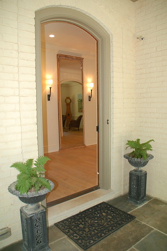
The arched entrance of the house opens to an entry hall with a mirror that reflects the mora clock in the living room. The owner of the home, Melissa , is a talented jewelry designer who owns her own company (more on that later); her design aesthetic is clean, uncluttered, and serene, with lots of natural materials and textures. She decorated the home herself, and it is truly an oasis of serenity due to the clean lines and lack of clutter.


English Cottage 3

The stairs are to the left of the front door, one set leading upstairs to three bedrooms and a playroom, and another set leading to the full basement. Melissa purchased the antique newel post at an architectural accents store in Atlanta, and redid the walls in shiplap, which creates a great detail in the entry. Photography by Brian Gassel.


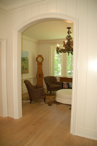
To the right of the front door is the living room, which also has an arched opening (there are many arched openings throughout the home, a theme that gives the home much beauty and character). If you look at the front of the house, this is the room with the bay window.


A close up of Melissa's charming collection of coral, housed under apothecary jars.


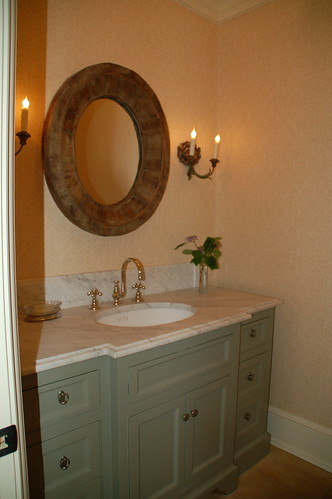
Just beyond the living room, in a small hall, is the powder room. The countertop is made of marble.


Continuing along the front of the house is the master suite. There is a room before the master bedroom which can serve a variety of functions; the previous owner used it as an office, but the Rovners chose to use it as a place to relax and read.


The master bedroom is a great size - spacious, but not too large. It gets good light from the three windows in the room, yet is private and tranquil. (Image from real estate listing)


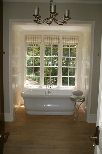
When walking into the master, this is the view - such a charming way to enter a bathroom. I love the detail on the walls and the fact that the bath has its own little nook! The windows look out to the totally private backyard.


I really love well designed, perfectly sized master bathrooms. This master bathroom has one of the best layouts I have seen. (Image from real estate listing)


English Cottage 3 (1)

Back to the main part of the house, to a view of the living room from the back of the house. This arched opening with its detailed panels is one of my favorite architectural features in the house. The home is full of lovely vistas like this. Photography by Brian Gassel.


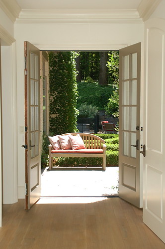
This is the view to the back from the living room - a set of French doors that open to the beautiful backyard. This house has a wonderful flow between the indoors and the outdoors, and is ideal for entertaining. To the right of the door is the dining room, seen in the next picture.


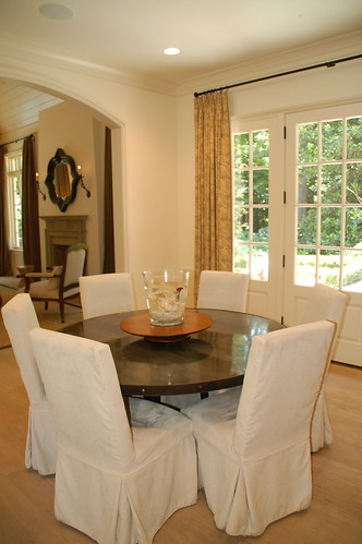
The doors to the dining room are so charming - shaped like the arch of the door. All of the doors in the home, both inside and out, are of the finest of quality - so solid and well made. The dining room has two sets of French doors that open to a blue stone patio with outdoor dining; when the Rovners entertain, they frequently have the doors open for a seamless indoor/outdoor feel.


A view of the other side of the dining room; the unusually long buffet looks perfect in the room. Melissa and her husband had the floors of the home stripped, hand scraped, and limed to give them a more casual and elegant appearance more in keeping with Melissa's neutral and organic approach to decor. Melissa and David also added much lighting to the house with sconces and overhead lights. The results are beautiful - the house has such a light and airy feel to it, in large part because of the wonderful natural light, the well thought out lighting inside the house, and the floors.


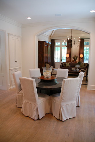
Another view of the dining room with its round table, slipcovered chairs, fireplace, and iron chandelier. The aesthetic is layered European, very clean and elegant.


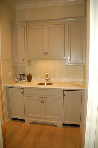
The wet bar/butler's pantry is between the kitchen and the hall off the dining room. There is also an arched entry directly into the kitchen from the hall (not pictured). I love the gray color on the cabinets; Melissa said that they matched the gray tones in the marble when selecting the color.


The kitchen is perfectly proportioned, and has the best of appliances. Melissa is an avid cook, and thoroughly enjoys cooking in this kitchen. (The wet bar can be seen to the left of the range). (Image from real estate listing).


English Cottage 5

Another view of the kitchen, by professional photographer Brian Gassel. To the right of the range the kitchen office can be seen. The kitchen has a large white farm sink, with a window above that lets in light and enables Melissa to supervise the activity in the courtyard (a favorite place for her children and dog).


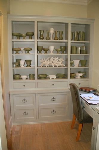
A closer view of the kitchen office setup. There is window over the desk that looks over the courtyard. To the left of the built-in, which features a collection of floraline pottery, is a very large walk-in pantry; the extra storage it provides allowed for overhead cabinets in the kitchen to be minimized.


The kitchen is open to the casual dining area, which has French doors on the right that lead to the back terrace, and opens to the left to the casual entrance of the home. Just beyond is the family room.


A view of the casual dining area, with the French doors open to the outside terrace.


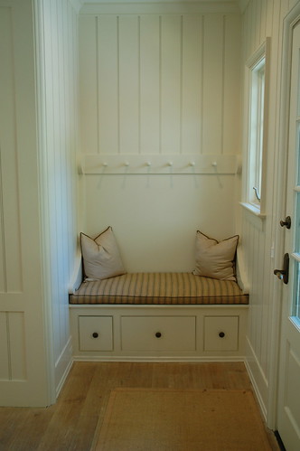
On the other side of the casual dining area is a charming little nook, and the casual entrance to the house.


The casual entrance to the home, which is inside the gates. Inside the garage there is also an entrance which leads to the mud room/laundry room.


English Cottage 4

The family room is my favorite room in the house, with its beautiful French doors and casement windows. The doors and windows in this home are of superb quality, very solid and expertly constructed. Melissa said that this room is truly the heart of the house, where the family spends the most time. The lush green from the outside blends perfectly with the neutral palette that Melissa uses in this room and throughout the home. Photography by Brian Gassel.


English Cottage 5 (1)

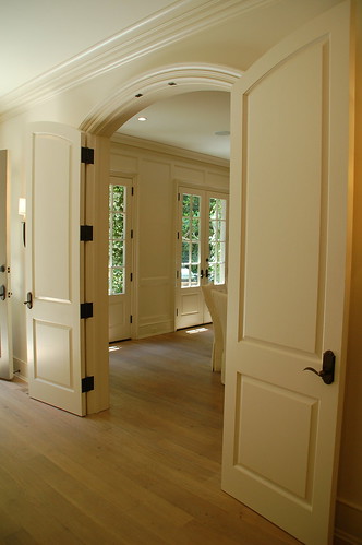
A view back from the family room to the kitchen, through a series of beautiful arched openings. Photography by Brian Gassel.


The outside is just as beautiful as the inside, with its sculptured hedges and pea gravel path. The two doors on the left, in front of the umbrella, lead to the dining room; the third door is in the hall. The wing to the right is the family room and casual dining area. (Image from real estate listing)


The family room opens to the pool area. This picture also captures the utter privacy and beauty of the backyard.


A view of the pool and the back of the home. On the right is the garage, which has a full unfinished guest suite or office above, with its own separate entrance (image from real estate listing).

Melissa is a talented jewelry designer, and (with her sister Allison) has a wonderful line of jewelry called Nastro Bello Jewelry. Nastro Bello means 'beautiful ribbon' in Italian, and Melissa and Allison specialize in designing and handcrafting organza lariats with freshwater and South Sea pearls, semi-precious stones, coral, shells, crystals, and cut glass. As I toured the home, Melissa was hard at work on a custom piece for one of her clients. Please visit her website for more information and to see examples from her beautiful line of jewelry!

I hope you enjoyed the tour of this lovely home! It is truly a one of a kind property, in a one of a kind location in Atlanta. The home is currently for sale; for additional questions on the property, please contact listing agent Patti Junger. For more information on Nastro Bello Jewelry, please contact Melissa. For more information on the architect of the home, please visit Stan Dixon's website (coming soon).


Sunday, May 17, 2009

The House that Keeps Haunting Me


Last year, I did a post on a home that was new on the market and stood out because of its distinctive decor: sophisticated, beautiful, transitional in style and very appealing.  The house had me at the front door - a beautiful shade of blue, which in combination with the cream painted brick and the putty colored shutters makes a striking and inviting exterior.  The fascade is highly symmetrical, yet distinctive with its rounded entrance and small porthole window above the entry.


 I wrote about a room in this house again in my 'one picture' post - a blogger challenge in which I had to pick one picture that best represents my design style.  I chose this picture because of the soft palette, the mix of traditional and contemporary elements, the clean lines, and the soothing, tranquil feel of the room.


Shortly after posting my 'one room' post, I received my Atlanta Homes and Lifestyles magazine in the mail (one of my favorite magazines for its coverage of the highlights of the Atlanta art and design scene - and the beautiful Atlanta homes that are featured, many of which I drive by several times a week).  The house was featured on the cover, and the article filled in all of the background on the house and the room that the real estate listing could not; the home is one of the oldest homes in Buckhead, and was renovated by famed Atlanta architect Neel Reid in the 1930s.  The designer is Margaret Bobsyshell, who decorated the house with a crisp color palette that was inspired by famed decorator Dorothy Draper.  The paint color in my 'dream bedroom' is milk pail by Martha Stewart; the linens are by Leontine, and the beautiful bed is by Julia Gray
(This picture: photography Erica George Dines)

To read the entire article, please visit the Atlanta Homes and Lifestyles site.  New to the site is a digital version of the magazine, definitely worth checking out.  To subscribe to Atlanta Homes and Lifestyles, click here.  To see the real estate listing for this house, please click here.


Postscript: after my friend from the Architecture Tourist commented, I looked up the house in the tax records. I was quite surprised to see the transformation that the house has undergone in the past 10 years. It is amazing what a renovation can do!

Monday, May 11, 2009

The Beautiful Home of a Designer

Every year in May, a volunteer arm of Children's Healthcare of Atlanta has a tour of homes in the Peachtree Battle section of Buckhead, where there are many beautiful houses built in the 1920s-1940s. The homes on the tour are usually newly renovated and decorated, and are real family homes, not staged showhouses (although I do love these too!). This year there were several homes that were just outside of the Peachtree Battle area, in the Peachtree Heights section of Buckhead (often called 'the jewel box of Atlanta'). One of them was my favorite kind of new home: a 'new old house', designed in such a classic style that it looks as if it has been there for years. It was evident from the moment I stepped into the house that the decor was done by an experienced and well trained eye; as it turns out, the home is owned and decorated by Lori Tippins, a talented young interior designer who used to work with a very well known Southern gentleman designer.


Lori and and her husband Clay originally lived in a 1950s ranch house on this site, but soon found that it was too small for their growing family. They considered renovating the original house, but ultimately decided to build a new house on the site with the help of architect Holly Johnson. Lori's goal was a house that was classic, but highly livable. She had long admired the work of Lutyens (considered one of the greatest British architects of all time), as well as the beautiful classic Atlanta homes found in her Buckhead neighborhood. With these as her inspiration, the home was designed and built over an 18 month period, and was completed in January 2009. The result is both classic and unique, and looks right at home in the neighborhood.

(Note: all pictures were taken by me. To see a larger view click on the picture to expand)

The home employs many English Tudor forms, while remaining simple and clean in detail. The front is symmetrical and features a pair of gables; copper awnings crown the French doors that flank the arched entry. Much reclaimed material and antique architectural elements were incorporated into the design of the home.


DSC_0126

One of the first things I noticed about the house was the open air garage, which I had never seen before. Lori said that she has a personal preference for not looking at a garage on the front elevation of a home, and the slope of the lot did not allow for the garage to be placed out of sight. So the garage is open, which allows for the kitchen to have more windows, and also provides a great outdoor entertainment area. If you look closely, you can see a table set up in the middle bay of the garage. Each bay also has a lantern, a charming touch.

DSC_0003

When entering through the front door, the eye is immediately drawn to the charcoal sketches by famed Atlanta artist Steve Penley. The rich color on the wall is a charcoal tone that was custom blended. Lori knew that she wanted a dramatic entry, and had to repaint several times before she got the right tone of charcoal.


DSC_0004

Looking down from the stairs, the antique arched front door can be seen, as well as a pair of contemporary abstracts by Atlanta artist Leanne West. Lori used quite a few antique doors in the design of this home, which can be done when custom building; the door openings were created to suit the shape and style of the antique doors. I love the juxtaposition of the antique and the contemporary art - one of my favorite looks.


DSC_0066

A charming bench makes for a nice vignette in the entry. When Lori worked with architect Holly Johnson to design her home, they made sure that there was a good balance of wall space, windows, and doors as Lori wanted her home to have good light, but also have space for beautiful vignettes like this.


DSC_0076

On the left, off the entry, is the elegant dining room. There are three sets of French doors, which make it a light and airy space during the day. Because the entry is so richly colored and dramatic, Lori wanted the dining room to have a sense of lightness to it. The charcoal tone is carried through to the curtains (which also have a blue tone to them), but the overall feel is light. The chandelier is an antique from one of Atlanta's finest stores, Jacqueline Adams. Lori is a self-professed lighting aficionado, and all of the lighting in the home is either antique or custom designed by Lori.

DSC_0002

A different view of the dining room. The door on the left connects through a small wet bar to the kitchen. The flow in this house is very good - every room connects to another, and every room is truly used. On the right the antique doors to the dining room can be seen, just one of the many details that gives this house character.


DSC_0065

Lori fondly pointed out the 'marble man' that she and her husband bought at an estate sale in San Francisco; it has a pedestal, but there are so many young children in and out of the house that Lori feared the marble man would fall and hurt someone. So, the marble man stays in the corner for now!


DSC_0071

The living room is to the right of the foyer, and it too has antique doors. The living room also has three sets of French doors, creating a space that is filled with light.


DSC_0013

For her own home, Lori likes high tables instead of coffee tables. The antique trumeau was one of her first purchases, and set the tone for the room. Although it is hard to see in these pictures, the wall color is a beautiful tone called appaloosa by Pratt & Lambert. It is readily apparent when seeing the home in person that Lori is masterful with color.


DSC_0012

The antique sketches and etchings combined with the crystal lamps and the flowering dogwood branches makes such a beautiful vignette, one of my favorites in the house. To the right of the antique etchings is the opening to the family room. The house really flowed so well, and Lori said she wanted an easy transition from one room to another.


DSC_0045

The family room spans much of the back of the house, and the doors flanking the fireplace lead to a covered porch. The room to the right of the sconce is the powder room (more on that later).


DSC_0042

When Lori and architect Holly Johnson designed the house, they carefully considered the balance of wall space to windows and doors; so many homes today sacrifice wall space for openness, and end up with few wall spaces to anchor furniture or hang art. Lori particularly wanted to have this wall space in the family room (the stairs are on the other side), and the arrangement here is the focal point of the room.


DSC_0121

Lori's mother is also a talented artist, and hand turns wood to make beautiful lamps. The lamps on the antique console were made by Lori's mother, and look great with Lori's collection of Chinese blue and white. When I toured the home last week, I found this vignette to be so striking with its elegant symmetry. I could not put a tablescape together to save my life, so I have such an appreciation for the artistic eye it takes to put together such a beautiful arrangement!


DSC_0048

A close up of an antique piece circa 1870, which belonged to an attorney in Belgium and is the home to much of Lori's Chinese blue and white collection. The sconces were custom designed by Lori.


DSC_0119

The chandelier in the family room was one of my favorite lighting fixtures in the house.


DSC_0123

The French doors flanking the fireplace lead out to the covered terrace, which is a highly desirable feature in an Atlanta home. I should have taken a wider shot of the terrace as the fireplace can't be seen.


DSC_0049

The kitchen and the family room span the back of the house, and an antique French table is centered in the middle of the two (in lieu of a separate breakfast area). Lori says that this is one of the best decisions she made in designing the home; the table is a real gathering place for friends and family, and keeps the kitchen and family room very open.


DSC_0051

Overhead cabinet space was kept to a minimum in the kitchen in order to make it feel more like a comfortable room; the kitchen was designed with extra drawer space for storage. Lori used crema delacato marble on the countertops, in keeping with the European feel of the house, and looks forward to the patina that the counters will gain with age and use. The lanterns over the island were custom designed by Lori, and the barstools are antique.


DSC_0054

A space was custom made for Lori's prized antique French vaisselier. Lori said that when she pulls into her driveway at night, she can see through the French doors of the dining room to the vaisselier in the back of the kitchen, a view that she enjoys every time.


DSC_0023

There is a small wing off the family room that contains the powder room and the guest bedroom and bathroom. Since the powder room is visible from the family room, Lori wanted to give the sense that it is a decorated room. She used an antique chest for the sink, a Louis Philippe mirror, and two Simon Pearce lamps with silk shades. On the right wall, not seen in this picture, is an antique painting that hung in the Royal Academy of Arts, and the small chandelier was designed by Lori.


DSC_0031

At the end of the small hall next to the powder room is the guest bedroom. It is quite light and airy because of the windows and the soft tones used in the decor, and is possibly the most beautiful guest room I have ever seen! The color on the walls is Farrow & Ball light blue. This color is also used in the master bathroom, and it translates more as green upstairs. Lori enjoys using Farrow & Ball colors as they change colors based on the light and the environment they are in.


DSC_0033

A view of the room from the other side - the antique panels were too pretty not to show.


DSC_0039

Another beautiful vignette, and the bedside table is so unique.


DSC_0035

The guest bathroom. Lori used Restoration Hardware sconces in the guest bathroom and her daughter's bathroom; she loved them, and once she found them, felt no need to look any further. Farrow and Ball light blue is also used in the bathroom, and it is interesting to see how the green comes through in this room.


DSC_0036

A close-up of the honed marble tiles used on the floor.


DSC_0067

Back to the entry, and up the stairs. Lori uses a lot of sisal in her house, which has a natural beauty and is quite durable.


DSC_0078

The upstairs is comprised of three bedrooms and a laundry room. A small hall connects one side of the upstairs to the other; the master/master bathroom/master closet spans the back of the house, and the children's rooms are on either side of the front. A sisal runner is in the hall, and the art above the bench is by the same artist who painted the abstracts in the entry, Leanne West. Look at the reflection of the lanterns on the ceiling - it is small details like this that make a home interesting.


DSC_0081

As a mother of girls, I have full appreciation for the beauty of this room! The bed was Lori's as a child, and she had it repaired and refinished for her daughter. The color on the walls is half strength pewter mug by Porter Paints; Lori's daughter wanted purple, and Lori wanted gray, so pewter mug was the perfect middle ground. The pink and white of the fabric and the light in the room cast quite a bit of a pink hue on the wall, making the purple tone in the paint come through. I had mentioned earlier that Lori has a wonderful way with color; usually I like walls that are neutral, but after seeing Lori's house I was tempted to go home and paint several rooms in my house!


DSC_0082

The side of the room, which has an antique bureau and a pair of Queen Anne mirrors. The beauty of this room is that it is ageless; it is as suitable for a young child as it is for a teenager (and beyond).


DSC_0084

The daughter's bathroom is a vision in pink and white.


DSC_0104

The room of Lori's son is classic and timeless as well. At Scott's antique market, Lori found a series of soldier engravings from an antique book, and the theme for the room was determined. This is particularly meaningful given Lori's husband's years of military service.


DSC_0108

The lamps on the bedside table were hand crafted by Lori's mother, and the antique sabers were found at Scott's antique market. Notice the beautiful Greek key trim on the curtains.


DSC_0110

The bathroom is painted in Ralph Lauren true blue. This blue took a while to select, as so many blues are either too purple or too gray.


DSC_0090

The master bedroom is a lovely oasis.


DSC_0101

Another view of the bedroom. The lamps on the bedside table were also made by Lori's mother, and custom painted.


DSC_0091

The master bathroom, painted in the same Farrow and Ball light blue as the guest bedroom, yet the color reads in its own unique way in this room. Lori selected polished marble for the floor of the master bathroom. The antique chair is a charming touch.


The vanity area of the master bathroom. I found this master bathroom to be the perfect size and scale - not too big, not too small.


DSC_0112

The office on the third floor - called 'the man's room' by Lori. The home also has a full basement that can be finished in a few years when the children grow older.


I hope you enjoyed the tour of Clay and Lori Tippins' beautiful home! When I asked Lori about her design philosophy, her first thought was 'soulful, livable elegance', and she acknowledged that she prefers fresh and carefully edited, classic and timeless. Although the decor reflects her own personal taste and love for antiques and the patina that only time and age can give, for her clients she believes in fiercely personal design that truly reflects a person's style.


What struck me about Lori was that she seemed to be very in touch with the varied needs and requirements of her clients, particularly in these challenging economic times. Although Lori has a trained eye for fine antiques, beautiful lighting, and elegant materials, she can also mix it up with well selected items from places like Restoration Hardware and little known secret sources that cut out the middleman and save her clients time and money.


For more information on Lori Tippins Interiors, you can contact her at lori@loritippinsinteriors.com. Her website, www.loritippinsinteriors.com, is being launched in the near future, so check it soon for updates.

LinkWithin

Related Posts with Thumbnails