.}

Saturday, February 28, 2009

Beautiful Clocks

Please visit the Quatrefoil Design store for one of a kind items and more inspirational images!

I have never really given much consideration to clocks, so pulling together this post was a bit of a challenge. Although I have so many pictures in my inspiration files, I never save pictures because of a clock, so any pictures I found in my files must have been saved for some other reason - a pretty fabric, light colored floor, architectural elements, or the overall design of the room.

I do remember thinking this picture was striking when it was on the cover of one of my favorite magazines, although I can't remember which magazine (maybe Traditional Home?). It was the clock that immediately caught my eye.
cottageliving_inspired3
This image (via Cottage Living) shows a nice big clock on the wall of a family room.

Another picture of a large clock on the wall (also via Cottage Living). I could only find three examples of this look in my files, which either means I haven't gravitated to the look in the past, or that the look is not reflected in the design magazines I read.

Readers, what do you think about large clocks on walls? I have decided that I like the look and am giving serious consideration to putting one over the sideboard in my kitchen. It would be both interesting to look at and functional, as it always seems like my children are racing against the clock when getting ready for school. On second thought, maybe it would be stressful for someone like me who likes to be prompt! I like the look of these wall clocks from Ballard Designs.; they are 31" in diameter. I just can't decide whether it is 'me', but it is not an overly expensive commitment. If you know of any other sources for large clocks, please email me, or better yet make a note in the comments. I get the feeling that if you are going to go for this look, the bigger the better, and 31" might not be big enough.

Traditional_Home_entry_stairs
Let's move on to the Swedish Mora clock. This picture, from Traditional Home, is truly beautiful, and the clock is part of what gives the entry such character. Others have done good historical posts on this style (such as this post from Willow Decor), so I will just focus on my admiration of the style. I have quite a few pictures of Mora clocks in my inspiration files because I love the light and airy look of Swedish decor, and Mora clocks tend to beautifully accent homes with this design aesthetic.
Recently, when posting about where to put a series of framed intaglios in my front hall, several readers emailed me and suggested that I put a Mora clock at the top of my stairs. I must admit that I am intrigued with this idea, and if I didn't have the steadfast belief (or maybe pipedream given the steep decline of our stock portfolio) that I will be moving within the next 18 months, I might have seriously considered this.

bolander11
Lars Bolander, master of elegant and sophisticated Swedish style (and from Sweden himself), uses a beautiful and rich colored Mora clock in this design.

AtlantaResidentialDesign_3lg
The Suzanne Kasler designed home that I posted about last month has a Mora clock tucked into the curve of the stairs.

circa2
This picture, from At Home magazine, shows a darker toned Swedish clock.

A pastel Mora clock seen on Daisy Pink Cupcake.

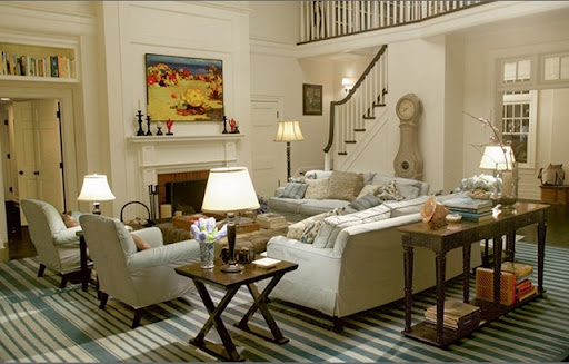
A room from the most blogged about movie decor of all time - Something's Gotta Give. Cote de Texas did a famous post on the decor from this movie, and she noted that the Swedish Mora clock is a very important design element in the room.

GJ Styles makes nice reproduction Swedish clock. This is the regular version, at 82" high. It also comes in blue.

This is the tall version, at 90" high. This one also comes in blue.


A. Tyner is a Swedish antique store in Atlanta that has literally dozens of Swedish clocks, both antique and reproduction. Here are a few examples that caught my eye. You can see additional examples on their web site.

french_barometer
Last but not least, a new discovery for me. While working on this post, I came across the most beautiful object on Cote de Texas' blog. It was from one of her first posts. Joni told me that it is an antique French barometer, and noted that they can be quite expensive; I verified this when looking at 1st Dibs. There is a gorgeous French barometer that is listed for $60,000! I initially thought it was a clock and a barometer, as it has a clocklike look (and this is why it is part of this post), but Joni corrected me after reading the post and said that it is not a clock, just a barometer!
Caplan_house_004_thumb[1]
Here is a picture of the barometer in the context of the room. Interiors by Joni Webb (isn't this a beautiful room?).
ScannedImage-3
In a happy coincidence, the new issue of Southern Accents has a lovely French barometer on the cover. The home belongs to Patrick Dunne, contributing editor of Southern Accents and owner of New Orleans antique store Lucullus. I will certainly be keeping my eye out for barometer in design pictures (and in fact, another reader suggested a barometer for the top of my stairs instead of a mora clock). It will be like playing 'Where's Waldo' every time I open a magazine or a blog post.


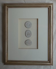
Beautiful framed intaglios, available here:

Unique architectural renderings, available here:


QD collage

To subscribe to my blog by email, click here. 
To follow my blog on Facebook, click here. 
Twitter: @TTIBlog 
Pinterest: http://pinterest.com/ttiblog/ 
Visit my online store, Quatrefoil Designwww.quatrefoildesign.com 
To see design, architecture, art, and decorative books that I recommend, please visit the Things That Inspire Amazon store.

Thursday, February 26, 2009

Freecycle

When I was in London last year, a friend told me about a great organization called 'Freecycle'.   Freecycle was started as a grassroots movement to provide a way for people to give away items they no longer needed.  By giving things away instead of throwing them in the trash, a lot of functional items are kept out of the landfill.

When I returned to Atlanta, I checked the Freecycle website. I was amazed to find that there is a robust freecycle network in Atlanta; in fact, freecycle networks are active in every state and in dozens of countries.   If you are interested in participating in freecycle in your area, find your local freecycle chapter on the freecycle website then join the local freecycle yahoo group, which enables you to post items you are offering (and see other items being offered). The website explains the system in more detail, but just know that if you join the freecycle group, it is good to create a filter on your email for freecycle related emails because there can be dozens and dozens a day. I have all freecycle emails go to their own folder so I do not have to look at the messages unless I want to.

I tried it out for the first time this week as I wanted to get rid of some old furniture.  I posted the furniture on the local freecycle board, had at least a dozen people who wanted the items, picked a person and coordinated pickup.  The website clearly states that freecycle members use freecycle services at their own risk (similar to Craigslist usage).   I left the items out in front of my garage and the freecycler picked them up without my assistance or involvement.  The person who took my furniture was so thrilled to be receiving such needed items for free, and I feel good that they will be used and appreciated for years to come.

So, the next time you have something to give away, consider using freecycle!  

Monday, February 23, 2009

Design challenge: a marriage of styles (with spectacular results!)

I recently had the opportunity to meet one of my favorite designers, Jim Beebe Hawes of the McLean, Virginia based design firm Caldwell-Beebe (Jim is the designer who created the magnificent interior of the Chespeake Bay house that I posted about in December). We hit it off immediately! The next day I was thrilled to get an email from Jim with pictures from a recent design project he had completed in the West End of Washington, DC, and permission to create a post using these unpublished photos.

Jim's clients for this project had always lived in a traditional houses (one was featured in the magazine Traditional Home in 2001), and were moving out of a traditional house in Charleston, South Carolina. When moving to DC, the 'young at heart' empty nesters were ready for a change. Jim's challenge: to make both the husband (a lover of contemporary style) and the wife (an avid traditionalist) happy. In other words, to create a marriage of styles.

Beall_081006_4719

The entryway sets the tone. A signed 18th century French fauteuil and antique tole plant stand look right at home next to the Saladino 'Platinum' console and subtle contemporary art. A few carefully chosen accessories are on the console - a blanc de chine Chinese dog and silver boxes. The space, already filled with light because of the architecture, looks ethereal with the beautiful light floors. The organic form of the branches is the perfect touch for this space. The paintings are by David Bell, owner of David Bell Antiques in Georgetown. His store is one of the 'go-to' places in DC for antiques (the antique tole plant stand in this picture is from his store) and his reputation as a painter is growing. He mainly paints on commission, and will create contemporary masterpieces to the exact color specification of his clients.

Beall_081006_4603

The glass walls make the space quite contemporary and fill the room with light, but how is privacy maintained with no visible window treatments? Jim said that the ceiling is recessed and privacy solar shades are mounted in the space created by the recess (this can be seen in the picture below). The shades can be pulled down when there is a need for privacy or to block the sun, and when pulled up the shades are invisible due to the room architecture. Jim said that his clients enjoy the view so much that they rarely lower the shades!

The sofa is Saladino's "Cape Sofa" upholstered in J. Robert Scott's Silk Tapis, with two pillows, one in Fortuny fabric and the other in Jim's signature diamond quilted ultrasuede.

Beall_081006_4661

I am particularly enamored with the antique Swedish armoire. It is circa 1800, and when opened reveals the initials of the couple who received it as a gift on their wedding day in 1819. What a history this piece must have! A flat screen TV is mounted within. The ottoman/bench is the Randolph Minor bench by Niermann Weeks, upholstered in a Great Plains nubby linen. (By the way, when checking the Niermann Weeks website for this post, I noticed that they have a brand new blog. It looks very promising!)

Beall_081006_4630

The coffee table is one of Jim's favorites, the Saladino three-legged coffee table with marble top. The paintings on either side of the armoire are by David Bell. I love to see symmetry on either side of an armoire, but usually I see this achieved with sconces or framed prints. The look of a set of four unframed paintings is quite beautiful.

Another one of Jim's favorite pieces is the Ellington wing chair by Dessin Fournir. He says the chair is not only beautiful, but also incredibly comfortable. The Ellington wing chair is upholstered in a sophisticated Classic Cloth linen. A custom Tibetan rug is on the floor.

Beall_081006_4728

The library/study is a cozy little room, with walls covered in ultrasuede. I love the contemporary piece of art set in a Baroque frame; the elaborate frame is the perfect contrast to the abstract art. The art is by Maxine Wright, and is from the collection of Vincent Price. In this picture, the subtle window sheer (described above) can be seen.

Jim's design challenge was to combine contemporary style with an element of the traditional; if the intent of the project was a 'marriage of styles', the resulting union is incredible! The contemporary is brought in with the architecture, the streamlined furnishings, and the art; the traditional is present in the antiques, the beautiful hand crafted Tibetan rug, the soft styling of the many of the upholstered pieces, and the classic fabrics. Jim also notes that many of the accessories add to the traditional element (many of which are not seen in these pictures); silver boxes, horn boxes, blanc de chine, a sweet Chinese table or two, balustrade lamps, a crusty French window frame, antique tole planters, and Redouté engavings are but a few of the treasures throughout the home.

I am not sure whether I have ever seen a home that has Swedish antiques, contemporary art, and Saladino furniture all under one roof! The wife took a big leap of faith and a major step in moving to a 'glass box', but was so thrilled with the results that she called her husband at work after the furniture was installed and thanked him for giving her such a beautiful place in which to live. Jim said that there is no better feeling than having his clients so delighted with his work.

In an interesting follow up, the couple received an unsolicited offer substantially over their purchase price just 90 days after moving in. What a great testament to the power of beautiful interior design.

To see another amazing project by Jim, please see my post on the home on the Chesapeake Bay.

All photos used with permission from Caldwell-Beebe.

Thursday, February 19, 2009

Things That Inspire Email Subscribers

I have an email subscription feature on my blog, and I just learned that google has purchased the company that manages the email and reader feed.  I am being required to transfer over to google's service, and supposedly the email subscriptions will transfer over too.  Just in case there is a glitch I wanted my subscribers to be aware because I love my email subscribers!

Stay tuned.  Since art is on my mind this week, I am inserting a gratuitous picture of one of my favorite artists for no other reason than it makes me smile. Painting by Brice Marden, interiors by Michael Smith.

Tuesday, February 17, 2009

Spotlight on Art

I recently read a quote by an artist on the Emily Amy Gallery blog - "What is better than a painting? Nothing."  Although this is taking love of art to an extreme, I do appreciate a good painting, and would far rather spend money on a wonderful piece of art than on expensive clothes, shoes, or handbags. A beautiful piece art is something that can be enjoyed for many, many years, and is such a wonderful expression of creativity.  This is why I am so excited that on Tuesday night at 6 pm (2/17/09), my favorite Artist Market of the year begins!  It takes place at Trinity School, which is located in Atlanta off of Northside Parkway, just north of Mount Paran and 75 (in Buckhead). 

The 'Spotlight on Art' Artist Market is my ideal kind of place- thousands of paintings and works from hundreds of artists, all under one roof, in a very relaxed atmosphere.  Virtually every genre is represented - contemporary art, impressionism, realism, sculpture, folk art, children's art, and most of the prices are very reasonable.  There are many established gallery quality artists, as well as new and emerging artists.  Here is a sneak peek of the show; all items in the pictures are for sale, and the show runs daily through Saturday afternoon, 2/21/09.  My favorite thing about the market is that the new paintings are put out every day, so there is always something new every time you visit.  For more information, hours, and directions, visit the website www.spotlightonart.com.  

DSCN0420

I like the painting on the bottom right - very organic and beautiful.  The paintings on the upper left are by one of my favorite artists, Annie Butrus. I was hoping that she would bring a bigger piece this year, but the small paintings she brought are beautiful. The framed series of pastels are by her too, and priced at $275 each, a pretty good deal.

 DSCN0421

DSCN0422

It is hard to see in the picture, but the artist on the right paints lots of abstract angels and landscapes.


DSCN0423

IMG_0388

I thought this section was so pretty with the fresh colors.  I always like to see what artist Christy Kinard brings to the Market - she is the one who painted the florals in this picture.

IMG_0387

I was intrigued by this dress sculpture, titled "Charlotte". Isn't it beautiful? 

IMG_0403

IMG_0400

IMG_0389

Folk art

IMG_0399

IMG_0396

Traditional landscapes, still life, and equestrian art. I love that painting of the poppy field.

IMG_0390

IMG_0398

Another lovely dress sculpture.

IMG_0397

A larger dress sculpture surrounded by beautiful art. It is hard to see in this photo, but the skirt of the dress is made of a deck of cards.  I love the yellow painting in this picture.

Do you see any trends looking at these pictures?  Red, yellow, and earth tones seem to be in vogue, although there were paintings to please every color preference, taste, and style.   For more information, hours, and directions, visit the website www.spotlightonart.com.   For those of you in Atlanta, I highly encourage a visit! 

Friday, February 13, 2009

Stair Decor

A designer I once worked with told me that it is better not to have anything on the wall than to have the wrong thing, but it seems like I have had nothing on my stair wall for many years now. I have always loved the look of a series of framed intaglios, which inspired my last post. Some of my readers were in favor of the idea, others thought that intaglios were not quite the right thing as they often work better in a space where they can be inspected and appreciated. A designer friend commented that intaglios also work best in a space where they are well lit, and my stairs are not particularly well lit although they do get a fair amount of indirect light. I did go ahead and purchase the intaglios yesterday, as I have several places I could put them. And although I am currently leaning against putting the intagIios on the stair wall, I would like to thank each and every person who commented or emailed me! I loved reading everyone's perspectives, it is the best thing about blogging.


So, as always, I turned to my inspiration files (which now contain over 5,000 images!). Although stairs are often a prominent architectural feature in homes, they are not always featured in the design magazines as they serve as a passageway from one place to another. I did, however, find a few images that might be of interest. This image above is from the former home of Suzanne Kasler (she has since moved). I adore the collection of watercolors and etchings in this picture, with the different sizes and styles of frames. I think this is what some of my readers had in mind when they suggested a collection of art with frames that would provide a good contrast to the wall. It is interesting to see how low the pictures are hung above the stairs - I should have studied this before taping off my stair walls! Clearly I taped off too high. This is the perfect stairway arrangement to me - it is interesting to look at but not too heavy.


allthebest
I read an article about hanging art in groups on Apartment Therapy, and immediately thought of Kasler's stairway gallery. I have always dismissed the idea of doing this in my own home because it looked too difficult, but the Apartment Therapy article breaks down the composition and explains how to achieve the look with good planning. Good planning is great, but collecting interesting items to hang is another challenge, not to mention picking frames! Kasler has an expert eye, and despite the fact that she uses all sorts of frames and art styles, it all works beautifully.
My favorite store, Mrs. Howard, has beautiful stairs that connect all three levels, and Phoebe Howard always has interesting framed series on the stairs.
The stairs at the 2008 Christmas showhouse had beautiful framed artwork in a dramatic series. Interiors by Bob Brown.

A lone dramatic painting is the focus on this unusual stairway. Interiors by Frank Babb Randolph.


One reader suggested a beautiful architectural element in the stairs, to add interest without putting art in the space (as it is such a high traffic area, and when you have children and a dog there are so many hands and tails hitting those walls!). I love the look (this is from James Michael Howard, who is a master at architectural design), but with housing values plummeting every month, I can't justify putting any beautiful architectural detail into my current house. Plus, I am hoping to move within a year (although, the financial crisis and uncertainty in the world is making me appreciate what I have instead of longing for what I don't have).
Another James Michael Howard space, with a series of botanicals in the stairway. I suppose the bontanicals are hung so high because of the scale of the space, and so that they can be seen over the beautiful iron on the stair rail.
Another James Michael Howard. Although this space has its own unique architecture and challenges, I love how Howard has used the framed botanicals in a staggered pattern on the right, then carried through to the left size of the stairs. I also love a striped rug on a stair!
One final picture from James Michael Howard. He seems to like stairs as much as I do, perhaps because stairs provide such a great place for architectural expression. In this stairway, he uses a single line of framed items (photographs perhaps), perhaps because he is working with the architectural constraint of the ceiling.
gingerbarber_cdt2
A picture from Houston designer Ginger Barber's house, via Cote de Texas. She used a small series of framed botanical specimens to lead the eye upstairs.
img_secondverselg_ss3
This stairway is actually similar to mine, in that there is a window at the top of the stairs, a large wall on the left, and a small landing at the top. I can see the edge of something framed (look at how low it is hung) and at the top of the stairs is a large piece of art. Another recommendation that came from quite a few readers, both through email and comments, was that the contemporary piece that I have at the top of the stairs is a bit small for the space, and the overwhelming consensus was to either put a larger, taller piece of art there. One reader even recommended a Swedish or barometer clock, which immediately got me thinking about the mora clock reproductions that I have admired at a local Swedish antique store. Image via Traditional Home.
PhillipSides_172
One of my favorite rooms by Phillip Sides has a large object on the wall of the stairs - it doesn't look like a tapestry, but it doesn't quite look like a painting either. Whatever it is, the scale is large.
thomfelicia
I have always found this picture to be interesting, with the lone small framed item at the bottom of the stairs. Design by Thom Felicia.
3534242_1
This home in an Atlanta real estate listing has been in the market for quite a while. The owners have filled the blank space on the stair wall with a variety of paintings gallery style, with paintings both large and small. I must admit, this is not the look I am going for. It comes across as way too heavy and formal to me. Also, the scale of the space needs to be grand in order to support this look, and although my space is a fine size, it is not grand!
KJoyce
A large painting anchors the wall in this space designed by Kerry Joyce. I certainly do not have the scale or proportion in my home to carry this off, but I appreciate the look!
MAX_010
A painting at the top of the stairs in Max & Company, Mrs. Howard's more casual/contemporary store.
Another picture of the stairwell at Max & Company. Everything is sold off the floor, so the scene changes every month, but I remember when these medium size framed prints were on the wall of the stairs at Max & Co. Although it is a bit hard to see them in this picture, I remember that the size of the framed prints and the soft colors of the matt and frame made them a really beautiful choice for this space.
Finally, a reader sent me an email that really touched me, and I wanted to share it with you. She said that her late father was an artist, and in art "blank spaces are just as important (and sometimes more important) than the drawing/painting part of the artwork. I didn't REALLY understand what he meant until I went to a Cezanne drawing show at the Met about 20 or so years ago. He's right. I also think this rule applies to interior design. Used judiciously, empty space/blank space is powerful and dramatic, and lay people (and some decorators) don't know it/utilize it". I was so thankful to her for imparting this wisdom from her father, and it really got me thinking. What I gravitate to in interiors are clean lines, uncluttered spaces, where every piece is selected with care. I do love a contrast of positive space and negative space. So maybe it is OK to keep this wall open until I find just the right thing, or maybe just the right thing is nothing. I will post what I end up doing, and I do think that moving the contemporary piece at the top of the stairs is a good idea. Again, I would like to thank my readers for their feedback, and feel free to email me any time - I really loved hearing from so many of you yesterday.
Please visit Quatrefoil Design for more inspirational images.


Things That Inspire Favorites: Cape Cod Metal Polishing Cloths

Things That Inspire Favorites: Oz Naturals Vitamin C Serum

Things That Inspire Favorites: Thera Breath Oral Rinse


LinkWithin

Related Posts with Thumbnails