I have posted about many houses through the years. Some of the houses are from magazine features, and a view of both the inside and the outside completes the picture of the house. However, many of the houses that I have posted about are only outside views gathered on my walks throughout Atlanta, with a focus on the architecture and exterior style. I often wonder what many of these houses look like on the inside.
A reader recently emailed me about a house that was new on the market, and it is one that I have featured several times on my blog. It is a charming renovation by Stan Dixon, and it won a Shutze award in 2008 for the small residence category. I was thrilled to get a glimpse inside the house through the real estate photos, and see that the beautifully decorated and traditional interiors look like something that might have been featured in Southern Accents.
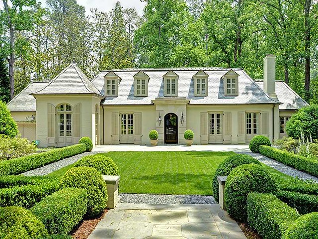
Here is the exterior – many of you probably recognize it. This house was a non-descript 1950s ranch house that was totally and thoroughly renovated to create the classical proportions and elegant street appeal that are characteristic of this area of Buckhead. The house is painted brick (a great way to update a ranch house in Buckhead), with a beautiful slate roof and an elegant limestone portico.
The landscaping on this property perfectly complements and enhances the architecture of the house. It’s simple and restrained, in the French style, and the symmetry of the design beautifully complements the look and feel of the house. I often wonder if the owner has soirees out on the front lawn.
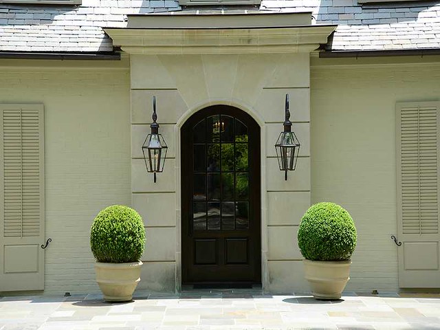
A close-up of the limestone portico. The monochromatic color scheme of the brick, limestone, and shutters is beautiful, and makes the lanterns and door stand out. The boxwoods are the perfect sculptural touch for the elegant design of the house.
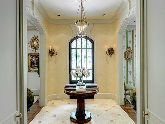
The entry is a wonderful introduction to the house, with its limestone floors and cabochon pattern. In this picture, the living room is the space to the left, the dining room is the space to the right. I love the design and scale of this center hall table – it must be an antique. If it is not an antique, and someone recognizes it, please let me know!
Another view of the entry, with a glimpse into the living room.
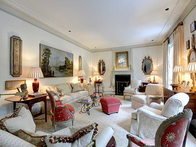
A view of the living room. Of course, I noticed the beautiful barometer with framed intaglios, arranged so artfully. The listing notes that the décor is by Tom Hayes.
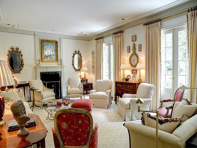
Another view of the living room. This room has an interesting mix of symmetry and asymmetry, and certainly has plenty of seating in all shapes and forms.
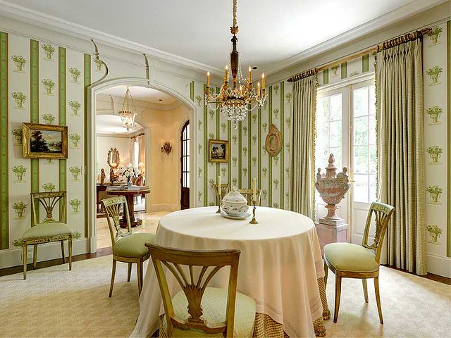
The dining room has an intimate scale and a fresh color scheme. I imagine that a second round table could be brought in if there was a need for more seating when entertaining.
I particularly like this view of the dining room, as the chandelier can be seen in more detail. It looks like the color of the chandelier might have inspired the color scheme of the entire room.
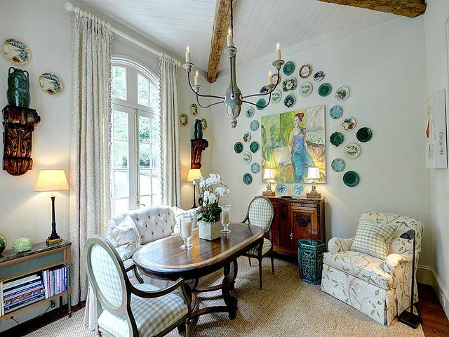
Adjacent to the formal dining room is the breakfast room (or casual dining area), which is in the section of the house that projects from the front.
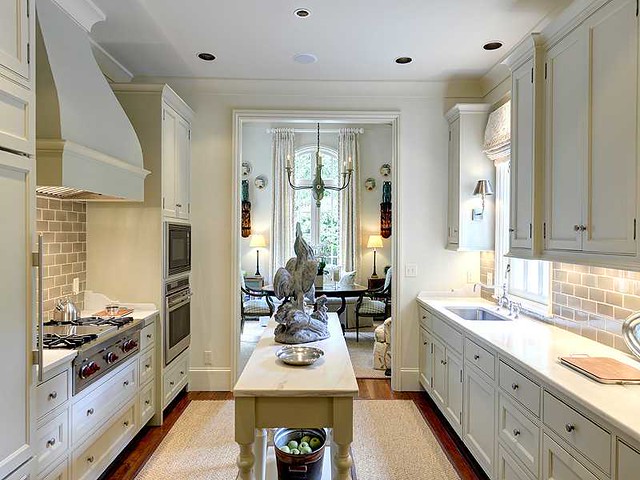
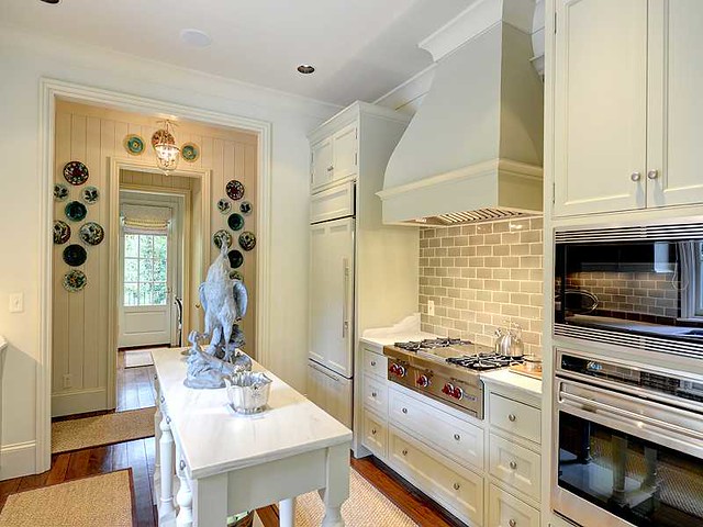
The kitchen is located on the side of the house, and connects the front to the back. Although the style is different, what comes to mind is a kitchen from designer Michael Smith’s own house (featured here). In his book on kitchens and baths, Smith notes that galley kitchens are exceptionally efficient. The kitchen looks like it has a winning combination of beauty and efficiency.
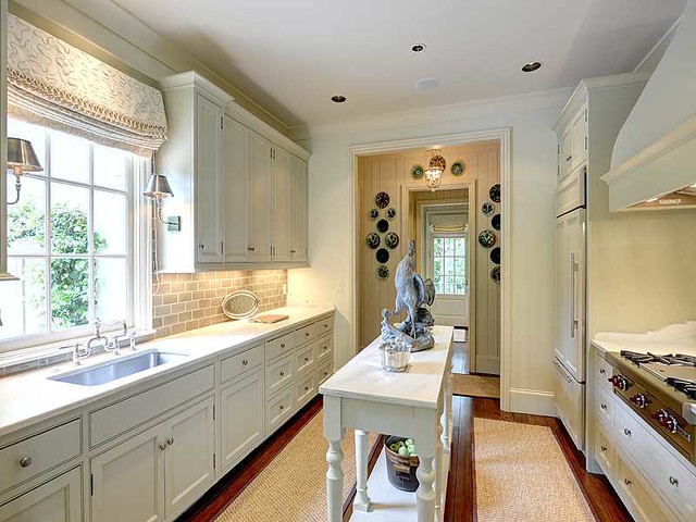
A view of the kitchen from the other side. The home office/mud room area is at the back of the house.
Another view of the kitchen. The subway tiles seem to be the exact color of the limestone on the front of the house.
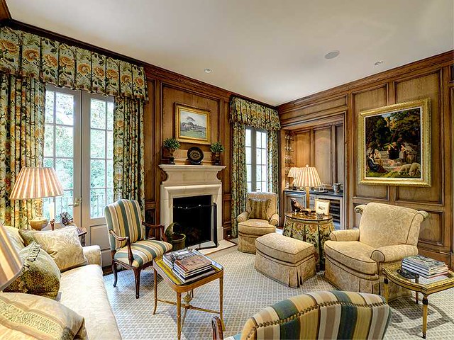
The wood paneled family room/sitting room is on the back side of the house. Note that the fabric in the curtains is also repeated in the fabric of the skirted table.
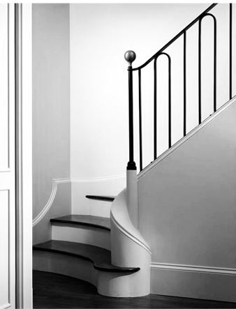
The real estate photos did not contain a view of the stairs (which is surprising, as they are so beautiful), but here is a picture from Stan Dixon’s website, taken when the house was just finished and the owners had not moved in.
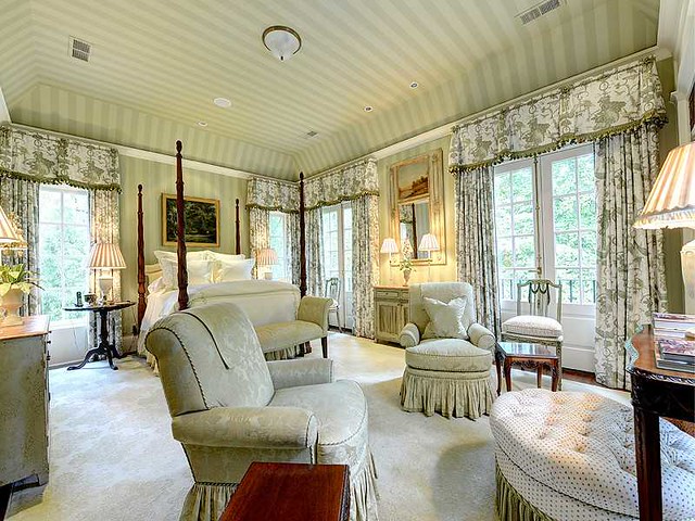
The master bedroom is on the main floor, and is filled with light, with windows on the east, west, and south exposures.
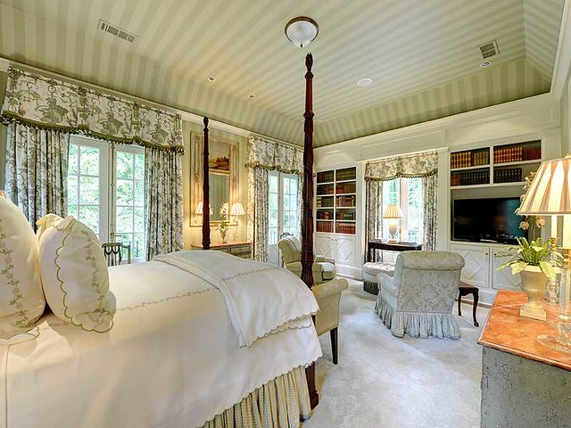
The bedroom from the other side of the room. Note the fine detail on the cabinets. This is the only television I have seen in the pictures, so I am sure the sitting area in the bedroom gets a lot of use.
A pretty master bathroom.
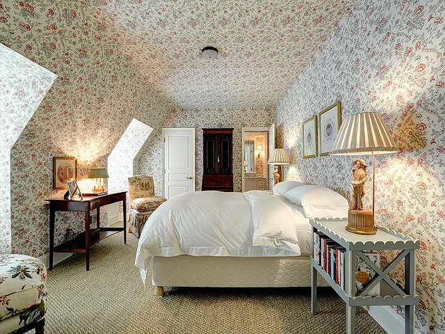
One of the guest rooms on the second floor is charming. I have a fondness for rooms that are built into the roof line, and I love the wallpaper treatment in this room.
The terrace level features a wonderful outdoor sitting room, presumably below the space of the master bedroom (like many Atlanta lots, when the front of the lot is flat, the back of the lot is typically on an incline, and the terrace level opens to the back yard).
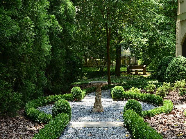
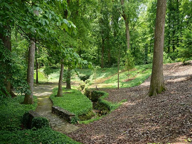
In contrast to the formal elegance of the front landscaping, the garden in the back has a more natural and park-like look and feel. This bird bath is a charming element, and the winding path seems to lead to a large bench.
Another view of the yard, which has a private and natural look and feel.
I get so much gratification out of seeing the inside of homes that I have previously only admired from afar. I think this particular house lives up to the exterior; the proportions of the rooms and the spaces in the house are really wonderful, and the décor is fairytale charming.
This beautiful, one of a kind house is listed by Studie Young of Harry Norman, and the listing can be found here. All photos in this post are from the real estate listing (they are particularly beautiful photos – I wish I knew who took them!).
To subscribe to my blog by email, click here.
To follow my blog on Facebook, click here.
Twitter: @TTIBlog
Instagram: http://instagram.com/ttiblog
Pinterest: http://pinterest.com/ttiblog/
Visit my online store, Quatrefoil Design:
www.quatrefoildesign.bigcartel.com
To see design, architecture, art, and decorative books that I recommend, please visit the
Things That Inspire Amazon store.

