
Several years ago, I noticed a house come on the market that was truly exceptional. The architecture, landscape, and interior design were all exquisitely done, and had a very special quality. I was eager to post on this house, which had been designed by residential designer Bill Baker, interior designer Suzanne Kasler, and landscape architect Land Plus. However, I soon learned that it had been photographed for Architectural Digest, and I received a request to not post any pictures until after the article came out.
When the article came out in the July 2013 Architectural Digest, the house was no longer on the market. Now, it is back on the market, with new real estate pictures that really showcase the beauty of the house and its décor. In my opinion, this is one of the best houses currently for sale in Atlanta. It’s a big house (almost 18,000 square feet) and includes just about every amenity you can think of – 6 bedrooms, 13 bathrooms (9 full, 4 half), indoor golf putting room, indoor sport court, indoor and outdoor pools, wine cellar, home theater, dog run, his and her fitness studios, multiple outdoor entertainment areas, 7 fireplaces, 4 car garage. The architecture is classic and tasteful, and since the house is only 6 years old, everything is fresh and up to date.
Here is a tour of the house, with pictures from the real estate listings (current and past) and Architectural Digest. Enjoy!
Front and Back Exterior
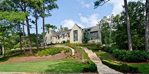
The house is described as inspired by the work of the late 19th century English architect Edwin Lutyens. In the AD article, architectural Designer Bill Baker describes the style as appealing to our time “because of the effect it achieves through form and asymmetrical massing rather than through elaborate details”. I thought this was an interesting insight, because many of the new homes in Atlanta seem to reflect this aesthetic rather than the classic French and English styles that have traditionally been popular in Atlanta custom homes. (Image above from real estate listing)
The house is perched on top of a hill. In Atlanta, many houses have a slope in the front, and a relatively flat back yard, so the back of the house is on level with the yard. Other houses have a flat front yard, and a sloped backyard, which means that in the back, the main level of the house has a deck or terrace. Personally, I prefer having the slope in the front and a flat back yard.
Regardless of the lot in Atlanta, a good landscape architect is a must as there are so many grading and draining issues associated with many Atlanta lots. The landscape architect on this project was Land Plus.
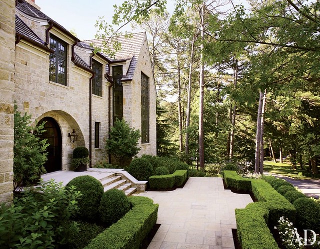
The online AD article has this wonderful perspective of the front of the house, and gives an appreciation of the wonderful landscape design by Land Plus. I love that the Korean boxwoods are trimmed to reflect the contours of the paving.
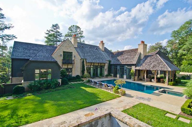
A broad view of the back of the house, from an old real estate photo. This house was made for entertaining, and the back yard space extends the options for entertaining. There is a wonderful indoor/outdoor connection with this house.

A different perspective on the back yard shows a stand alone structure that serves as an outdoor living room/kitchen. There is an outdoor fireplace with seating area beyond the outdoor living room. More on these spaces later in the post.
Main floor public areas
In the AD article, Suzanne noted that “this house is all about juxtaposition; town and country, formal and informal, elegant and rustic, dressed up and dressed down”. This comes through clearly in the AD pictures, but the real estate pictures give an additional perspective on the house that makes it all come together.
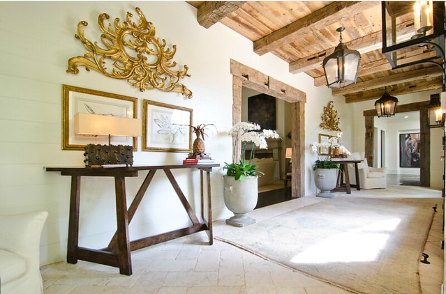
Not pictured in the AD article is the entry hall. Beautiful lighting is a hallmark of this house, as is plentiful seating. Note the chairs in the entry. The juxtaposition of styles noted by Kasler is clearly seen in this space.
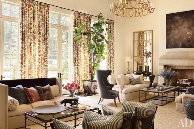
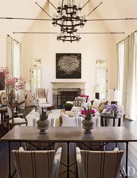
One of the most pinned images from this article is the great room, which appears soft and muted in this image. It’s a large room, and has two seating areas. Apparently the Robert Kime curtain fabric was the starting point for the color scheme of the room, and individual colors from the fabric were used as accents throughout the room. The Dessin Fournir Duveaux chandelier is one of my favorites.
The old real estate photos (from the original listing a few years ago) show more color and a wider view. Note that the chair on the left is part of the opposite seating area in the AD picture. I suspect the color has been enhanced in this picture, as it’s so much more vivid than the AD picture. It’s interesting to see the other side of the fireplace, which has a matching mirror.

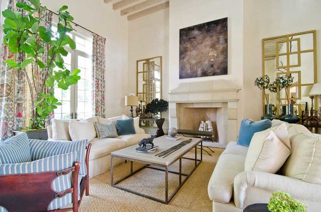
The other side of the room, from an old real estate photo. Note that the Dennis & Leen wing chair resides by the fireplace on this side of the room. The paintings above both fireplaces are by Raphaëlle Goethals. This picture shows a glimpse of what is on the wall on the left side of the room. If I had to guess, I would say that the opening to the left of the fireplace leads to a transition area and the dining room, and the opening to the right of the fireplace leads to the kitchen and family room (with the kitchen positioned on the other side of the wall where the fireplace is located).

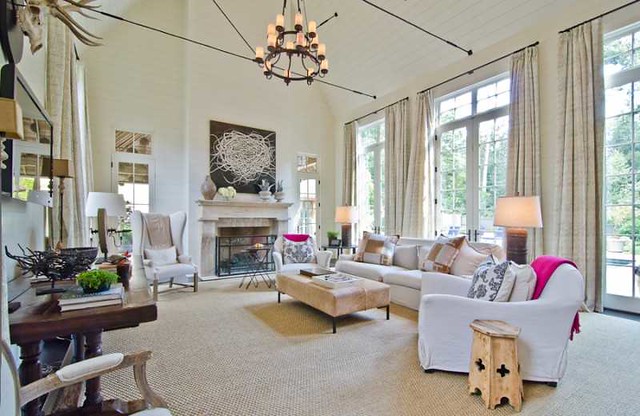
This image is from the current real estate listing. My guess is that the colors in this are more reflective on how it looks in real life. This is a wonderful picture that gives a good feel for the space of the room and the way in which the two seating areas interrelate. Looking at the picture of the back of the house, I think that this room is along the back of the house.
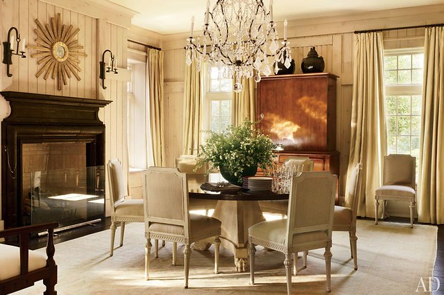
This beautiful dining room is just the right size, and has another one of my favorite chandeliers – the Fontaine chandelier by Dennis & Leen. It looks like the dining room is located on the left side of the house, in a bump out section along the front.

The next room on the left side of the house, in the juncture between the main body of the house and the wing, is the kitchen. Note the lamps on either side of the range, the X pattern in the island, and the metal range hood.
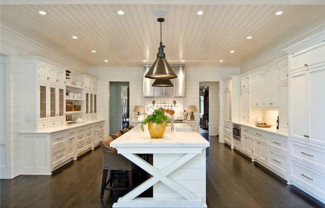
This old real estate image of the kitchen gives a fuller view, and emphasizes the extensive use of shiplap on the walls and ceiling. To the left is an opening that leads to the great room.
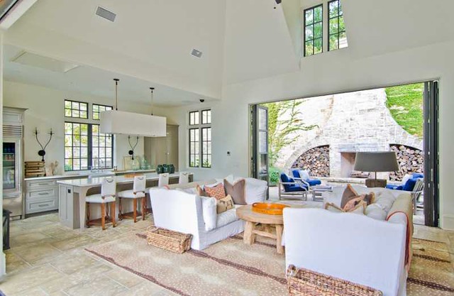
Just beyond the kitchen, in the wing of the house, is the family room. A kitchen dining table is positioned in the transition space.
This old real estate photo of the room gives a better view of the family room itself. I like the asymmetrical furntirure arrangement, possibly designed this way as there is a TV on the wall. The volume of space in this room really appeals to me – the vaulted celings, the beautiful and dramatic light fixtures, and the subtle art by Stefany Hemming - all enhance the look and feel of the room. I particularly like the interesting RH wing chair to the left of the fireplace. The doors on either side of the fireplace lead to one of the outdoor entertaining spaces, which will be featured later in the post.
Master bedroom and bathroom
Also on the main floor is the master bedroom, and this picture from the real estate listing shows that the room is identical to layout and design as the room is portrayed in AD. In fact, it’s reassuring that this house in its every day state is pretty much identical to the house as it is portrayed in AD, with the exception of a piece of furniture moved here and there. The arm lights over the headboard are an interesting touch.
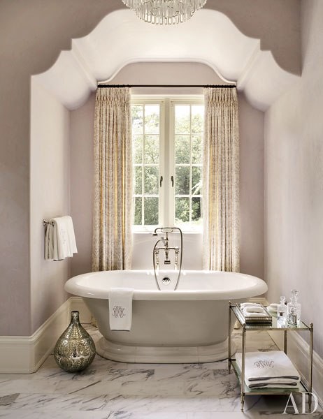
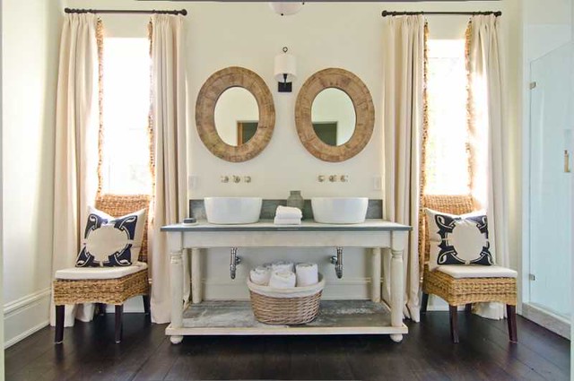
The master bathroom received a lot of attention, because of the beautiful lavender color of the walls, and the detailed shape and design of the niche that the freestanding tub is located in.

A wider view of the master bathroom gives an appreciation for the combination of all of the elements in this room, including the panelled mirror wall and the Venetian glass mirror mounted on the wall. Note the TV mounted on the wall. It appears to be on a swiveling stand so that TV can be watched while someone is bathing. I love real estate photos, as this detail would never be shown in a magazine (and in fact, was airbrushed out of the AD photo).
Second floor and basement
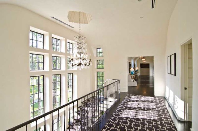
Another space not seen in the AD article - the dramatic and beautiful main stairs, which are in the front of the house. Again, show stopping lighting define the space, as does a bold geometric carpet and runner and huge dramatic windows. Note the detailed opening in the ceiling for the chandelier base, and the paneling in the room on the right.
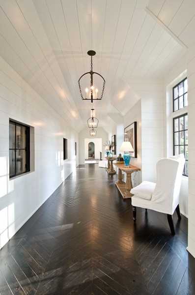
A view from the end of the hall shows the unique interior windows in the upstairs rooms, the chevron pattern of the dark floor, and the shiplap siding on the walls and ceiling.
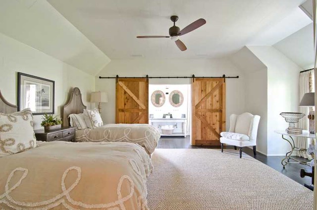
A secondary bedroom that was featured in the AD article, but this view gives an appreciation for the entire room and the way in which the bathroom relates to the room.
A closer view of the bathroom. The shower is on the right.

A pretty and sophisticated teen room. Note the sleeping niche built into the wall.
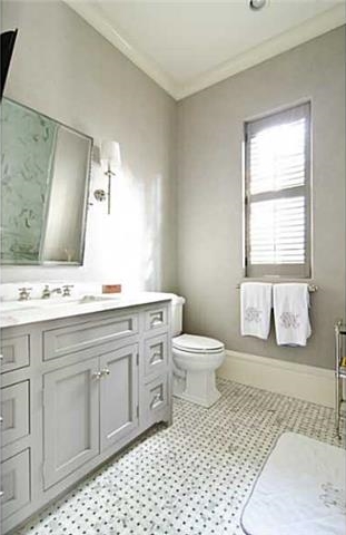
I like it when real estate photos feature lower key rooms in the house, as it is interesting to see the design choices. This secondary bathroom is beautifully done, with gray walls and cabinety, and a detailed basketweave floor with a dark accent stone.
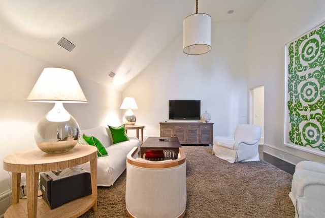
Based on the ceiling shape, I suspect this is an upstairs sitting room. Most of the upstairs rooms appear to be built into the roofline and have vaulted ceilings.
Believe it or not, there’s more! On to the basement.
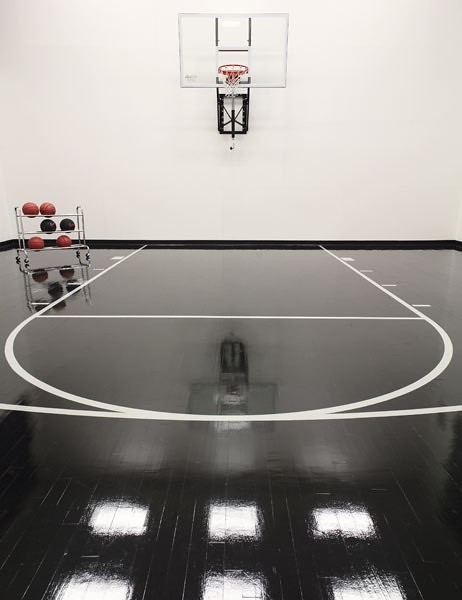
An ebony floor sports court.
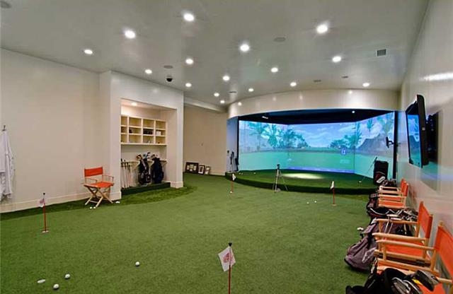
A mini putting range with golf simulation screen.

An indoor spa area with lap pool (I suspect this has one of those contraptions that allows someone to swim in place).
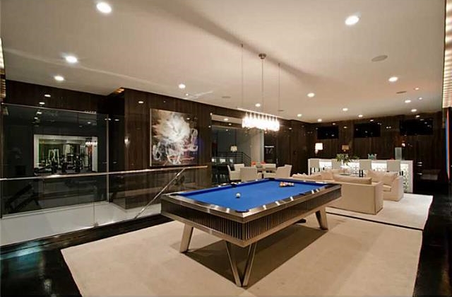
A basement game and recreation room, with a home gym seen through the glass doors on the left.

Of course, the house has its own home theater, complete with hot pink throws and custom sconces.
Outdoor entertaining areas
There is still more (after all, this house is almost 18,000 square feet)! The outdoor spaces are show stopping too.

An outdoor sitting area and dining area are off the family room, and face the pool. The AD article notes that the homeowners regularly entertain, and can accommodate more than 200 people – spaces like this would be ideal for entertaining, even if it is raining.

Just beyond the pool is an outdoor structure that houses a living area and full kitchen. It features fully folding French doors on both sides.
A view from the other side, which reveals the outdoor fireplace and yet another seating area on the other side of the doors. I don’t think this space was featured at all in AD, but it is one of my favorite parts of the house.
The house is listed by Atlanta Fine Homes/Sotheby’s International Realty. The listing can be seen here.
So, what do you think? I really love this house. I wonder which rooms the owners use the most, and whether they even use some of the rooms in the house. I would probably spend a lot of time in the outdoor living area/kitchen and the family room, as they are so light and airy and have such a great look and feel to them. Do you have a favorite room?
To comment, click here.
To comment, click here.
◊
To subscribe to my blog by email, click here.
To follow my blog on Facebook, click here.
Twitter: @TTIBlog
Instagram: http://instagram.com/ttiblog
Pinterest: http://pinterest.com/ttiblog/
Visit my online store, Quatrefoil Design: www.quatrefoildesign.bigcartel.com
To see design, architecture, art, and decorative books that I recommend, please visit the Things That Inspire Amazon store.

Things That Inspire Favorites: Cape Cod Metal Polishing Cloths

Things That Inspire Favorites: Oz Naturals Vitamin C Serum

Things That Inspire Favorites: Thera Breath Oral Rinse


.webp)


