.}

Monday, November 30, 2009

Green doors


When I was a child, I lived in the Georgetown neighborhood of Washington, DC for several years. My family lived in a rowhouse near a deli called Booeymonger, and given the urban nature of Georgetown we walked everywhere. Even as a child, I remember noticing the different characters of the homes and how many of the doors were used as individual expressions of personal taste.

georgetown

One of my favorite doors in the neighborhood was painted green, and I used to look for it every time we went out. Image of Georgetown via About.com, photo credit Rachel Cooper.

Since then, I have always had a fondness for green doors. In Atlanta, many doors and shutters are painted in 'Buckhead green', which is a dark, dark green that reads as black. This is not the green that catches my eye; I like the lighter shades that are more unusual on a door. I was reminded about my love for green doors recently when I 'rediscovered' this home while posting about the origin of the name of my blog, and since then I have driven by it several times. The green door and shutters are still there, but the front of the home is distinctly weathered now.

IMG_0232

I snapped this picture of a green door in London when I was there a few years ago. On that trip, I walked all over the city, so I am not sure where it is located.

lime green door

I found this incredible image of a lime green door on Living the Sweet Life. I love double doors - they seem so gracious, like you would throw both of them open and welcome guests into your home.

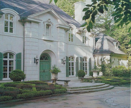
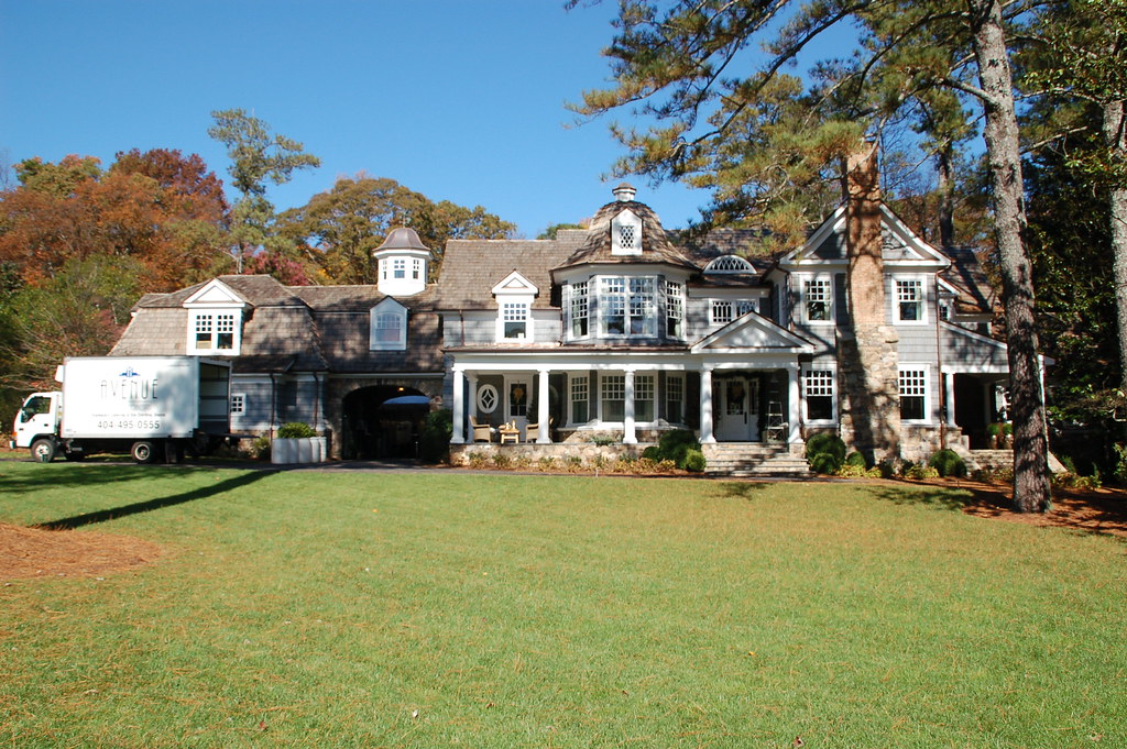
I 'discovered' this little gem of a home while walking my dog this year. It is right in the middle of Buckhead, yet tucked away on a tiny street; I even had a Buckhead realtor email me and ask where it was located, as she had never seen it. There are so many things I love about this home and the landscape; it looks perfectly at ease in its surroundings. My favorite feature is the green door with the charming criss-cross design on the transom above the door.

A beautiful green door leads into designer Kathryn Ireland's Spanish Colonial home in California. Image via Veranda, photo credit Miguel Flores-Vianna.

french_pakheydt

This home, which was featured on the cover of Veranda and is on the market in Atlanta (I posted about it here), looks like it has a sagey green door, but it could be taupe. I will investigate this week, although the front door is difficult to see as the home is on a hill and the landscaping conceals it.

This is a one of my all time favorite houses, and it is not even the front of the house, it is the back! I wonder what the front looks like. The architect was A. Hays Town of Baton Rouge, Louisiana. The door has a distinct green tone to it. Image via Provencal Interiors. (Have any of my readers ever seen this house in person? If so, please email me!)

This lovely hotel in the French countryside, called Prieuré d'Orsan immediately caught my eye because of the mellow green door. It is from a book called French Country Hideaways.

I love this magnificent green door in Paris - the real door is human scale, and the huge doors are the grand scale. Image via the Porch & Atelier.

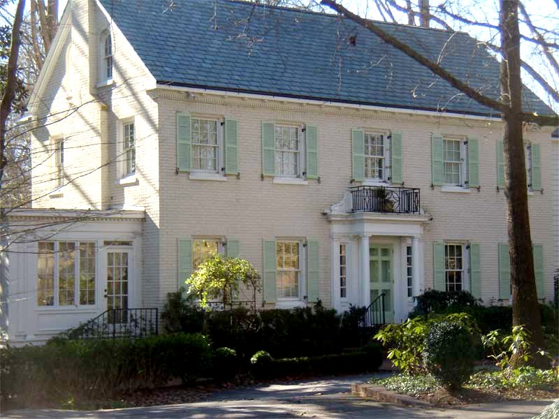
Architecture Tourist alerted me about this beautiful Neel Reid designed home (1885-1926) last year, and I have never forgotten it. The light lime sherbet color of the door and shutters is unusual in an Atlanta home, and yet it is part of what adds to the charm of this home. I have been reading a lot about Neel Reid recently; he was one of Georgia's premiere architects in the early part of the 20th century, and owning a Neel Reid house was considered to be 'a mark of taste and social acceptability'. He died young, at age 41, and yet he had such a dramatic impact on the landscape of Atlanta.

These were the only green door images I could find. If you have any good ones, I would love to see them!

To visit my store, Quatrefoil Design, click here.

To subscribe to my blog by email, click here.

To follow my blog on Facebook, click here.


Beautiful framed intaglios, available here:

Unique architectural renderings, available here:

Whimsical original crab and lobster paintings, as seen in House Beautiful, available here:


http://www.quatrefoildesign.com/

Monday, November 23, 2009

The Brickmaker's Table


A few weeks ago, Brooke of Velvet & Linen started what has become the one of the most sought after 'give aways' in the blogosphere. Mark Sage of Bobo Intriguing Objects offered to give three of his iconic 'brickmaker's tables' to the V&L readers whose spaces were selected, based on pictures submitted to Brooke.


Brooke ended up receiving almost 200 entries, and she asked some of her blog friends (27 in total, me included) to assist in narrowing down the list to 10. It was a difficult task. Many of the rooms were so beautiful as is, and I tended to steer away from these. Other rooms could be profoundly changed or updated with the addition of the table, and I seemed to gravitate to these rooms. Alas, none of my top selections made the top 10 (although many were on my short list) - but that was part of the fascinating experience of the voting. Everyone on the selection committee looked at the pictures with their own ideas, perceptions, and and aesthetics. The top 10 selections are wonderful choices and I loved being a part of the process.

Now, Brooke is asking everyone to weigh in and vote for their favorite room. Please go to Velvet & Linen this week and cast your vote. Email subscribers, click here to go to the vote. I can't wait to see who wins! Good luck to all of the finalists.

To subscribe to my blog by email, click here.

To follow my blog on facebook, click here.

To visit my online store, click here.

Thursday, November 19, 2009

D. Stanley Dixon: my favorite architect


I just received my December issue of Atlanta Homes & Lifestyles, and although I normally do not post about articles from the current issue (what's the fun in that- everyone should get to experience them first hand in the magazine), I could not resist mentioning one of the features that made me so proud of the beautiful homes in our city, and the long-standing tradition of talented architects and outstanding Classical architecture in Atlanta.
The style section of AH&L has a photo feature on 'timeless style' as seen in the architecture of Atlanta. Twenty homes were selected to represent the best of classical design - some old, some new. Although the architects behind the homes were not listed, I immediately noticed that my favorite architect, D. Stanley Dixon, was the architect on four of the twenty homes - an amazing testament to Stan's talent for creating beautiful homes with the purity of form that speaks to the very best in Classical architecture. Here are the four 'Stan Dixon' homes in the AH&L twenty:
229 Nacoochie
This home was a renovation project that can be more aptly described as a transformation, so extensive were the modifications to the exterior facade, roofline, and floorplan. It is hard to believe that this home was originally a 1940s Colonial ranch! Stan Dixon won the 2009 Shutze Award for small renovation with this spectacular project. The prestigious Shutze Awards are sponsored by the Southeast Chapter of the Institute of Classical Architecture and recognize excellence in Classical architecture. The awards are named for Philip Trammell Shutze (1890-1982), one of America's greatest Classical architects. Shutze practiced out of Atlanta, and some of the most revered historical buildings in Atlanta were designed by him.
174 Peachtree Battle
I snapped a quick iphone picture of this home in the spring, as it is one of the most beautiful examples of a newly built French style house in Atlanta. Stan Dixon designed this house, and it was completed earlier this year. It looks perfectly at home among its neighbors on the gracious Peachtree Battle Avenue.

280 Peachtree Battle
Stan was the project architect on the design of this new home when he worked for Norman Askins Architects during the early part of this decade. As with the previous house, it is truly difficult to tell that this house was built less than 10 years ago. It fits right in with the neighboring homes, many of which were built in the 1920s-1940s.
2841 Vernon
This home was a renovation of a 1950s ranch. The goal of the renovation was to improve the scale and proportion of the home, and make it more fitting to the elegant neighborhood in which it resides. Stan Dixon decided to take the renovation of the home in a French Provincial style direction, as the already existing pitched hip roof and French doors across the front lent themselves very easily to this style. Stan won the 2008 Shutze award for residential /single family under 4000 square feet category.
I have known Stan for many years, as our daughters go to school together. In my pre-blog days, he was the only architect I knew, so I would always pepper him with questions about architecture whenever I saw him. Finally, all of his patience with my questions and enthusiasm for architecture has paid off; Stan is the architect that my husband and I have selected to design our new home, which is slowly but surely emerging as French Revival style. We appreciate Stan's dedication to Classical architecture, his excellence at his craft, and his talent in blending the best of Classical architecture with the needs of a family in the 21st century. It has been a pleasure working with him; even though we are still in the early stages of the process, already it has been a fascinating experience to begin the design of a home from the ground up.

To subscribe to my blog by email, click here.
To follow my blog on facebook, click here.
To visit my online store, click here.

Monday, November 16, 2009

Seeking bathtub advice


Perhaps it is because my mother was English, but I have always had a love for baths and bathtubs. When I spent a month in England in '97, touring the great stately homes around the countryside, I was quite at home with all of the country hotels that only had bathtubs, no showers (my husband was not so pleased). To me, even the sight of a bathtub makes me feel instantly relaxed, and the bath has always been a place where I retreat when I feel any kind of physical or psychological pain.
By the time I went to college, I had already moved seven times because of my father's career. As a child, my sister and I always shared a 'kids bathroom' with a standard built in tub and shower. As long as I had a bathtub, I was not picky. A shower-only set up would have caused real angst for me.
fairmont-bungalow-bathroom
When I was a junior in college, I lived in the garage apartment of a family who had five little girls. In exchange for room and board, I tutored the children and assisted with the daily afternoon logistical challenge of managing five children at five different schools, with five different sets of afternoon activities. This was the first time I had a claw foot bathtub in my life. It was a real vintage tub, and I loved it (although, I hated taking showers in it). This is not a picture from the actual guest house in which I lived, but the set up was very similar - the tub was also the shower, and had a shower curtain exactly like this. It was unusual and a bit rare at the time, as whirlpool tubs were all the rage in the early 90s.
Now, it seems like every newly built or renovated bathroom I see has a freestanding bathtub. This is the tub that was in the Christmas Showhouse (interior design by Susan Ferrier, picture taken by me). When using a freestanding tub in a space like this, it truly looks like a sculpture, doesn't it?
Nate Berkus bathroom
Another freestanding tub picture that has recently caught my eye. Design by Nate Berkus.
Through this beautiful picture, I discovered a designer who is now one of my new favorites. So striking is this vignette that it was selected as the cover of Atlanta Homes & Lifestyles this spring . Would this space be nearly as beautiful with a built in tub? The answer is a resounding no. The freestanding tub allowed for the floor to ceiling antique mirror to be placed behind it, which is a large part of the charm of the space. Interior design by Amy Morris, image via Atlanta Homes and Lifestyles, photo credit Steve Pomberg.
kjoyce_br
This is one of my favorite pictures from Kerry Joyce's portfolio - I have admired this photo for years. The combination of the freestanding tub and the mirror strikes me as very European, yet also Californian too (Joyce is out of LA). Again, there is no way that this space could have been made so beautiful with a built in tub.
Sarah Richardson often uses freestanding tubs in her bathroom designs. They combine a vintage look with a modern feel.
When I think about all of the pictures in my files, this one comes to mind immediately as my 'dream bathroom'. I think it is because of the light fresh colors and the beautiful pattern on the floor. The tub is interesting to note - somewhat freestanding, yet it is also enclosed and has a ledge. I believe this is called a 'drop in' tub, as it has a finished rim and was made to drop into a custom surround. Image via House Beautiful, design by Jacqueline Derrey Segura, photo credit Simon Upton.
IMG_0152
I also have some beautiful pictures of built in tubs in my files. This was an iphone photo I took at a tour of homes two years ago - it was truly one of the first tubs I have seen in a while of a new or newly renovated home with a tub that is not freestanding. This one is an undermount tub as it is mounted underneath the stone. Upon further reflection, this was a renovation of a bathroom and there probably wasn't space for a freestanding tub.
Image via Velvet & Linen - one of my all time favorite tub pictures. The shutters are so charming. So, it is definitely possible to have a beautiful arrangement of tub and window with a built in tub. Interior design by Kelly Harmon.
Grant Gibson, designer extraordinary and a blogger too - designed this master bathroom space. I love the look of a tub that appears to be set in a single piece of carved stone.
One of the most romantic images of a tub, from a post on sconces by Cote de Texas. Taking a bath in here would feel like being in a little hidden room.
This picture is also in my 'favorites' file - the tub tucked into the arched space, the sconces, and the window over the tub are wonderful elements, and work even better when all brought together in this vignette.
I have always thought that my dream bathroom would have a tub in an alcove, with an undermounted or drop in tub, but definitely not a standalone tub. Where would I put all of my magazines and books (the tub is the best place to read, and many a magazine and book have become casualties of my fondness for reading in the tub)? Are standalone tubs uncomfortable? Why am I now starting to turn my eye to freestanding tubs all of the sudden? I think it is because of the sheer sculptural beauty of a freestanding tub, the European charm of them, and the fact that they are now 'de rigueur' in Atlanta. I am starting to get persuaded.
So, readers, I would love your thoughts on bathtubs in this day and age. When you have the luxury of space and beautiful natural light (it might not be practical in a city apartment), what type of tub would you select? Why have we seen a resurgence of freestanding tubs over the past few years? For those of you who have a freestanding tub, do you like it? Is this one of those 'classic' design elements that will remain timeless because it represents historical design, or is it something that will be a sign of the times and outdated in 10 years? I would love to hear your opinions. I am not fixated on having jets in my tub or anything, I am more of a purist about just a simple tub. And yet, I have always thought that I would do a tub in an alcove like some of these pictures. Help!

To subscribe to my blog by email, click here.
To follow my blog on facebook, click here.
To visit my online store, click here.

Saturday, November 14, 2009

My Favorite Showhouse


I am a huge fan of the holidays, and the way that I start to get into the spirit of the holiday season is with the Atlanta Homes and Lifestyles Christmas House. Every year, a beautiful home is selected, the Southeast's most talented designers are enlisted to create spectacular spaces, and a showhouse is created that combines four of my favorite elements: beautiful interiors, amazing architecture, stunning art, and elegant holiday decor. I have been following the progress of the Christmas House through AH&L editor Clint Smith's tweets; I have also been reading the profiles of the designers on the AH&L newsletter and magazine. Finally, after months of preparation, the 2009 Christmas House is ready to open its doors on Saturday, November 14.
This week I had the great honor of getting a sneak preview of the 2009 Christmas House, located at 1795 West Wesley (in Atlanta). Bill Baker (whom I interviewed on the blog this summer) was the architectural designer behind the home, Mark Stevens of Southwick Real Estate was the builder, and over two dozen of the Southeast's finest designers were responsible for the interiors. Virtually everything was in place, in preparation for the opening night party. Like any home ready to open its doors to honored guests, there was a buzz of activity and last minute fluffing. It was a bit surreal to see some of the nations most revered designers doing last minute checks on their spaces; AH&L editor Clint Smith was on site making sure that everything was picture perfect for the home's premiere.
The 2009 Atlanta Homes & Lifestyles Christmas House. There were many busy people on site, preparing for opening day on Saturday, November 14.
I had heard buzz that this year's Christmas House is the most spectacular one yet, so my expectations were high. Without a doubt, my expectations were exceeded. My overall impression was of the beautiful flow of the spaces, which is both in part because of the architecture and the skill of the designers, who were hand picked by Clint Smith for the Christmas House.
The interiors of the home have a definite transitional flair; there were certainly elements of the traditional in every room, but the openness of the architecture and the beautiful quality of the light in the home lent itself to a neutral color palette (with quite a bit of soft gray), striking contemporary art, and a fresh interpretation of design that really reflects what people are liking now. Walking through the home was like walking through the pages of a magazine.
I always think that entries define the first impression of a home. Barbara Howard's entry (of Marshall Howard) set the perfect introduction to this home, with the branch arrangements adorned with green, gold and cream glass ornaments. A hint of the room can be seen in the mirrors lining the wall - note the antique lighting feature in the reflection. To see the space in its entirety is a marvel to behold...you can get a hint of the beauty in the first picture in this post. (All photos were taken by me).
Beyond the entry is the spectacular living room, with interior design by John Oetgen. As luck would have it, John was there when I arrived. He said the inspiration for the room was a house in the Hamptons, as the connection between the interiors and the garden is so strong in this home (there are three French doors in the living room that open to the back yard entertainment area and pool). John's intent was to create a space that is both elegant and casual; a four season room that would be enjoyed every day of the year. Here is a little peek at my favorite vignette in the room. I have a soft spot for a piano in a home; John Oetgen incorporated a piano into the living room with a beautiful gallery wall as the background. Most of the artwork is from John's personal collection, and the blue piece in the center was painted by John himself.
Next to the piano sits a clamshell perched on a garden seat, loaded with gifts; in the room of John's imagination, guests who play the piano at holiday gatherings will receive a special gift for their efforts.
A charming cherub sculpture with a whimsical Etro velvet cap. John is known for his touches of whimsy in every room he creates, and this scene made me smile.
Another highlight of the home is the master bathroom created by noted designer Susan Ferrier of McAlpine Booth & Ferrier Interiors (she also designed the elegant and peaceful master bedroom). There was so much stunning light streaming into this space that I actually had a hard time capturing the room's beauty on camera.
The dining room, created by Sara Steinfeld, had a chic Hermès place setting on the table. Hermès of Paris is one of the sponsors of the Christmas House, and designed a room on the second floor of the house.
I found Barbara Heath's room (owner of Mercantile Atlanta) to be particularly beautiful. Barbara was putting last minute touches on the room when I saw it, and we had a difficult time picking out which vignette to feature from the room - there were so many beautiful elements in the space. Ultimately, we picked the 'magazine perspective' of the side table, and the mirrored bed. Barbara's store, Mercantile Atlanta, is well known for its one of a kind Murano glass lamps, as seen in this picture. (Make sure to peek into the closet in this room!)
Beth Webb did the design for the 'Artist Atelier', which really captured my imagination. In this small vignette from the space, I felt completely transported into the world of an artist refining his craft (and enjoying himself too - you will know what I mean if you have the opportunity to see the rest of the room!).
This is just a small glimpse into a few of the many amazing rooms in this year's Atlanta Homes & Lifestyles Christmas House. The roster of design talent reads like a 'who's who' in design:

Susan Ferrier, McAlpine, Booth & Ferrier Interiors
Barbara Heath, The Mercantile


Barbara Howard, Marshall Howard
Bill Hudgins, Lush Life Home & Garden
Suzanne Kasler, Suzanne Kasler Interiors
John Oetgen, John Oetgen Design
Jared Paul, Jared Paul Interiors
Jimmy Stanton, Stanton Home Furnishings
Sara Steinfeld, Sara Steinfeld Ltd.
Courtney & Randy Tilinski, Bungalow Classic
Beth Webb, Beth Webb Interiors
Mark Williams and Niki Papadopoulos, Mark Williams Design Associates
Mimi Williams, Mimi Williams Interiors

For those of you who do not live in Atlanta, you can subscribe to Atlanta Homes & Lifestyles magazine, which will feature some of the rooms from the showhouse in a springtime edition of the magazine. For those of you who live in Atlanta - or within driving distance - I highly recommend a visit to the showhouse. It is a great weekend to come to Atlanta - Scott's Antique Market is going on, the weather is supposed to be beautiful, and the Atlanta Homes & Lifestyles Christmas House opens this Saturday, November 14, at 10 am. The Christmas House benefits the Alliance Children's Theater.
Where: 1795 West Wesley Road Atlanta, GA 30327
Dates: Open for public tours Saturday, November 14 through Sunday, December 6.
When:
Wednesday – Friday: 10 a.m. – 4 p.m.
Saturday: 10 a.m. – 5 p.m.
Sunday: 1 – 5 p.m.
The House is closed on Mondays, Tuesdays and Thanksgiving Day

Tickets: $20 at the door, $18 in advance through woodruffcenter.org or alliancetheatre.org
Food & Gifts: Soups, salads, sandwiches and seasonal desserts will be for sale on site at Café Noel. Holiday gifts at the special shop by Boxwoods Gardens & Gifts, Inc.
Parking: Parking is not allowed at the Christmas House. However, there will be a continuous courtesy shuttle to and from the house from the IBM Office Complex at 4111 Northside Parkway NW, Atlanta 30327.
More information:
Finally, for an insiders perspective on the inspiration behind a room at the showhouse, check out designer Niki Papadopoulos' blog post on the room she designed with Mark Williams.

Tuesday, November 10, 2009

Looking back, and looking forward

Image via Veranda, photography by Tria Giovan

When I started my blog 2 1/2 years ago, I had no clue where it would take me. I saw it is a private scrap book, a place to organize my thoughts, a place to write. I remember very clearly registering for the blog, and trying to come up with a blog name; all of my top picks were taken. I looked around the room for inspiration, and my eye fell upon the latest issue of Veranda (June '07), which was open to an article called 'Fresh Palette' (picture above). I thought this was the perfect name for my new blog, as my intent was to write about art, architecture, and design. The palette reference was an obvious nod to art, as both the color selection that artists use, as well as the traditional board that artists use to place their paints. Fresh palette seemed an ideal way to describe the interiors I love as well; light, fresh, airy, serene.

Image via Veranda, photography by Tria Giovan, architecture by Norman Davenport Askins

In fact, the article from Veranda is one of my all time favorites, and the home in the article is on a cul-de-sac in Atlanta. I occasionally drive by the house just to appreciate its beauty.

When I actually started to write my blog, I chose 'Things That Inspire' for my blog header. It came to mind immediately, and it has turned into a better description of what I do on this blog; I like to write about the things that inspire me. I am usually very much on topic - after all, architecture, design, and art inspire me to no end - but occasionally I will slip in something else off topic that is a source of inspiration.

Now that I am venturing out a little bit more with my blog, I am finding that I no longer relate to the 'fresh palette' component of my blog url. When my blog was mentioned in Atlanta Homes and Lifestyles, it was identified as 'Fresh Palette' - an understandable assumption, given that it is in my blog url, however, in my mind the blog is 'Things That Inspire'.

Last week, when I attended the book launch party for Suzanne Kasler, I felt like I was 'coming out' as the person behind the blog. I finally met some of the other Atlanta bloggers; I met a lot of people in the Atlanta architecture and design community, many of whom I have written about at length; I met the president of Hickory Chair; I met Nancy Corzine's right hand man. After that party, and having to spell out the name of my blog url several times, I decided that it was time for me to register a web site for my blog.

And so, with this post, I am introducing my new blog address: http://www.thingsthatinspire.net/
I registered for the web site through blogger, so everything should be linked and hooked up automatically. No need to change any of your links; in fact, freshpalette is still working in the background, it's still there, but everything gets redirected to the new address. One casualty has been my blog list - it was totally wiped out in the transition. I am slowly but surely trying to recreate it, but it has been a challenge as it was something that developed naturally over the past two years.

I am looking forward to many more observations on the the things that inspire me, and hope you will stick around for the next chapter in my blog.

To subscribe to my blog by email, click here.

To follow my blog on facebook, click here.

To visit my online store, click here.

Sunday, November 8, 2009

One of my favorite things


People are often surprised to find out that I do not enjoy shopping for fabric, given my love for all things interior design related. I am fully aware of the beauty that a lovely fabric adds to a room, and think that the selection of the right fabrics with the right patterns, textures, and/or colors are essential elements in the design of a room. However, to me, shopping for fabric is like shopping for clothes - there are so many options, so many styles, my heart sinks every time I walk into a fabric showroom. I am definitely more of a fan of furniture.
I could look at furniture all day long. Sometimes I go to the Atlanta Design Center or Americas Mart for the sheer joy of looking at the most exquisite furniture you can imagine, all different styles and shapes and colors. To me, a well made piece of furniture is like a sculpture - so much care and consideration must be put into the scale and proportion in order for the furniture to 'work'. Then there is the matter of the finish, which can give a piece of furniture an entirely different look if it is created in a light or dark finish, a painted finish or stain.
233_NantucketSideTable
The Nantucket table by Rose Tarlow-Melrose House is, without a doubt, my one of my favorite pieces of furniture. I love the curves of the legs and finials counterbalanced with the straight beam in the midde, and the decorative elements carved into the top. After reading 'The Private House' by Rose Tarlow recently, I have an even greater appreciation for this beautiful piece of furniture. Quotes from Tarlow perfectly describes her approach towards the furniture in her line: "I don't reproduce furniture, I simply adapt designs until I find them pleasing". I highly recommend this charming book; it is a book that is mainly text, in some ways more of an autobiography. I loved reading Tarlow's observations on a life well led; she is keenly observant and has a sincere appreciation for quality over quantity, for slowly collecting, and for giving a room an emotional layer that goes a bit beyond just decorating.
The Nantucket table has gained a fair amount of press because of its placement on the set of 'Something's Gotta Give' - it was used in the main character's bedroom.
bolander_6
One of my all time favorite designers, Lars Bolander, used the Nantucket table in my favorite home from his portfolio.
rosetarlow_southernaccents_triagiovan
On rare occasions, I spot this table in my favorite design magazines. When I first saw this picture (image via Southern Accents, photo credit Tria Giovan), I noticed nothing but the Nantucket table. Now I am also appreciating some of the other details in the room - the contrast of the light finish of the table with the darkness of the built in cabinets. As a side note, I have recently noticed quite a few cabinets that are actually built into the wall - they look like furniture, but a recess in the wall has been created.

IMG_0061
Rose Tarlow is represented by Ainsworth-Noah in Atlanta (to the trade). I must admit that I purposely seek out this table every time I go into the showroom. Earlier this year, the showroom displayed the table next to a bed.
IMG_0123
Recently, it was paired with a sofa in a living room scene. Same lamp, though!
If I were to buy this table, I am not sure where I would put it. And, I wonder whether my dog Ben would knock this table over with his huge enthusiastic tail? He has decimated an antique table that belonged to my husband's grandmother as it has been knocked over so many times. This table, however, looks quite sturdy with its base with four legs. I keep thinking about Rose Tarlow's own recommendation in 'The Private House'- she is emphatic about buying what you love, and you will find a place for it. Does this philosophy work for you?
Please visit Rose Tarlow's newly relaunched web site for more inspiration. Also, for an excellent write up of the new location of Rose Tarlow's showroom in Los Angeles, see Velvet & Linen's post.

To purchase Rose Tarlow's wonderful book, The Private House, click here.

To subscribe to my blog by email, click here.
To follow my blog on Facebook, click here.


Beautiful framed intaglios, available here:

Unique architectural renderings, available here:

Whimsical original crab and lobster paintings, as seen in House Beautiful, available here:


LinkWithin

Related Posts with Thumbnails