

From the moment my architect first started sketching the new house, we agreed that the entry would have a stone floor. I have never really given much thought to the floor material of entries, but it seemed like the right fit for the house. Recently, I decided to do some research and find good pictures of entries with stone, and I realized that most of the pictures in my files seem to have wood floors in the entries. I am not sure why this is the case; perhaps it is because a stone entry works best when the foyer is defined as its own room (or when the floor of most of the house is in stone), and so many entries in houses these days seem to be open to the other spaces in the house.
I asked my architect about stone floors in entries, and he noted that in previous times, it was probably very practical to have stone in the entry as it offered more durability when a visitor was coming in from the rain or snow. Now, it is more of a personal preference, although he said that there are some styles of houses where a stone entry would be out of place.
![windsor%20smith%20morocan%20otthome[1]](https://blogger.googleusercontent.com/img/b/R29vZ2xl/AVvXsEgRfqer4zcyB8_AG3vPj7pe5HDxrB_UX7L9YOj94BsZmAaC4NsV77KswJuCI0JzDj77C_G2BflxYjkSKHXb70dLtrBNLcgTOg1iI9e7PPHd1ZK0BNCzhI1Dx3ElukzG2zo0xoEVwT-bp-s/s1600-h/windsor%20smith%20morocan%20otthome%5B1%5D.jpg "windsor%20smith%20morocan%20otthome[1]")
This is one of my favorite pictures of a stone entry, from the house of Windsor Smith (featured in House Beautiful). Windsor calls this her ‘David Adler’ foyer, and it is crafted with statuary marble and Bateig Blue limestone.
![smith-13-0909-xl[1]](https://blogger.googleusercontent.com/img/b/R29vZ2xl/AVvXsEgamkfKjbE7Yoq_ZvLZsFLwLKKLFeLZjI3l2zAB2VDmyTKK5-LIRfkR_9BVOt48sr6mfFgTFA_nmWo4qaNV2LNderT9Rg7XVGMmR7tysSzQecwWbkWtc9HfsKcEcJV9Ohb4dydCudvcyCk/s1600-h/smith130909xl1.jpg "smith-13-0909-xl[1]")
I love the soft and aged look of the blue limestone; it is a new take on the classic black and white marble entry.
![Swan-House-Entrance-Hall-by-Ruby-Ross-Wood[1]](https://blogger.googleusercontent.com/img/b/R29vZ2xl/AVvXsEj1yLwRPG3cCXMJOiwQZSFMyiP3otL7QMMk65W-zK9_czeDN3ktOGcFvKTUWeeyBd0_cW3rgzxOYoaIhHml_y7kb6xxpsaVSxqhBRJq5r7qRY7b8Z6o1J9gBvQz4F3C3lirX99RXz7I9yY/s1600-h/Swan-House-Entrance-Hall-by-Ruby-Ross-Wood%5B1%5D%5B3%5D.jpg "Swan-House-Entrance-Hall-by-Ruby-Ross-Wood[1]")
For a classic black and white marble entry, it doesn’t get much better than the Swan House, a Philip Shutze masterpiece designed in 1928; this house is a museum now (and one of the great architectural gems of Atlanta). I had the opportunity to tour three privately owned Shutze designed houses this spring, and two of the three had marble entries. (Source)
![2233173039_1778ede2a2_o[2]](https://blogger.googleusercontent.com/img/b/R29vZ2xl/AVvXsEhmyo2fJOp2zVL7so6PjEAEj2jqohihG00kk4y6f2jm6HmkNHV6GTTmjX1ekYfzcU0Hl3vA7XL28rJG8_nyu8NRSC1UZpUhmyPsRPxw5Bw3hM-L01P7U8t7NxWv1OzkSaDbse56gGuJKFY/s1600-h/2233173039_1778ede2a2_o%5B2%5D%5B3%5D.jpg "2233173039_1778ede2a2_o[2]")
![3898591742_c509127348_o[2]](https://blogger.googleusercontent.com/img/b/R29vZ2xl/AVvXsEhfysUYnXmDJaL1c5eTRW83lvM74qD8hqPrgMHlfiwz1l6E1I3_UF9bgxG_P1AuPNBB534BPXXj-UR7Hl4XF_5-KaqwdH_hp3HF-15PB4Ttcq13dvImZC_YlUHgmlqPIGnCIZMAtHALAHk/s1600-h/3898591742_c509127348_o%5B2%5D.jpg "3898591742_c509127348_o[2]")
This beautiful entry, with a large scale original painting by Todd Murphy, provides a great contrast between the classic and the contemporary.
![2233183189_4bb3284e68_o[1]](https://blogger.googleusercontent.com/img/b/R29vZ2xl/AVvXsEgnT7D2nkhkN4GoHIyOILn2rJ_lZkfqDFWXgV2zbJ-PPX3w9SOv5vzxLSv2dUEmwormiTx9yKbkbhxbqgP0zyXBlg51VTgQLlku31peLZyj5BfYatzvqJ9a9SzHSmsUyLw5arboquYvNOE/s1600-h/2233183189_4bb3284e68_o%5B1%5D%5B3%5D.jpg "2233183189_4bb3284e68_o[1]")
I am not sure where I got this image, but I saw it with new eyes while working on this post – the scale of the marble tiles is quite large and dramatic. Interiors by Suellen Gregory.
![2343326388_d3c6c920eb_o[1]](https://blogger.googleusercontent.com/img/b/R29vZ2xl/AVvXsEijYSSSsoCfdIy6s1bp9bviQL33bF7hk7nbDVavdhw2vWylzM-A4s9PypqcKRk0ArltBMic0wgWsXe7ka_-uUtyZi_hRM2hQTR5XMyzmhuYQggOW1gjiAIOzs5wO3RSl0vhuHsaBvqp-us/s1600-h/2343326388_d3c6c920eb_o%5B1%5D%5B3%5D.jpg "2343326388_d3c6c920eb_o[1]")
Another striking interpretation of the classic black and white stone entry.
![4555616737_fdb6cbd6a3[1]](https://blogger.googleusercontent.com/img/b/R29vZ2xl/AVvXsEhTaDfgzgow5RGtMQZavy5PDkEY5mQ-3HJ-D-CaOZO8GzCkqaWKdlgeAmqhZHdFXBMIlHjexlr5EHryNABJ665v48FEbin-QcT9auGZJyRQebWfsxBTWEe-ibhn-zg8w93vJ5JHbcZrKxg/s1600-h/4555616737_fdb6cbd6a31.jpg "4555616737_fdb6cbd6a3[1]")
I also appreciate a stone entry that has a bit of flair to it.
![4556246196_3526e8092d[1]](https://blogger.googleusercontent.com/img/b/R29vZ2xl/AVvXsEj3W1fv67jGd-aK_nH2MClSN6ioxNgP9s6pwe8g5kas-5gaoyWfPvNsNNNGeMBLNWY_L1eHdkoVOHTfuSAEj8sSqZY43Aj8daL6tAF_OslLDrMQ2_S-7y_sY3WisgIbkVThTEQCZADkAkI/s1600-h/4556246196_3526e8092d11.jpg "4556246196_3526e8092d[1]")
This beautiful compass style floor is in a classic Atlanta estate (which is on the market) that was renovated by Neel Reid in the 1920s. Photo credit (this picture and the one previous): Blayne Beacham.
![3898166779_5416026456_o[1]](https://blogger.googleusercontent.com/img/b/R29vZ2xl/AVvXsEg7he44b-a5hWJTY5MyUo7UE6dx4uxkRIj_WxZjrpuWnm_5NR6wgmU4aPzlH3WrCgfM0X2DbD2lRJAtSBqeFIp9Ety4KBBrEbBeVqFj56vRNKCMNZgfn6VrLpU1UC91M9AP36pfaTC99NI/s1600-h/3898166779_5416026456_o%5B1%5D.jpg "3898166779_5416026456_o[1]")
Although this space is actually in the back section of Mrs. Howard, a store in Atlanta, it is designed to feel like an entrance. The Howards always have the most beautiful floors in their spaces, and this is no exception.
![SuzanneKasler_pg013a(2)[1]](https://blogger.googleusercontent.com/img/b/R29vZ2xl/AVvXsEhDSC8Aw4849pvujDf5IgS7_LL2G30NWBhxt0MhjFvJpZCpCSHzB3QGUnxEwd08ERyGgJsIBSsHJVoBF6dkgS8e75uLhzjHNyBfUz1pyc-ylUmZYovYdYPokg0ljfzQisiKzxAwPDzR4lI/s1600-h/SuzanneKasler_pg013a(2)%5B1%5D.jpg "SuzanneKasler_pg013a(2)[1]")
In the entry of Suzanne Kasler’s previous home, this charming vignette looks wonderful on the foundation of a polished marble floor.
![bunny%2Bwilliams%2Bhallway1_[1]](https://blogger.googleusercontent.com/img/b/R29vZ2xl/AVvXsEjlLYK0_6-7qFHccVAb1iI7PhyJgvFy004nFVJNWc-luo_AteNEUQsZCKWzFUHAFvzyE5vyswsyFYr-5iwhkcm7DITbftYK0vkBrv523ubUwBF7FoVhwcsFeeid5c3szTijHIPvGQFh7H8/s1600-h/bunny2Bwilliams2Bhallway1_1.jpg "bunny%2Bwilliams%2Bhallway1_[1]")
A stone floor in the entry doesn’t always have to make a formal statement. Take this house, with interiors by Bunny Williams (via Style Chronicle). The ancient look of the stone really relaxes the formality of the space.

Much of designer Jill Sharp’s home (as seen in House Beautiful in January) has natural oak floors, but the entry features reclaimed French limestone, which sets the tone for the rustic elegance of the house. Photo credit: Simon Upton.
![3897811243_5f0cc3c33b_o[2]](https://blogger.googleusercontent.com/img/b/R29vZ2xl/AVvXsEjiuBriPG8XiVNvW0IeUK13MTgiby1alfUXnnBS4JggeF7eytEr-pyh6om_WkEONMBWZf-nV4HqtNuqlKJfrKzk79V4-9I6NMkkMhsiKyyZhMA-4QhTxCmfX31kP6nNhSy163Eye5d8fGI/s1600-h/3897811243_5f0cc3c33b_o%5B2%5D%5B1%5D.jpg "3897811243_5f0cc3c33b_o[2]")
I imagine this space as more of a side entry, but it could be the main entry for a relaxed and casual home. The stone in this space is more casual looking; somehow, the running bond pattern seems to reinforce the less formal feel. Architecture by Mark Finlay, photo credit Erik Kvalsvik.
![3898591680_c21b76f16c_o[1]](https://blogger.googleusercontent.com/img/b/R29vZ2xl/AVvXsEjcPsu2HZZBpW0jSpirA7-PZrcwFibBVxsEibZkT8ucg85sq-RvhOwnoGh6OgnoTUmyhcLzepRSkClBkFqkjEv9sPvLpQsXBhGG2wDVaaMh9p-Xv0tFrwxeVlyEhPQpT6CYdGVbuZRhSAg/s1600-h/3898591680_c21b76f16c_o%5B1%5D.jpg "3898591680_c21b76f16c_o[1]")
Although a herringbone pattern can be quite formal, there is something about the pattern and materials in this entry that set a slightly less formal feel to this house.
![3805709510_4b25408aec_o[2]](https://blogger.googleusercontent.com/img/b/R29vZ2xl/AVvXsEgWX9j0h4jr-ZOYk2cdG0ll6sKR4VcDcHo8FQZyDbw7p7RIyrzhgoZu-NJIhel79BUk8eIssxz-7n7lWKI2GtMdKZDPqRW16VQJW7yRpp2ocJlzm0Vsh3TWLsjOAWN5AC5SdAZAKD_QvBE/s1600-h/3805709510_4b25408aec_o%5B2%5D.jpg "3805709510_4b25408aec_o[2]")
Finally, I saved my favorite for last. This picture is from a real estate listing from several years ago, and I think it is a beautiful and dramatic entry. The stone part is set in an oval shape which emphasizes and reinforces the oval shape of the space.
We are still working on the specific materials and design for the entry of my new house; more than likely it will be limestone, and perhaps a tone on tone pattern with two different kinds of stone. The entry is a defined space, and the stone will help establish it as a special part of the house.
Do you see many stone entries where you live? Now that they are on my radar, I always notice them when looking through magazines and real estate listings.
To see my latest blog post, click here.
To subscribe to my blog by email, click here.
To follow my blog on Facebook, click here.
Twitter: @TTIBlog
Instagram: http://instagram.com/ttiblog
Pinterest: http://pinterest.com/ttiblog/
Visit my online store, Quatrefoil Design: www.quatrefoildesign.bigcartel.com
To see design, architecture, art, and decorative books that I recommend, please visit the Things That Inspire Amazon store.


![4181482154_870751a93b_b[1]](https://blogger.googleusercontent.com/img/b/R29vZ2xl/AVvXsEjUpJedzFsfQ0xnZ5sAf8rJju3o9AjScV7SX6dvc3MgpeZxqzEhdMKVAuoxB8I4-GQJlsS5rGVVOHBQ2UjEwyXTChJ_4aFRkuNHgTlyKxqOAQCMrtqbRszz6JxgmWDC9exKz9Rz52If3wA/s1600-h/4181482154_870751a93b_b%5B1%5D%5B5%5D.jpg "4181482154_870751a93b_b[1]")
![4181558628_2fe69b069a_b[1]](https://blogger.googleusercontent.com/img/b/R29vZ2xl/AVvXsEh8XfTvBswS1JbquY-HLCoIX5BbemRheHxlxupI0a4Rav6kElytCFhAPxRmCDMa02GxaMo-kQsBRdwPpH7CEziiywe4dUR2AD4YW4nhWvIUwL87av3AcH_Y4XnutL2kQdNjsQsqyVO8fI4/s1600-h/4181558628_2fe69b069a_b%5B1%5D%5B5%5D.jpg "4181558628_2fe69b069a_b[1]")
![3196861433_a3cc10e908_b[1]](https://blogger.googleusercontent.com/img/b/R29vZ2xl/AVvXsEiFaB3gRdcNfAcvqi07b-SUOUCrA6QSd8V9aVa4xLmN_3BwX2K0aGT7i1d9h_Fqorfq24v5uEz_plLjfA85_c3IorQWFuoOIhyqh7ejecSYtEyicSA4YLFQA-GvmZufsp9EHUKj3y0ob-o/s1600-h/3196861433_a3cc10e908_b%5B1%5D%5B5%5D.jpg "3196861433_a3cc10e908_b[1]")
![3470077085_21423d3a25_b[1]](https://blogger.googleusercontent.com/img/b/R29vZ2xl/AVvXsEgQPSjV6aTNh14ConN2DejLRlQOjKQCoFAbwuy_DjdbBOaa5xvAF703Ge2EXPVoz6l4XYOdfO7Lo0Ags8IzKUevkRTRiotVOThHtaLKuaemwRjeCQpki2xRNmiNN0B_jJeYxCf2KUdY6OA/s1600-h/3470077085_21423d3a25_b%5B1%5D%5B4%5D.jpg "3470077085_21423d3a25_b[1]")

![3690438871_f53d10c329_b[1]](https://blogger.googleusercontent.com/img/b/R29vZ2xl/AVvXsEjRXp_WIJwZ83EiQObKbrADXcCXpsW_rT_PTiE1NkxeRfg4yRucxSqeguKfUi2DJ-7g4m97aT9BxFsappxRANZkdcQ4gVNphK3xew17gV2fn5nRMy6bQsrLMDl-Ymr6x1o-0oI_RPFvo4k/s1600-h/3690438871_f53d10c329_b%5B1%5D%5B3%5D.jpg "3690438871_f53d10c329_b[1]")



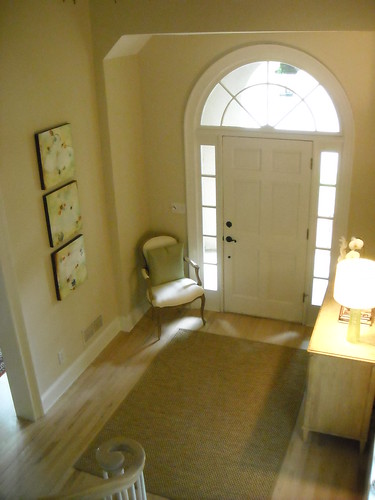
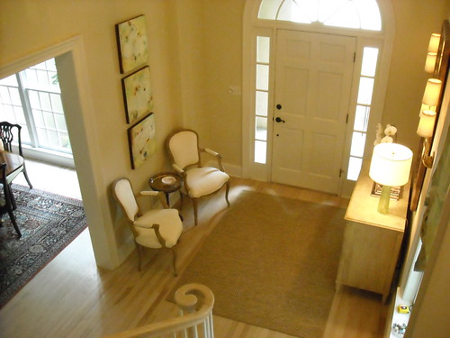

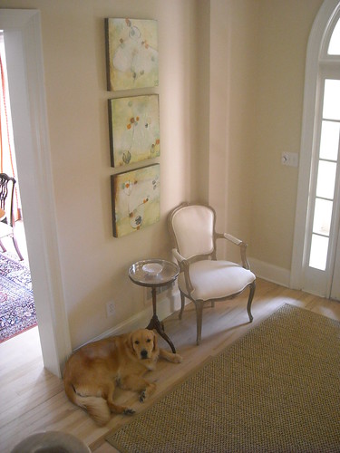
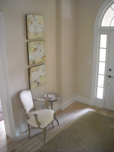


 I love the lines of this settee, from Beautiful Homes magazine. I think the scale of a settee works particularly well when the ceiling is standard height (not double height). If you look carefully, this settee is under the part of the ceiling that is not double height.















.jpg)


