

A few weeks ago, I did a post on my entry transformation. I invited readers to give me honest feedback, and I heard from at least a dozen of my readers with constructive tips on how to improve the space. Most of the feedback from my readers was about the disconnect between the chair in the corner of the entry, and the art that is on the wall nearby. There was a sense that the two should be connected in some way.
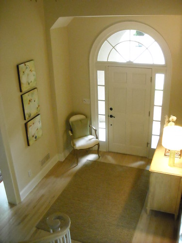
This was how I started out. The chair is in the corner, all alone.
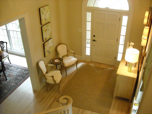
At first I tried this set up. The small table is an antique that belonged to my husband's great-grandmother; it was in the living room next to a large bergère chair. The small table is not in great shape, as Ben the dog has knocked it over at least four times with his tail. Perhaps this new location will protect it a bit more! I like how this looks, but wonder whether two chairs makes my entry too crowded.

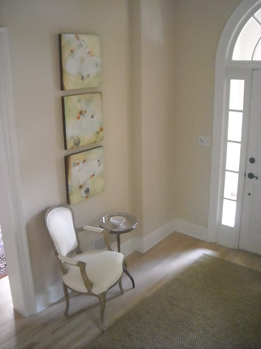
This is how it looks with one chair and the side table (I polished up the silver top for this picture!). I prefer this look because it does not crowd the entry, but this might be because I am only used to seeing one chair in this space. What do you think?
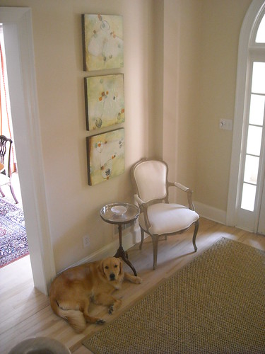
Look at this...I move the table, and Ben follows!
Update: here is the chair on the other side, requested by a reader!
At this point, you are probably tired of reading about my entry (I am too!). My next home transformation post will be my bedroom; I am having some pillows made, then the bedroom will be in good enough shape to post.
Please come visit Between Naps on the Porch for Metamorphosis Monday!


.webp)


It is too funny that your dog followed the little table.
ReplyDeleteI have to say that I liked the look with the two chairs. Maybe it is too crowded--but it didn't look that way in the photo--but photos can be deceiving. I'm sure you know best.
Have you tried using only one chair, but placing it angled toward the door? Where Ben is in that last picture. It might be more inviting for an entrance, rather than walking in to the back of a chair. Just a thought.
ReplyDeleteI still think Ben is the best accessory!
Actually, the last photo with Ben in it is the best - and Ben is the reason. Not necessarily because he is your beloved Ben, but because he is very near the correct height and mass for that spot. I agree with you that the two chairs are a bit much. But if you keep the setup as it is in the last photo, but replace Ben with the "just right" piece, I believe it would work.
ReplyDeleteI like the one chair... I think one chair makes sense, one might sat there and look at the mail they just brought in or put thier shoes on ect. Two makes it look like you are trying way too hard. It looks lovely!
ReplyDeleteApparently, your dog feels some connection with that table! I like both looks. If you come in the front door do you find you have to squeeze past the chairs?
ReplyDeleteUltimately, you have to go with what YOU like and works for YOU (and Ben) in that spot.
I like the entrance with one chair and the side table. Another option would be a small cane bench with a beautiful pillow seat.
ReplyDeleteI agree with Carey, you need that other element for balance. It would be great if Ben could just pose there when people are around. Good luck finding something as cute and shaped like Ben. Maybe a large pillow and a stack of books?
ReplyDelete* IMHO, if you can convince your DARLING BIG BEN to adopt that spot as his "FAVE", alllll your problems are SOLVED! He looks SOOOOO TERRIFFIC there~ sooooo COMFY~ & what a LOVELY "WELCOME" he provides!!! (It just "works"!!! Smiles)~~~
ReplyDeleteWarmest,
Linda in AZ *
First, I should admit right up fron thtat I am perfectly compulsive regarding symetery - therefore, I prefer the two chairs far and away.
ReplyDeleteWhatever you choose, however, it is lovely, serene, and gracious. Well done.
I prefer the two chairs! It looks great there...nothing wrong with a little coziness, it's welcoming.
ReplyDeleteYes yes yes. Keep changing it around.
ReplyDeleteI think your dog illustrates what is needed: something that grounds the whole scene.
The pictures don't get to the floor, the table and chairs have delicate legs that make them "float." Imagine a near life-size sculpture of a sitting dog there. Could be a - as we call it - "a chunky vase on the floor full of decorative sticks" or a plant, or...
Our Gordon would be searching the house for something thick and solid on the floor and trying absolutely everything that might work.
I love the two chairs in the entry! It gives such a polished, unified look!
ReplyDeleteI like the 2 chairs look too but I'd like to see them in an obvious place for a sit-down conversation.
ReplyDeleteI might never sit in the chair but it's a comforting feeling to have one in the entrance: Maybe to tie my shoes, give a tired or sore guest a place to plop after a tough day, throw a few coats, or a shopping bag.
I like the one chair and the table as this way it stops the entry looking like a waiting room in a doctor's office - two chairs and tight symmetry would do this. Love the silver topped table!
ReplyDeleteLove the 2 chairs with the table - I come home I need somwhere to sit to take my shoes off, a place to rest my keys, and somewhere to toss a coat & purse b4 it gets put away.. it's very inviting..
ReplyDeleteThey both look great, but you'll have to live with if for a while and see how it works..:-) cute doggie..
Vitania
I'm going with the majority and voting for two chairs. They symmetry is perfect, even if it is more cozy. Clearly, Ben knows what he's talking about. :)
ReplyDelete~lori
Love reading your blog, by the way.
2 votes for 2 chairs. One from me and the other from "my Ben", Tucker... who is never far from my side either! cb
ReplyDeleteI think it would be good to create a 'Ben Blog' - he is one popular dog!
ReplyDeleteI am updating the post with a picture of a chair in Ben's place, to see how that looks.
Thank you, thank you for the comments! I love doing interactive posts, I eagerly read each and every comment. I do think that photos can be deceiving - but I also think it is important to live with a new set up for at least 48 hours to allow the eye to adjust.
I like the one chair, one table, one Ben scheme!
ReplyDeleteThere is now a connection to your artwork while maintaining the light airy quality of your entry.
xo
Brooke
You do inspire me, with your wonderful blog.
ReplyDeleteI didn't see the original post
asking for suggestions. I hope I'm not being too bold for adding my comments at this time and in this post? So I went back a page and took a look at your initial entry post.
I'm in love with the entry chest.
My suggestions are: have you thought about a beige and cream plaid narrow two seater taller straight back settee? Instead of the chairs?
In the corner perhaps so greenery or an umbrella stand.
On the other side next to the chest you have a lovely window with a beautiful roman shade. Have you thought about have the roman shade mounted to pull up from the bottom - in this way you would be afford a bit more privacy from the neighboring home. You could have it pulled part way up to block the view and preserve your privacy while still benefiting from the
light. Or you could get a spring
rod and put a sheer on the bottom portion of the window in conjunction with the roman shade
to screen the neighboring home.
Or else etching the lower half of the window?
The art work to me doesn't work.
Thank you for sharing your amazing vision in your blog with others.
Kindly,
CJF
I like the idea of the two chairs or also the bench in the entry. It looks large enough to carry it off. The one chair looked lonely to me as well! The art is fab!
ReplyDeleteI do think a bench would be amazing in this space! Before I put the art up, I seriously thought about putting 8 framed intaglios in the space, but I felt I needed a bit of color - so the intaglios went into the dining room (a subject for a future post).
ReplyDeleteHere is my status: I have been in this home for 12 years, so I keep shuffling things around to make me like the home more, but the plan is to buy or build a new home within the next 24 months. Plans are underway to do that...even though I don't plan on altering much to this house, or buying many new things for this house, I still love the suggestions as it shows how many possibilities there are!
I am thinking a plant stand with might look nice somewhere in the entry, thanks to the person who suggested that!
I have to say that the one chair on the right with the small table and Ben plonked on the left is perfection. How to entice him to stay there all day for our love of an 'interior'.....xv
ReplyDeleteI vote for the two chairs.
ReplyDeleteDo I get a vote? :-) Either way, the entry looks welcoming and serene... especially wth Ben there!
Cass
I liked the two chairs, but I like this last photo best, where you've moved the chair to the other side of the table. Seems to give it more balance. I love the crisp look. I don't think it needs another thing.
ReplyDeleteFor what it's worth, my vote is for 2 chairs. IMHO, one chair looks just too alone and lonesome...not as welcoming as 2.
ReplyDeleteYour entry is beautiful! I wish I had this much space to play with in mine (I have openings on all sides--no wall space to put furniture against). I agree with other commenters who said they like both chairs together. It didn't look too crowded to me from that angle, anyway. Also love how it looks with Ben there! :-)
ReplyDeleteFor what's it worth...I like the two chairs and table. The pair of chairs really finishes the space.
ReplyDeleteI would like to suggest that you take the chairs and table out all together. My logic is this. Your entry chest and sconces are GORGEOUS! Your art on the opposite wall, stunning. I think the chair/chairs & table dilutes the beauty of space. To me I see the chair as a 'prop', a space-filler. And I think your entry is so very pretty that you don't need it at all. If I 'had' to pick something, I guess a bench as prevously described, but I think the beauty of your entry lies in it's clean lines, elegance, and calm welcoming energy.
ReplyDeletejust my very humble opinion!
joan
p.s. Ella and I adore Ben!!
I am enjoying all of these comments! And, I agree, a bench would be beautiful, wouldn't it?
ReplyDeleteI like the two chairs with the table in the center. By far, my fav! Thanks, that was fun!
ReplyDeleteI wonder if your husband's great-grandmother was a dog lover? Maybe Ben can sense it some way and just feels a connection. I prefer the arrangement that has Ben by the table.
ReplyDeleteYour home is lovely.
Your entry way looks lovely. I have to say I love the two chair look best. It looks so put together and complete that way.
ReplyDeleteI've enjoyed reading your blog - just gave you a Blog Lovin' Award.
ReplyDeletexo,
cristin
I like the 2 chairs best. I'm working on my entry way now and it really is not the easiest room work with!
ReplyDeleteI vote for the two chairs - I think it fills the space nicely without crowding it - nice place to sit and put on shoes etc.
ReplyDeleteLovely work
xx
I'd vote for two chairs but it's too crowded. I'd put the artwork over the chest and the mirror on the wall. And lose the chair all together. One chair looks odd no matter which way to put it. If you really need something in the corner, a topairy or umbrella stand. More room for a friendlier greeting when people arrive. Just my 2 cents.
ReplyDeleteI'm sure whatever you finally feel happy with will be lovely!
Tina
I think the last photo looks the most "balanced". Love the dog - we have one just like him.
ReplyDeleteGreat entry..., and wow. Small change, big impact.
ReplyDeleteI love the last picture! it's perfect. I like the two chairs too becuase I love symmetry, but either one is great imo.
ReplyDeleteNow, can we talk about the dining room rug? haha!!!!!! I know I sound like a broken record.
I keep thinking about the chairs. If I had them in my entry they would be full of stuff. Every day I'd have to gritch about the stuff dropped off in the chair!
ReplyDeleteI like your lovely entry!
The dog must have a Thing for the little table!
Thank you for the comments, everyone!
ReplyDeleteI sometimes put a pillow in the chair to prevent my kids from putting 'stuff' on the chair. Ivory linen is pretty, but it will get dirty if too much is put on it!
I'm a little late to the party, but I prefer two chairs. Even though chances are that no one will ever sit here, it looks more inviting with two rather than one. Doesn't look crowded in this photo, but you know best the way it feels when you use the entryway. Thanks for sharing!
ReplyDeleteI like the 2 chairs better....but, it looks good with 1 too....you have a great entry and I am just jealous.....
ReplyDeleteHugs ~ Kammy
Your transformation of the foyer is impressive! I really prefer it with the one chair and table. If you leave the chair on the left side, would you consider filling in that little corner to the left of the doorway with an umbrella stand (rattan?), with some decorative walking sticks and/or pretty umbrellas? I have this in mine, and it adds a nice touch.
ReplyDeleteI think the two chairs better balance out the furniture that is across the way from them.
ReplyDeleteBrenda
What a beautiful entry hall, one chair or two, it's dreamy. Love Ben getting in the picture!
ReplyDeleteI like it with 2 chairs... it gives the foyer better symmetry :). Love your blog!!
ReplyDeletei'd move the artwork just a bit higher up and put one chair right under it, no table(you might want to look through your old post titled something like "chair scenes" for inspiration). i might also put the second chair on the other side of the entry (between the chest and the window) if it doesn't crowd that area too much
ReplyDeleteI love playing around with things until it lands just right. You have a beautiful home and the attention to detail is wonderful. Everything you suggest is perfectly fine, but if you happen to have a lower chest type table (perhaps rectangle with short feet) to put next to the chair? Then maybe an orchid (something similar really) on top to play off the art? I don't know, just thinking outloud. I really do love it best with one chair.
ReplyDeleteFun= and some great feedback! My favorite is the one chair, table, and Ben. :)
ReplyDeletePerhaps a slipper chair? I'm ok with the 1 chair- seems like a good place to slip on shoes, etc.
I love the two chairs! I don't think it looks crowded at all, and I love the table under the artwork, too. It all looks very inviting!
ReplyDeleteI like the picture with Ben the most. Can you convince him to stay there?
ReplyDeleteI wouldn't overthink it. Two chairs is too many (and pointless, but I like one, plus the wee table). handy to have a chair for putting on shoes, a table for sitting down something.
My only suggestion might be that a wide bench under the art would be nice instead of a chair...
Ben is the best accessory though. ;)
I actually like the look of both chairs in the entryway, but I think I'd have to be in the space to really get a feeling for whether or not it's too crowded (though it doesn't appear to be from the picture).
ReplyDeletePS - Ben is adorable!
I really think you need some more interest and/or texture. What about a pillow on the single chair? Something oblong and old. A tapestry?
ReplyDeleteI vote 2 chairs.
ReplyDeleteWow, obviously we are not tired of your own decorating dilemmas. I vote for the placement in the photos with Ben. I think the two chairs make it a bit "doctor waiting room-ish".
ReplyDeleteI'd read a blog on Ben - so would my pooches. You have inspired me to move my own stuff around and see if I can get a different look. I've been here 6 years and a bit bored with it. Love following your blog.
I have to agree with some of the other posters - a bench would be lovely! One that is slightly larger than a piano bench but not too long, with a soft colored upholstery that might pick up some of the colors in the art.
ReplyDeleteI have a thing about symmetry and so my inclination is to do the pair of chairs instead of just one, but I think it looks too crowded. The table is beautiful!
Good luck with whatever you decide - it's a wonderful entry and it's nice that you have some great options.
I find the symmetry of the 2 chairs visually pleasing to the eye.
ReplyDeleteAlso from your inital post on your foyer, I absolutely love the sconces you designed with Julie Neill. They are simply stunning. Thank you for the 2 years of great posts.
I love reading these comments, and it is interesting how beauty is truly in the eye of the beholder! To be fair, it is all but impossible to see how something really fits without seeing the space. I love the idea of a bench...and I love the idea of a jardiniere or plant stand in the corner, or even a small tree. Lots of possibilities! I have put my piano bench in the space in the meantime, to get a feel for how a bench looks there.
ReplyDeleteThis is so much fun everyone has an opinion and here is mine. I love the last picture with the chair facing the door. Sweet sweet puppy~ ~Ahrisha~ ~
ReplyDeletethe two chairs and table look great.. very inviting.
ReplyDeleteWith 62 great comments and suggestions... and with your own eye and design style... it would seem that you're well on your way to solving your entryway dilemma! My opinion? One chair. And while I LOVE your little table, I feel the answer is a larger table with something tall on it... to create a vignette with little more presence.
ReplyDeleteThanks so much for visiting DesignTies and sharing such a supportive comment! Yes... the creative process DOES take you through the ugly/messy to the beautiful and crafted!
Take care...
Victoria
We are definitely not tired of looking at your beautiful house ever! I like the last picture, the 2 chairs, although beautiful, maybe starts looking like a living area--not that it is wrong to do that either!
ReplyDeleteI love seeing pictures of your house!
So pretty. I love your Holly Golson Bryan paintings too!
ReplyDeleteThis comment has been removed by the author.
ReplyDelete