

Yes, I am still agonizing over what to do with my front hall...and I blame it all on this picture. Somehow or another, I stumbled upon this wonderful image from Decor8's blog. It is from the talented designer Anne Coyle (thank you for letting me know, Peak of Chic!). There is something so appealing about this tableau to me. If you break down the individual elements in this picture, it should not be on my obession list. I am not a fan of yellow or purple. I am also not a fan of lots of 'stuff'. However, the console table is just about perfect to me. It has presence and style, and enough width to pull off a mirror and a framed sketch (as well as a multitude of other items!). Perhaps it is the overall balance of the arrangement that appeals (I love the variation in height of all of the objects). Perhaps it is the lovely sea fan that catches my eye.
I think something like this would be amazing in my entryway. A dark brown/black console (I love that this one has books balanced on the bottom...I have SO many design and art books), my Niermann Weeks mirror, a small painting or sketch, a seafan in a bowl. Combined with a Madeline Weinrib Mandala rug with green and black....maybe it is the hunt I enjoy the most.
To visit my store, Quatrefoil Design, click here.
To subscribe to my blog by email, click here.
To follow my blog on Facebook, click here.
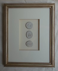
Beautiful framed intaglios, available here:

Unique architectural renderings, available here:
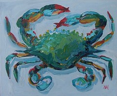
Whimsical original crab and lobster paintings, as seen in House Beautiful, available here:


.webp)


Love this photo. I have a console in my dining room I had the same dilemma with. Like you, sooooo many decor books. I picked the favorites and stacked them up, propped a gilded mirror up on it and against the wall, and also broke up the book stacks with a big cup coral and it's a pretty foxy-looking arrangement, if I do say so myself! I really think the eye needs one perfect arrangement in the room, so that when there are piles of bills or a dog-hair-ed throw on the couch, your design-y self can look across the room and sigh, "Well, at least SOMETHING is perfect in this house." :)
ReplyDeleteIt is a lovely tablescape, I can understand why you were drawn to it. I do agree with Decorno's comments, my apartment is sooo not how I want it to be at the moment, but it makes me feel good to have one perect corner or tabletop to look at to make me remember that someday the rest of it might look just as good.
ReplyDeleteI feel drawn to this arrangement. I'm not a fan of the colors, but the composition is lovely.
ReplyDeletePat
I can completely see why you're drawn to this tablescape--and I'm not a fan of yellow or purple either, but something, just something about the way everything works together makes it beautiful to look at. This would be perfect for your entryway.
ReplyDeleteI love this vignette too. If you're interested in seeing the rest of the house, go to Anne Coyle's site- you can see the rest of her house too (www.annecoyleinteriors.com).
ReplyDeleteI hope it doesn't sound like I'm giving her a plug, but I am a fan of her work :)
PS- Please promise to show us photos once you get your hallway completed!
That really is a stunning photo. I love the color combo together...I think it's the wallpaper that's grabbing me, though. I love the sea fans. Aren't those elegant? Sounds like you're getting a clearer vision of how you want your entry to look...and are pretty darn close to arrival! You are smart to take your time and let the ideas flow to you vs. trying to force a look. Been there, done that, and it's always a mistake. When you finally hit on the perfect combination you will know it!
ReplyDeleteThis would be wonderful for your entry! I like the rounded corners, and the whole composition!
ReplyDeleteIsn't it great to find a perfect inspiration photo? I have one for my dining room and I gaze at it periodically just to keep me inspired with the direction I am going.
Even if it isn't your favorite color scheme. You can work with that!
I like it!
Melissa
Thanks for all of the comments!
ReplyDeletePeak, thank you SO much for letting me know that this is Anne Coyle's work. I had no idea! Her website is divine.
You're right - the more I look at it, the more I like it. At first, it was too busy and loud for me. The table is still too bright, but like you, I like the busy arrangement (everything is soo spare these days, it is almost a shock!) and the wallpaper really is the icing on the cake for me. Love the colour and the pattern. Oh to be so bold.
ReplyDeleteLove the photo . I love the colors. I will not use it but the composition looks gorgeous
ReplyDeleteA beautifully arranged table, the hues of lavender are lovely, and the chandelier being mirrored - very chic.
ReplyDeletehttp://olivia-kroth.blog.de.vu