
Often the difference between good and great design is in the details. I particularly love interesting and whimsical details on chairs.  It can be as simple as a contrasting welt. I love the wedgewood blue contrasted with white. This picture is from Domino Magazine decorating contest; entry by Catherine of Mill Valley, CA.

 Here is the chair the Mrs. Blandings recently recovered. The contrasting welt is beautiful, but what really caught my eye is the nailhead Greek key detail. Beautiful!
 I particularly love contrasting trim on the bottom of a chair. I think it is a beautiful finishing touch. My favorite table too...by Niermann Weeks. Photo by John Umberger.
 Constrasting color on the bottom of the slipcover, picked up in the pillow.
 An amazing chair from Stanford Furniture. I love the trim on the bottom, and the coordinating red welting.
  A fascinating detail on a chair, by Quitana
 A striking chair from Whiteney Stewart.
The details in these chairs makes them so interesting, don't you think?
To visit my store, Quatrefoil Design, click here.
To subscribe to my blog by email, click here.
To follow my blog on Facebook, click here.
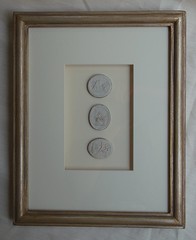
Beautiful framed intaglios, available here:

Unique architectural renderings, available here:
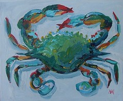
Whimsical original crab and lobster paintings, as seen in House Beautiful, available here:


.jpg)


So many great pieces, but my favorite is the last one!!!
ReplyDelete~Kate
Oh, yes, I agree. Not everyone notices details, or absence of them. Too bad for them! I love all the little buttons, welting, trims, tassels, pleats, stripes, the way the fabric matches at a seam...simple but important details!
ReplyDeleteYes I agree, I think it shows someone with an eye for detail - Melissa is right, not everyone would notice, but those that do will appreciate it. I am a huge fan of contrasting welts (or piping as we call it down under) - it is a little detail but can add so much interest.
ReplyDeleteSuch beautiful images, especially the top two. I love contrasting welts as well (Suzy, we also call it piping here)--the details really do make a difference.
ReplyDeletethe details definitely make all the difference. quality is often seen only when viewed up close.
ReplyDeleteI love the images here, and agree with the others. I think that a designer's creativity can really shine through in the details.
ReplyDeleteThank you for the comments!
ReplyDeleteI took a guess at what the 'trim' was called...I thought it was welts? welting? But piping sounds right. Is it called by both terms?
I'm so flattered that office chair made the group - these are great examples of what detail can do for a piece. Truly, doesn't matter if anyone else notices - as long as you do.
ReplyDeleteI love the Whiteney Stewart chair and it goes perfectly on the carpet it's on. This is my first time to your blog -- what a great find!
ReplyDeleteI like the Quintana chair...that side detailing is so unique and clever!
ReplyDeleteI love all these details . they are lovely
ReplyDeleteI just love the red detail on Patricia's chair!
ReplyDelete