
I love it when a house I have personally visited is featured in a magazine. This doesn’t happen too often, but given that Atlanta is known for its beautiful homes and its nationally known designers, it happens on occasion.
When a representative from Veranda contacted me to see if I was interested in featuring a house that is in the September-October 2012 issue of the magazine, I was very excited to see that it is an Atlanta house that I visited when I was in the early stages of designing my own house. The homeowner is an acquaintance (our children used to go to school together), and the designer himself, Jim Howard, gave me a personal tour back in the fall of 2009. The house made a big impression on me – the architecture (by William T. Baker), the landscape (by LandPlus, whom I had already hired to create my own landscape), and the design are nuanced and beautifully done, and all work together in harmony, perfectly reflecting both the taste and style of the homeowners.
Note: all Veranda watermark photos are by Max Kim-Bee and are used with permission.
Note: all Veranda watermark photos are by Max Kim-Bee and are used with permission.
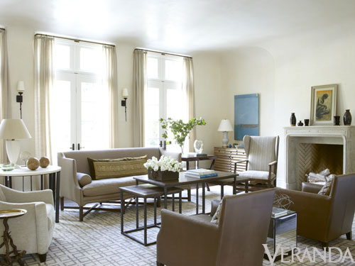
The living room is central to the house, and is a wonderful space both architecturally and from a design perspective. There was very little styling that needed to take place for this photo – this is how the room looks on an every day basis. Note the plaster walls, and the curve where the planes of the wall and ceiling meet. The architectural ornamentation is at a minimum, and the lines are clean and spare – the article in Veranda is titled ‘Simply Belgian’, and notes the Belgian modernism style of the house, and the quietly intriguing interiors that the homeowners requested.
The Dusty Griffith painting to the left of the fireplace caught my eye right away – I would love to have one of his encaustic and mixed media paintings in my library! I have my eye on one of his paintings right now, but have to wait until 2013 to make any more furniture or art purchases, alas.
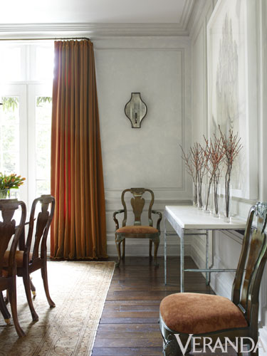
The article only had one small glimpse of the dining room. I seem to recall a fabulous David Iatesta chandelier in this room…
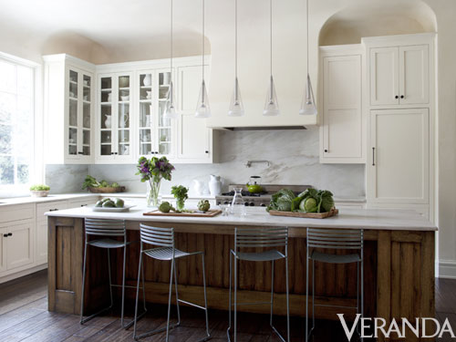
The kitchen as seen in Veranda. The clean lined and and modern style of the kitchen combined with the classic touches of the white marble, white cabinets, and glass front cabinets makes this kitchen a favorite. It was interesting to learn in the article that the stools are from Design Within Reach, and the cabinet hardware from Restoration Hardware.
A head on shot of the kitchen, as seen in Jim Howard’s web site, which shows where the kitchen is located in relation to the living room – the opening to the right of the 27” fridge shows a peek of the living room space. As with many European style houses, the living room is not only a beautiful room, but a passage from one place to another, ensuring that it is used on a daily basis in many different ways.
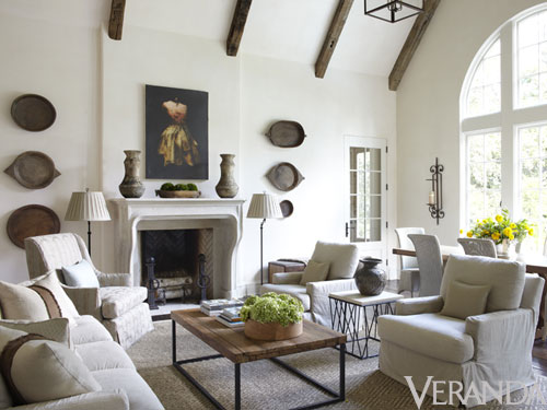
The kitchen is open to the family room and casual dining area. The Veranda feature has a double page spread on this room, which provides a wider view, so make sure to check it out in your copy. This is a space that has definitely evolved since I saw it, with the addition of the Afghan dough bowls that really take the room to a whole new level. If I am not mistaken, that is an original Todd Murphy piece above the fireplace.
Here is a view of the family room as I saw it three years ago. The basics are the same, but the furniture has been rearranged, and the room feels much more complete as seen in the more recent Veranda picture. Seeing this picture makes me appreciate the transformative effect of the Afghan dough bowls on the room, and the fact that a room often becomes more layered over time.
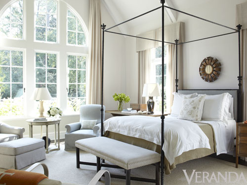
Now, onto my favorite room in the house – the master bedroom. I remember when seeing this room in person, I was truly struck with its beauty. The views are magnificent, the architecture soars, and the design is so nuanced and elegant. This is such a serene space, and is filled with light. The large arched window faces east, and there are two other windows that face north and south, so there is constant light all day, and in the morning the room is truly filled with light. As a morning person, I love an east facing bedroom – as one of my favorite architecture books (A Pattern Language) notes, “give those parts of the house where people sleep an eastern orientation, so that they wake up with the sun and light. This means, typically, that the sleeping area needs to be on the eastern side of the house”.
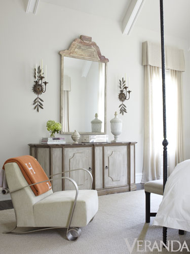
A view of the other side of the bedroom – such a charming vignette, and love that little pop of orange that the Hermes blanket lends to the space.
Since I have been in the house, I knew that this striking powder room from Jim Howard’s portfolio is also from this house. A little peek of a Carolyn Carr painting can be seen in the reflection – in my own house, I have a wall that I am saving for a Carolyn Carr painting. I love her work!
This is a teenage daughter’s room (not pictured in the Veranda article – this is from Jim Howard’s website) – with the endearing and fresh combination of bright orange and pale blue.
When I had the chance to look through all of the beautiful pictures that were part of the article (with photography by Max Kim-Bee), I was surprised that an exterior picture of the front and back were not included. To me, the exterior and the landscape tell an important part of the story of this house. I asked my Veranda contact if any exterior shots were taken, and after he pulled a few strings he was able to get me these exclusive pictures that show both the front and the back.
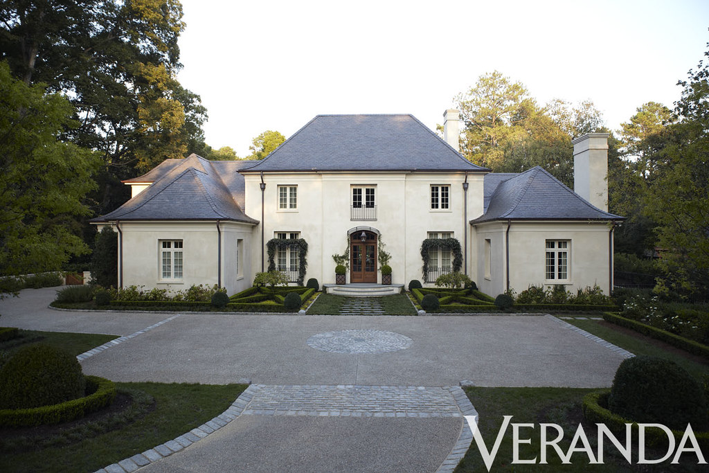
The front of the house is beautiful – the article refers to it as a ‘French style manse’. The mellow stone-like color of the stucco and the steely gray of the slate work beautifully together. One of the front wings is a library, and I seem to recall that the other is a garage. Look at the beautiful landscaping, designed by Alec Michaelides of LandPlus. The relative flatness of the lot (not the norm in Atlanta!) lent itself well to the parterre composed of tightly clipped hedges and boxwoods. I love the creeping vines that grow over the front door and the French doors to the left and right of the front.
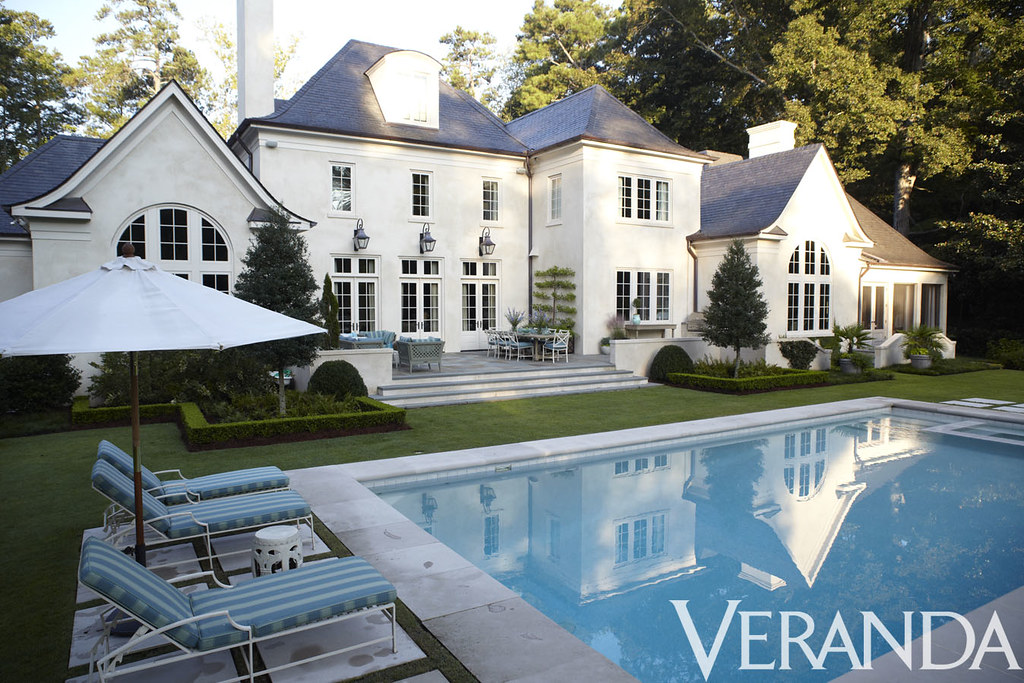
The back of the house is just as beautiful. The three doors in the center are part of the living room; the window to the right (on the main level) is the window over the sink in the kitchen. The large arched window on the right is the family room, and the arched window on the left is the master bedroom. This is truly a beautiful back yard, with the accent colors of the lounge chairs and outdoor furnishings matching the color of the pool perfectly.

Here is a gorgeous picture of the house that is on architectural designer William T. Baker’s website.

I hope you enjoyed this glimpse into a beautiful Jim Howard designed home featured in this month’s Veranda! To read the designer’s perspective on the house and its décor, and to see the other wonderful features in this issue of Veranda, check your local newsstand. It is a great issue! Cote de Texas did an in depth feature on the townhouse by Jane Moore that is featured on the cover of this issue – check it out here. Finally, follow Veranda on facebook here - http://www.facebook.com/VERANDAMagazine – it is a great place for behind the scenes information and more information on current and future features.
What is your favorite aspect of this house? I love everything about it – and seeing the pictures and reading the article makes me remember the way in which I felt when I saw the house in person. The architecture of the spaces, the beautiful light in the house, and the style of the décor - and the way all three of these interact - are hard to put in words or capture in images, but I think that the Veranda article and the photographs by Max Kim-Bee came as close as you can get without actually visiting the house in person!
P.S. - many of you have asked how I came to be asked to feature houses from recent magazine spreads on my blog. I simply commented on posts of others who had featured different articles - and the magazines looked at my blog and thought it might be a good fit for additional features they had coming up - clearly the magazines are reading the comments!
P.S. - many of you have asked how I came to be asked to feature houses from recent magazine spreads on my blog. I simply commented on posts of others who had featured different articles - and the magazines looked at my blog and thought it might be a good fit for additional features they had coming up - clearly the magazines are reading the comments!
◊


Things That Inspire Favorites: Cape Cod Metal Polishing Cloths
Things That Inspire Favorites: Oz Naturals Vitamin C Serum
Things That Inspire Favorites: Thera Breath Oral Rinse

To see my latest blog post, click here.
To subscribe to my blog by email, click here.
To follow my blog on Facebook, click here.
Twitter: @TTIBlog
Instagram: http://instagram.com/ttiblog
Pinterest: http://pinterest.com/ttiblog/
Visit my online store, Quatrefoil Design: www.quatrefoildesign.bigcartel.com
To see design, architecture, art, and decorative books that I recommend, please visit the Things That Inspire Amazon store.
To subscribe to my blog by email, click here.
To follow my blog on Facebook, click here.
Twitter: @TTIBlog
Instagram: http://instagram.com/ttiblog
Pinterest: http://pinterest.com/ttiblog/
Visit my online store, Quatrefoil Design: www.quatrefoildesign.bigcartel.com
To see design, architecture, art, and decorative books that I recommend, please visit the Things That Inspire Amazon store.
















.jpg)


