
I love it when a house I have personally visited is featured in a magazine. This doesn’t happen too often, but given that Atlanta is known for its beautiful homes and its nationally known designers, it happens on occasion.
When a representative from Veranda contacted me to see if I was interested in featuring a house that is in the September-October 2012 issue of the magazine, I was very excited to see that it is an Atlanta house that I visited when I was in the early stages of designing my own house. The homeowner is an acquaintance (our children used to go to school together), and the designer himself, Jim Howard, gave me a personal tour back in the fall of 2009. The house made a big impression on me – the architecture (by William T. Baker), the landscape (by LandPlus, whom I had already hired to create my own landscape), and the design are nuanced and beautifully done, and all work together in harmony, perfectly reflecting both the taste and style of the homeowners.
Note: all Veranda watermark photos are by Max Kim-Bee and are used with permission.
Note: all Veranda watermark photos are by Max Kim-Bee and are used with permission.
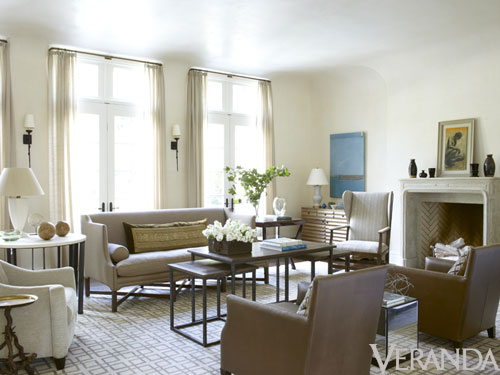
The living room is central to the house, and is a wonderful space both architecturally and from a design perspective. There was very little styling that needed to take place for this photo – this is how the room looks on an every day basis. Note the plaster walls, and the curve where the planes of the wall and ceiling meet. The architectural ornamentation is at a minimum, and the lines are clean and spare – the article in Veranda is titled ‘Simply Belgian’, and notes the Belgian modernism style of the house, and the quietly intriguing interiors that the homeowners requested.
The Dusty Griffith painting to the left of the fireplace caught my eye right away – I would love to have one of his encaustic and mixed media paintings in my library! I have my eye on one of his paintings right now, but have to wait until 2013 to make any more furniture or art purchases, alas.
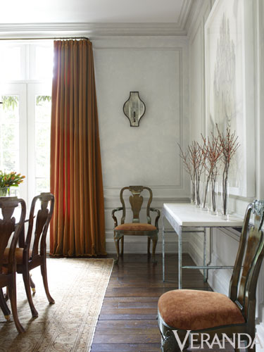
The article only had one small glimpse of the dining room. I seem to recall a fabulous David Iatesta chandelier in this room…
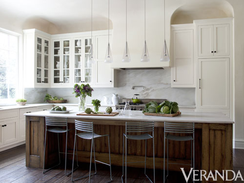
The kitchen as seen in Veranda. The clean lined and and modern style of the kitchen combined with the classic touches of the white marble, white cabinets, and glass front cabinets makes this kitchen a favorite. It was interesting to learn in the article that the stools are from Design Within Reach, and the cabinet hardware from Restoration Hardware.
A head on shot of the kitchen, as seen in Jim Howard’s web site, which shows where the kitchen is located in relation to the living room – the opening to the right of the 27” fridge shows a peek of the living room space. As with many European style houses, the living room is not only a beautiful room, but a passage from one place to another, ensuring that it is used on a daily basis in many different ways.
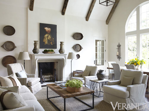
The kitchen is open to the family room and casual dining area. The Veranda feature has a double page spread on this room, which provides a wider view, so make sure to check it out in your copy. This is a space that has definitely evolved since I saw it, with the addition of the Afghan dough bowls that really take the room to a whole new level. If I am not mistaken, that is an original Todd Murphy piece above the fireplace.
Here is a view of the family room as I saw it three years ago. The basics are the same, but the furniture has been rearranged, and the room feels much more complete as seen in the more recent Veranda picture. Seeing this picture makes me appreciate the transformative effect of the Afghan dough bowls on the room, and the fact that a room often becomes more layered over time.
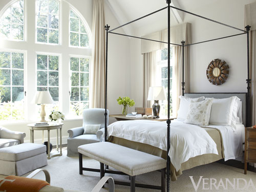
Now, onto my favorite room in the house – the master bedroom. I remember when seeing this room in person, I was truly struck with its beauty. The views are magnificent, the architecture soars, and the design is so nuanced and elegant. This is such a serene space, and is filled with light. The large arched window faces east, and there are two other windows that face north and south, so there is constant light all day, and in the morning the room is truly filled with light. As a morning person, I love an east facing bedroom – as one of my favorite architecture books (A Pattern Language) notes, “give those parts of the house where people sleep an eastern orientation, so that they wake up with the sun and light. This means, typically, that the sleeping area needs to be on the eastern side of the house”.
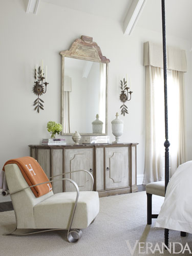
A view of the other side of the bedroom – such a charming vignette, and love that little pop of orange that the Hermes blanket lends to the space.
Since I have been in the house, I knew that this striking powder room from Jim Howard’s portfolio is also from this house. A little peek of a Carolyn Carr painting can be seen in the reflection – in my own house, I have a wall that I am saving for a Carolyn Carr painting. I love her work!
This is a teenage daughter’s room (not pictured in the Veranda article – this is from Jim Howard’s website) – with the endearing and fresh combination of bright orange and pale blue.
When I had the chance to look through all of the beautiful pictures that were part of the article (with photography by Max Kim-Bee), I was surprised that an exterior picture of the front and back were not included. To me, the exterior and the landscape tell an important part of the story of this house. I asked my Veranda contact if any exterior shots were taken, and after he pulled a few strings he was able to get me these exclusive pictures that show both the front and the back.
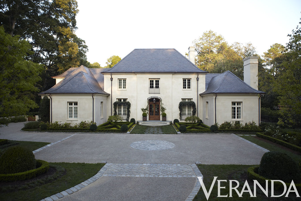
The front of the house is beautiful – the article refers to it as a ‘French style manse’. The mellow stone-like color of the stucco and the steely gray of the slate work beautifully together. One of the front wings is a library, and I seem to recall that the other is a garage. Look at the beautiful landscaping, designed by Alec Michaelides of LandPlus. The relative flatness of the lot (not the norm in Atlanta!) lent itself well to the parterre composed of tightly clipped hedges and boxwoods. I love the creeping vines that grow over the front door and the French doors to the left and right of the front.
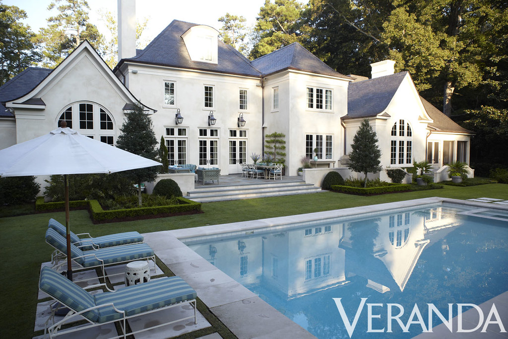
The back of the house is just as beautiful. The three doors in the center are part of the living room; the window to the right (on the main level) is the window over the sink in the kitchen. The large arched window on the right is the family room, and the arched window on the left is the master bedroom. This is truly a beautiful back yard, with the accent colors of the lounge chairs and outdoor furnishings matching the color of the pool perfectly.

Here is a gorgeous picture of the house that is on architectural designer William T. Baker’s website.

I hope you enjoyed this glimpse into a beautiful Jim Howard designed home featured in this month’s Veranda! To read the designer’s perspective on the house and its décor, and to see the other wonderful features in this issue of Veranda, check your local newsstand. It is a great issue! Cote de Texas did an in depth feature on the townhouse by Jane Moore that is featured on the cover of this issue – check it out here. Finally, follow Veranda on facebook here - http://www.facebook.com/VERANDAMagazine – it is a great place for behind the scenes information and more information on current and future features.
What is your favorite aspect of this house? I love everything about it – and seeing the pictures and reading the article makes me remember the way in which I felt when I saw the house in person. The architecture of the spaces, the beautiful light in the house, and the style of the décor - and the way all three of these interact - are hard to put in words or capture in images, but I think that the Veranda article and the photographs by Max Kim-Bee came as close as you can get without actually visiting the house in person!
P.S. - many of you have asked how I came to be asked to feature houses from recent magazine spreads on my blog. I simply commented on posts of others who had featured different articles - and the magazines looked at my blog and thought it might be a good fit for additional features they had coming up - clearly the magazines are reading the comments!
P.S. - many of you have asked how I came to be asked to feature houses from recent magazine spreads on my blog. I simply commented on posts of others who had featured different articles - and the magazines looked at my blog and thought it might be a good fit for additional features they had coming up - clearly the magazines are reading the comments!
◊


Things That Inspire Favorites: Cape Cod Metal Polishing Cloths
Things That Inspire Favorites: Oz Naturals Vitamin C Serum
Things That Inspire Favorites: Thera Breath Oral Rinse

To see my latest blog post, click here.
To subscribe to my blog by email, click here.
To follow my blog on Facebook, click here.
Twitter: @TTIBlog
Instagram: http://instagram.com/ttiblog
Pinterest: http://pinterest.com/ttiblog/
Visit my online store, Quatrefoil Design: www.quatrefoildesign.bigcartel.com
To see design, architecture, art, and decorative books that I recommend, please visit the Things That Inspire Amazon store.


.webp)


Holly, I see so many things about this house I love. The living room is amazing with its vaulted ceiling and beams (very European). I didnt realize what you said about using main spaces as passageway to other rooms. I pulled out our plan and you right! I see that in a few locations. As soon as I saw the outside of this house I fell in love. If you recall looking at our exterior plan; some aspects of this home resemble what Jack Arnold is working on for us. The rear elevation is incredible. I certainly didnt expect that. Have a great day! - Tonya
ReplyDeleteYes, we did the same thing - we have no real hallways in our house with the exception of a transition space to the kitchen, which is sort of a hall but is really part of the living room too. I like walking through rooms to get from one place to another!
Delete- Holly
I love the coved ceilings, especially how they integrate the kitchen cabinets and exhaust! Such a great and simple detail that really makes the house really special and 'tones it down' to an informal level. Just great work all around!
ReplyDeleteI couldn't remember the term 'coved ceilings'. Thank you!
DeleteThe Jim Howard house was by far my favourite house featured in the current issue of Veranda. The houses that he and/or his wife, Phoebe, create are always elegant and livable, never gimmicky like so many of the homes we see featured in magazines now.
ReplyDeleteI especially loves the glimpse of the dining room with the console table he created and the row of vases filled with what look to be ilex berries. Gorgeous!
Thank you so much for showing us the exterior of this house. I, too, was wondering what it looked like.
I always wonder what the outside of a house looks like! I remember reading an article about an Atlanta house in House Beautiful, and using some connections to find out where it was so I could see the exterior (which was not in the magazine).
DeleteI think people always want to see both the interior and the exterior, don't you? Especially when it is a standalone house.
- Holly
i'm crazy about this and will pick up a copy. belgian modernism is def one of my favorites, and the understated spaces just make my heart race.
ReplyDeletethanks for this exclusive glimpse & hope you'll visit soon.
michele
I agree! We furnished the main floor of our house at a fairly minimalistic level, mainly because my husband was tired of spending money after going through 2 years of a house build. However, it gave us the chance to see what we thought of the spaces and how we really used them. We ended up completely changing the original furniture plan for our master bedroom when we realized that we did not want a sofa in our bedroom - we preferred two swiveling comfortable chairs with a large center table and an ottoman, so we could both face the bedroom, as well as turn and face the pretty view outside our bedroom window.
ReplyDeleteWe are doing round 2 of the interior design next year, and I am looking forward to it! I am hoping to buy some great art as well as finish off the kitchen decor and the family room decor. A nice chandelier for the dining room would be good too....the list goes on.
- Holly
Another fabulous preview, Holly! This is an exceptionally elegant and handsome home. The mix of tradional and transitional furnishings is very well done. I love the classic kitchen with the contemporary stools---wonderful touch of modernity!
ReplyDeleteCheers,
Loi
Holly-
ReplyDeleteThis home is stunning, and I love the bedroom and the powder room. The back of the home and the pool is beautiful..
Thank you for sharing your images too.
Teresa
xoxo
Holly, as usual your posts are incredible. This house is so beautiful that it really needs no explanation. Loved seeing it in Veranda but really loved seeing it through your eyes. Thank you so much for sharing your insights with us! There is nothing that takes the place of truly being there and experiencing it all. Hope to see you soon if you are still coming in town!
ReplyDeleteAfter reading your post i have found that your post is really amazing interesting and informative also keep posting that kind of posts.
ReplyDeleteWhat an amazing Home!!! I want to move in on the day :)
ReplyDeletelove K
Wow! Love this.
ReplyDeleteDonna T.
very beautiful post, xoxox, LETA
ReplyDeleteLovely piece! Interesting issue with such a variety of features. How fortuitous that you had seen the project in progress. I love your addition of that fabulous powder room! And of course, the orange and blue in the daughter's bedroom is right up my alley!!
ReplyDeleteGorgeous! I disagree about having bedrooms on the Eastern side, though. I cannot sleep if there is any light and during the summer, I wake up at the crack of dawn, no matter how many draperies and eye masks I use. I guess it depends on your nature, but I really don't want to wake up at 5:30!
ReplyDelete'A Pattern Language' does note that this is one of their more disagreed upon principles! My bedroom faces east, but we have a super thick blackout lining in our curtains, so the room is very dark even when the sun rises. However, I recall that the owners of this Veranda house said that they usually keep the curtains open all of the time because they like to wake with the sun!
Delete- Holly
What a beautiful house! I especially like the rear elevation!
ReplyDeleteWhat a beautiful house! I especially like the rear elevation!
ReplyDeleteWhat an enjoyable post! Thanks for the beautiful pictures and your thoughtful commentary.
ReplyDeleteThe first photo in this post shows a Gregorius Pineo cocktail table that I have been in love with ever since one of our DreamHome designers used it in his room last year at the DC Design Center -- it's so great to see it used in a real residence. Suffering now from serious coffee table envy now!
ReplyDeleteThanks, I love to have furniture identified!
DeleteThere is a Gregorius Pineo dining table in our local Jerry Pair showroom that I seriously love - I visit it so often just to admire it!
- Holly
A gorgeous house!! And oh yes definitely Belgian inspired!! Love it!!!
ReplyDeletexx
Greet
Wonderful and informative post. I love seeing the family room additions and information on artwork and artists! Thanks for sharing!
ReplyDeleteI've been studying the pictures of this project in Veranda very carefully. So much to take in... In the living room - how the the drapery rods return to the wall, echoing the plaster detail at the ceiling for example. The paneling details in the dining room feel so very French.... Love the modesty and honesty of the of the kitchen details. I would love to know whether the table lamps are the only source of lighting in the mater bedroom. It is such elegant space. The house is masterfully and so subtly detailed and decorated. Brilliant!
ReplyDeleteThoroughly enjoyed reading your memories of your tour. They so helped flesh out my impressions of the home. So many people are in a rush to get it all done now. It's nice to read/hear that there are others who have the patience to slow down and listen to what the house is telling them.
Cheers,
John
When I saw the master bedroom, there was a Bobo Intriguing Objects wine barrel chandelier, which was specifically a request of the client. Maybe the angle of the photographs did not show it? Or it has been removed?
DeleteThe angle doesn't show it.
DeleteOff to look one up...
Cheers,
John
This was my favorite room featured in this months Veranda. I was thrilled to get to see more photos & I agree with you that the exterior is just as important...this one did not disappoint! I'm hoping to find the perfect color to repaint my stucco exterior to give it a similar feel. Thanks for posting
ReplyDeleteHeidi
From the drive up, to that fabulous family room....love every detail. What a top notch group of designers + architect!!! Can't wait to get my Veranda and explore each page in detail.
ReplyDeleteThanks for the preview!!!
xoxo Elizabeth
Thank you Holly and Veranda for featuring another Benecki Homes house. We really enjoyed building this one and the whole team, Bill Baker, Jim Howard and LandPlus, were great to work with. I know the lot looks flat now, but it wasn't so flat when we bought the lot and started construction.
ReplyDeleteVern
I have my copy of the Veranda Oct. issue and just love it!! So glad to see you featured it thank you Things that Inspire. -Monica
ReplyDeleteI was so excited when I got my new Veranda to pour over every image of this gorgeous home...perfection!!
ReplyDelete