
In late November, I wrote about the Atlanta Homes & Lifestyles Home for the Holidays, but only showed a few vignettes. As I was perusing the real estate listings last weekend, I noticed that the house is now on the market, and thought it would be interesting to take a look at the house empty – which enables the pure architecture to shine through – as well as decorated for the showhouse. It is amazing to me how a room can be transformed by décor – and how an empty room can be a source of fresh inspiration.
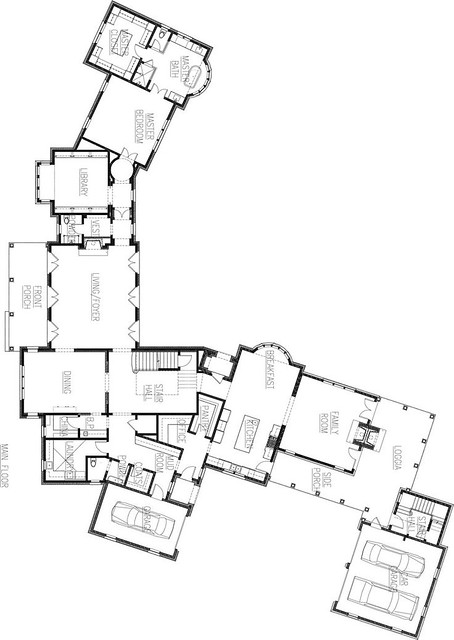
Here is a floor plan of the main floor, which might help orient you through this post. The house was custom designed by Harrison Design Associates specifically for the lot, which is a corner lot that is located in a prime area of Buckhead. The house is (for the most part) one room deep, which gives every room great light.
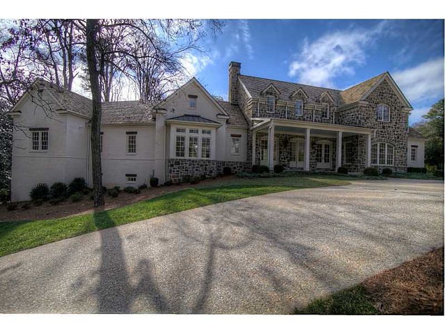
An expansive view of the front elevation is seen on the real estate listing. The house exterior materials are field stone and painted brick.
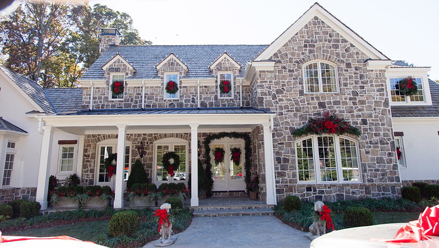
Here is a picture of the exterior, taken during the show house. Photo credit Kate Byars Photography.
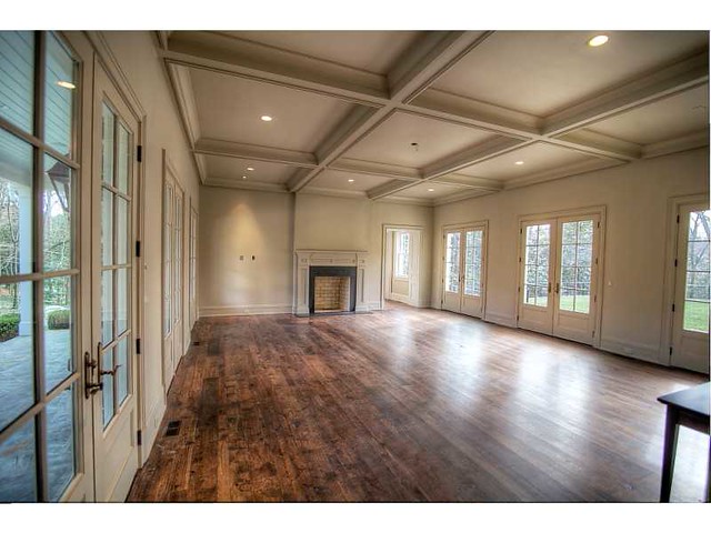
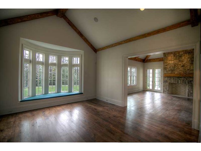
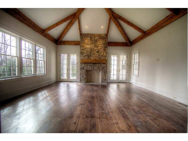
The entry opens into the living room, which features coffered ceilings and French doors all along the back. The cased opening to the right of the fireplace leads to the master bedroom wing, which includes the library. Source.
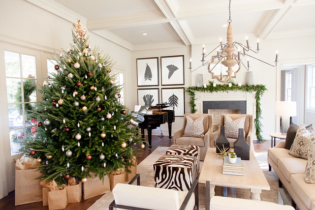
Here is the living room as it appeared during the show house. The living room was decorated by Jimmy Stanton, Stanton Home Furnishings. It’s interesting how the designer chose not to arrange the seating around the fireplace – I didn’t notice that when I walked through the show house! The piano is the perfect touch for this room. Photo credit Kate Byars Photography.
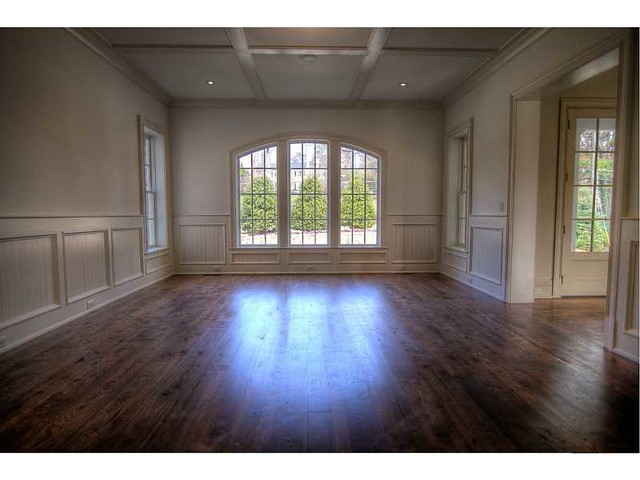
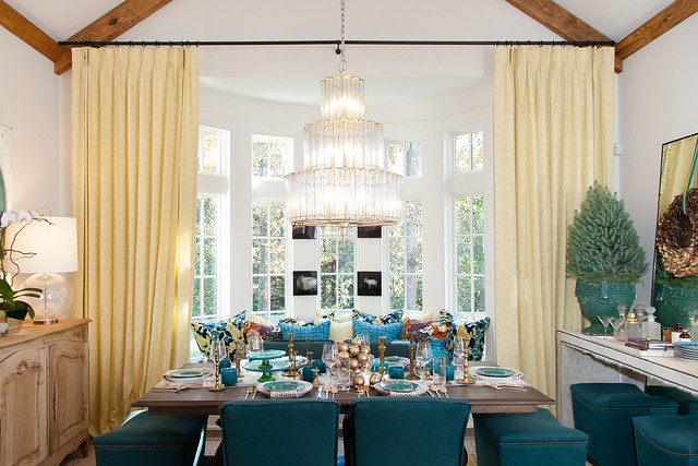
When I saw this picture from the real estate listing, I couldn’t figure out which room it was until I identified the view from the window! It’s the dining room, located immediately to the right of the front door. Source.
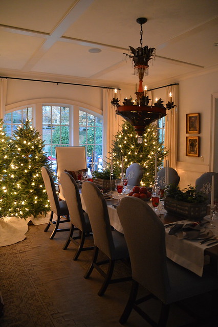
The room was completely transformed by Barbara Westbrook Interiors. I took this picture with my iphone when touring the house.
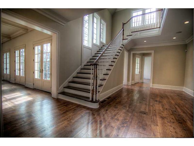
The stair hall is located at the heart of the house, and is the transition point between the wings of the house. Source.
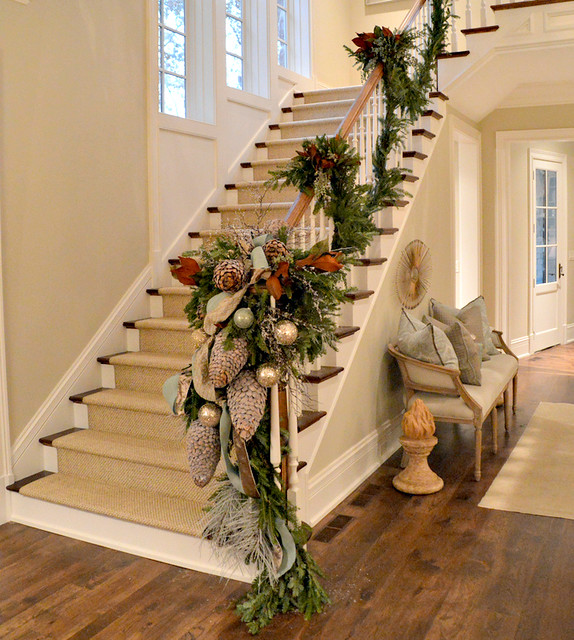
As decorated by Courtney Giles Interiors. My photo.
I didn’t get a picture from the same perspective of the real estate listing, but this is my own photo of the stair hall taken from the stairs.
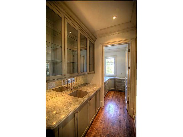
A bar connects to the dining room and the back hall, and on the other side is a small china storage pantry. Source.
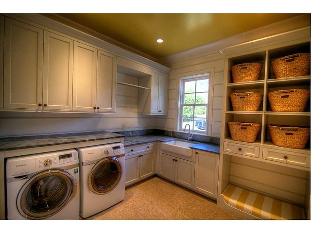
The laundry room, as shown in the real estate listing. The floor is made of cork rounds, which are resilient, mold resistant, and easy on the feet. Source.
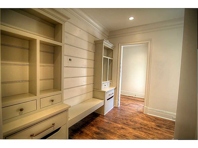
The mud room, as seen in the real estate listing. Source.
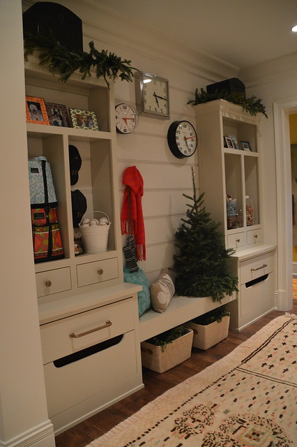
My own picture of the mud room, which was created by Insidesign.
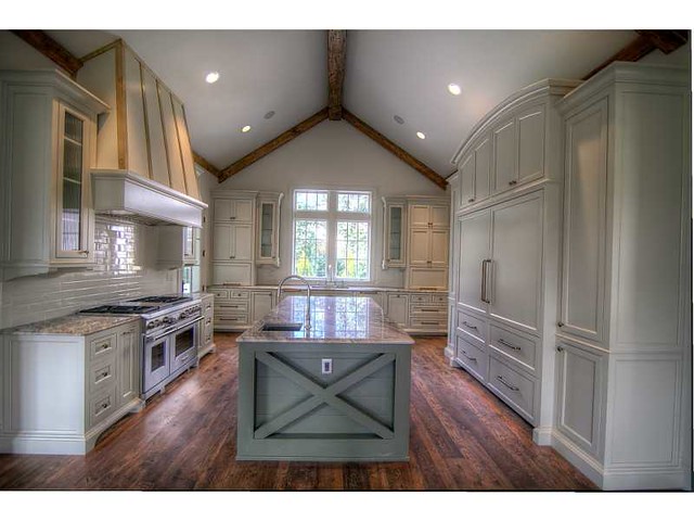
Many people asked what the kitchen looked like, as I did not include a photo in my blog post. Here it is! I love the ‘x’ design on the island.Source.
On the other side of the kitchen is the breakfast room. The kitchen and breakfast room are separate from but open to the family room. Source.
Here is the breakfast room as decorated by Paige Sumblin Schnell & Anna Kay Porch, Tracery Interiors. Photo credit Kate Byars Photography.
A view of the family room. The two doors on either side of the fireplace lead to the covered porch. Source.
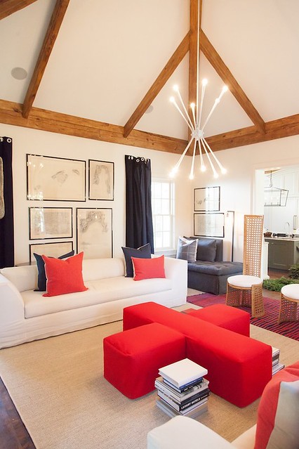
The family room as it appeared in the show house (taken from a different angle in the room), by Kay Douglass & Dixie Peeples, Kay Douglass Interiors/South of Market. Photo credit Kate Byars Photography.
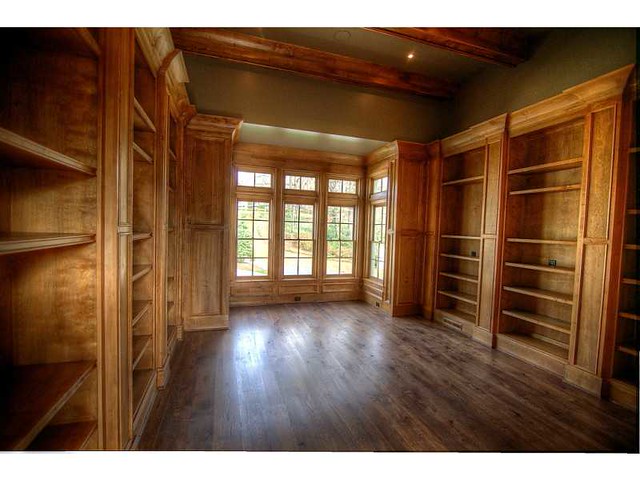
Now back to the master wing. This is the library. Source.
![10967973053_4e626d3758_z[1]](https://blogger.googleusercontent.com/img/b/R29vZ2xl/AVvXsEgXGd_KgCQZ9lsJOvLXe3V0fHp5vAm8nJX44xAOyj-ilRyjyzyKqJE5St6z2MN4pLpXlwcIUDlMdZi2IxU7HlIoC1a-UESxzxhLeBr7hyphenhyphenTv2CfJ5RtHHdzQXPjANRhKMmMxi81lqOQ8Gz8/s1600-h/10967973053_4e626d3758_z13.jpg "10967973053_4e626d3758_z[1]")
The library as it appeared during the show house, by William Peace, Peace Design. Photo credit Kate Byars Photography.
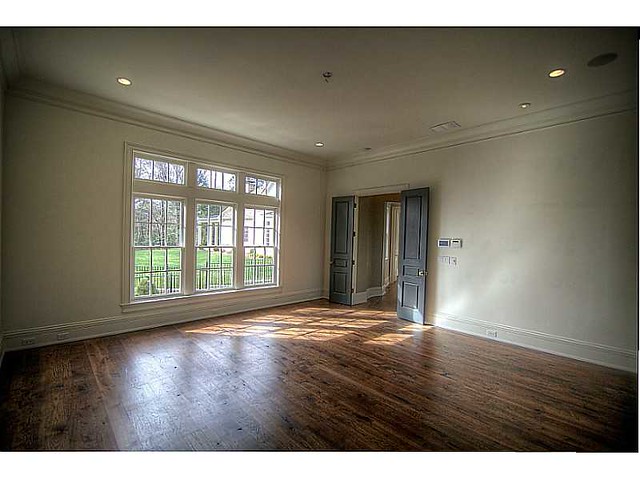
The master bedroom. Source.
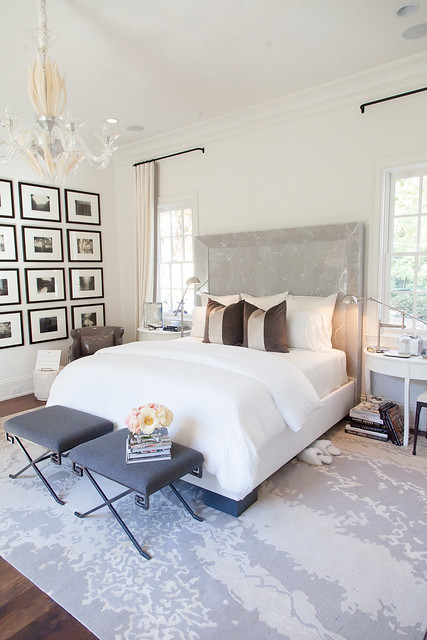
The master bedroom decorated by Wolf Design Group. Photo credit Kate Byars Photography.
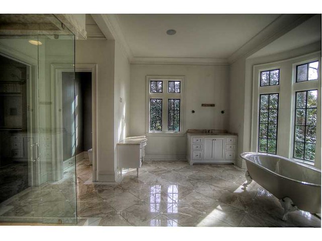
The master bathroom. I love how the mullions on the window are painted dark. Source.
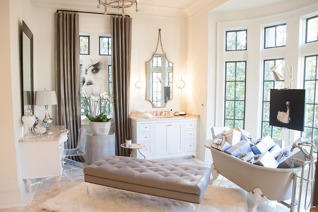
The master bath decorated by Kelly Wolf Anthony, Wolf Design Group/Anthony Wolf Collection. Photo credit Kate Byars Photography.
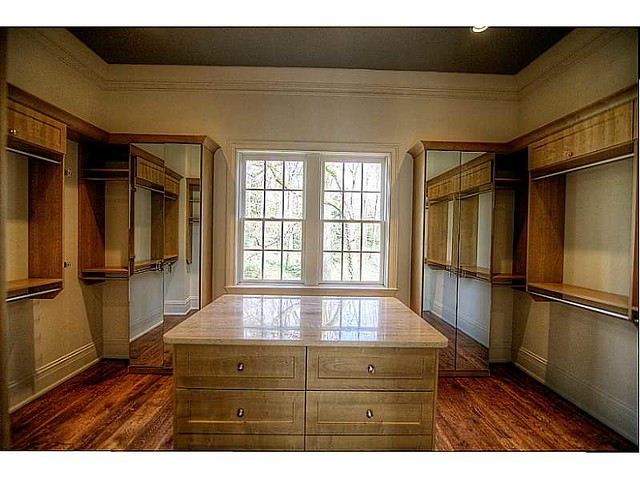
The master closet, as seen in the real estate listing. Source.
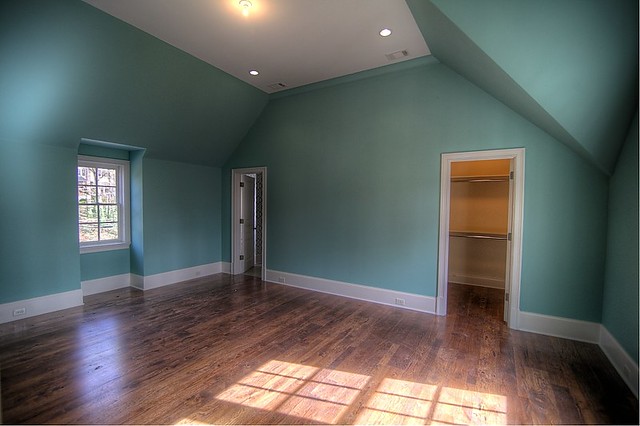
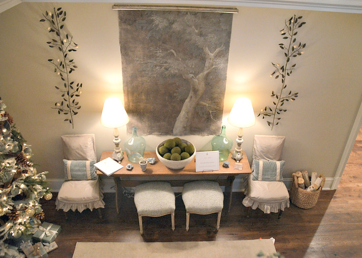
The lovely shade of blue on the walls hints at how this room (a guest suite) was decorated for the showhouse.
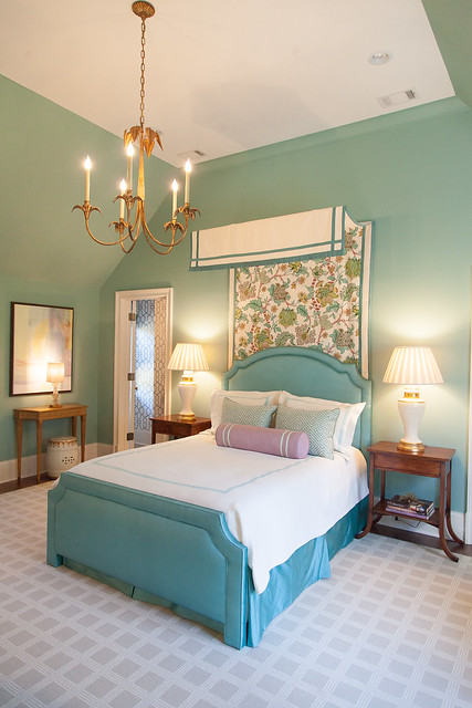
The guest suite by Huff Dewberry.
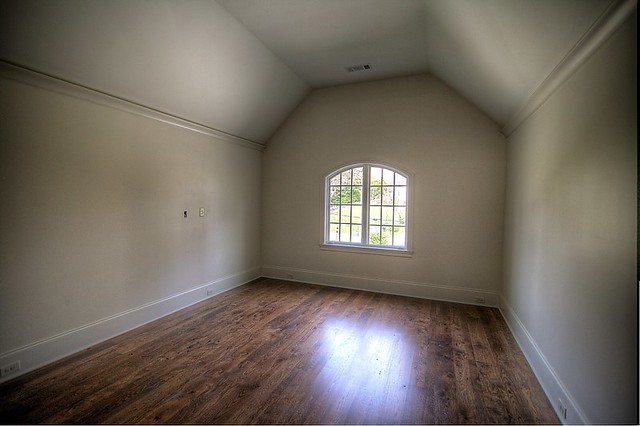
Another bedroom upstairs.
.jpg)
This is how the bedroom looked during the show house, as designed by Musso Design Group . It’s interesting having seen the room empty – I never would have thought about placing the bed in front of the window, but I wouldn’t change a thing about this room. Photo credit Kate Byars Photography.
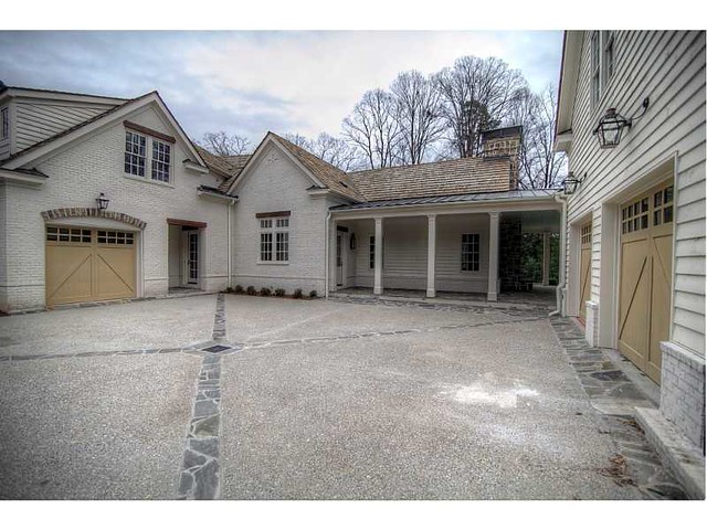
The parking court, as seen in the real estate listing. I didn’t notice this space during the show house – I am wondering if there might have been a tent here?
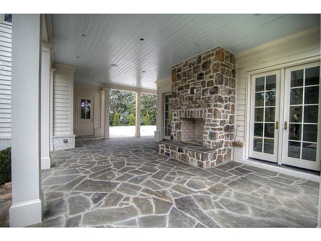
The back porch, as seen in the real estate listing. The covered walkway leads to the kitchen; the door to the right and left of the fireplace lead to the family room. This would be an excellent entertaining space for Atlanta’s mild fall and spring seasons.
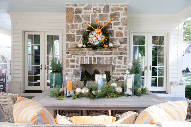
The back porch as decorated during the showhouse, by Steve McKenzie, Steve McKenzie’s. Photo credit Kate Byars Photography.
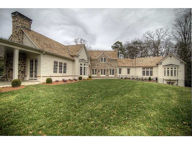
The back of the house, as seen in the real estate listing. The back yard is full of possibilities – it could be landscaped for a garden, or there is plenty of room for a pool.
So, what do you think? Do you have a favorite room? It’s interesting to see the bare rooms and then see how the designers transformed them for the show house. I have always been a big believer in the power of interior design for transforming a space, but rarely do I get to see the before and after in a new space like this. I wonder how the new owners will transform the house once again?
For more information on this house, which is currently on for sale, please visit the listing by clicking here.
To comment on this post, click here.
To comment on this post, click here.
To subscribe to my blog by email, click here.
To follow my blog on Facebook, click here.
Twitter: @TTIBlog
Instagram: http://instagram.com/ttiblog
Pinterest: http://pinterest.com/ttiblog/
Visit my online store, Quatrefoil Design: www.quatrefoildesign.bigcartel.com
To see design, architecture, art, and decorative books that I recommend, please visit the Things That Inspire Amazon store.


.webp)


Gorgeous
ReplyDeleteHi Holly,
ReplyDeleteHave followed your blog for a few years and love it. Wondered if you already knew that this house is a recreation of a Harrison Design Associates plan for the Southern Accents Showhouse 2005 in McLean VA. It's very close by to my home and I've patterned a number of things in my own house after it. David Mitchell was the designer. Interesting to see the rooms decorated completely differently for the Atlanta Showhouse. Here's the link to some slides. http://www.myhomeideas.com/decorating/design-ideas/old-dominion-showhouse-10000001135782/ Thanks for the post!
Hi, Holly. Great post! Love how you tried to use same angles of shots when possible for a real sense of the dramatic difference with the design choices. I think that upstairs bedroom was not Barbara Westbrook, but Bill Musso's team including Todd Falconbury.
ReplyDeleteThanks, I think you are right! I was wondering why Westbrook had designed two spaces. I will update post.
ReplyDeleteI am not as crazy about the exterior but feel there are some beautiful spaces inside. It looks really large and roomy and welcoming, I like the materials used as well. Thanks for sharing Holly.
ReplyDeleteI am keeping this post forever...I loved how you showed decorated then not decorated. So many of the rooms threw me for a loop and I had to look twice to make sure it was the same room just empty. BRAVO!!! Beautiful house...wish it was mine!!
ReplyDeleteVery interesting post, thanks so much. Great to see the floorplan and the "before and after" photos.
ReplyDeletei too was not thrilled by the front exterior, or the empty rooms. but was blown away by the interior and back porch decor! and the photos are a true testament to good photography. the guest room made my jaw drop.
ReplyDeleteWhat a fun post! I love seeing the empty rooms and then the designer's creative takes on the space. My favorite has to be that second guest bedroom by Musso Design. Amazing what those fabric panels did for the bed - a fabulous focal point. Too good. M.
ReplyDeleteThe house looks so much better empty - except for the last bedroom photo.
ReplyDeleteThe inside is quite nice, but as for the detail on the outside, the mortar between the stone should be much darker. When I first clicked on the email and saw that house my first impression was that the stonework looked extremely disjointed and very busy. It would look much more cohesive if the mortar were a lighter value of the stone.........
ReplyDeleteAnonymous at January 14, 2014 at 9:30 AM, I was thinking the same thing! When I saw the floor plan, I immediately thought of the Southern Accents McLean Show House. While these rooms are very nice, I like David's rooms better. Granted, he had about a year to execute it. The dining room with the hand painted walls by Sheppard Bear of Fine Art Finishes is still one of my all time favorite rooms.
ReplyDeleteI love the empty rooms without someone else's furnishing - we seldom see completely empty houses because when you view a house it is generally lived in & it is barely vacated when the moving in boxes arrive.
ReplyDeleteI love the flooring & the study is just so beautiful as an empty room with lovely wooden details.
Thank you for taking time to do the photos from the same angle as it really helps to appreciate the house.
Happy New Years Holly! A gorgeous home!
ReplyDeletexoxo
Karena
Kansas City Culture
Lovely home. I think it needs to be staged for prospects to be able to comprehend how to fill these large rooms ( I am a Realtor ... just from experience on larger homes )....This post is really great to see the differences. A smaller home... I can see the "blank slate" better... ..
ReplyDeleteI would love to decorate this place.
ReplyDeleteUnlimited budget, really nice clients, and free rein.
Heaven.
Holly-
ReplyDeleteIt is amazing to me how so many designers, with such difference style, can create a home that comes together! I love this home. The floors are perfect too.
Thank you for sharing. Someone will be a lucky homeowner.
Teresa
Love this house! It's amazing - thank you for sharing!
ReplyDeleteI just found you and I can't believe I haven't been here before. What a post -- this house is amazing, and I have to say one of my favorite things about it is the wood and the finish on the floors. It does wonders to make this large house warm and cozier.
ReplyDelete