
A few months ago, I posted about interesting windows, and how interesting windows add so much character to a home.
Here is a view of one of the interesting windows in the new house...this is the same space seen from the inside out in my 'View of the chimney pots' post.
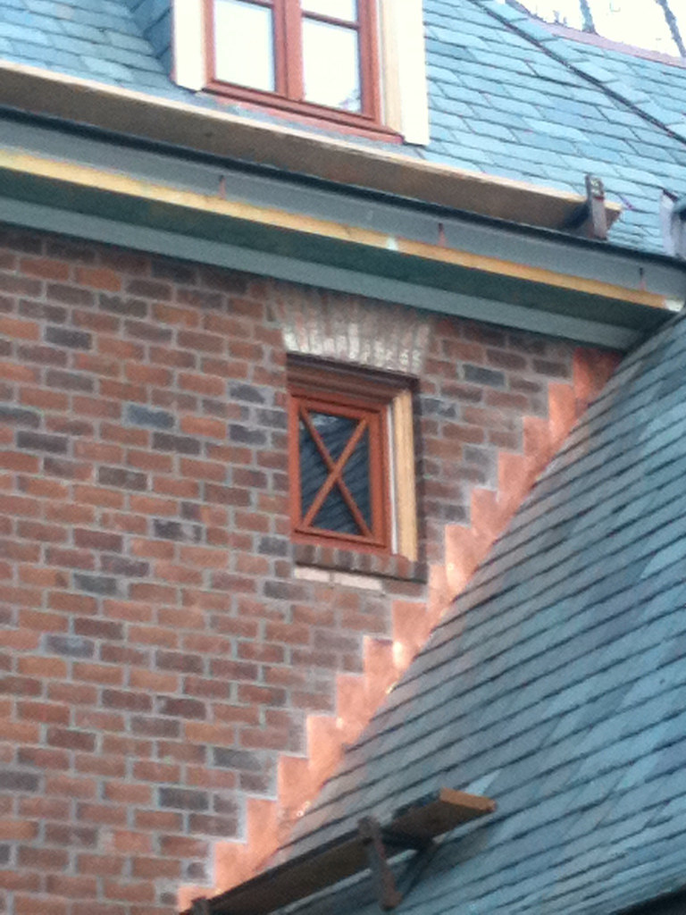
Things are really starting to come together now that the windows are in! We are working on the paint color for the brick - the color we were considering, Sherwin Williams 'wool skein', is looking a bit too buttery/tan leaning for the house (although it is a beautiful shade), so we are testing out different neutrals from Benjamin Moore. If you have any suggestions, I would love to hear them!

On another note, there are six original Melissa Tubbs bird drawings in the Quatrefoil Design store. They are original ink drawings, one of a kind, and are signed by the artist. They would look wonderful grouped together, but are sold individually. Melissa's drawings are in high demand, so it is rare that I have them in the store - they are so beautiful!

Eastern meadowlark custom framed, $325, outside measurement of the frame is 9 3/4" x 9 7/8".

Robin custom framed, $325, outside measurement of the frame is 9 3/4" x 9 7/8".

Berwick wren custom framed, $325, outside measurement of the frame is 9 3/4" x 9 7/8".

Hummingbird custom framed, $325, outside measurement of the frame is 9 3/4" x 9 7/8".

Steer's Jay custom framed, $325, outside measurement of the frame is 9 3/4" x 9 7/8".

Warbler custom framed, $325, outside measurement of the frame is 9 3/4" x 9 7/8".
To visit my store, Quatrefoil Design, click here – come see the brand new art and scupture items in the store!
To subscribe to my blog by email, click here.
To follow my blog on Facebook, click here.
Twitter: @TTIBlog
To see design, architecture, art, and decorative books that I recommend, please visit the Things That Inspire Amazon store.


.webp)


Love the charm...can't wait to see it finished!! Beautiful drawings...
ReplyDeleteIn choosing a color to paint the brick, you cannot go wrong with duplicating a hue of stone or clay. In other terms, the color could range from almost white to dusty peach to sand to coffee to charcoal. Also, you might consider a wash, absorbent enough to prevent flaking. Repainting would not be required unless an enrichment of color was eventually desired.
ReplyDeleteThanks for the comments!
ReplyDeleteWool skein was actually a candidate because it is a lighter version of relaxed khaki, which is a great match for the leuders limestone we are using on the door surround. I think it leans towards tan, and I prefer for the paint to lean towards taupe in the limestone, so we are picking some new candidates.
We are more than likely (although not 100% sure) going to use San Marco's mineral paint, which is often used in limewashes in a diluted wash. We would use it full strength. It bonds with the brick, but allows the brick to breathe, and does not chip or flake. As you menioned, DC, it does not need to be repainted unless there is a desire to enrich the color. It has a chalky look, which is more like stucco.
I though you'd decided. I like DC's idea of the wash but wonder if it will cover.
ReplyDeleteIMHO our painted brick looks better with every chip, nick, and stain.
The wren is irresistible, my favorite bird.
One of my all time favorite neutrals is Pratt & Lambert Lambswool. No yellow to it at all, it is rich, creamy, and soothing. We had it throughout our last home and I never grew tiered of it. If the limestone surrounds you are using have a grey cast to them then it may just be the perfect selection.
ReplyDeleteGlad the windows are going in!!! Love the bird prints....I found that interesting as my client that I have been working with for the last year,as her new house gets its finishing touches owns about six large prints all of hummingbirds in color... We are planning to use throughout the house...... Maryanne ;)
ReplyDeleteOne of my favorites is Manchester Tan. I just used it in a family room with belgian linen sofa in natural flax. It's like coffee with lots of cream. Looking forward to seeing what you pick!
ReplyDeleteTake a look at B Moore Pashmina or Taos Taupe. Both fabulous colors leaning towards grey. I have used both with fabulous effect!!
ReplyDeleteI hope you'll take this as the compliment I intend it to be, but your "new" house looks like it has been there forever! Love that darling little window.
ReplyDeleteOh Holly the Warbler is wonderful!!
ReplyDeleteI have always love painted, then sandblasted brick...
xoxo
Karena
Art by Karena
If the relaxed khaki is the perfect shade, could you do it in a diluted strength like 50 or 75 percent? I have done this several times when the color was the perfect shade/undertone but too dark. The paint store should be able to mix it in several strengths for you to test :)
ReplyDeleteI second the Lambswool mention. I also used it throughout my house and have recommended it often. It's the perfect tan/gray balance - in my humble opinion! I also just painted another room Edgecomb Gray - BM - and I love it. It's a warm gray and blends beautifully with the Lambswool in the adjoining rooms. It's so fresh. Keep us posted!
ReplyDeleteLove the little window. We budgeted a huge amount for the windows in our last house which were all custom made. They made an enormous difference, especially all the little quirky ones. Drawings are lovely as well.
ReplyDeleteThanks for this article. My house has an interesting oval window, in both the shower and the toilet room. I love this window. It took a lot of thought and experimentation to come up with a good way to frame the window with the new tile. I am very happy with the way out.
ReplyDeletelandscape contractors
We recently painted our brick using Benjamin Moore's Grant Beige and love it.
ReplyDeleteGreat bird drawings. I love that little window. Charming!
ReplyDeleteLove to see a project in progress. Thanks for sharing-
ReplyDeleteI have painted brick and we painted it Greenbrier Beige (HC-79) by benjamin moore. Inside, I used Manchester Tan and I love it. Of course, it may look totally different in your house! I like it because it was so neutral, not too yellow, not too tan. I use manchester tan in the smaller rooms and 1 shade darker (bleeker beige) in the larger areas. I'm happy with it. You actually can't tell there are two different colors because the darker one looks so light in the big rooms. Thanks!
ReplyDeleteThat first window is pretty cool. It may take someone experienced in home building to really appreciate the workmanship of the brickwork above the window which, given the fleck of white in the bricks adds an awesome effect. Very cool!
ReplyDelete