
For more inspirational finds, please visit www.quatrefoildesign.com
Earlier this month, I wrote a post on wall mounted faucets. What is on my mind this week are sinks that are on walls (which often have wall mounted faucets!). Most of my pictures from the wall mounted faucet post were from powder rooms; in a kitchen, it is far more common to place a sink under a window or on an island, both for the view and to achieve some open space over the faucet.
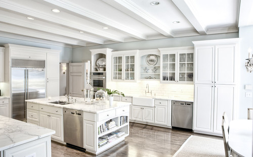
In my new kitchen, we are going to have two sinks: one on the kitchen island, which will have a nice view across the kitchen to a wall of windows, and will be used for prep and pot washing (because it will be across from the range, and convenient to the fridge). For a variety of reasons, we will also have a sink that is on a wall, and this sink will be used mainly for clean up; we have started calling it the ‘scullery sink’. It will be convenient to the kitchen table, for easy dish clearing and washing.
At our last architecture and design meeting, we talked about how to handle the cabinets that will be over the wall sink. These will be the only overhead cabinets in the kitchen, so they are important. Luckily, I had already started saving images for this post, so I was very prepared and could visualize the options!

This is one of my favorite pictures of a sink on a wall. I love the glass front cabinets and how the back of the cabinets are painted in a contrasting color. Note how the cabinet above the sink is raised to allow more ‘breathing room’ for the faucet. Image via House Beautiful.
![image42_thumb[1]](https://blogger.googleusercontent.com/img/b/R29vZ2xl/AVvXsEjzNrG4aWuiyx81hfuhmNyrQ5zGClC3RmXSXoC9oS4ngUQOT81iWZRrrzs5Kgd4xmUJGqxE8pJQYiE3ZDXJfuAjvSfC0P0uNa8GXegiNQnvix2UKZi9gb6V7B2qWFVd8cAXamq6R7YfCno/s1600-h/image42_thumb11.png "image42_thumb[1]")
I really like a stone cut-out above a sink if it is on a wall. Given the small closed space in this area, the place above the sink has somewhat limited use, with only room for a few shelves and display cabinets. Image via Cote de Texas.
![image45_thumb[1]](https://blogger.googleusercontent.com/img/b/R29vZ2xl/AVvXsEi2KCShLjKYG9O31LsfC9Az1wIf5v4TUtLYgE2clEaCEJivILB2tzNAoq7zDkjuApMVJqYigaqL6MJE45MdJEIVfH0lIt-tQXvzmVSJqVXqReY-acctsV1Oj85XidSGnvLjA_MIOoH08vg/s1600-h/image45_thumb11.png "image45_thumb[1]")
Another sink on a wall, this time with a wall mounted faucet. There is some nice open shelving above the sink, and the back is painted in a contrasting color. I wish I could see the whole wall (see update below)! Via Cote de Texas.

Revised: Two wonderful readers emailed me links to the entire kitchen - and it is beautiful. This is actually quite similar to the layout that we are thinking about for our plan, but our kitchen will be wider - there will be two floor to ceiling hutch like cabinets on either side of the windows. One will house the microwave and other items, the other will be the dish cabinet.
![The%2BQuatrefoil%2B-%2BDavid%2BDuncan%2BLivingston%2B2[1]](https://blogger.googleusercontent.com/img/b/R29vZ2xl/AVvXsEgdQPebH7vvImI2d5LQc0FbbLfk8Imbwn3aoFCZ6ni6MUCBIlCnZ7feiu6-QetUtNQfGs5c9E_zExjpp2H5MFsigwAR4eMY8qjtqNNaGK6QG8JGfdCjRoB5AWCr-C3lo-hxPBuc0teOUzM/s1600-h/The+Quatrefoil+-+David+Duncan+Livingston+2%5B1%5D%5B3%5D.jpg "The%2BQuatrefoil%2B-%2BDavid%2BDuncan%2BLivingston%2B2[1]")
I was really struck by this kitchen when I first saw it on Limestone & Boxwoods, in part because of the unique window over the sink on the wall. It is an interesting way to treat the space – to use an interior window. I am not sure how I feel about it, though. What do you think?
![bh03a[1]](https://blogger.googleusercontent.com/img/b/R29vZ2xl/AVvXsEjeGjMfWuIm-OTgRVzYvBopfpR4VnyBOHA9zlrs8bGxvxJQedU2tKJGjphaYkaU59T5DljixNBiyn3efRUtQpOWyDN9Wuz3nap6HvZqb7Y1ckhXYkJ23Gi_BnvR5VbqmfQr05K0TstEDUs/s1600-h/bh03a11.png "bh03a[1]")
This great kitchen, by Bear-Hill Interiors, uses open shelving above the sink on the wall. To me, this works because it relieves the heaviness of a cabinet above the sink, and is also practical because there is not a solid mass to bump your head on (which could be a problem with a cabinet over the sink). Also, it appears as if the shelves are high – higher than the standard 18” above the counter which is typical for cabinets. I truly appreciate the style of this kitchen, but I am not a fan of open shelving for myself.
![4528247475_6e967f0fd6_o[1]](https://blogger.googleusercontent.com/img/b/R29vZ2xl/AVvXsEj8Qi6RTTU0BCL5E4LoUXYg2Z5z3bQjI1HNFFT6_lYlV8ZTpBjnZliFY2-hxsfmXH-inpIhYnuUR_0wkTmiRHewWIYBMlL_MzKGFTPbjbWYJ1f_3obRWdBmWdi1ezwKHbAC8s5Ggm-X3kM/s1600-h/4528247475_6e967f0fd6_o%5B1%5D%5B1%5D.png "4528247475_6e967f0fd6_o[1]")
Another beautiful kitchen by Bear-Hill Interiors employs both open shelving as well as a bump up for the area above the sink. I actually really like the idea of cookbooks in this area.
![2407691310_af747e47ea_o[1]](https://blogger.googleusercontent.com/img/b/R29vZ2xl/AVvXsEjGBiWDgY7wYcnhSkNJ3ZgbIddz_LRnow__4zgvf9eKTC7TmrMYBKgr9_nzHMqLkoiCLwlGuc3L47hvkZQ5Z5wRgU9Pj74EkrjQ6ACBUpitsQLBwBLRcmaCXiAHtJn_CzrqrEE0YhCqSrg/s1600-h/2407691310_af747e47ea_o1.jpg "2407691310_af747e47ea_o[1]")
I am not sure where I got this kitchen picture (maybe a real estate listing?), but it is interesting to see how the sink wall was handled. The shelf on the sink is not exactly on the same plane as the side cabinets, but close; it is not as deep, which removes the issue with bumping the head. I am not sure how I feel about display shelves, though.
![image_thumb1111[1]](https://blogger.googleusercontent.com/img/b/R29vZ2xl/AVvXsEjhuICGxHO-cy3YWpXhdD-jcj8xlZdPPm_2u2ykDcxKPis-8CmdEyw-4rXmC0-HC6Czdqh4YDBE2x6b405r-WQFunMxq2_83RDseajdEd0K_UTMSDupjFQUzrXscXoEXVwVuWJWxTR4qUQ/s1600-h/image_thumb1111%5B1%5D%5B1%5D.png "image_thumb1111[1]")
This picture is very well known in the blog world, but did you ever notice that there is a sink on the wall? I remembered the plate rack on the wall, but did not notice that there was a sink there too until I went back and scrutinized the picture. Image via Cote de Texas.
Revised: I had to add this picture, from the new post from This Photographer's Life on a historic Neel Reid house. Photo credit: Blayne Beacham. Click here to see more pictures of the incredible house! I really like how this sink is handled on the wall of the kitchen. It doesn't feel crowded, perhaps because of the light colors and the expanse of space on the wall.
![HomesRooms-BraysIsland-10-lg[1]](https://blogger.googleusercontent.com/img/b/R29vZ2xl/AVvXsEhaXgTMVZFwCCGIzIQ_7stVBX_vftAefvmx4e0fk1Sx3IXEEcULB2pD8JOwYL5P29d89Odx8ZY-3hOfLYtnpz0-U4wQ1_0bxC9VzBv5S7MKaPxYArtjS59z1SXdhSEaMgAdqgeEQ3ZPuhI/s1600-h/HomesRoomsBraysIsland10lg1.jpg "HomesRooms-BraysIsland-10-lg[1]")
This is a secondary kitchen (in a former garage space) designed by Suzanne Kasler, as seen in Veranda. Suzanne loved open shelves in this kitchens, and said it worked well in this because it is not the main kitchen in the house.
![2407693134_c98385e617_o[2]](https://blogger.googleusercontent.com/img/b/R29vZ2xl/AVvXsEgRfVuDATKZXWjN0k2ZqTz1tVuMvZOYGvUwiUnok6YZxyEootbOXqhZX8nSqbuD0PU5NU8QF_hVA7QaIE7BxH-WDjNH8GZyflQYJ14bR7efnkjc-Mum3ASGPYYudpOd6xeFvAy4lEKbFvY/s1600-h/2407693134_c98385e617_o22.jpg "2407693134_c98385e617_o[2]")
This is from Martha Stewart’s old home in Connecticut. The cabinets go across the wall, but notice how high they are – certainly above the standard 18” above the counter. This may look good and work well for secondary cabinets, but I don’t think it would work well for cabinets that are used every day (especially for a short person like me).
![2406860335_17ef512fd3_o[1]](https://blogger.googleusercontent.com/img/b/R29vZ2xl/AVvXsEg2tHoDhe6Z_Xkh_JJgvaxhWATKaqKLvEX7qKU0C_UnH1H-DVJxu4EqQOK2i6Xgp3CJvNYRFTj_1-fCbHWX0xdkYU0C-VnvPmGqAkX0NlMu8EC8wQhycrrzUoL5PPJDzdGrXkSRtATVYW8/s1600-h/2406860335_17ef512fd3_o1.jpg "2406860335_17ef512fd3_o[1]")
One of my favorite sink pictures – how many times have a posted this on my blog? At least a dozen. I see new things every time I look at it, though. The cabinets go all the way over the sink, but wouldn’t this be annoying to use on a daily basis – it seems like a tall person or even a not so tall person would bump their head on the cabinets when trying to wash the dishes.
![4558384205_f2c0c60c07_o[1]](https://blogger.googleusercontent.com/img/b/R29vZ2xl/AVvXsEjx-ZopfLGfUglw76YICtAvoi6TUZ0OOP-xhBClLei9gbhJscpZM9ZNAS3vNzMMB06KZDBhVvDRb4vtckI7e8Ms7HjvTxuZTgY45w6awQHmp_ZNJd6Ky3T35jQ-AHZBoXmnm4pheXdGK4s/s1600-h/4558384205_f2c0c60c07_o%5B1%5D%5B3%5D.jpg "4558384205_f2c0c60c07_o[1]")
Los Angeles based architect Steve Giannetti is truly masterful at kitchen design. This is an example of a sink on a wall in a home he designed; he said that whenever he incorporates wall sinks, he usually bumps up the cabinetry above the sink.
![2408239762_5fd512cd26_o[1]](https://blogger.googleusercontent.com/img/b/R29vZ2xl/AVvXsEhHdCZLcxIhJT7wAvJl4EaDs8axfk3gFC3DxzJXMEbT0g-HxbFDf3AJzQCKr2IBL3EtU89gBMUYC9Fo6E5jRkfiyd377oQSMxshGJC_tF_sUJsL5wkHzhFmeQ0QfaLZtFF4fAohoJEMTD0/s1600-h/2408239762_5fd512cd26_o%5B1%5D.jpg "2408239762_5fd512cd26_o[1]")
In this kitchen the area above the sink is free and clear, which allows for a great view of the beautiful tile. But, it somehow it doesn’t look quite finished. I think it would look better if the shelf was lower, or if there were multiple shelves. My architect noted the importance of making some sort of connection between two banks of cabinets when they are separated.
![2650869902_ecc9ffe6f3_o[1]](https://blogger.googleusercontent.com/img/b/R29vZ2xl/AVvXsEgAGkg6-J8Yran-ImKGrJ8HcOZSGnVKXGc9RouT55M9zicNRpSXB0lAWn_DGc6LKbj0uYOCxKUdarKABiXpCL8DxdL2IjMgtCvX5B_Yc1RA0Utbi6ypy5NuYYxjBUydFnjvSopZscjAirg/s1600-h/2650869902_ecc9ffe6f3_o%5B1%5D.jpg "2650869902_ecc9ffe6f3_o[1]")
This is an interesting use of the space above the sink – it is raised, and there is cabinetry and a small shelf.
Have you ever seen a sink on a wall in a kitchen? What solution do you like the best out of these pictures, or do you have a good picture to send to me? I love the idea of a sink on a wall in our kitchen plans, because it is a practical and convenient place to put a sink. However, it is not totally straightforward coming up with a good cabinet arrangement on this wall. These are going to be much used cabinets, which makes the configuration even more important. I would love your observations and insights!

To follow my blog on Facebook, click here.
Twitter: @TTIBlog
Pinterest: http://pinterest.com/ttiblog/
Visit my online store, Quatrefoil Design: www.quatrefoildesign.bigcartel.com
To see design, architecture, art, and decorative books that I recommend, please visit the Things That Inspire Amazon store.


![imgProj74[1]](https://blogger.googleusercontent.com/img/b/R29vZ2xl/AVvXsEgvpy024o0hXRaDqgdDGXCerneAZjPKQ9vyQr_Idq38e2j4SxZTDuKUsA_wVN4WTLE1DcRS266Cs4JT1DyPGN0QywMdxZIky1IXPq3h2pSu9P4jctp39PxpZoxQjx585baY3CDTrqyWguo/s1600-h/imgProj7413.jpg "imgProj74[1]")
![4451089202_0876dafc7d_o[1]](https://blogger.googleusercontent.com/img/b/R29vZ2xl/AVvXsEhx-LnZ4uLGZjLwiRkvErNEGc_yMybBIvpb5YwgQrh-F96xzyDh3jAf7dcAj9D5CVwOIxF17aspNCk7WNXcy4nbvYzhpad5F10Sz_BgrsIo_mhQnRoskzgSxU-cz-4IJNDI50bLPnLh6Sk/s1600-h/4451089202_0876dafc7d_o13.jpg "4451089202_0876dafc7d_o[1]")
![KitFix[1]](https://blogger.googleusercontent.com/img/b/R29vZ2xl/AVvXsEhJM_mhkFihuiGV_YQfCosKbsBOS3pyNeHotMphm0C-VbOt-MwRR6EEka_MyNflA67zBHEY96AwkZ5uU6AiCxC_oJFwyShyDOnbDSAL4pBvFN3pjHcu_abAWdASU8PaMgLdrnBUDG4jvHE/s1600-h/KitFix%5B1%5D%5B3%5D.jpg "KitFix[1]")
![2407692316_9bbb11acc5_o[1]](https://blogger.googleusercontent.com/img/b/R29vZ2xl/AVvXsEjiFPgZ9BNt2j7N_pM2qhrWEoT-0YV1JkiCvhIaHG3ypkM1JhyjffsNYaMmaNY2nBxTl-FIf7MvdPHPyTmfVhX0HpMp7aLvj4l0h1chahW8i59-ikkLoHpewpaIpD3TFgWbpfgjkRqnKfo/s1600-h/2407692316_9bbb11acc5_o13.jpg "2407692316_9bbb11acc5_o[1]")
![image_thumb51[1]](https://blogger.googleusercontent.com/img/b/R29vZ2xl/AVvXsEiGTYLbgbIdGeeLL91HHAdum7yI5D3xn9m8wtxrGsRp4bcDQWtcYoxm1zUwHuT-zY5AGbk85sXS3DLQLoSb5elEloyR-7cUZDi57RddkCYvu-GgD3q2fYmfSPl-JpnxJwVHk-lDGPNQL-Y/s1600-h/image_thumb51%5B1%5D.png "image_thumb51[1]")
![image142_thumb[1]](https://blogger.googleusercontent.com/img/b/R29vZ2xl/AVvXsEheUrimF-5tbPTAfFd397IMswgTGtU4AFTz1flTrarxKWuVhVsjBBXGCN7QBPc0GNwj9iBFspRaE8FGhLWQCTBg8g45QcxVbh0yoeP-pRot84f3F6jFWr99h77xEvacgsTG87t6mqcTR1w/s1600-h/image142_thumb11.png "image142_thumb[1]")
![2406859709_05021fc2ee_o[1]](https://blogger.googleusercontent.com/img/b/R29vZ2xl/AVvXsEjNJdCaJkosF83B6BX2c32xfklcuJ5HmfeG8wOv7ByEjJv8b-qoiul7HwdqDbYjHb18U6hOjpxBLkFVjF4aXTNcoNmRA_FhUvF0Rof-9bmNFd_ALtrF44X2vvVf61RU7YzGWgvLmjQzBIo/s1600-h/2406859709_05021fc2ee_o13.jpg "2406859709_05021fc2ee_o[1]")
![image_thumb%5B10%5D[1]](https://blogger.googleusercontent.com/img/b/R29vZ2xl/AVvXsEgQK0QShkuEB_eNUp3vIy42GEZ-WmoAYAxva5CkmTK5zBc8T0wTg12sZEfpOfP7XVldOJV8eQUbH_CsLPOrjqGHPss87byVcVjneYrCrVCtRW0Tx63t-pVhnTOgCKfuy9xubO29wJKkEa8/s1600-h/image_thumb5B105D11.png "image_thumb%5B10%5D[1]")
![2406860335_17ef512fd3_o[2]](https://blogger.googleusercontent.com/img/b/R29vZ2xl/AVvXsEhhIc2KAy_saZF6tnJjctd4G3Euqz99P3a2KjYFAPGUji_jmzB1uzRJe2dO5NwIJmo3gCG-t16Nc_oyqp649HDy27Y4MtOIkIJdHSKbKvlop8AzWCveSVLqaGoPjDU_I3T-QCCJlIbY2QA/s1600-h/2406860335_17ef512fd3_o23.jpg "2406860335_17ef512fd3_o[2]")
![2408239050_bdb6b17162_o[1]](https://blogger.googleusercontent.com/img/b/R29vZ2xl/AVvXsEi303uWfOHMD4CquI8wMQOqBlUnpoxeB8FeGz36qxnuucRj5vo7jeLrYUvngcK5Tbx8a408FvI1aArOaCq6ScdZm4FP_XzW4fSKSlz-tcY_rkPz7MIc8CcxaYi0zsCk-alysb_UKuZsaSc/s1600-h/2408239050_bdb6b17162_o13.jpg "2408239050_bdb6b17162_o[1]")
![Kvanum Kitchens3[1]](https://blogger.googleusercontent.com/img/b/R29vZ2xl/AVvXsEjxh97t3WUL_d_XGOAOKIuYMoC0pDqhZgl9mW4ap9MAKD0pTiKs4aUTS5kU3P4EPiauhu45FTWn4EMr8BNIvHp_9uVf0r7DFZd6JI9BS1UyMOrJt_eNRfsZSDMY6-episWaQbWFtJFZnlg/s1600-h/KvanumKitchens311.png "Kvanum Kitchens3[1]")
![3155667757_26127e3fcd_o[1]](https://blogger.googleusercontent.com/img/b/R29vZ2xl/AVvXsEhVLWr8wIU3uu1QYh1PrKqCUzO3MZuaR9BozU-RecFQkgqJ-gWDGTxO9J5YbyBddd1ooVzC4hj35bBSvuyyuQoFEEMWMLbyqUllr6l-Kd59MhPclT2d63X7CJ3_Qcw5sHo6YOerr1GJjAw/s1600-h/3155667757_26127e3fcd_o13.jpg "3155667757_26127e3fcd_o[1]")
![3104264645_fc66182faf_o[1]](https://blogger.googleusercontent.com/img/b/R29vZ2xl/AVvXsEigcMnpCx_9o5F3-VZ2c5Nr8ZWAITXZVyjJk4LXOlA9bn2esRp_-NcBJh6duQQwuuOb8Pbr9bMBf7r7oipJ3iT_uYw-97U9-GaXV3PUcX_4lk0e-kPCzB86CzsCZXMAmg-9HwlM9aELBxE/s1600-h/3104264645_fc66182faf_o%5B1%5D.jpg "3104264645_fc66182faf_o[1]")
![3899097366_f8f60e178d_o[1]](https://blogger.googleusercontent.com/img/b/R29vZ2xl/AVvXsEjZ3W_K6piJQZ5nG6MIM8tykbMe-P5SwzslHEV5HOmpfNbpQcdXHWRICc0LvJcAoNRdgzGNAkjjzBj4-4JGgelQTSzECllrx9DVNHTZ6Se7hv5Vyi1SZGU4LN1s9BBY9_l2qyk_VOx01r0/s1600-h/3899097366_f8f60e178d_o13.jpg "3899097366_f8f60e178d_o[1]")
![2408239762_5fd512cd26_o[2]](https://blogger.googleusercontent.com/img/b/R29vZ2xl/AVvXsEjhXnPs1KYiWImRt7yKQPwBLHsYeRUcbTmS3qGIuWwGEBqLMu_e69ZYe73jCnWDLW6GJwuCvDBlgR7xMfwt_38qMPc0YgTQcRa_xvp31fHDVQ_MI20aSuUbaSvZdcROqPquuWfNyI1F6L8/s1600-h/2408239762_5fd512cd26_o23.jpg "2408239762_5fd512cd26_o[2]")
![3899107030_137675bb6a_o[1]](https://blogger.googleusercontent.com/img/b/R29vZ2xl/AVvXsEi4tAN4L1_N57ij0kOvQh5vlWj0vsC6bpoSOnK1bldV_O4c9gvVYWDlChrtDhKQOkXo93fvcqsumEP5T3dU1ENCGaKhXRvSgKZKskirm1A3e5sdeiIgK_QklYU1A1u3KTMTBt0r_NPotXE/s1600-h/3899107030_137675bb6a_o13.jpg "3899107030_137675bb6a_o[1]")
![4358607739_07a68acf94_b[1]](https://blogger.googleusercontent.com/img/b/R29vZ2xl/AVvXsEjIClwnW_RuuMRhqkH_KQy60F09mZhZgtJOu8KhCL_6T-6lNhkpCxLG_TpDHK5bN5jS8hFNPJlgTelCI7xuTX_TH5qzo8l52aKbC9OdS42bVx5cf0xsU9XoVzYYDlEp9zvzk5vqGVDPTeE/s1600-h/4358607739_07a68acf94_b13.jpg "4358607739_07a68acf94_b[1]")

![4451649938_bc150c3178_o[1]](https://blogger.googleusercontent.com/img/b/R29vZ2xl/AVvXsEjuGhvdYHyjcchLfqskilN1pNmbktpuIIcvbUMVlktURwTZjGHOUoRL4HELOjcXtdE2h7fjJoKykS7kCDplhmmJbU-qJREBdLA-2qsa1Yxlnsxq43_WZvAfbJeUmZCP2euQMkBWowzQlxk/s1600-h/4451649938_bc150c3178_o1.png "4451649938_bc150c3178_o[1]")
![2427112183_14eb9814fe[1]](https://blogger.googleusercontent.com/img/b/R29vZ2xl/AVvXsEiPhR_mmdAlUQju7j8gMMOjpzGX28PlxRNsMCdQ_vXGVODXJh8AlImJrjoqPVY8QjlKOk1zd-QXuNbeKwVNLsHyzJWeR32r5kFUo-QoexoEowLGqOkEnSJL8LcUD7qJ3UqyD-h57wOVI48/s1600-h/2427112183_14eb9814fe%5B1%5D%5B1%5D.jpg "2427112183_14eb9814fe[1]")
![4522769311_bfdf459346_o[1]](https://blogger.googleusercontent.com/img/b/R29vZ2xl/AVvXsEjjtv5jhRFQgkQU8DpZ45ClQVo2WdrhwVwlavWWczuJytD593tHeOpO9oipD0R6g4SWrf7-pYyuaiBhmiP4PZWidqk86IHtUlGIZPVX_IdkHenlDvbPLzx171jb3r3bNzEThc7dLquCsmw/s1600-h/4522769311_bfdf459346_o17.jpg "4522769311_bfdf459346_o[1]")
![4538572937_4c66d431f8_o[1]](https://blogger.googleusercontent.com/img/b/R29vZ2xl/AVvXsEi4D1-KH-gep6z5uWfUoleLQUZ5nlEmMOJTE085hVBj8jt_4r5IDIVMkl6AbN-jK0csJ9hyphenhyphenaAzwBQjN5qwMRmPlZpAqXrgCUGu11Gt3iylLvRvVoFyPmQP98Ex36Wg8DmxDziL__f16CnQ/s1600-h/4538572937_4c66d431f8_o%5B1%5D%5B5%5D.jpg "4538572937_4c66d431f8_o[1]")

![allee[3]](https://blogger.googleusercontent.com/img/b/R29vZ2xl/AVvXsEiRxucUyxhhzHCFLslLcSq4DCkZ3YM6TR1aQGuuZVUjcDrOcidAkI6554JVyuyvEv_LEUWNgbRheqXCrpSumN3QvXl1DnSdki3p6nph6uAY-_wUTY3ZLk6DJ87Y02M0giFKWvg_5fZyq08/s1600-h/allee%5B3%5D.jpg "allee[3]")
![h2_1975.1.211[1]](https://blogger.googleusercontent.com/img/b/R29vZ2xl/AVvXsEgzZEM7k_rHux0QE8H2PH0D3oYL4O8vmEhAXzcy4iWBdwuybrCTpgja9rljdtzlnDREyKN0VRG_uXjs11N6A5HoJZaj1mQ56S-pkvBb8w_DpJyWEnTK-vQCAYM7hpqLbaCMuOH0lX1M5GE/s1600-h/h2_1975.1.211%5B1%5D%5B3%5D.jpg "h2_1975.1.211[1]")
![400px-Karl-Marx-Allee_Berlin_B%C3%A4ume[1]](https://blogger.googleusercontent.com/img/b/R29vZ2xl/AVvXsEjFPwVnsitFArAdWRrcJRv5cj6HY84TF5p7ToatwQ5-I8Zl859WqZm7GIlPwRhDiwLuhRMYNTLmjci8ePt9xpNYn6ej98zVckcYEzhToCjdNCCrF97iuwLq6Wzn6jEiFrwgG6wfO81Wqdc/s1600-h/400px-Karl-Marx-Allee_Berlin_B%C3%A4ume%5B1%5D.jpg "400px-Karl-Marx-Allee_Berlin_B%C3%A4ume[1]")
![margaux[1]](https://blogger.googleusercontent.com/img/b/R29vZ2xl/AVvXsEhG8QAvb1khbZKlRaLD-RHYX3uwmML5ux5Mhx0YTMfI2lGFSr9D0F43mSbZO8oiV5L2JtdkrLmzfmj_zT-nKsgH7rO7S5Mgs3n7MfDVsTDOg9kmpX-hOErpgPcQ3ODM1VvyIeFb6X7Mg4o/s1600-h/margaux13.jpg "margaux[1]")

![4512892958_3d82a66340_b1_thumb2[1]](https://blogger.googleusercontent.com/img/b/R29vZ2xl/AVvXsEhgiGmPVNzJoghfkten_nXwqo7xHNP-tPW3x2Vcace7zutcDHujw27htz7gD_qs3zpJVlVixe-SwAysniQ0OWQV2G2BCVkP7-6KUJVbWOIS-hshSp76UGBB7j0O4nuewyYTvnczpScj4qU/s1600-h/4512892958_3d82a66340_b1_thumb2%5B1%5D.png "4512892958_3d82a66340_b1_thumb2[1]")

![4541569519_2044fd033f_o[1]](https://blogger.googleusercontent.com/img/b/R29vZ2xl/AVvXsEjy2BNpf8uuOapAT5-YB__P0PaKX_ZyikGqK0VPlDXaf6Qy-SFF8TLErriZqZp59YRnMaiBWtWWnQ4P04UUl07259kxG78LC_YzoNLvdvx5JxVpWDc73AjSkpKfCW4-VqRYZBolq6dAapQ/s1600-h/4541569519_2044fd033f_o%5B1%5D%5B3%5D.png "4541569519_2044fd033f_o[1]")


.webp)


