.}

Tuesday, June 22, 2010

New on the market: a Southern Accents cover house?

Even though I am not in the market anymore for a house, I still love to peruse the Atlanta real estate listings. There are so many beautiful houses in Atlanta, and every so often a house comes on the market that I have admired from afar, or has interiors that I recognize from some of my favorite magazines.

pic11

When I first saw this picture on the real estate listings, it looked quite familiar.

2318662791_70766bfc2d_o[1]

It reminded me of this picture that was a cover of Southern Accents a few years ago. Alas, this issue was the victim of my aggressive magazine reduction effort a few years ago, when I went through my old Southern Accents and tore out the articles I wanted to keep, but did not keep the entire magazine. This is not the first time I have regretted doing this!

pic11 2318662791_70766bfc2d_o[1]

Let’s look at them side by side. There are a lot of similarities, but enough differences to make me wonder if they are the same room. It could be the camera angle or exposure, but the wall color looks different. The built in around the plates looks to be the same – with five shelves on either side, plus two shelves on top. Both spaces have brick floors, and the brown and cream check fabric. The wood chair on the left has a cushion in the SA picture, and a slipcover in the real estate picture. The coffee tables are different. But, these are all changes that could come after many years of living in a space, and tweaking it along the way.

transfermagazine[1]

Also, there is the matter of the plate display. The magazine cover (found on the internet) has fewer brown transferware plates, but that could be due to a growing collection over the years. The issue is September-October 2002 – does anyone have this issue – could they check to see if the house was renovated by architect Norman Askins and designer Jackye Lanham, for these are the talents that are behind the home on the real estate listing. Even if it is not the same as the house featured in Southern Accents, it is definitely worth checking out.

4725119430_c02bc55323_b[1]

The house is located in Brookhaven, one of the most charming neighborhoods in Atlanta.

14128-1-2[1]

The brick entry sets the tone for the house, and reminds me of houses in Louisiana that I have seen. I love the chevron pattern in the front door. and the gallery like approach to the walls in the space.

4724468171_26c455db3f_b[1]

An elegant living room speaks to years of collecting. The neutral natural fiber rug is a great balance to the formality of the furnishings, fabrics, and accessories.

4724468357_4b42d13c6c_b[1]

This room might be upstairs, based on the sleigh bed and the ceiling line. The room seems to have a dual function as a cozy study and an extra bedroom. I am struck by the beautiful arrangement of etchings and sketches that hang on the wall; most of the rooms in the house have interesting objects on the wall.

4724468139_f204c4612c_b[1]

The formal dining room is no exception, with its interesting collection of portraits and mirrors on the walls.

4725119572_40ccaef899_b[1]

And the breakfast room has one of the most interesting wall displays of all – a collection of cake and muffin tins.

4725119544_5e77d26cc8_b[1]

The kitchen is a warmly decorated, with furniture in the kitchen – a look I love. I wonder what the large green bottle is all about? There must be a story there!

4724468115_9994e9aa74_o[1]

I am not sure where this is located in the house, but the floor gives the indication that it must be near the entry. Again, with the signature of the house decor - interesting objects hung on the wall.

4725119714_f23f725609_b[1]

More brown transferware, and some charming silhouettes on the wall.

4725119764_4a83e227d0_b[1]

The bedrooms in the house are all very special. Imagine sleeping in this charming canopy bed.

4725119620_480dd65754_b[1]

A spectacular master bedroom in a case study about how to do neutrals well. Note the beautiful trim detail on the canopy bed.

4725119748_d37dbfe8fb_b[1]

Two twin beds, placed close together, is actually a novel way to have the function of twin beds, with the feel of a larger bed. Note the cleverly arranged prints framed above the bed – they pull the area together and make the beds feel even more linked.

4725119812_a3e03188ed_b[1]

A casually elegant porch completes this lovely home, with its formal and casual elements working beautifully together.

4725119838_42c41c434b_b[1]

The house tour ends with a charming sculpted garden; the garden bench provides a great focal point in the distance. Note how lush, green, and private this yard is.


For more information, please see the listing by Wes Vawter of Atlanta Fine Homes, Sotheby’s International Realty. And, if you happen to have a copy of the September-October 2002 Southern Accents, please let me know if this is the same house!

http://www.quatrefoildesign.com/

To visit my blog store Quatrefoil Design, click here.

To subscribe to my blog by email, click here.

To follow my blog on facebook, click here.


Monday, June 21, 2010

Mosaics in the bathroom

The recent issue of House Beautiful featured a lovely home with interiors designed by Jim Howard. I have had the pleasure of getting to know Jim over the past year, and reading the article was fascinating as it sounded so much like Jim…I could imagine him saying every word I read.
6a0111683c7ee2970c01348185bcaf970c-pi[1]
I particularly liked the bathroom in the house that was featured. Jim is always generous with sharing his own philosophy towards interiors, and it was interesting to read his thoughts on bathroom design. Jim clearly has a penchant for mosaic tiles in a bathroom, and I share his love for this design. Jim noted that “most people use matte tile these days, but the lustrous spa-like finish of polished tile – it feels expensive”. Note the polished basket weave tile on the floor of this beautiful bathroom featured in the recent House Beautiful, with interiors by Jim Howard. I have to agree with Jim – this floor looks very elegant.
The timing of this article is wonderful, as Suzanne (my designer), Keith Arnold (principal with Suzanne Kasler Interiors), and I have started to tackle the tile selections for the bathroom. Although I have a fair number of pictures of bathrooms in my inspiration files, and the master bathroom is one of my favorite rooms in my own house, I didn’t really have any preconceived notion of what any of the bathrooms in my new house would look like.
So, I thought it would be helpful to look at some of the pictures that inspire me to see if there are any themes or patterns that consistently appear – and the one that clearly emerged was mosaics in the bathroom.
DSC_0158_thumb%5B3%5D[1]
Last year, I featured the Atlanta city apartment of Phoebe and Jim Howard, and had a personal tour of the space. It is clear that both Phoebe and Jim love the look of mosaics on the floor too; both bathrooms in the apartment had the most beautiful mosaic floors. This is the floor of the guest room. The tile border makes the space, in my opinion.

DP01_10[1]
The master bedroom floor in the Howards’ apartment seems more subtle, as there is no border, but it appears to be the same tile.

4500563156_6698a609fa_b[1]
I recently saw a house that was being renovated, and I gasped when entering this bathroom. It is so beautiful with it creamy colored polished marble hexagon tile floor. It was great to see this bathtub in person, because just the day before (in a total coincidence) Suzanne had selected this freestanding tub for my master bathroom.

4690694958_edc3fac3fa_b[1]
The master bathroom of designer Lori Tippins’ house, featured in a post I wrote last year, has a larger scale in the polished marble hexagon tiles, which is perfect for this airy and spacious master bathroom. I still consider this to be one of the prettiest master bathrooms I have ever seen…and it proves Jim Howard’s theory that polished tile has that certain luxe look that is hard to achieve with a matte finish.

bathtile1[1]
I would love to create a bathroom with beautiful green and white mosaic tile on the floor, but I also know that for me, it is best to keep the colors neutral given that it is easier to bring in color in the bathroom through towels or paint rather than through tile – color in the tile is such a big commitment.

4718656179_76a47da0aa_o[1]
Something like this is more like it – a beautiful basket weave tile on the floor, with the color coming in through the wall color and the lighting. Image via Brooks Falotico.

4719304226_5334b1a618_b[1]
Basketweave tile showed up quite a bit in my inspiration files. This bathroom is sublime, with its fresh natural light, basketweave on the floor, and a border of solid marble tiles, making the basketweave almost like a rug. (Can anyone tell me the source?)

Tile-decorating-ideas-ED0310-06[1]
I also like the look of solid stone on the floor of the master bathroom, and a nice bit of mosaic tile on the shower floor. This is a good way to have the look, but not as much of the cost – mosaic tile can cost 2 or 3 times what a large tiles of solid stone costs.
Tile-decorating-ideas-ED0310-08[1]
Elle Decor recently featured an article on using mosaic tile in the interiors of a house, and there were some great pictures to illustrate its use in the bathroom. This room, with interiors by Kerry Joyce, has a great floor – and the tiles make quite a statement by spelling out ‘BOYS’ on the floor!

11-kansas-city-bathroom-dec0807_xlg-64114671[1]
This bathroom is described as ‘spa-like’, and I love the feel of it. Interiors by David Jiminez, from House Beautiful August 2007.
4718656661_472235ee18_o[1]
As I was writing this post, I remembered that a reader commented on a post I did in the fall, and noted that the tile in one of my pictures was from New Ravenna mosaics. The reader was none other than Sara Baldwin, the owner of New Ravenna. I went over and checked out the New Ravenna website, and spent at least an hour looking around. The New Ravenna website is awe inspiring!

4718656357_855502e58a_o[1]
A subtle and beautiful basketweave floor from the New Ravenna website.

pic_0_collections-fields_198[1]
Found in the New Ravenna product section - would this be amazing in a bathroom?
pic_0_collections-fields_191[1]
Or maybe this one…it is like a piece of art. It reminds me of a set of beautiful sheers I saw in the window of a townhouse in London 10 years ago – I am slightly obsessed with this pattern!
pic_0_collections-fields_190[1]
Although I am usually a tone on tone or light and soothing color person, there is a great appeal to this black and white design.
pic_0_collections-fields_164[1]
The chevron pattern also caught my eye. I love this warm toned color.
When Keith and I were looking at tile last week, we selected all of the tile for the kids’ bathrooms and the guest bathroom (more on that later), but I totally burned out before we got to the master bathroom. Looking at tile is mentally exhausting! When we meet with Suzanne this week, we will complete the tile selection for the master (can you tell that I can make fast decisions when an expert is presenting the options?). Keith said that he envisioned the master bathroom being ‘an envelope of serenity’ – which seems exactly right to me. There were early discussions about onyx, but I have a feeling this might be over my budget. I react more to warm colors in stone rather than cold grays…so we will see what happens when Suzanne sets the direction!

As far as mosaic tiles are concerned, what do you think? They seem pretty classic to me, perhaps because they remind me of vintage bathrooms. If you have any good pictures of mosaic tiles on the floor, please feel free to send them to me!


To see my latest blog post, click here.
To subscribe to my blog by email, click here.
To follow my blog on Facebook, click here.
Twitter: @TTIBlog
Instagram: http://instagram.com/ttiblog
Pinterest: http://pinterest.com/ttiblog/
Visit my online store, Quatrefoil Design: www.quatrefoildesign.bigcartel.com
To see design, architecture, art, and decorative books that I recommend, please visit the Things That Inspire Amazon store.


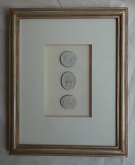
Beautiful framed intaglios, available here:

Unique architectural renderings, available here:


Sunday, June 20, 2010

An iconic design photo: one degree of separation


4710860690_8787ec9e35_o[1]

There are some pictures that just pull me in, and I revisit them from time to time just to enjoy the pure artistry of the space. Such is the case with this charming and iconic photo from House Beautiful’s top kitchens file, in a space designed by Ruthie Sommers. The room combines many elements that I love: a wall mounted sink, stainless steel sink and appliances, lots of natural light, and my favorite element in the space, original art.

When I first admired this photo, I had no idea that the artist who created the charming little crab painting is in fact an Atlanta artists whose children attend school with mine. Her name is Nancy B. Westfall, and her whimsical art and fresh approach to her subject matter make her one of the most popular artists with the top designers in Atlanta and around the country.

I am thrilled to be able to offer a selection of Nancy’s iconic crab paintings in the Quatrefoil Design store, for a limited time. All of the paintings are original, painted with great skill and artistry, and are full of vibrancy and beautiful texture and movement in the paint and brushstrokes. The crab painting in the picture above truly makes the space designed by Ruthie Sommers, just as one or a series of these beautiful paintings would define your own space.

4710027281_290527a4dc_b[2]

‘Roger-Roger’ – 10”x12”, acrylic on gallery wrapped canvas, $288.

Sold

http://www.quatrefoildesign.bigcartel.com/product/original-art-roger-roger-10x12


4710893001_002a9295fc_b[2]

‘Clearance Clarence’ – 10”x12”, acrylic on gallery wrapped canvas, $288.

Sold

http://www.quatrefoildesign.bigcartel.com/product/original-art-clearance-clarence-10x12


4710855312_a63fe7f416_b[1]

“Oscar’ – 10”x12”, acrylic on gallery wrapped canvas, $288. Click here for store item and more photos.

http://www.quatrefoildesign.bigcartel.com/product/original-art-oscar-10x12


4710692838_98900d39a2_b[1]

“Otto’ – 10”x12”, acrylic on gallery wrapped canvas, $288.

Sold

http://www.quatrefoildesign.bigcartel.com/product/original-art-otto-10x12


4710143887_81392bd6f5_b[1]

‘Penelope’ – 10”x12”, acrylic on gallery wrapped canvas, $288.

Sold

http://www.quatrefoildesign.bigcartel.com/product/original-art-penelope


4710193137_32384acca1_b[2]

“Portia’ – 10”x12”, acrylic on gallery wrapped canvas, $288. Click here for store item and more photos.

http://www.quatrefoildesign.bigcartel.com/product/original-art-portia-10x12


4711568756_6e8cb73737_b[1]

And finally, last but not least: ‘Rock Lobster’. This painting is absolutely magnificent in person, and I hope this translates to the picture seen above. It is so unique and full of character; this painting would absolutely make any space where it is hung.

‘Rock Lobster’ – 48”x60”, arcrylic on gallery wrapped canvas, $2,288. Click here for store item and more photos.

http://www.quatrefoildesign.bigcartel.com/product/original-art-rock-lobster-48x60


To see all of the paintings in one place, under the art category of the store:

http://www.quatrefoildesign.bigcartel.com/category/art


I hope you are as impressed and delighted with the wonderful art of Nancy B. Westfall as I am! Custom creations and colors are possible, please email me at quatrefoildesign@gmail.com to inquire. These paintings are all one of a kind, once they are sold they are noted as ‘sold out’ in the store.

To see more of Nancy’s art, please visit her website at http://www.nancybw.com/.

http://www.quatrefoildesign.com/


To visit my blog store, click here.

To subscribe to my blog by email, click here.

To follow my blog on facebook, click here.


Wednesday, June 16, 2010

Serendipity

Given that all of our products are custom made to order at the Quatrefoil Design store (allowing for an infinite amount of customization), it is rare that we have three of the same design in different frame colors at any given time. However, we have several orders that were completed this week, and in a happy coincidence all of the orders included our popular ‘Charlotte’ design in all three of our frame colors -

4700557534_d908a6b45e_b[2]

Gold


4699853863_ed91cd985d_b[1]

‘Gilver’ – silver base with a warm gold glaze


4700386014_3049c4c157_b[1]

Silver


4700672496_d01efa6506_b[1]

All three, in a quick picture before they were packed up and sent to their new homes! Do you have a favorite frame color? I love all three!

Designers, stores, and architects - we have brand new trade and store pricing; please email for more information. To visit the store, please visit www.quatrefoildesign.com. For more information, please email me at quatrefoildesign@gmail.com.

Come see our new framed architectural renderings!

www.quatrefoildesign.com

LinkWithin

Related Posts with Thumbnails