

"You would think it would be obvious, but sometimes it needs to be said: attention to the third dimension is critical to shaping space. All too often in a rush to plan room-to-room adjacencies and sequencing on a particular floor level, treatment of the third dimension becomes an afterthought".
After reading Katie's article, I went through the pictures in my own inspiration files to see where the 'third dimension' adds to, and even defines, a space. Many of the examples I found were in the beautiful ceiling treatments that the designers and architects used, but there are so many possibilities for adding the third dimension to a space. Here are some of my favorite examples.

This picture has circulated around the blogosphere, and it seems as if the ladder is the feature that captures everyone's attention. The ladder and the opening at the top is the third dimension that gives definition to this large two story space. The mystery of what is at the top of the ladder is part of the intrigue of the room. Interior design by Christopher Maya.

Katie says that an area often neglected is the ceiling, and many designers see it as the perfect canvas for a beautiful design feature. This ceiling, in Marble House, Newport, was one of the most memorable features of the home. The intricacy of the ceiling and the fretwork all around the room was breathtaking to see in person.

My favorite stately home in England, Blenheim Palace, has a beautiful library that is my favorite room in the house. The eye is naturally taken up to appreciate the detail on the ceiling, and the shape of the space makes it feel like you are passing through an amazing portal. At the end of the space: a magnificent organ.

John Saladino is perhaps the master at making every space full of subtle dimension; every surface is an opportunity for a statement, whether it be subtle or bold. The walls are textured and appear to be carved out of stone, an impression solidified by the columns that flank the door. The leather door with the detail in nails is so original and adds so much to this space - it simply would not be the same with just plain painted wood doors.

I love the look of this entry to designer Frank Babb Randolph's townhouse; he added the door surround, which is quite sculptural and defines the style of the house. I am a big fan of beautifully defined front doors as the perfect introduction to a home, and a great extra dimension to a house.

This is an amazing interpretation of a staircase, in an entry designed by Bunny Williams. There are so many elements in this space that add the 'third dimension' - the texture of the walls, the columns in the window above the stair, the wave pattern on the floor, the curve of the wall, and of course the magnificent stairs.

The groined ceiling and detailed columns are the the third dimension of this space that makes it extraordinary. Would a flat ceiling and walls have the same impact?

This unusual room has a recessed ceiling and a curve built into the wall, a third dimension to the room that makes it very powerful from an architecture and design perspective. The shape of the dining chairs reflects the shape of the room, in a nice use of a repeating design element. Interiors by J. Randall Powers.

Do you notice that the area for the console is recessed in this room? A unique architectural feature that gives this room extra dimension. Architecture by Steve Giannetti.

A richly detailed room with beautiful moldings on the ceiling and an ornate mantel give this room an extra dimension of elegance. Interior design by Suzanne Kasler, architecture by Bill Baker.

I went to a party at this house many years ago, and was struck by the hand painted ceiling and the trestle beams in the ceiling. It is hard to see the painting on the ceiling, but the trestle really made a large room with high ceilings much more intimate. This room would not have the same impact if it did not have the detail on the ceiling - an example where the third dimension in the ceiling treatment really defines the room. Architecture by Jack Arnold.

I love the look of this room - the walls have beams, similar to what I have seen in Tudor style homes in England that are authentic to the time. Again - it is the third dimension of the wall and ceiling treatment that defines this room. Interior design by Tom Scheerer.

This Hermes box inspired room has lovely walls, a third dimension in design that really defines the room. I have seen those more and more often in Atlanta - a paneled wood room with wood that is bleached, waxed, or glazed to lighten the feel of the wood. The Pottery Barn rug also adds a great look to the room. Interiors by Melanie Turner.

I can't tell if this is a groined ceiling, but the effect of all of the curves in the ceilings is dramatic and beautiful - a beautiful dimension to the space. Design by Katherine Newman.

I did not notice the ceiling when I first saw this picture, but upon further examination, I see that the ceiling is painted to give it a coffered look. Simply painting a ceiling or giving it an interesting treatment is an easy way to add dimension to a space.

I saved this picture because of the beautiful painting by Mira Hecht, but also love the look of the curved arch that separates the two seating areas, varying the ceiling for additional interest and space definition. These are elements that give an extra dimension to the space.

I love this arched passageway in a home with architecture by Steve Giannetti. What a great way to transition from one room to another - and a good use of the dead zone under the stairs. Katie says that 'spatial variety in the form of interludes with lower ceilings in which to pause or take personal shelter can relieve otherwise tall, open spaces'. I thought about this picture when reading Katie's words.

This picture, from an ad for oak flooring, has both a massive fireplace and beams on the ceiling, as well as thickly framed bookshelves to the side of the fireplace. There is a lot of texture and dimension to this room.

Yet another space with architecture by Steve Giannetti (who adds such outstanding architectural details to the houses he designs). I love this ceiling, which has beams but they are laid in a pattern that gives a coffer effect.

The art mounted on the bookshelf, a signature design feature in libraries by Jan Showers, adds a great dimension to the room.

One of my new favorite pictures - I think the double doors is a beautiful third dimension' design element that adds so much to this space, a thoughtful approach to balancing privacy and light.

Even something as seemingly simple as painting a door in a color other than white is a great way to add that extra third dimension to a room (although, of course, this room has so many other wonderful dimensional design features too). Interiors by S. Gambrel.

Windows can be a powerful design element in a room that gives a great dimension to the space. The beautiful windows (not to mention the gorgeous chevron floors) add to the architectural strength of this room. This is from Ina Garten's pied a terre in New York City.

An example where unique windows add a great dimension to the room; the 'x' motif is one of my favorites. Note the beams used as the window frame - unusual and beautiful.

Another dimension that is often seen in French architecture is an enfilade style design, where one room opens to another, without the use of halls. This design gives a wonderful axial view from one room through to the room on the end, often with a beautiful vignette at the end. The walls are also done in an interesting treatment that adds dimension to the room.

Another home with the enfilade design, as well as a unique and beautiful treatment on the ceiling and door surrounds.

Look at the detail in this stairwell, in a home by architect William Hefner. The curve of the stair, the design of the rail and window, and even the design of the ceiling are details that certainly add many layers and that 'third dimension' to the architecture.
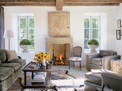
The depth of the window was what first caught my eye in this beautiful room designed by Betty Burgess. This room is full of the kind of architectural details that make a room exceptional, from the ceiling to the fireplace to the windows and flooring. Image via Veranda.

A kitchen from a renovated 1930s home in Atlanta. The kitchen was added on, and the vaulted ceiling and lack of upper cabinets emphasizes the airiness of the space. The home is Tudor in style, with relatively low ceilings and a cozy, intimate feel that are typical of the time when it was built, so entering the kitchen wing is a great way to balance differing ceiling heights. This is another way that a third dimension in architecture is utilized - varying the heights of the ceilings.

The shiplap style ceiling is so popular these days, and adds a noticeable third dimension to this beautiful kitchen by Victoria Hagan.

There is something about this room that is so unique and appealing. It has light on two sides - both sides of the room are glass. The columns make a seamless transition between the inside and the outside, giving this indoor room the feeling of a loggia. The ceiling adds texture and dimension to the room. Interiors by Lars Bolander.
Readers have emailed me and asked how they can make a house have more of a unique feel, as most of us do not live in custom homes where there is a lot of architectural detail. Although many of the homes in this post are very customized, I have seen home design shows, particularly ones focusing on getting a home ready for sale, install interesting architectural elements into fairly bland homes - like crown molding purchased from Home Depot, wall molding that frames spaces on a wall, detail on stair treads, and interesting ceiling treatments. Even painting a ceiling or a door in a color, instead of builder's white, is a great way to add another dimension to a room.

![4450319507_9d55282d5c_o[1]](https://blogger.googleusercontent.com/img/b/R29vZ2xl/AVvXsEhb9ZvNRoJkQ4BXl1TPrEQHP5P9V7vN8l-zFV37nDeiVnQNh6uokO9DwVQeZK7cgbP1Cn8KJ01nWpllnkxW0T3YSRzfZ83UBhaIddJK3xMgJdOLQ_QNl408BqfZ-zreswTW7j9GlRuLUr4/s1600-h/4450319507_9d55282d5c_o%5B1%5D%5B3%5D.jpg "4450319507_9d55282d5c_o[1]")
![3806[1]](https://blogger.googleusercontent.com/img/b/R29vZ2xl/AVvXsEjAjQAtlg4mOXvG5PdkNUeKEd0EBEVAgAePASXTtLXdK2DRHIIsSkDAWcr4h0HhbuvqgYB52MxZgHo9vyeT8qOBU9VwldJgLyQw-55eJZFxlPnfHoy17lCMYiDiOHMPcAFeXk8RAJBHiv8/s1600-h/3806%5B1%5D.jpg "3806[1]")
![3804[1]](https://blogger.googleusercontent.com/img/b/R29vZ2xl/AVvXsEi0KzpOGoBc_NJI1R-1kTEl2uDU1_-TQEzPpKkxSzgc539x60GeToLSEXXVrfJpv7DRJxSb62Ik9n-jObNtSDpXddaGwj8emNJIcKcWr_PhzxngspFJq9k5juWtdD-R9EAJf7TzEfmh8Yc/s1600-h/3804%5B1%5D.jpg "3804[1]")
![3803[1]](https://blogger.googleusercontent.com/img/b/R29vZ2xl/AVvXsEhAKlZJO3dWnQFaUflypLlGsdEMh-jQ_RuProFIeBdnR9pslmLp789EIfYyj9OPYNqnq1ZRQrmn3LXI77rm7s2_JBi1s_SsxNfuhRVnYkLzZQ8xCwsuWRpjHizluWh_zm8Q8f5ZPs3fPDg/s1600-h/3803%5B1%5D.jpg "3803[1]")
![3801[1]](https://blogger.googleusercontent.com/img/b/R29vZ2xl/AVvXsEhghY5KKm7aagm7ZrLGadMC2NkGZ6x8Zsz4I0Eb1z_Q2vCowJcAMNnhnZDiXFbsFN7v5BzTDMw32rGGzzhC0CxImFPEuRZmQ19q9Ypgp3LFDah3Pl4YKS1X-2Y0yuBoCYcVNXHPhp7fOJ4/s1600-h/3801%5B1%5D.jpg "3801[1]")
![3802[1]](https://blogger.googleusercontent.com/img/b/R29vZ2xl/AVvXsEh1I7_6QPoD_njIEGJH7I52VtlpbZGnv9gJvBle5sMa6d0aCyZ8NIqaS_UiXtjm9v6TbF03ITclkNILliZ-HoBYYHdsKVO6JlwLjhUz83VKQmXoQv6mxxb2bhynu8fj1g35RYePvIa3ISI/s1600-h/3802%5B1%5D.jpg "3802[1]")
![3809[1]](https://blogger.googleusercontent.com/img/b/R29vZ2xl/AVvXsEgRnjonDG2fWQCwZP-jIWOQSy-Oxywu8WO7gMl32obh7yWxtb9lm7W91WqaO-NatN5zMIZpJXRUBnuaE7l7cvDoy8viVGTZTTMGs3qYTaKxdO3oMi472eOmtXiXTxCFCh1egbatK2zcAZM/s1600-h/3809%5B1%5D.jpg "3809[1]")
![3808[1]](https://blogger.googleusercontent.com/img/b/R29vZ2xl/AVvXsEgjMyZoPU7Hm8k1XhIg3YWuDryPVI4wZvDcOoN7C_2rhK3OxcWO8Ldt2FDxk2zhVFpT6sWr0ic6fcxKYtUHhxSdW9dzAaVwBDcIhAdVkVxE4ei7DQJbYvyxtwhf6pjFnRRYjTGk0CzWb2s/s1600-h/3808%5B1%5D.jpg "3808[1]")
![3805[1]](https://blogger.googleusercontent.com/img/b/R29vZ2xl/AVvXsEhVCXnkrjS8Z19Ww0Sp3wcQPHLtaC-_Ke7tUcbxArWhfzAzlVfRK67X08fOndsW91P1uZ6npIQFcHy8VJEzNd8GjCFZir4oe9wxtJt8JT4ImYhX3xn16kSj98mnBRy72E3I45YSAenZmoM/s1600-h/3805%5B1%5D.jpg "3805[1]")



















.jpg)


