.}
Showing posts with label inspirational architecture. Show all posts

Tuesday, July 27, 2010

Architect Bill Litchfield's stunning new website

One of my favorite architects, Bill Litchfield, has just launched a new website, and it is full of beautiful images from the homes that he has designed.  Before starting his own firm, Bill spent ten years with the firm of the great Atlanta classicist architect Norman Davenport Askins; Bill is clearly continuing the tradition of classical residential architecture and period detailing with adjustments for the 21st century way of life.  


One of the jewels of the portfolio is a beautiful home whose exterior was featured recently on Limestone & Boxwoods (click here for the post) - but this time we get to see the inside through Litchfield's new website.  Click here to see the pictures; I feel pretty certain that Jackye Lanham was responsible for the interior design on this project. Can anyone confirm?  Here are a few of my favorites:

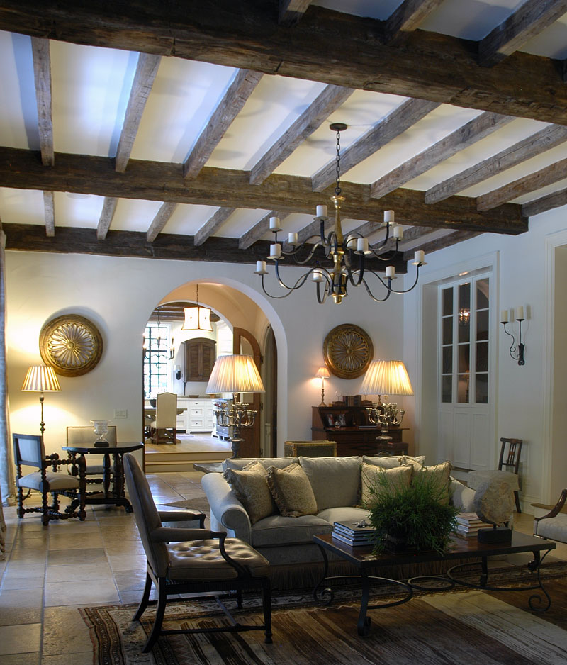
Note the beamed ceiling and great arches in this room.  I love the symmetry of the wall hangings, the graceful curve of the chandelier and the charm of the game table in the corner.

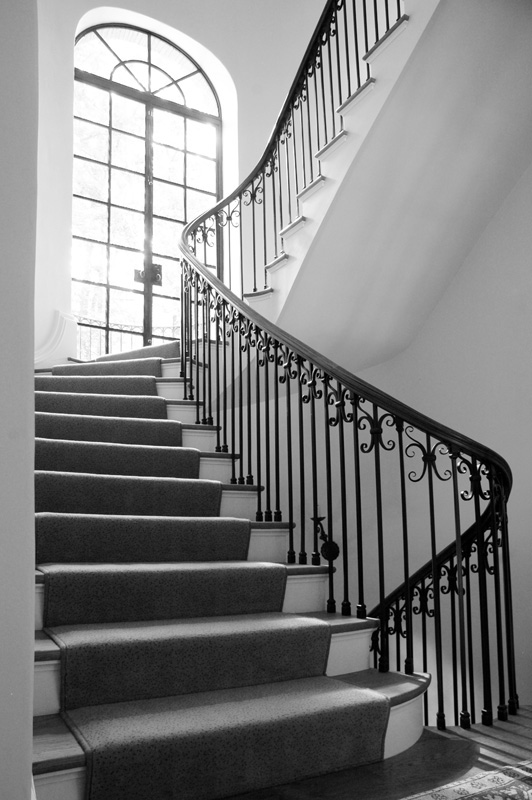
This is one fabulous staircase, with its sweeping curves, stunning window, and iron railing.  

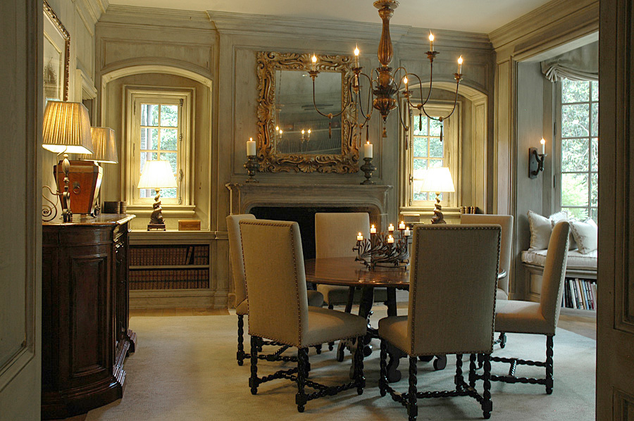
This has got to be one of the most beautiful rooms I have seen in a long time.  This is my favorite kind of paneled room - softly and subtly painted in a neutral color that is hard to define. The architectural and design details in this room are beautiful - the recessed windows, built in bookcase under the window, limestone fireplace, and the stunning chandelier and mirror. 


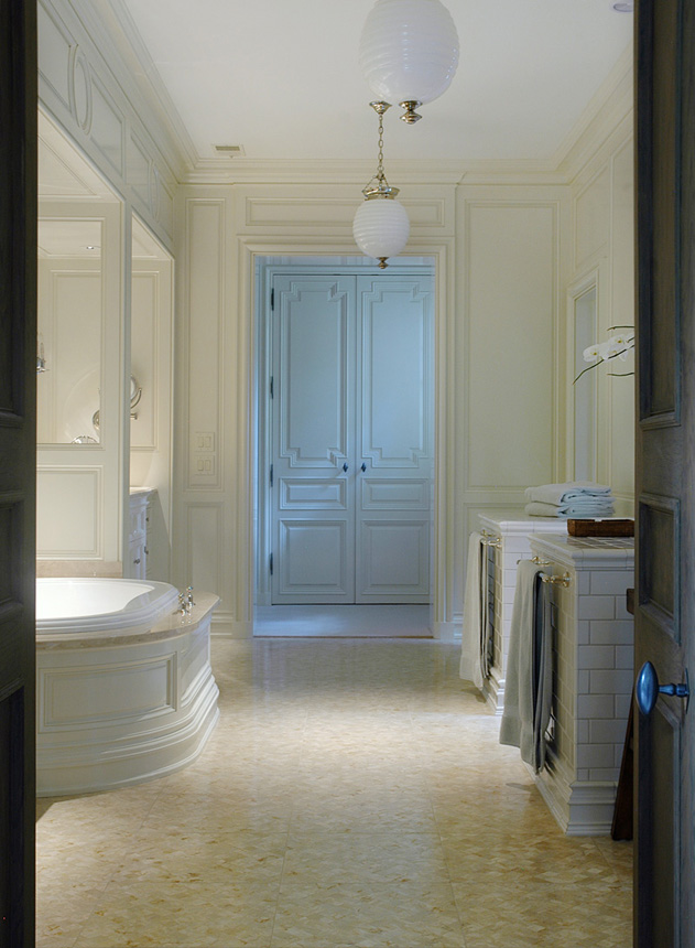
This bathroom has a great vintage feel to it, in part because of the lighting fixtures and the subway tile.  The detail on the door at the end of the bathroom is absolutely perfection.


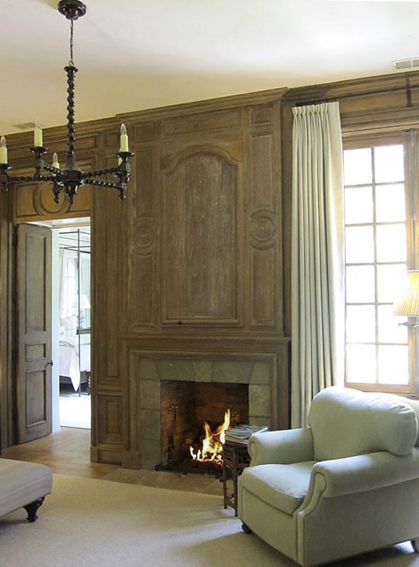
Well, maybe the detail on the paneling of this room is absolute perfection!  The circles carved over the door and above the mantel seem so French to me (and are also seen in the master bathroom panels).  I wonder if the paneling above the fireplace conceals a TV?

Click here to see more pictures of this exquisite home, on Bill Litchfield Design's new website: http://www.litchfielddesigns.com/feature1.html

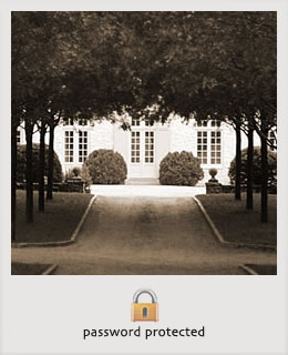
I am intrigued by the 'Featured Projects' page, which features this beautiful house:


I love the mystery that surrounds this house, which is emphasized by both the picture and the password protection.  How I would love to see the images contained within....Bill, if you read this, can you please send me the password? :)

Please visit Bill Litchfield Design's website for incredibly beautiful and inspirational images, and keep him in mind if you are ever in need of an oustanding architect!


http://www.litchfielddesigns.com/

All photographs used with permission - photography by Tom Namey of Namey Design Studios: http://www.nameydesign.com/index.html
Namey Design Studios is also responsible for the outstanding website design for Bill Litchfield's new site.


To subscribe to my blog by email, click here. 
To follow my blog on Facebook, click here.


Thursday, June 3, 2010

Inspirational Architects: Bates Corkern Studio


4143632760_f149ef27c9_b[2]

Last year, I posted a picture of one of my favorite inspiration houses – a beautiful Baton Rouge, Louisiana gem designed by legendary architect A. Hays Town (seen above). There is something about this house that really appeals to me; the combination of the style, the lines, the proportions,and the materials is perfect. In my post, I asked if there were any readers who knew more about the house. Within a few days I had a lovely email from architect Jeremy Corkern; A. Hays Town was Jeremy’s dear friend and mentor.

It was fascinating to learn more about this charming house from Jeremy. He told me that the slate roof was reclaimed from an old building in the French Quarter, and that the house is brick but with a ‘mortar wash’ – the bricks were laid loose and the mortar was allowed to ooze out, then it was rubbed into the brick surface with a burlap bag. It is labor intensive, but as you can see the effect is quite beautiful.

Jeremy and I have developed an easy email dialogue over the past year, yet despite this I had no idea of Jeremy’s stature in the architectural community until I read not one but several articles on the work of his firm – homes that he and his business partner, Thomas Paul Bates, designed have been prominently featured in Southern Accents, Cottage Living, House Beautiful, and Veranda (click on any of the magazine names to see the associated article). In fact, one of the feature homes in the June/July 2010 Veranda was a house designed by the Bates Corkern Studio.

1-crisp-exterior-dec0907-xlg[1]

Jeremy recently let me know that website for his Birmingham based firm, Bates Corkern Studio, was recently launched. It is quite an important task to create a web site for an architectural or design firm; the site must represent the core of the aesthetic and philosophy of the firm. The site for Bates Corkern Studio is one of my favorites, because it gives a lovely hint of the houses in the portfolio – the ‘soul’ of the houses – without fully revealing every detail of the houses. Each featured house has a title (the one above is called ‘Shade of Pale’), which to me is like establishing the narrative of the house, and letting the reader make their own impressions based on the striking images. The web site is also very easy to navigate, and is tailored and elegant.

This beautiful 1920s home (seen above), renovated by Jeremy Corkern and Thomas Paul Bates, was featured in House Beautiful last year (click here to see the article). The house really resonated with me, and captures the essence of what I love in architecture and design: formal without being imposing, elegant without being ostentatious.


3-crisp-living-room-dec0907-xlg[1]

A picture from the interior of the house. I am going to show this picture to my designer – the floors are exactly the color I hope to achieve in my new house. The interiors of this house were by Betsy Brown.


4663145612_3ba1712b66_b[1]

A stunning exterior picture from the Bates Corkern Studio porfolio. When looking through their portfolio, I immediately noticed the number of cedar shingle roofs in their designs. When I inquired, Jeremy noted that cedar immediately sets a house at ease, and gives it that relaxed elegant look that seems to be a signature of his firm’s style.


4662525577_d6399b6411_b[1]

I could look at this picture for hours, just to take in all of the exquisite details. The architectural details of the room are so pure – with the ample light from the windows, the stone floors, the uniquely designed window, and the huge hearth. Working in concert with the architecture is the beautiful interior design. Note the floor lamps on either side of the sofa…love the translucent shades.


4663145716_dc28faf7c7_b[1]

Same room, different angle. I love the simple beams over the doors, and that painting in between the doors is exquisite. The title of this home is ‘suspended in light’ – what could be more appealing than a home designed around the light?


4663145560_b250e0f2bc_o[1]

In the introductory page of the firm’s web site, they say

‘We dwell in our homes and our homes dwell in us. It lingers with us when we leave. Beckons when we are weary. It is the place that gives us comfort and ease. Home is the one place where we can simply be. Where we can find our way in the dark. Where we can identify the sounds of our children’s feet on the floorboards, trace the same patch of sunlight across the dining room wall – from spring through the coming winter”.

I remembered this quote when I saw the picture above (from the ‘Shade of Pale’ house). I had never quite thought of it that way, but don’t we all have that patch of sunlight in our homes that becomes like a familiar friend through the seasons?


4663145678_7d8078f7ba_b[1]

When you have a moment, take some time to look through the portfolio of Bates Corkern Studio. It is a feast for the eyes, and full of inspirational images, and lyrical architecture and design.


4663145490_b8052a730e_b[1]

I love this view through the rooms to the vantage point out to the garden. It is particularly gratifying when the view has a lantern at the end! Architecture by Bates Corkern Studio, interiors by Liz Hand Woods.


4662525441_1d1294cb68_b[1]

Any house that designs a space specifically for a piano really speaks to me. And to think this is a vacation home (this is the home that was featured in the recent Veranda; image via Veranda). Architecture by Bates Corkern Studio, interiors by Liz Hand Woods.


4662525473_636ae8dac5_b[1]

This is a beautiful, beautiful kitchen. I really like how the countertop material wraps around to the side of the island. I wonder what material this is? Image via Veranda, architecture by Bates Corkern Studio, interiors by Liz Hand Woods.


4663145470_9b5764548c_b[1]

A freestanding tub in an alcove surrounded by light on three sides, from the Bates Corkern Studio portfolio. Image via Southern Accents.


4663145598_e764e8c2ce_b[1]

My favorite lantern, the Nierman Weeks Mitzner lantern, in another space that perfectly captures the light. Architecture by Bates Corkern Studio. Image via Southern Accents.


4663145662_b7feaa5194_b[1]

Brick on the interior walls reminds me so much of A. Hays Town’s work. An interior window and a floating staircase complete the feeling of lightness and sculptural beauty in this space.


4663429798_a6d514724d_b[1]

A detail example of architectural design in a house designed by Bates Corkern Studio. I love the sculptural take on paneling in this space.

To learn more about Bates Corkern Studio’s architectural services and portfolio, please visit their website at http://www.batescorkern.com/. I am sure that my readers will find it as inspiring as me – the perfect combination of architecture, environment, and interiors. Enjoy!

All images, except where noted, are from the Bates Corkern website.

To subscribe to my blog by email, click here.

To follow my blog on facebook, click here.

To visit my online store, click here.


Monday, September 28, 2009

Inspiring Architect: Steve Giannetti

Last year, a new blogger burst onto the scene, and from the moment her blog started I was a fan. The blogger is Brooke Giannetti from Velvet & Linen, and one of the things that immediately endeared me to her blog was its unique focus on both design and architecture - two of my passions. In fact, in Brooke's very first month of blogging, she created a post called 'A Wonderful Collaboration' - and I learned that Brooke's husband Steve Giannetti is an architect. Could it get any better - a blog written by a designer whose husband is an architect? Brooke recently celebrated her one year blogging anniversary, and her blog continues to amaze me with every post. My favorite posts, though, are the ones where she shows the houses that Steve designed, and I particularly love the ones where Brooke did the interiors.

Steve Giannetti graciously agreed to answer a few questions for me as part of my 'Inspiring Architects' series. I loved learning more about Steve's background and the inspiration for his work.

Steve Giannetti

Q: How did you decide to pursue a career in architecture?

Steve: When I was a child, I really enjoyed drawing and building. As I got older, I found that I also really liked solving problems.

Growing up I worked for my father doing ornamental plaster work. I would come in contact with a lot of architects. So, when I was in high school I started hanging out at the Architecture department at the University of Maryland. In my free time I would do the projects that were assigned to the architecture students. I enjoyed it so much that I applied to the architecture program and got accepted.

shapeimage_1

Steve grew up surrounded by the beauty of an ornamental plaster studio, which developed a love for attention to detail that makes Steve such an exceptional architect.

Q: From where do you draw your inspiration? Particular architects, things, places?

Steve: I like Classical architects like Thomas Jefferson and John Soane. They always came up with clever solutions to problems. Soane's house in London, now a museum, is amazing with all sorts of ornaments that remind me of my dad's shop.

020Interiors

Sir John Soane's house is considered one of the most magnificent house museums in the world. Here is a picture from the museum.

breakfastroom

The breakfast room from Sir John Soane's house - no wonder Steve cites this as an inspirational place for him.

breakfastroomceiling

The ceiling of the breakfast room - amazing architectural and design detail.

Steve: Pierre Chareau did a great house in Paris in 1930 called Maison de Verre. It looks like it could have been done last week.

maison_de_verre

The exterior of Maison de Verre (House of Glass). Chareau's patron purchased the first three floors of the building, but the person who owned the top level would not sell. Undeterred, Chareau simply worked with the space his patron owned, without disturbing the the original top floor, in order to create this masterpiece of architecture (source: Wikipedia).

4-29-08bookcase1

The wall of books in Maison de Verre.

maison1

Another view - I love the concert grand piano in front of the wall of glass.

Q: Do you have a particular style of architecture that you favor?

Steve: I work in all kinds of styles. Classical architecture is always fun, but I tend to open it up more with glass when I can.

P1030793

A home that Steve designed.

IMG_4292

The light filled interior of the home pictured above; note the architectural details in the transom of the doors. Special details like this are what make homes unique and exceptional.

Steve: I am working on combining the open space and flow of Modernism with the proportions and humanity of Classicism. I try to simply things a bit more these days. This is the style I favor right now, unfortunately I don't know what to call it yet. We are doing a couple of projects right now with this in mind.

I am also just finishing work on another home in Malibu that combines some traditional Mediterranean details with a modern feeling.

DSC_0632

DSC_0646

A home (designed by Steve) that is in the finishing stages.

DSC_0240

DSC_0201

A house and barn in Maine is nearly complete and is a design that blends traditional shingle style with a more modern interior.

Q: What is your favorite exposure for quality of light (North, South, East, or West), and why?

Steve: South. This exposure allows a quality of light into the room in a way that energizes the space. North light is very static and doesn't move around, so the room always feels the same. I'll work pretty hard to get south light into a room with dormers or sidelights.

DSC_0141

A recent project of Steve's, in collaboration with Brooke, was a pool house/artist studio that had a beautiful quality of light.

Q: What types of projects do you work on (i.e., size of home, renovation vs. new contruction)?

Steve: There is no real average size. They range from 4000 sf to 10,000 sf. I do both new construction and renovation, although I prefer new construction.

A charming French style home designed by Steve.

Q: What is something you should not skimp on what building a home?

Steve: A detailed set of plans. Nothing is more expensive than indecision when you are building a house. It holds up the building process. The more detailed the drawings, the less questions a builder will have and the quicker it will all go.

arch_vl1

One of my favorite pictures from Steve's portfolio - there is something so beautiful about this little arch under the stairs, and every time I look at the photo I notice another architectural detail.

Q: What trends are you seeing in your projects? Smaller, larger, green? Classical, modern, a blending of the two?

Steve: I see people asking for smaller houses with cleaner, minimal details that still have warmth of traditional architecture. Also, my clients really prefer an open floor plan, so the rooms feel bigger. Living rooms are also going away and being replaced by bigger libraries that also act like intimate living rooms.

library

A beautiful library in a home recently designed by Steve.

Q: What is a fad you hope to never see again?

Steve: Lava rock. We had a huge wall of it in our place in Oxnard that we just had to plaster over.

CIMG8311

The lava rock wall: before.

P1040512

The wall after Steve plastered over it. This space continues to evolve - Brooke has been documenting the renovation of the house on her blog.

I hope you enjoyed this interview with Steve Giannetti. Although I have admired his work many times over the past year, I really did not know much about Steve other than the small tidbits I read on Brooke's blog. As you can see in this post, Steve's inspirations are from the Classical tradition in architecture, yet he is putting an exciting new modern framework on these Classical designs, which makes them so suitable for life in the 21st Century. Steve truly said it best when he wrote of wanting to retain the proportion and humanity of the Classical tradition, with the space and flow of modernism. For more information about Steve, Giannetti Architects, Giannetti Home (Brooke and Steve's store that sells Steve's original furniture designs), and Brooke's blog, please visit the Giannetti website.

Come see what everyone is posting about on BNOTP Metamorphosis Monday!

Tuesday, September 8, 2009

Inspirational Architect: Katie Hutchison

A few months ago, Terry from Architecture Tourist forwarded a wonderful online magazine to me, called 'House Enthusiast'. It is written by an architect from Massachusetts, the state where I was born and where I returned for a few years when my husband was attending graduate school. As much as I love living in the South, there is a part of me that is drawn to New England, and I was thrilled to learn about Katie and her inspirational work. On Katie's site, she writes 'Inspired by the simplicity of New England vernacular buildings and landscapes, Katie Hutchison Studio composes, promotes, and photographs meaningful architecture and design'. What a creative life, and what a wonderful subject for my 'Inspirational Architecture' series.

IKatie

Katie Hutchison - architect, writer, and photographer

How did you decide to pursue a career in architecture?

I’m not one of those people who discovered while playing blocks as a child that I wanted to become an architect, and only an architect. I have at different times wanted to be any number of things. Three interests have persisted more, though, than the others, so it’s those three that I pursue today. They are architecture, writing, and photography. In fact, I have three bachelor degrees: a B.A., B. Arch., and B.F.A. I’m a licensed architect in the Commonwealth of Massachusetts; a writer for shelter magazines: both those produced by others and the online magazine House Enthusiast (http://www.katiehutchison.com/house-enthusiast/) which I produce; and I’m a fine art photographer. I practice all three disciplines via Katie Hutchison Studio (www.katiehutchison.com) in Salem, Mass. Each discipline allows me to explore the physical world in a different way: designing it, commenting on it, and reframing it. I believe each contributes to the other, a philosophy I first considered while a student at the Rhode Island School of Design. I enjoy the variety, overlap, and synergy of the three. It’s a creative life that suits me.

KHS c

A beautiful new home in Martha's Vineyard, with architectural design by Katie Hutchison and her colleagues. The shingle style is so quintessentially New England to me.

What type of projects do you work on?

As a residential architect, I enjoy placemaking. I seek projects, whether they involve new construction, renovations, adaptive reuse, or additions, which allow me to shape unique environments, rooted to their sites and context, where everyday living is embraced indoors and out. In general, my preference is to design smaller homes, rather than large. For one, it’s a matter of sustainability, and for another; I actually find it a more satisfying design challenge to accomplish more with less.

OLYMPUS DIGITAL CAMERA

A garage/garden room designed by Katie epitomizes an incredible use of space: in the winter, it is a garage, but in the spring through fall the 12'x18' space serves as an outdoor living space. On the side facing the driveway are a pair of garage style doors that swing open.

OLYMPUS DIGITAL CAMERA

Another view of the living space; on the side that faces the garden are sliding doors that slide open for easy access to the yard.

From where do you draw inspiration?

It sounds banal, but beautiful things and places inspire me.

I have an old, wooden, hand-made, 36-inch measuring stick with a flush, brass pivot hinge and two inset butt hinges that fold the stick into four. I found it at an antique store. I picked it up the moment I saw it and ran my fingers across the carved measuring lines, worn more smoothly on the outside face then the inside. It’s beautiful. It’s practical, while elegant. Exquisitely crafted, but not fussy. It invites touch and wonder. It’s a tool made for a person by a person who clearly loves tools. These are the same qualities and realities I aspire to convey in the homes, outbuildings, additions, and renovations I design.

OLYMPUS DIGITAL CAMERA

Katie's cherished antique measuring stick.

I grew up mostly in New England and live here today. I’m endlessly fascinated by its historic fabric, rustic farmlands, and weathered seascapes. I take great pleasure in day trips to explore small villages, urban pocket neighborhoods, remote barns, and coastal constructs: boats, sheds, and cottages. The language of New England is second nature to me. Many say that you’re fluent in a foreign language, when you begin to dream in it; I dream in the language of New England, when I’m daydreaming about a project. It infuses and informs my design.

OLYMPUS DIGITAL CAMERA

New England beach house, photography by Katie Hutchison.

OLYMPUS DIGITAL CAMERA

A photo from a house addition that Katie designed. Photography by Katie. I love this scene - it is here that you can see the wonderful eye of the fine art photographer.

Do you have a particular style you favor?

I talk about architectural style in a letter on my website. To quote myself:

I steer clear of reproducing formulaic styles such as “Georgian,” “Arts and Crafts,” “Modern”, etc. Such styles were developed in specific time periods in response to a specific set of circumstances, be they cultural, material, or political.

Instead, I believe in determining what it is about a certain style that a client would like to express in a project. Is it the delicate proportion, the craftsmanship, the massing, the materiality, the openness? The answers to such questions then inform my design which is further driven by the nature of the site and client program.

Of course, I have my own aesthetic proclivities too. I enjoy reinterpreting the regional vernacular for today's lifestyles. I’m particularly inspired by the charm and simplicity of New England vernacular folk and work buildings: like fisherman cottages, farm houses, barns, sheds, and boat houses. I delight in the way that traditional Japanese architecture engages the landscape and modulates levels of enclosure. I appreciate lush, sustainable materials: warm woods, dry-laid stone, glass tiles, natural fiber rugs, tactile fabrics. I have a fondness for colors found in nature. I’m influenced by the creative arts. I bring these preferences with me to the drawing board. It’s part of who I am.

OLYMPUS DIGITAL CAMERA

New England village, photography by Katie Hutchison.

What are your favorite exposures for quality of light?

Effectively harnessing natural daylight is an architect’s great joy. I believe in orienting a house to capture low morning light, while shielding harsher afternoon sun with overhangs, pergolas, or even deciduous trees. Where possible, I invite indirect daylight, reflected off surfaces, too. Unless seeking to light an artist studio, I usually limit windows on the north side in order to keep the chill out in the winter. I’ve lived in and visited homes in the northeast that are oriented toward the north, and found them dark and uninviting. Instead, I generally try to orient a house to the south, so its long axis runs northeast/southwest, if the site allows.

OLYMPUS DIGITAL CAMERA

A kitchen renovation by Katie Hutchison Studio; I thought the quality of light in this room was beautiful.

OLYMPUS DIGITAL CAMERA

A view of the newly renovated space, a place created with family life in mind.

OLYMPUS DIGITAL CAMERA

A Katie Hutchison Studio renovation of a condo within an old house that used to belong to a sea captain. I love the location of the breakfast nook, in a corner with light on two sides.

What projects are you working on now?

I’m currently brainstorming the design of three or more homes to sell as design and/or construction sets available to any and all who might wish to purchase them. They will be small, ranging from approximately 1000, to 1400, to 1800 square feet. I envision each design springing from a vernacular type, reimagined for today. Since only a fraction of the population can afford to retain an architect for a custom design, I hope that my drawings will enable a larger audience to own an architect-designed home. Since no site or homeowner is alike, I plan to include a range of extra services to assist with customizing the drawings to suit a specific situation. Since it’s still early in the planning stage for the three designs, I’d be interested to learn from your readers what attributes they might like to see in the three homes.

OLYMPUS DIGITAL CAMERA

Katie and her colleagues designed a new two car garage with studio and full bath above it, built to work with the slope of the site. The location is Martha's Vineyard.

What’s something you shouldn’t skimp on when designing your home?

Architectural services. Really. Time invested in planning, designing, and implementing the design of your home to suit your specific site and program is invaluable. Far too often, in the interest in forging ahead quickly, before resolving or thoroughly investigating options, design opportunities are regrettably lost. A home built today should last generations; it should reflect and enhance your lifestyle; it may be your single largest investment. Making the right and best decisions for your home prior to construction are imperative. You know the expression: “Measure twice; cut once.” It’s good advice. Plan. Plan. Build.

OLYMPUS DIGITAL CAMERA

A renovation project on Martha's Vineyard, in which a new dormer was added to increase the room and quality of light in a bedroom, and add space for a new bathroom and closet.

OLYMPUS DIGITAL CAMERA

Inside the house, in the space expanded by the dormer. I love the unique character of rooms created out of dormers.

A fad you hope to never see again?

I’m not a big fan of fads in general. I believe in timeless design. Fads are by definition short-lived. I prefer spaces and environments that adapt over time to the lifestyles of those inhabiting them. To me, a good home design speaks to many folks, across time, like a work of fine art or book might. If it’s a meaningful design, through the years, it will reflect something elemental about human nature and our capacity for home.

he250x150

I encourage anyone with a love for architecture, homes, and gardens to visit Katie's online magazine 'House Enthusiast', and her website, www.katiehutchison.com. On the sidebar are helpful links to recommended 'House Enthusiast' posts. If you have any questions for Katie, please leave them in the comments. In particular, Katie is interested in hearing about features that my readers might like to see in the small home plans that she is working on.

LinkWithin

Related Posts with Thumbnails