My oldest daughter’s bedroom is a comfortable and inviting space (and so much nicer than my room as a teenager!), but there are still a few items that need to be selected. In general, I have taken a low key approach to my kids rooms. They are slowly coming together over time, with input from each child based on their likes and their personalities. I thought I would work through my remaining thoughts on this room (perhaps to spur me into action)….so this post does not contain any ‘after’ photos! Hopefully that will come soon.
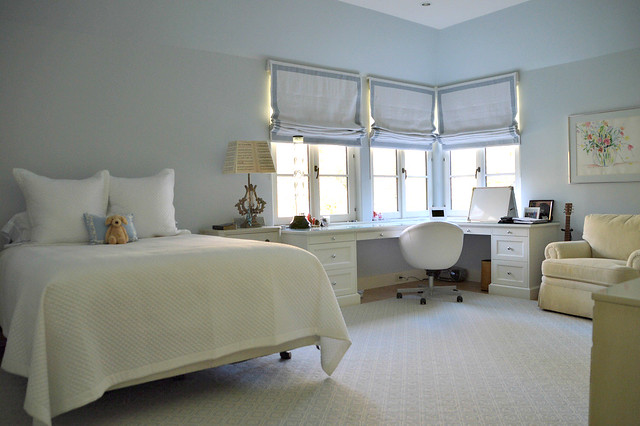
My oldest daughter has spartan taste and is pretty low key about décor. Her main request was to have blue walls – so we selected Farrow & Ball borrowed light, which is a truly beautiful shade of blue. Her room is north facing and gets very soft natural light. F&B borrowed light looks wonderful in the day and night (at night, the gray undertones come out) and is neither too babyish nor too sophisticated.
We have purchased very few new items for this room. The chair and a half came from our old family room. The furniture on the wall (only the edge can be seen in this photo) is Ethan Allen circa 1980s – it was in my sister-in-law’s room as a teenager. My daughter is very attached to it and displays all of her music awards and camp memorabilia in it, as well as a collection of snow globes. The bedside tables were in the master bedroom in our old house, and the iron lamps were from a sample sale at the Mart (I liked the lampshades, which are made of antique music sheets). The watercolor was the very first painting I ever purchased – I love it as much as I did when I first saw it.
My architect designed the built in corner desk for the room. The room is a somewhat unusual shape, as it is fit into both the roofline and a juncture of the house. The built in desk is my daughter’s favorite feature of the room; she a sophomore in high school, so she spends much of her time studying at that desk! The desk chair is from IKEA. Keith Arnold designed the roman shades, which are white linen with a tape trim by Samuel & Sons.
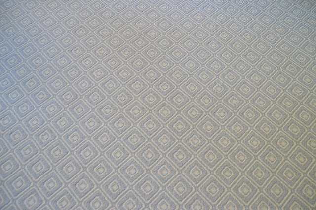
The most significant purchase for this room was the area rug, which we bought right away as the room has hardwood floors, and quite a bit of floor space; a rug was needed to warm things up. Many of my area rugs (as well as my stair runners) were ordered from John Horton at Underfoot Design. His showroom is located just outside interstate 285 in Atlanta (John can brings samples and selections to your home or business in the greater Metro Atlanta area), and his prices are excellent. He has a large selection of in stock items, can source just about any line imaginable, and has the best installers in town. John also specializes in hardwood floor selection and installation.
I picked out this geometric pattern by Stanton, as it has the color my daughter wanted (light blue) and she really liked the pattern. Although it is hard to see in this picture, there is a small amount of a flax color accenting the center of the squares/diamonds in the carpet threads.
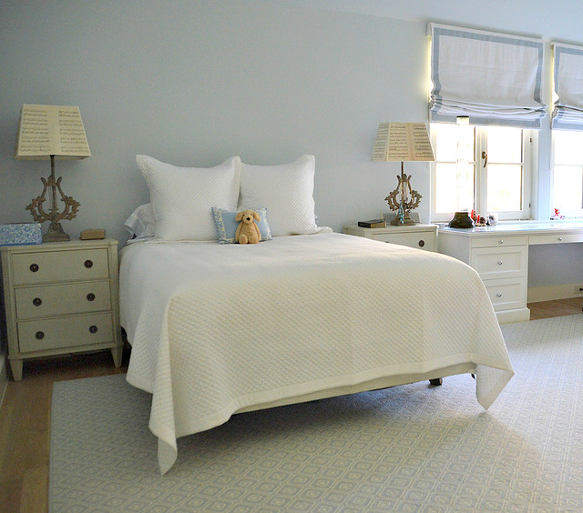
So now on to the bed. My daughter wants an upholstered head board, and given that the room has so much built in cabinetry, I think this will soften up the room and make it feel more finished (headboards always do that, don’t you think?). I have been collecting images of headboards on Pinterest (see my headboard inspiration board here, my bedroom inspiration board here), and it has become clear that my daughter gravitates towards tufted headboards.
Here are some of the style candidates that we are considering:
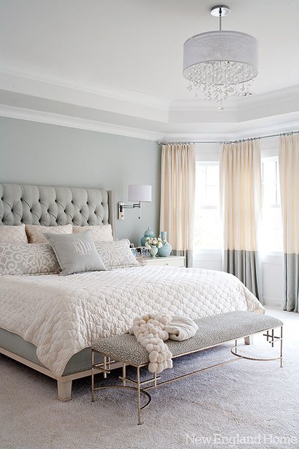 |
| I have seen quite a few headboard with this style – tall and tufted, with a distinct edge on the left and right. This is a king size, so the tall design works well. |
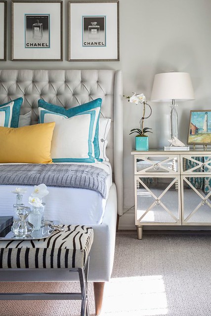
I just saw this one on the House of Turquoise, design by Beach Glass Designs. Gray is very on trend for bedrooms and headboards now. This is a similar style to the first picture.
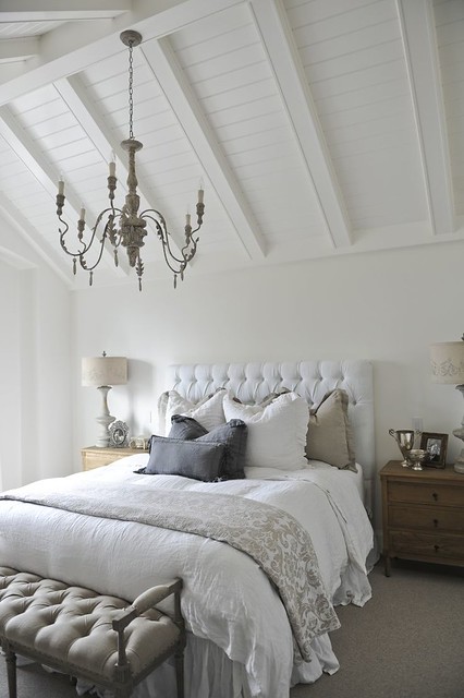
A squared off headboard in a simpler style. I think the height of this headboard is just right. It appears to be a queen size.
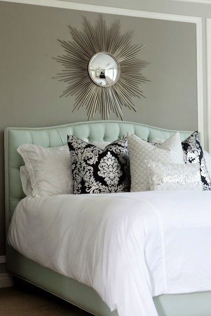
This one caught my eye – tufted, but with a gentle camelback curve. The nail head trim is a great detail.
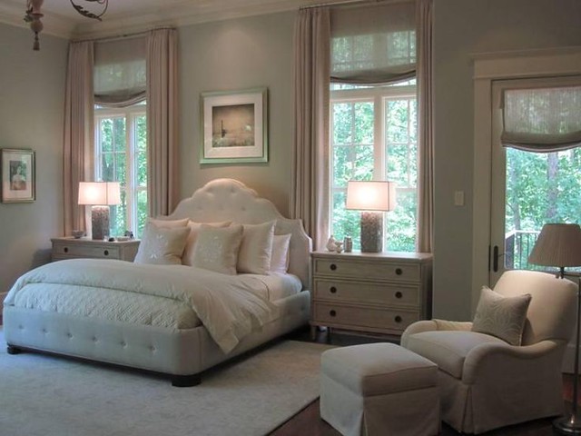
A bedroom by Phoebe Howard, the master of bedroom design. I love the feminine design of the headboard. It might be a bit fanciful for my daughter, but it certainly is beautiful. Note how the platform is also tufted.
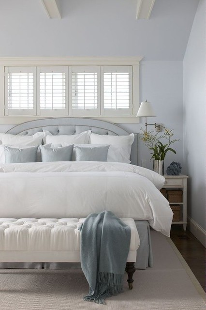
A pretty design by Griffin Balsbaugh Interiors, via House of Turquoise. This picture also caught my eye because it is a blue bedroom, with blue fabric on the headboard. The color scheme of this room looks similar to that of my daughter’s room (although the fact that the rug is off white creates a different balance of the whites and the blues). Given that my daughter’s rug has so much blue, I have the feeling that the fabric on her headboard should either be the white of the roman shades, or pick up the flax accent in the rug. The style of this headboard is great – the double nail head trim is a nice touch. The tailored bed skirt is similar to what we will be doing.
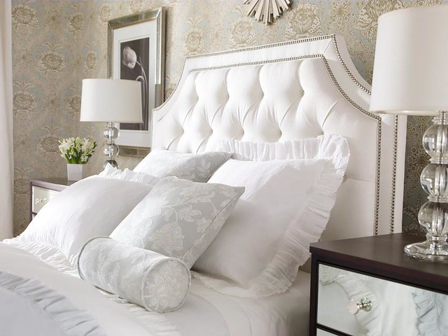
My daughter likes this style and shape of this headboard – clipped curved edges, tufted with a border. She is not wild about nail head trim, however. Also, this style might be a bit high for her, although the advantage of the height is that the tufting detail can clearly be seen. This also appears to be a queen size bed, so is a good comparison for proportions. Via Pinterest, source unknown.
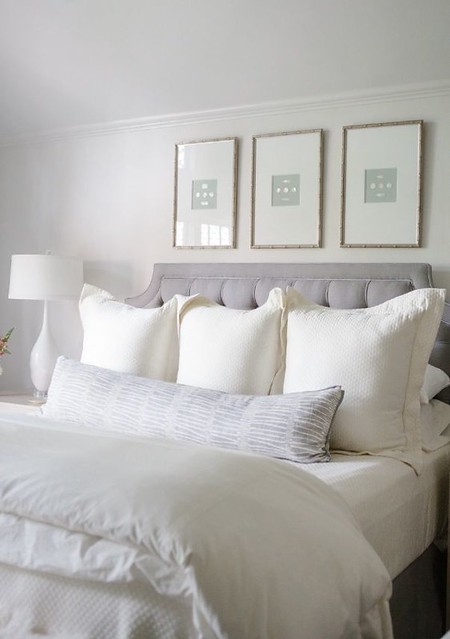
Overall, this is my favorite inspiration picture. I love the shape and style – it still has a defined border, but none of the nail heads that don’t appeal to my daughter. I might go somewhat in between the height of this one and the height of the picture before this. Design by Collins Interiors.
My daughter initially wanted a blue headboard, but is now leaning towards the same white linen that is used in the roman shades. Another option is to pick up on the flax color that is an accent in the rug. The white linen is being discontinued so we need to act fast if this is the direction we will take! We will have a custom tailored bed skirt made to match the headboard.
So, what do you think? What’s your favorite style headboard? What color do you think that the headboard should be? What height do you think? Opinions are welcome!
Favorite design and architecture books of 2013: http://www.thingsthatinspire.net/2013/12/books-from-2013.html
2013 books on my Christmas list: http://www.thingsthatinspire.net/2013/11/books-for-my-christmas-list-2013.html
2012 books on my Christmas list: http://www.thingsthatinspire.net/2012/11/books-for-my-christmas-list.html
2011 books on my Christmas list: http://www.thingsthatinspire.net/2011/12/my-book-list-christmas-2011.html
To subscribe to my blog by email, click here.
To follow my blog on Facebook, click here.
Twitter: @TTIBlog
Instagram: http://instagram.com/ttiblog
Pinterest: http://pinterest.com/ttiblog/
Visit my online store, Quatrefoil Design: www.quatrefoildesign.bigcartel.com
To see design, architecture, art, and decorative books that I recommend, please visit the Things That Inspire Amazon store.
For advertising and sponsorship opportunities on Things That Inspire, please click here. We carefully select the sponsors that are featured on Things That Inspire, and only partner with those whose aesthetic and product is a good fit with the interests of our readers. Posts on Things That Inspire may contain links to sponsor sites.


![6a00d83539e9ed69e2010535c30c24970b-500wi[1] 6a00d83539e9ed69e2010535c30c24970b-500wi[1]](https://blogger.googleusercontent.com/img/b/R29vZ2xl/AVvXsEiBDmaniMqzsZZJnvlQH5_-ovpFnc4vk-_ttjXDGShyphenhyphen112UV8TvzP6i8wvrJcLsP3ih_eVUWcmIZtN_iPRqGJQMzlpWQgCYkGNOnHLMiDKjH7uiUm5X4b6_cl9tz31MG1yhpB98-PPJVJY/?imgmax=800)
![1[1] 1[1]](https://blogger.googleusercontent.com/img/b/R29vZ2xl/AVvXsEgIQOINwNoYC_V2XIAOpzNWIx8IutY3zEEDpsOahtlXtl8bvWFsx5TG8hM18QMDPmRPRCMwtyzh05lcf6t4-QeA6ufBza-bmBk0J-FQkXTbn1RAnVtPnr5vGUOXc6FpvnUImKW6gLFIiNQ/?imgmax=800)
![4-color01-0209-xlg-35592062[1] 4-color01-0209-xlg-35592062[1]](https://blogger.googleusercontent.com/img/b/R29vZ2xl/AVvXsEiPpJ0qIgS7mCqsleAEJWNGEjuhO27EmkUJ_gAEVh4rz7UL80Dk6OAJxEqLOAJIeSJ2u0VkWPfFN3ccivJG_aOKiHEHgvKE8O5OsJVLY5rMgqBy4dBIzL3-rFB8LmfTqk-5sQzV_KImbe8/?imgmax=800)
![6102239469_c9c5e7a99a_b[1] 6102239469_c9c5e7a99a_b[1]](https://blogger.googleusercontent.com/img/b/R29vZ2xl/AVvXsEj7q7AE4KvutdE0D6D6Hwr0DONzXflnDcwH45DXdf0xV9fjUcqqqZamBC00l2f8fKW97S1U_UFg9e006IoKARuwEjNQn-8d1q4LEE-WwFlgXTcZvgoaeOfwaJD8HK10SxJN2dXvqzT_nEs/?imgmax=800)


