
This Miles Redd designed living room, in the house of Veranda contributing editor Danielle Rollins, has been featured quite extensively in various media outlets.
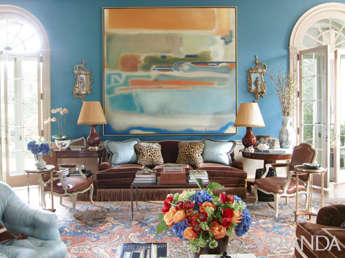
Here is an image from Veranda. The room is full of rich colors and materials; the walls are noted as being upholstered in Brunschwig and Fils silk satin, and the rug is antique Oushak. But to me, the star of the room is the magnificent painting by Agustin Hurtado. Its sheer size and the softly abstract style are beautiful, and I also love that it incorporates all of the colors in the rug and the room.

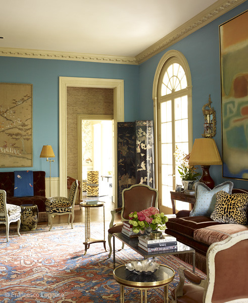

Finally, my favorite view of the room shown in Town & Country. This gives a good perspective on the importance of the painting in the overall design of the room.

I decided to check out artist Agustin Hurtado’s website, and was happy to see a blog post on the ‘before’ state of this painting as it was being created. I love to get a peek into the inspiration and creation process of art, so this was a great find!
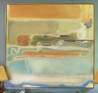
Note that Miles Redd hung the painting with the orange on top; the artist painted it with the orange on bottom. That’s the beauty of abstract art, it can be interpreted in many different ways, and even hung in many different ways.
I personally love really large scale art, and art that both reflects the taste and style of the homeowner and the colors of the room has particular appeal to me. I know that many artists and designers don’t like it when the art matches the sofa; what do you think? Do you prefer for art to match the room?
To see my latest blog post, click here. To subscribe to my blog by email, click here.
To follow my blog on Facebook, click here.
Twitter: @TTIBlog
Instagram: http://instagram.com/ttiblog
Pinterest: http://pinterest.com/ttiblog/
Visit my online store, Quatrefoil Design: www.quatrefoildesign.bigcartel.com
To see design, architecture, art, and decorative books that I recommend, please visit the Things That Inspire Amazon store.
For advertising and sponsorship opportunities on Things That Inspire, please click here. We carefully select the sponsors that are featured in Things That Inspire, and only partner with those whose aesthetic and product is a good fit with the interests of our readers. Posts on Things That Inspire may contain links to sponsor sites.


.webp)


I personally think that clients graviate towards art that appeals to them on many different levels, and one of the most important is color. Often, the colors of the decor are the colors the client prefers - and naturally the colors that they will gravitate towards in art. Usually this applies to abstract art more than traditional art, however, when the subject matter is often as important.
ReplyDeleteLove this post Holly. I have had a few clients flip my work around as well. I think it's great that someone can see something different that the next person. It really is so subjective. Love it.
ReplyDeleteI hate to disagree with my friend Christina, but as an artist it drives me nuts when people flip over my work. That said, if an abstract works in another orientation, its a pretty solid composition.
ReplyDeleteThat is one of my favorite Miles Redd rooms and the painting is incredible.
You know...I just gravitate to paintings, "art work" that appeal to my color passion...how can it help not?? franki
ReplyDeleteI prefer the artist's interpretation personally but totally get why it got flipped in the first place. My guess is there was just too much of the same colour going on in the lower half of the room. Raising the predominant colour to the highest part of the painting deflects the attention upwards and away from the obvious. Gorgeous!
ReplyDeletethis was fun to see-i love how miles redd broke the rules!!-great post!!
ReplyDeleteThe artist is not always around to ask. I'm sure Mr. Redd tried it all 4 ways. I think he picked the best one for the room. For another room - who knows? I flipped the picture in PhotoShop, what do you think? http://www.flickr.com/photos/terrykearns/10848907414/
ReplyDeleteFor me personally, I collect art for the art not for decor. It does not need to match the room, in fact, it is not even a consideration.
ReplyDeleteI believe you should build a room around art and rugs. It seems everything works beautifully.
ReplyDeleteHappy Thursday, Holly.
Teresa
xoxo
I personally think art as being the foundation to the inspiration of the design/decor of a room.... I don't think furniture should be matchy matchy with a piece of artwork... Art creates interest and conversation....should not melt away with the furniture...
ReplyDeleteIt is looking like you have captured all the colors of the world in your room. Painting is looking beautiful and your room also.
ReplyDeleteHowever you choose to look at ~ you've inspired me to get my big brushes out! The room is stunning and I'm so glad you've visited the artists page. I'm sure he's appreciative as well.
ReplyDelete