
When I was a child, I loved to draw, and I saw writing as another means of creating art on paper. Learning about calligraphy was a natural extension of my interest in beautiful writing; after all, the word calligraphy comes from two Greek words which roughly translate to 'artistic beauty' and 'writing' or 'drawing'.
My love for calligraphy inspired a post in November on Barbara Barry and her calligraphic inspiration. One of my readers speculated that the painting in the image below was created by Elliott Puckette. I am not so sure....
 Here is the McGuire furniture ad, featuring the Barbara Barry line. Is this painting a Puckette?
 This is a work by Elliott Puckette, called Untitled I, from the Danzinger Projects
 One of the characters from the new show Cashmere Mafia (ABC, Wednesdays at 10 pm) has a beautiful painting similar to the one in the McGuire ads. Perhaps a Puckette, yet it does not look like any of the Puckette works I have been able to find online. Puckette's work has a free feel, like it is inspired by the techniques of calligraphy, yet goes in an unconstrained direction. The painting in the McGuire ad and on the Cashmere Mafia set have a more formal, structured technique. Regardless, as soon as I saw this painting on Cashmere Mafia, I knew that I had to write another post on calligraphic inspiration.
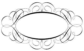
Since I created the post on Barbara Barry, my interest in calligraphy has increased. Specifically, my interest in the ornamentation that graces the work of the most inspired and skillful calligraphers. I purchased a wonderful copyright free book on calligraphic ornamentation, which is full of beautiful scrolls and flourishes.
A few of my favorites:


 Below is a picture from a recent Saks Fifth Avenue in store vignette. I thought this was so beautiful, both original and classic, yet modern at the same time (with such a typically American motto: Want It!).

A few of my favorites:


 Below is a picture from a recent Saks Fifth Avenue in store vignette. I thought this was so beautiful, both original and classic, yet modern at the same time (with such a typically American motto: Want It!).
The Peak of Chic posted this elegant Christmas greeting on her blog (below), and in doing so, introduced me to an amazing calligrapher: Bernard Maisner. Maisner is also a stationer, and creates exquisite cards with the most elaborate of ornamentation.

I particularly enjoy initials inspired by originals from illuminated manuscripts from the Middle Ages. In fact, many of the ornamental flourishes have their origin with the style in which the initial letter of a page or chapter was drawn with great flourishes and decoration. Ornamented initials are truly little works of art.

To subscribe to my blog by email, click here.
To follow my blog on facebook, click here.
To visit my online store, click here.


.webp)


You are forever amazing me with your beautiful posts. I am afraid I cannot assist on the painting question, but I can say hurray for calligraphy. I love those elegant scrolls and swirls as well, and they are so pretty as art and object...
ReplyDeleteWhere do you find these great images?!?!? Rhetorical question, as I know you must have a great academic stash!
I love the Barbara Barry calligraphy designs. Great post!
ReplyDeleteOh, you're slayin' me. Calligraphy is a great love of mine.
ReplyDeleteMust tell: yesterday I was at The Whitney and picked up a terrific book of Twombly repros. Thought of you and your great post a while back. Would that I had your phone # to ask if you'd like a copy as well...
Good weekend.
Hello everyone - thank you so much for the comments!
ReplyDeleteTerri - I think I was made to blog. I have been collecting images on my computer for years, kind of an electronic file system, and I have even started to create folders for post ideas!
Suzy - you and I are the big Barbara Barry fans! I saw one of her rugs today at the design center - the one with the calligraphy style flowing lines - it was so beautiful.
Diana, lucky you! I have not been to the Whitney in years. I really need to plan a trip to NYC. Thanks for thinking of me!
and you have a new calligraphic blog banner border, no? very crisp and clean!
ReplyDeletei once found a couple of dessert plates in a thrift store with a border very like that of your blog banner. they didn't have any markings on them so i could never find out any information on them, but i kept them for years hoping i would stumble across more and build a complete set.
nice post!
Gorgeous post - I have always wanted to learn calligraphy!
ReplyDeleteYes, the border was part of my calligraphy CD set! It was the only one I could find that would not distort and stretch when uploading to a banner. I was worried that it was a bit busy, but I love the artistry of calligraphy so I kept it.
ReplyDeleteThanks for noticing!
Great (and unique) post! I'm a closet Cashmere Mafia watcher and I noticed that painting. Barbara Barry is an odd but not contradictory mix of very modern and absolutely traditional. Since I'm not in design I first noticed her because of her goregous ads.
ReplyDeleteBarbara is great, isn't she? Her trim is fabulous from Kravet.
ReplyDeleteBeautiful post! I saw this calligraphy, http://betsydunlap.googlepages.com/bdunlap
ReplyDeleteon Design Sponge a couple of months ago, and it took my breath away!
I have been keeping a tear-sheet of the Barbara Barry ad too! I've had it for a couple of years now, because I love the painting so much. You've done some great research, good job!
ReplyDeleteI love the new banner. Incredibly elegant, lively and fun. Just like your blog.
ReplyDeleteGreat post and wonderful images (I like Barbara Berry's aesthetic, too.)
When I was developing my card, I fought a hard battle with myself every time I saw the fonts with all the calligraphic swirls and flourishes. Maybe next time.
Thank you, e&e. What a lovely compliment!
ReplyDeleteI agree...you have such lovely posts. I hope you will play with your calligraphy pens!
ReplyDeleteI agree...you have such lovely posts. I hope you will play with your calligraphy pens!
ReplyDeleteI love this post (and the original)! The Saks ad is by Canadian Marian Bantjes. I'm also in love with her "Click Me..." print http://www.bantjes.com/index.php?id=169
ReplyDeleteThanks Amber and Jane! Jane, I will check out that calligraphers web site tonight. Thank you so much for sending it to me!
ReplyDeleteI'm loving your new header with the great flourishes.
ReplyDeleteSo many lovely examples of calligraphy. I love your new header, by the way.
ReplyDeleteI tagged you on my blog. :)
Can you tell me the name of the book that you bought that inspired this post? I am looking for something similar!
ReplyDeleteThanks,
Jenny
The book is called Calligraphic Ornaments, part of the Dover series. I bought it on Amazon. Hope you can find it!
ReplyDeleteThe furniture ad is definitely Puckette. The Cashmere Mafia one looks derivative.
ReplyDeleteI enjoyed seeing the writing in the middle of the card. It looks like Ornamental Penmanship, also called Spencerian Script, which was either started by or made popular by Platt Spencer. My late uncle was an expert in this script and once corrected me that it is NOT calligraphy (my uncle's emphasas).
ReplyDeleteOne of the marks of a really great penman was the exquisite flourishes, sometimes in the form of birds, that were added to the basic letters. Rumor has it that a penman would often send his writing to another penman and that they were always trying to outdo each other with the elaborateness of their letters and flourishes. It is done with a special dip pen that has the nib at the side of the pen handle and the motion to make the letters involves movement of the entire arm.
Michael Sull, of the Kansas City, MO, area, studied under another late master penman and was advised to contact my uncle, which he never did. I think he was involved with the White House Christmas cards one year (probaably addressing them) and the Oscars another year. He teaches a course in this penmanship at The Paper Source in Kansas City, MO, and a book he produced is currently listed as a Buy It Now on eBay. He is a delightful person and I'm sure you would enjoy connecting with him.
My uncle did this as a hobby and later demonstrated the technique at Silver Dollar City after his retirement from farming. When he died, his friends had his name engraved on his headstone in this script.