.}

Monday, April 19, 2010

Small kitchen islands


Atlanta is a great place in the spring (unless you are a seasonal allergy sufferer!), as every week seems to have a different home tour. One of the best home tours of the spring, the Atlanta Symphony Decorators’ Show House, is in full swing now, and it promises to be spectacular.

AWH_PHOTO_Design_Galleria_IMG_71831[1]

I have not seen many sneak previews of the spaces in the Symphony Show House, with the exception of the kitchen. The Atlanta Homes and Lifestyles blog has featured guest posts on the design of the Show House kitchen by one of Atlanta’s preeminent kitchen designers, Matthew Quinn of Design Galleria. Matthew and his team have been working for months on the transformation of the kitchen in the Show House (they gutted the old kitchen), and the results (seen above) are stunning. I took special note of the two small islands; according to one of Matthew’s guest posts, the design came out of a desire to improve traffic issues that one long island often causes in a kitchen where there are multiple people cooking. Also, it was noted the two islands creates more usable countertop space.


salmon house_01_06[1]

It was the second time this week I had seen a kitchen with two small islands. At the end of last week, the authors of the Whitehaven blog posted pictures of the kitchen from the house that I featured on my blog on Tuesday (click here for more images). Note that there are two islands, one of which has storage, and one of which is open. I think this is a great combination – the best of both worlds. Architecture by Brad Heppner (who is clearly very talented at kitchen design).


salmon house_01_01[1]

Here is a wider view of the kitchen – you can see the storage island better in this picture (and those fantastic lights are amazing in the space). Brad designed one island to match the cabinetry, and one island to look like furniture. The overall effect is beautiful. Image via Whitehaven.


A charming 1925 Tudor style house that is on the market in Atlanta has a stunning kitchen addition that is filled with light. Although it is hard to see in this picture, there are two islands, each shaped differently. A big island would have really changed the look of this kitchen, but the two small islands give the kitchen additional work surfaces without overwhelming the space. Does anyone know which architect helmed the renovation of this house (I have a guess…)? Image via real estate listing.


4528660786_0db80acd5a_b[1]

This beautiful kitchen is in a Mediterranean style house (circa 1929) that was renovated under the guidance of project architect Rodolfo Castro (who was with Summerour and Associates at the time, but has since started his own firm, Castro Design Studio). Ed Belding also worked on the kitchen design; Ed is a talented interior designer who worked with Rodolfo at Summerour, and has since started his own firm, the Belding Group. The kitchen has two islands of different sizes and shapes, with open shelving underneath. Photo credit: Blayne Beacham; to see more of this house, please visit Limestone and Boxwoods.


4528681720_61abf43c3f_o[1]

Rodolfo told me that the inspiration for the kitchen islands came from Castle Drogo, located near Drewsteignton, Devon, England. Castle Drogo was built in the 1910s - 1920s and was designed by Edwin Lutyens (the island in the picture above was designed by Lutyens for the home). An interesting side note, Castle Drogo was the last castle to be built in England, and more than likely the last private house to be built entirely of granite (source: Wikipedia).


What do you think of two small islands in a kitchen? I like the look, provided there is enough storage space in other places in the kitchen. I can definitely see the advantages from a traffic flow perspective, and I love the idea of having multiple independent work surfaces (during busy times in my kitchen, we have small battles for countertop space). The one concern I have is losing the storage that is in a large island. I am looking forward to seeing the kitchen in the Symphony Show House in person, and I will be paying special attention to those kitchen islands!

The Atlanta Symphony Decorators’ Show House opens this weekend (April 17, 2010), and runs through May 9, 2010. For more information, please visit the show house website: http://www.decoratorsshowhouse.org/

To subscribe to my blog by email, click here.

To follow my blog on facebook, click here.

To visit my online store, click here.

Friday, April 16, 2010

A great blog, and a thank you


Late last year, a new blogger started commenting on my blog. As soon as I visited her blog, I knew I had found something (and someone) special. Gwen Driscoll writes Ragland Hill Social, and is not only an extraordinarily talented designer (and owner of Gwen Driscoll Designs), but also a design blogger with a talent for writing with flair and wit. Her posts are a visual feast, filled with image after inspirational image.

In Gwen's words:
My design always evokes emotion. It's just part of my process. A sterile environment is usually not my favorite. People who hire us are drawn to our work for that reason. I rarely hear people say they were "wowed" by my work. I often hear "they loved the way a space made them feel".
This perfectly captures what I like about great design - I am not looking for spaces that bowl me over, but spaces that feel right. It is hard to pinpoint exactly what makes a space feel right, but a designer like Gwen has a 6th sense for this kind of thing; it is about scale and proportion, a mix of textures, a sense of comfort and ease, spaces that work for the people who are going to live in them.

Gwen's own work represents this perfectly. Look at this room that Gwen recently designed for a client. It is beautiful and clean lined, yet has traditional elements that have stood the test of time. Image via Gwen Driscoll Designs.

I always love a room with a grand piano in it! Image via Gwen Driscoll Designs.


The farmhouse table and rustic dish cabinet look amazing in this space. I would love to see more of the kitchen - what is that countertop made of? Image via Gwen Driscoll Designs.


Also not to be missed is Gwen's series in which she matches a Hollywood celebrity with a piece of furniture. One of my favorites: the dining room chandelier post (click here) and the 'Every Room Should Have a Superstar' post (click here - it one of my favorites of the year so far!).

It is also clear when reading Gwen's blog that she is a generous soul. She shares her gift and her knowledge freely.


She also has wonderful giveaways! Gwen has giveaways for things that she personally loves to use in her own home and for clients, and one such giveaway was for Leontine Linens (Leontine founder Jane Scott Hodges is one of Gwen's dear friends). I have always admired the beauty and craftsmanship of Leontine Linens, and was amazed to learn that I was the lucky winner!

My gift arrived this week; we ordered it in late January, but each item is custom crafted and takes 8-12 weeks for delivery. Not surprisingly, the Leontine box was beautiful and tied with a lilac ribbon.


And here is my wonderful gift! Three custom monogrammed dinner napkins, one for each of my children. I wasn't sure what to select, as the color scheme for my new house has not even been discussed. Gwen and I brainstormed a bit, then I told Gwen about one of my fond childhood memories of visiting my Aunt in Scotland; every member of the family had their own special napkin and napkin ring. So this will be the beginning of a wonderful new family tradition in my own family! I even have the napkin rings, which were gifts to my children when they were babies.

Thank you, Gwen! Please stop by and pay her a visit at her marvelous blog - she has a great post up today. http://gwendriscoll.blogspot.com

To subscribe to my blog by email, click here.

To follow my blog on facebook, click here.

To visit my online store, click here.


Tuesday, April 13, 2010

A beautiful Atlanta house


Last year, while running an errand, I missed a turn and traveled along a section of road that I had not been on in a long time. It was a serendipitous error, for I spotted a house that has become one of my favorites. It happened to be near the 4th of July when I saw this house, and I was charmed to see that the house had an enormous American flag hung across the front. It so inspired me that I went back at the crack of dawn the next day to capture a picture for my blog, and I dubbed the house ‘The 4th of July House’. A few months after this post, the architect who was in charge of the renovation emailed me and thanked me for the kind words in my post; the architect’s name is Bradley Heppner.

The name immediately rang a bell, as he was the architect who designed the charming house of the author of Whitehaven; I met her many years ago through a mutual friend, and was able to tour her house when I was trying to decide whether I should renovate or custom build.

3680717497_ee321d1135_b[1]

The house I dubbed ‘the 4th of July house’

Since the time I first saw the 4th of July house, my path has crossed with Brad Heppner’s several times, although sometimes it was through one degree of separation. When I first met the amazing designer Amy Morris, she had a set of plans spread out on her desk, for a house designed by none other than Brad Heppner (not the house pictured above). More recently, my blog friend Architecture Tourist arranged for a tour of a house that was recently built in his neck of the woods, a contemporary masterpiece designed by – you guessed it – Brad Heppner (the interiors were by Amy Morris). I was delighted to finally meet Brad in person; he led the tour of the home, and it was spectacular.

Since the tour, Brad has become a ‘friend of the blog’. I recently asked Brad if I could feature the 4th of July house in a special guest post I was writing, and not only did he provide me with some excellent pictures, but he also told me the story of the house and how the new owners found it. This was clearly a special project for Brad, and now that I have seen the ‘before’ pictures of the house, I am in awe of the transformation that took place.

before_july_thumb%5B1%5D[1]

Here is the house in a ‘before’ picture, from an undated tax record. The house was originally built in 1967, and Brad calls it a ‘pseudo Greek Revival’ style so popular during that era.


4512893030_a687b64cbc_o[1]

This picture comes from the 2007 real estate brochure (before the current owners purchased the house). The color scheme of the house was softened by painting the brick, door, and shutters a lighter tone. Still, this was far from Brad’s clients’ dream home; in fact, they were reluctant to even show Brad this property because the house itself was so far from their style. The property was one of a kind, though; over 5 acres of usable land, and just a stone’s throw from their children’s school. Even after purchasing the property, the clients still weren't convinced they could ever get their ‘silk purse from a sow's ear’ from this house and contemplated tearing it down at several points during the project.


4483331823_6eb8cb8bd4_b[1]

Here is a picture of the ‘after’ – quite a stunning transformation. Greek Revival was not the favored architectural style of Brad’s clients, so Brad recommended to "move in a direction that reflected a region interpretation of the Greek Revival style rather then adhering to the purity of the style itself”. The cedar roof was selected with this in mind; cedar is used as a roof material on some Greek Revival plantation homes in Mississippi and Louisiana, particularly in more agrarian settings. Brad used this as his precedent to begin to loosen up the formality of the Greek Revival and portray a feeling more closely related to a low country Natchez farmhouse. (Photo credit: Brad Heppner)

The formality of the Greek Revival style was also relaxed by adding a balcony between the front four columns of the house, breaking up what had been the rigid horizontal structure of the six columns. It wasn't until the interior functional changes began to develop (the entire floor plan was gutted and rearranged) and some of the formality of the Greek Revival style was relaxed that the clients began to realize that the house was becoming more then they ever thought it could be.


4512892958_3d82a66340_b[1]

I asked Brad whether they had planted mature trees along the driveway, and he told me that the oak allée (a path lined with trees) was actually part of the original landscape, however no one ever seemed to notice them prior to the renovation. As Brad said, ‘they are one of those priceless assets that made this lot special no matter what we decided to do”. I also find the urns on the entrance pediments to be charming – the owners put different flowers or plants in them, according to the season. (Photo credit: Brad Heppner)

For more information on Atlanta based architect Brad Heppner, please visit his website - http://bradleyeheppner.com/. It is always inspiring to see how a talented architect and a client who is willing to trust the vision of the architect can transform a house and give it a whole new story for the next generation!


To visit my store, Quatrefoil Design, click here.

To subscribe to my blog by email, click here.

To follow my blog on Facebook, click here.


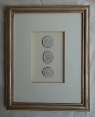
Beautiful framed intaglios, available here:

Unique architectural renderings, available here:

Whimsical original crab and lobster paintings, as seen in House Beautiful, available here:


http://www.quatrefoildesign.com/

Thursday, April 8, 2010

Wall mounted faucets


I was recently in a store looking at bathroom faucets, and overheard a designer sigh and declare that she was ‘over’ wall mounted faucets. I thought this was an interesting statement. Was this the personal reflection of a person who is immersed in design day in and day out, or does it reflect the fact that wall mounted faucets are something that have been overdone? Quite frankly, I never even realized that they were ‘in’! I rarely notice plumbing fixtures when looking at magazines or visiting homes, so I really have no perspective on this.
3626311138_540ff2e01c_o[2]
One of the first times I actually recall seeing a wall mounted faucet was when I saw this beautiful powder room in a newly built home – just a few years ago. My eye was mainly caught by the window over the sink, an unusual and charming feature, but I also thought the wall mounted faucet on a carved piece of marble was a great way to handle this space.

image_thumb32[1]
Last year’s tour of Houston houses, as seen through the eyes of Cote de Texas, had quite a few striking examples of wall mounted faucets. The houses were all rustic European style; this one was dubbed ‘the Provence house’ by Joni.

image_thumb%5B38%5D[1] image_thumb13[1]
These wall mounted faucets were from ‘the Octagon house’ on the same tour. Note the use of concrete sinks.

yesornohb[1]
Recently, the blog ‘If the Lampshade Fits’ posted this picture (via House Beautiful), with the simple caption ‘your thoughts please’. The comments are hilarious – I recommend a visit to the post. The controversy had more to do with the iron gate in front of the mirror; the wall mounted faucet received quite a bit of praise.

My all time favorite powder room, designed by Jim Howard, has a delicate wall mounted faucet that works beautifully in the space. When Jim gave me a tour of this home, I couldn’t resist trying out the faucet – I really haven’t seen too many wall mounted faucets in person. I love the fact that the plumbing is completely hidden, and the sink appears to be carved out of a single piece of stone.

Jill Sharp Style - Powder Room[1]
A powder room by designer Jill Sharp Brinson; Jill custom designed the sink base. Image via Limestone and Boxwoods.

ss0509_10-l[1]
I recently came across a great article from Coastal Living, featuring the beach house of designer Kay Douglass. Note how the faucets are mounted to the mirror. I wonder how deep those sinks are? One thing that needs to be evaluated when using a wall mounted faucet (or really any faucet) is the splash factor.

4501996111_4d737a84c8_o[1]
I like the ‘wow’ factor of using a wall mounted faucet for a powder room.

McAlpine
A great sink and wall mounted faucet, from a house designed by architect Bobby McAlpine, with interiors by Susan Ferrier. Image via House Beautiful as seen in Nest Egg.

mcalpine_veranda
I love this powder room, from one of my all time favorite houses, a McAlpine house in Nashville that was featured in Veranda a few years ago. I saved the picture for the mirror, but the wall mounted faucet is spectacular.

6a00e554d7b82788330128768270a2970c-pi[1]
The beautiful new sink in designer Brooke Giannetti’s (of Velvet & Linen) weekend home caused quite a stir in the blogosphere when she unveiled it.

3923487249_ce39f1c128_o[1]
Brooke’s powder room re-do was inspired by another one of my all time favorite powder rooms, from John Saladino’s Villa. Upon looking at this picture a bit closer, I noticed that the control for the faucet seems to be on the counter.

6a00e554d7b82788330120a77f9cf0970b-500wi[1]
Here is another view of Brooke’s powder room – and sure enough, the control for the water is on the counter! Beautiful. Click here to see more.

4471376506_2d565f087a[1]
A home featured in Veranda in 2008, with architecture by Steve Giannetti and interiors by Madeline Stuart, featured a beautiful sink with a wall mounted faucet.

2853220582_a83197f6cf_o[1]
Designer Phoebe Howard uses a wall mounted faucet in a beach house. It is interesting how many of the wall mounted faucets are used with vessel sinks. Perhaps these are styles that naturally work with one another, or perhaps it is because of the ‘splash factor’ of a wall mounted faucet.

wall_mounted_faucet
Although the wall mounted faucet style seems to be most common in bathrooms and powder rooms, I have seen it in kitchens as well. This picture has been in my files for years. I never really looked at the faucets before, but I think I would actually like this set up - a separate faucet for hot and cold, and a sprayer. I tend to use either hot or cold in my kitchen faucet, rarely warm.

4470579175_93f1d3e089[1]
This is Monet’s kitchen at Giverny (image via Veranda) – I immediately noticed the wall mounted faucet in the large sink. It appears as if this style has been used for over a century!

2408239762_5fd512cd26_o[1]
One of my favorite architects, William Hefner of Los Angeles, has the most beautiful and inspiring kitchens in his designs. This kitchen is as beautiful as it is functional. The area along the wall appears to be the cleanup zone, with a sink and dishwashers flanking the sink, and storage for plates and cups in the cabinets above. I love the look of the wall mounted faucet on the wall here, but I do wonder if I would like the function. One of those knobs next to the sink must be a sprayer. What do you think? Would a wall mounted faucet in the kitchen work for a secondary sink?

4359348314_f2b5157216_o[1]
I love this little wall mounted faucet in a butler’s pantry. Note how the marble goes up to provide a great backdrop to the faucet. Image via Nest Egg.

4358609845_f935043472_o[1]
And finally, last but certainly not least – the laundry room of one of my readers. When my designer suggested that we use a farmhouse sink in the laundry room, I immediately had a point of reference because of this lovely space. My reader was worried about how the wall mounted faucet would work in the laundry room, and thought that her children might not be able to reach it, but she says that it works great!

So, readers, what do you think? Are you ‘over’ wall mounted faucets – or are you just discovering them? I think they are beautiful and special when used sparingly in a house. I have a feeling that a wall mounted faucet is going to end up somewhere in my new house.

To see my latest blog post, click here.
To subscribe to my blog by email, click here.
To follow my blog on Facebook, click here.
Twitter: @TTIBlog
Visit my online store, Quatrefoil Design: www.quatrefoildesign.bigcartel.com
To see design, architecture, art, and decorative books that I recommend, please visit the Things That Inspire Amazon store.

LinkWithin

Related Posts with Thumbnails