
Thank you to the Washington Post for including this post in your Blog Watch, December 18th, 2008!
House aficionados, here is a special treat for you. Last year, I did a post on Donald Kaufman paint, and it featured a room from the home of my sister. It is on Gibson Island, a private island situated off the Western shore of the Chesapeake Bay. The home is amazing; it has a great floor plan, and is quite spacious, but not over-the-top big. Because of the great floor plan, every room in this house is truly used. However, what took this house from good to great was the amazing interior design done by James Beebe Hawes of Caldwell-Beebe. I can honestly say that seeing this house, and seeing how Hawes transformed it, completely changed the way I look at interior design. Of course, my sister had the advantage of being able to furnish this house from scratch, so there were no old awkward pieces of furniture to fit into the scheme.
 The entry. The house was built in the 1920s, and the fireplace is in the middle of the living room (on the other side of this entry wall). Because it was not possible to change the configuration structurally, Hawes made the entry feel like a room with a window. The window is antique Swedish.
 Here is the living room, and there is the fireplace on the other side of the entry. The room is carpeted in Pueblo sisal. The Victoria Hagan wing chair (upholstered in Rogers and Goffigon fabric) is a beautiful focal point, and quite comfortable too. The John Saladino 3 leg table is a favorite of mine. The pine bookcase along the wall is antique Swedish. According to my sister, the walls are painted in Donald Kaufman No. 55
 The living room serves a dual purpose, as it has the dining table in it as well. The dining table is made by New Classics, and has a custom nautical design on the top. The chairs, also by New Classics, are slipcovered in duck cloth to bring down the formality of the space. The chandelier is by Mike Reid Weeks, and is no longer made, unfortunately!
 The sunporch is one of my favorite rooms. It is fully enclosed, and the light streams in, making the space sunny and bright. The floors are bluestone, and have radiant heat. None of the pictures on the listing show the lovely bay view, unfortunately.
 The other side of the sunroom. The French doors leading out to the lawn are on the left, and they lead directly to the bay. The walls are painted in Donald Kaufman No. 29.
 The family room is casual and slightly nautical in theme, but not over the top. I love how the pillows and the art work so well together.
 The master bedroom has a custom Dessin Fournir bed. The walls are painted in Donald Kaufman No. 6.
 The guest bedroom has the Donald Kaufman paint that I raved about. According to my sister's records, the color is DK No. 29 (if you like this color, sample pots are available for purchase at The Color Factory in New Jersey). It truly changes colors throughout the day, based on the sunlight. I think this is as close to the color of seaglass as you can get!
 Another view of the guest room. Much of the furniture in this room was purchased at Tone on Tone, a Swedish antique store in Bethesda, Maryland. The view out the window is of the Chesapeake Bay. No doubt, this is the prettiest guest room I have ever seen.
ITo visit my store, Quatrefoil Design, click here.
To subscribe to my blog by email, click here.
To follow my blog on Facebook, click here.
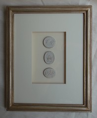
Beautiful framed intaglios, available here:

Unique architectural renderings, available here:
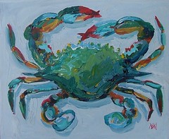
Whimsical original crab and lobster paintings, as seen in House Beautiful, available here:


 My favorite painting from the showhouse was in a bedroom room designed by


 The kitchen of designer Dan Carithers, which he 'redid' 30 years ago. Carithers has long favored using furniture pieces in his kitchen, rather than wall to wall cabinets everywhere. The kitchen overlooks Carithers' beautiful sculpted English garden. From Traditional Home.
  This looks like a remodelled kitchen from an older home, based on the ceiling height. The windows really open up the kitchen and give it a modern feel.
 I love this gray and white kitchen, and although I am not certain whether the windows extend along the entire wall on the left, I like to imagine that they do.


.webp)


