I have been collecting pictures of my favorite ways that designers have styled the bedside – not necessarily the bedside table, but the area to the left and right and the bed. The design decisions are influenced by the architecture of the room, the location of the windows, the shape of the bed and the positive and negative space that it creates, the way in which the items on the bedside (lamps in particular) work with the composition.
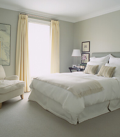
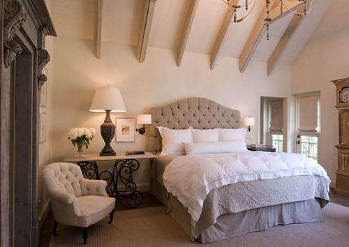
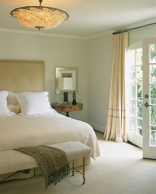
Here is an example where the designer has chosen to keep things simple on the bed wall. There are windows, but they are to the right of the bedside table. The fabric used on the headboard and the curtains is the star of the room, and lends a peaceful and uncluttered look to the room.
This bedroom, designed by Alessandra Branca, is a favorite of mine. The wallpaper provides all the pattern and interest that is needed on the bed wall, and is a strong design element in the room.
One of my favorite bedrooms by Miles Redd features hand painted wallpaper on the bed wall. However, I tend to admire wallpapered bedrooms from afar – this is not a design element that has ever been considered for my bedroom. I like my bedroom to be very peaceful and serene in look and feel, a sanctuary of sorts.
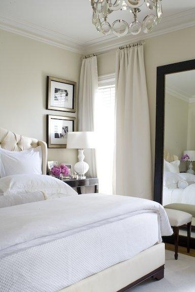
Mirrors are often used to flank a bed that has a large bed wall. This was a vignette from Suzanne Kasler’s line for Hickory Chair at High Point. The urn on a decorative shelf pulls the vignette together.
Here is a bedroom designed by JFS Design Studio, with symmetrical mirrors on either side of the bed, but nothing above the headboard.
A bedroom designed by Katie Stassi has two different mirrors on either side of the bed (as well as two different bedside tables). The fabric behind the headboard is a beautiful transition between the mirrors.
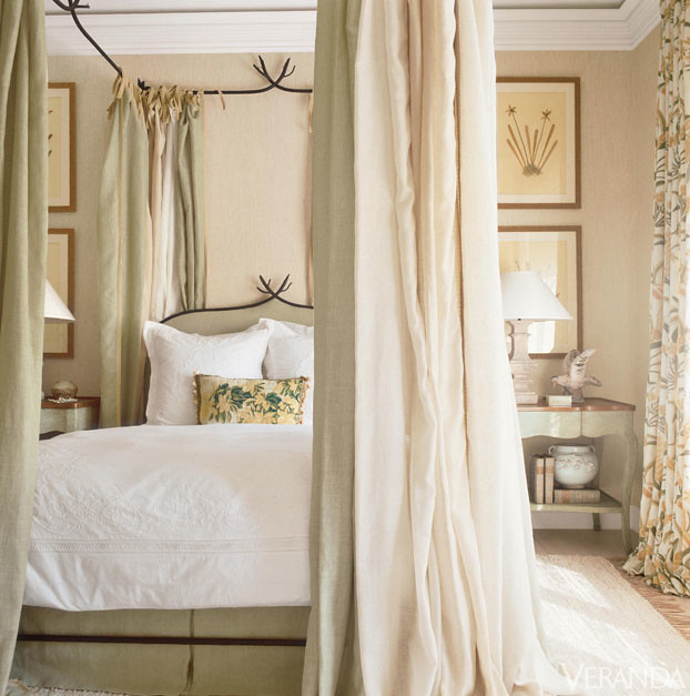
I would have to say, though, that my favorite look on the side of the bed is some sort of art or wall hanging. This picture was featured on Veranda’s Facebook page recently, and I immediately added it to my bedroom wall décor file. The design is by Richard Hallberg, and the wall hangings appear to be framed pressed flowers. Interestingly, I saw a lot of framed pressed flowers at Scott Antique Market this month.
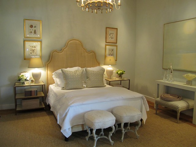
The front bedroom vignette from Mrs. Howard Atlanta is an ever changing inspiration for beautiful ways to arrange a art above or to the side of a bed. Here is the space with a king bed and an array of botanical prints.
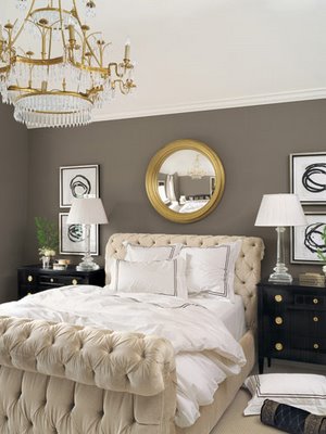
The same room, styled differently. This was a favorite, a Hickory Chair bed with two beautifully framed sketches on each side, and a starburst mirror above the headboard. I also love the scale of the lamps on either side of the chests.
This was one of my favorite vignettes from Max & Company in Atlanta, the sister store to Mrs. Howard. The composition of the scene is so pretty, with the stacked watercolors and the unusual mirror in the transition space between the two sides. The size and material of the glass lamps allow the artwork to really show.
The same room in Max & Company, but with a different vignette.
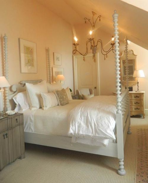
The third floor of Mrs. Howard has a space that is usually decorated as a bedroom, and it is always a treat to see how it is styled. I found this picture on Pinterest – I don’t think I saw the room when it was set up this way. The beds with the tall posts lend themselves well to the two pictures on either side with a picture in the middle styling.
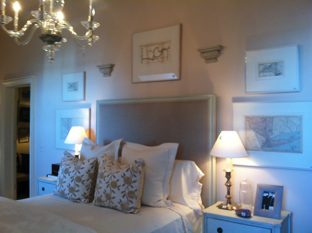
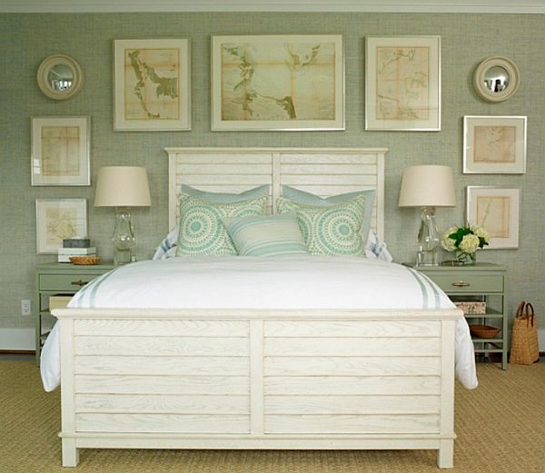
Here is that same room, recently styled with maps on either side and above the headboard. Everything is sold off the floor, so it is possible to purchase the entire vignette!
Here is the ‘five item’ design in the home of Houston designer Renea Abbott, as seen in a 2008 Veranda. I think this is beautiful, and the tall slim shape of the lamps and the translucent crystal material makes it all work beautifully.
Another Phoebe Howard design with a beautiful composition of mirrors, maps, and lamps – this is a favorite.
There is something so beautiful about a well conceived bed wall that has great appeal to me. This is an old image via Cote de Texas that I found in my ‘bedroom design’ files on my old computer.
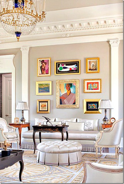
A gallery wall above the bed that I have had in my files for years.
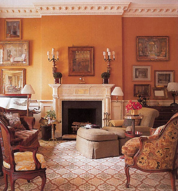
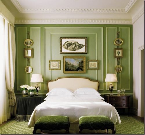
I am always in awe of well designed gallery walls, and this one by Miles Redd is particularly successful. What do you think of gallery walls above and around a bed? I really like them.
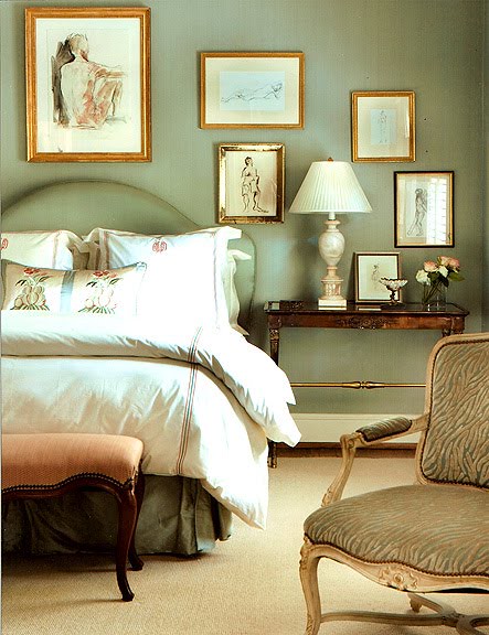
Another picture from my old files, a gallery wall of nude sketches and paintings are beautifully framed and artfully arranged by Atlanta designer Carole Weaks.
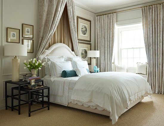
This is one of my favorite bedroom pictures, and one of the reasons I like it is so much is the interesting arrangement of art on either side of the bed. I don’t think that this asymmetrical arrangement would work without the canopy/curtain (not sure what the fabric design on the wall is called?) that separates the sides. I particularly like the trio of framed items on the left side, and how the lamp and flowers work perfectly with the composition. Via Traditional Home.
This bedroom by Phoebe Howard, which was in a showhouse a few years ago, has always stood out in my mind. I love the symmetrical series that was hung on either side of the bed, but I think the entire composition (which included a luxuriously canopied bed) made it work. Do you think a composition like this could be standalone with a simple headboard? I’m not so sure.
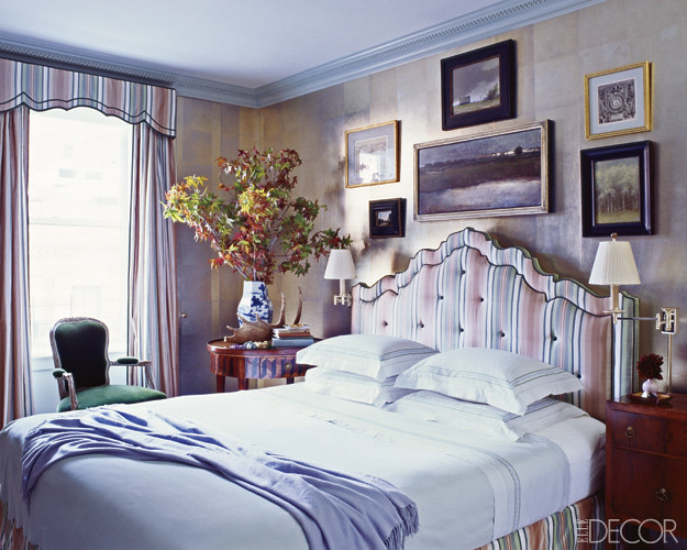
Two paintings stacked are often seen in bedside wall composition. However, with the height of the paintings, it seems as if there is always something directly over the bed (whether it be a mirror, a canopy, or a painting) to pull together the two sides of the bed. Design by Phoebe Howard.
I wonder if there is another element over the bed? This view only shows the right side of the bed, but if you look in the mirror, the other side of the bed can be seen – and there are no framed photographs on that side (maybe because of lack of space).
A similar arrangement, but it is clear there is nothing above the bed. The small size of the framed items and the slim proportions of the lamp makes this work beautifully. Also, the ceilings don’t appear to be very high, which reduces the space above the bed.
Ultimately, though, I keep coming back to the look of one item on either side of the bed. The pen or ink sketch works so well in this vignette, and I think sketches work well in general in bedrooms because of their soft look.
One framed painting leaning on each side of the bedside. The tall thin lamp works well allowing the art to be seen. I really like that a well scaled painting is hung above the bed, mainly because of the very tall ceilings.
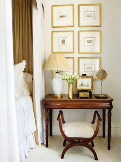
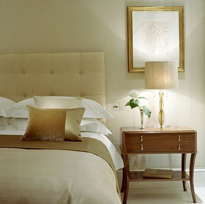
One small square painting placed to the left of the headboard, in a design by Eleanor Cummings.
If there is enough space on the bedside table, a leaning painting makes a nice composition.
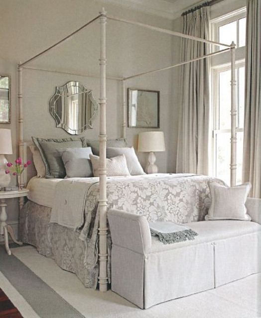
A pretty bedroom with framed coral on either side of the bed, and an interesting mirror in the middle. The shape of the headboard (and the very tall ceilings) allows for a larger mirror to be used to fill the negative space above the bed.
Another favorite bedside vignette, with a leaning framed print. It’s interesting how the lamp is placed on a stack of books, which compositionally elevates the shade above the art. I wonder if the homeowner keeps it this way all of the time, or if this was styled for the photo shoot? It’s a beautiful composition. I would love to see this entire bedroom. Design by Carter Kay Interiors.
I really love this bedroom. My only observation would be that the art on the side of the bed is obscured by the lamp shade. Perhaps it is just this view. The framed item does add to the look of the bed wall, and it can’t really be placed higher or lower or even further to the right.
A beautiful bedroom by Kimberly Seldon design. The bedside tables are large enough to hold the lamps as well as display a good size piece of art on either side of the bed. Note that the lamps are crystal, which allows for both the painting and the lamps to work together.
I found this beautiful bedroom on Pinterest, and I am not sure who designed it. Note how the framed painting to the left of the headboard fits perfectly into the space between the bed and the lamp. The bedside table is large on the left side; the other side (which has a different side table too – it looks like a skirted table) has a potted plant. Although I really like the classic tight shot of a headboard and side table, I also appreciate seeing the entire room.
The perfect little painting complements this space so beautifully. I must admit, I have held up small paintings to the side of my bed, but they seem dwarfed by the wall. I think this works better in a more intimately scaled room than mine. Design by Courtney Giles, via Atlanta Homes & Lifestyles.

One of my all time favorite images – I have had this on my blog many times. The Melissa Payne Baker painting is a little jewel in this vignette, as seen in a room designed by Alison Womack Jowers seen in a recent Atlanta Homes & Lifestyles (photo credit: Emily Followill).
What is your preference for bedside décor? Is there an image in this post that you gravitate towards? Bedside decor is often dictated by architecture, window placement, size of the room and height of the ceiling. I never really thought about this in my old house, as I had windows on either side of the bed. In my new house, I have a big wall, and the décor for my bedroom is not complete, and given that my bedside tables are large, there are lots of possibilities.
This post has been helpful, though - I realize that I do like a serene and uncluttered bedroom, so I want to keep the bed wall fairly simple. Perhaps I will hang one soft colored painting or sketch on either side of the bed. I'll have to keep my eye out for something at the upcoming Trinity Artists Market!
To comment on this post, click here.
◊
For advertising and sponsorship opportunities on Things That Inspire, please click here. We carefully select the sponsors that are featured on Things That Inspire, and only partner with those whose aesthetic and product is a good fit with the interests of our readers. Posts on Things That Inspire may contain links to sponsor sites.
To see my latest blog post,
click here.
To subscribe to my blog by email, click here.
To follow my blog on Facebook, click here.
Twitter: @TTIBlog
Instagram: http://instagram.com/ttiblog
Pinterest: http://pinterest.com/ttiblog/
Visit my online store, Quatrefoil Design:
www.quatrefoildesign.bigcartel.com
To see design, architecture, art, and decorative books that I recommend, please visit the
Things That Inspire Amazon store.