For full post with large scale pictures, please visit
http://www.thingsthatinspire.net/2013/01/new-on-market-blind-side-house.html
Georgia has been a hot spot of movie and TV production over the past few years; in fact, Georgia is one of the top five states in the country for film production. Georgia’s many scenic urban and rural settings are a draw, as well as its mild climate, however the biggest factor is probably the generous tax incentives for filming in Georgia.
It is a fairly common to see production crews in Buckhead, and a small cottage industry has sprung up – renting your house to be used as a filming location (or even as a temporary abode for a famous movie star).
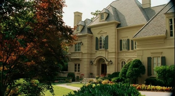
Several years ago, the movie The Blind Side was filmed in Atlanta. After Hooked on Houses did a post on the house used in the movie, I kept my eye out for the house, but it did not look familiar and I did not ever find it. Photo source.
After inquiring with a real estate friend, I learned where the house was located that was used in the film – however, only the interiors were used. The exterior shot seen in the film is a different house.
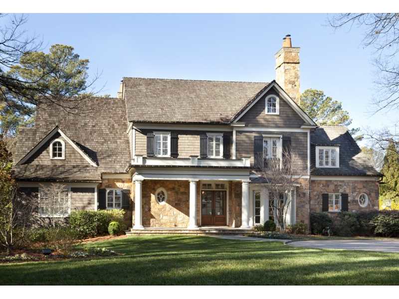
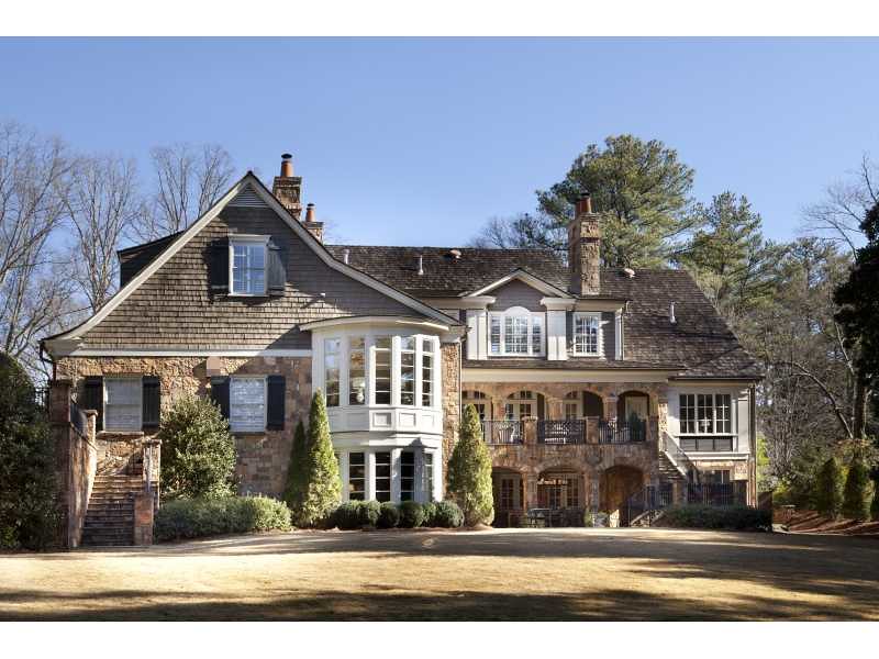
Here is the exterior of the house that was used for the interior shots in the film – and it has just been listed for sale (see listing here), which offers an interesting peek into how the house looks and is used on a day to day basis versus on a film set. The house is located in a prime area of Buckhead, a prestigious area of Atlanta just minutes from shops and restaurants, and is on a large piece of land with an expansive and private yard. According to the listing, the house has over 11,000 square feet on three finished levels.
The rear elevation of the house, from the real estate listing. Given Atlanta’s sloped and hilly topography, it is quite common for the rear elevation to show three levels. I think the architects, Spitzmiller & Norris handled the rear elevation beautifully – it is an interesting and charming view of the house.
It was fun to compare the pictures of the movie set (from the Hooked on Houses post) to the real estate listing. Initially I was a bit disoriented when trying to figure out which room was which. Apparently the set designers used some of the rooms for different purposes than the homeowners. I ended up used the trim and moldings to figure out which room was which.
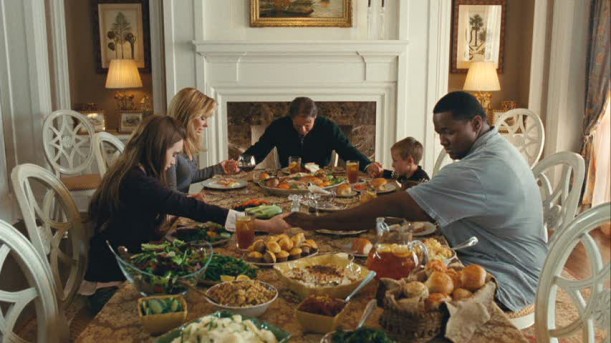
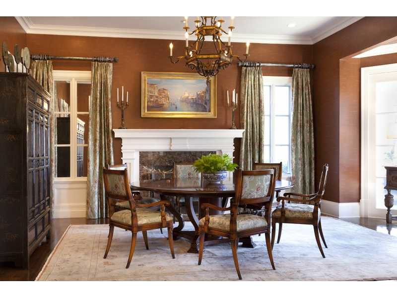
The set designers changed the function of some of the rooms, perhaps because of better filming angles. For example, the above picture shows the dining room in the movie. Photo source.
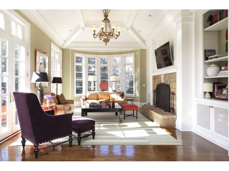
In the real estate listing, the same room is actually used as a living room. The homeowners’ décor is much more streamlined than the set décor (and I love the pop of purple from the pillows), which highlights the architectural details of the rooms. It is also important to note that real estate photography emphasizes the volume and character of the spaces, which was not the focus of the movie. By the way, I think this is particularly nice real estate photography – the pictures are beautiful.
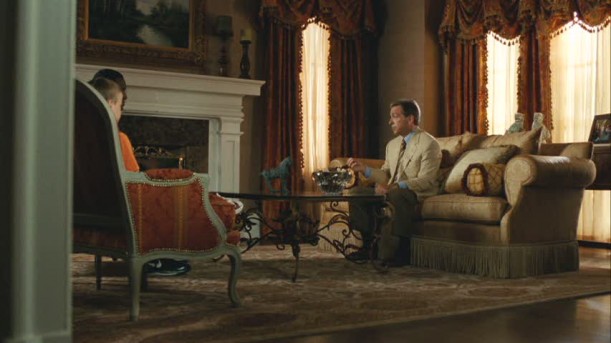
The movie living room is the place where a lot of the important family meetings take place. Note the heavy curtains, and the window to the right of the fireplace. There is a bay window seen to the right. Photo source.
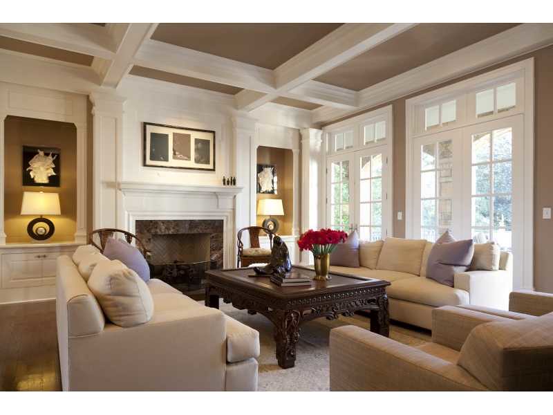
Here is the same room, in the real estate listing. This room is actually the dining room in the house. Note how a mirrored ‘window’ is placed on the other side of the fireplace to give a symmetrical and balanced feel to the room. I wonder if there is a door on the other side of the large chest, perhaps leading to a bar.
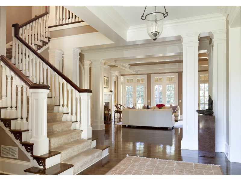
A picture from from the real estate listing shows the view from the front door to the back. Note the detail on the stairs….
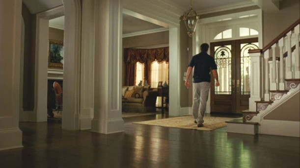
Seen in the movie picture, with the view from back to front. Photo source.
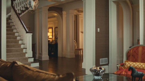
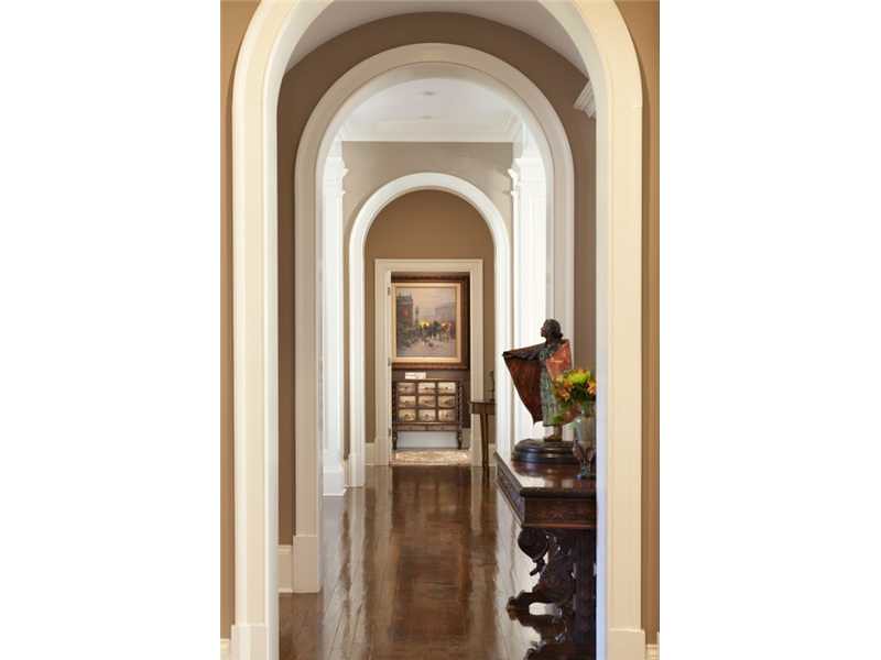
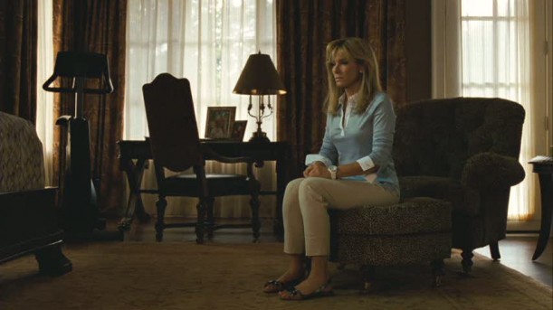
A view from the movie set ‘living room’ to the front hall. I suspect that the hall seen through the arched opening leads to the master bedroom (the real estate listing says master on main), although in the movie the master bedroom is depicted as being upstairs. Photo source.
Here is a picture of the arch door hall, as seen in the real estate listing. This is a lovely picture, and a great axial view.
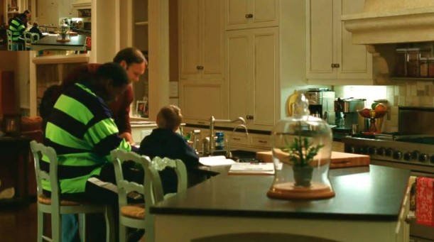
Hooked on Houses noted that there were not many good movie views of the kitchen or the family room, as the scenes were shot rather close up. Here is a picture of the kitchen from the movie. Source.
From the movie set, a view from the kitchen to the family room. Photo source
Here is a real estate picture of the kitchen. What a beautiful space!
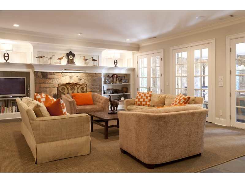
A view from the kitchen into the family rooms shows the dramatic difference in how the movie set was decorated, versus how the homeowners decorate in real life (I wonder who the designer is?). The pictures are beautiful quality, but this really shows the beauty of the architecture and how light-filled the spaces are.
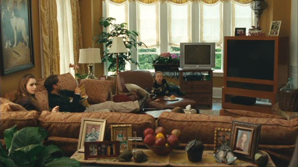
A picture of the family room from the movie – there are multiple TVs that enable them to watch multiple sports games at once. The sectional sofa makes for a great place to watch TV, but it closes off the room. Photo source.
It’s hard to believe this is even the same room. I understand that the movie was about the family and the characters, and not the house – and the house décor was supposed to reflect that of Leigh Anne Tuohy, whose story was the basis for the movie. Still, it’s interesting to see how different the space looks when the furniture arrangement opens up and the emphasis is on the décor and architecture. I really like the absence of window treatments in this room; they make the space very airy and light. Note the cabinet doors on the right side of the picture – so pretty. The southern light exposure is ideal in this space.
After writing this post, I received an email from the design firm who created the lovely interiors of the 'real life house' - T. Duffy & Associates. They have a wonderful website, full of an incredible portfolio of work.
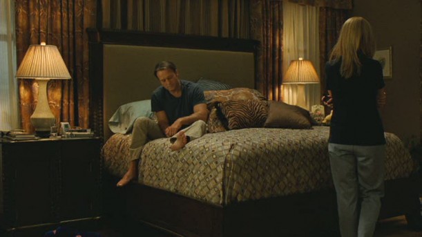
There aren’t great views of the master bedroom in the movie, but these images show the dark and fabric filled décor scheme used on the movie set. Photo source.
The fabric conceals the fact that there is a niche of sorts where the desk is placed. Photo source.
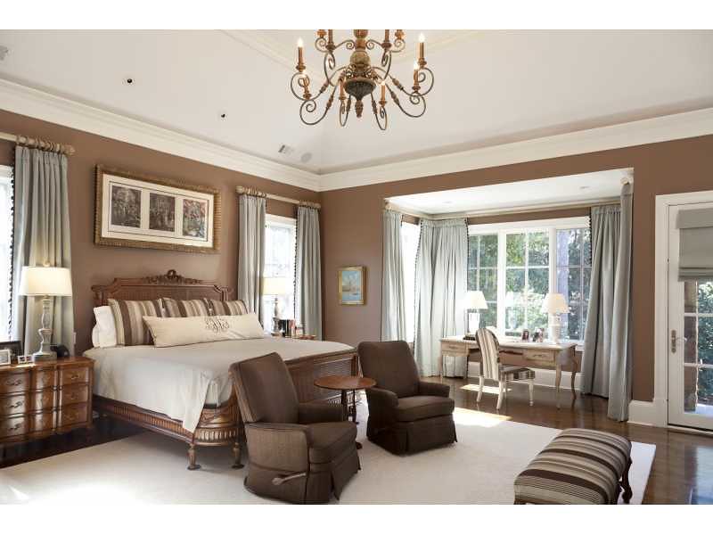
The master bedroom, from the real estate listing. The contours of the room can be seen much better, and it is interesting to see the rich brown and blue color scheme used in the space.
That’s it for the house comparisons, but there were some interesting pictures in the real estate listing worth checking out.
A casual basement sitting room. Many houses in the area where this house is located have a full basement (which is often called ‘the terrace level’), which is often used for rec rooms, guest bedrooms, wine cellars, exercise rooms, and/or media rooms. These spaces add a lot of square footage to a house, and are common features in large Buckhead homes. I am not a big fan of basements, but people in Atlanta seem to love them and they are highly desirable. Some people won’t even look at a house without a basement.
From the real estate listing – this is on the terrace level, and opens directly to the back yard.
From the real estate listing, a media room that is probably in the basement of the house. Clever to have a scene from The Blind Side on the screen!
So, what do you think? I think it is a great house both inside and out. It can be yours - the house is on the market, and the full listing can be seen here. The architects who designed the house, Spitzmiller & Norris, are two of the top architects in the Southeast, and many of their houses have been published in national magazines. They are known for the beauty and quality of their designs, and the casually elegant nature of the houses that they create.
The beautiful interiors of the 'real life house' seen in the real estate listing were designed by T. Duffy & Associates.
To subscribe to my blog by email, click here.
To follow my blog on Facebook, click here.
Twitter: @TTIBlog Instagram: http://followgram.me/ttiblog/modal
Pinterest: http://pinterest.com/ttiblog/
Visit my online store, Quatrefoil Design:
www.quatrefoildesign.bigcartel.com
To see design, architecture, art, and decorative books that I recommend, please visit the
Things That Inspire Amazon store.


.webp)


