.}

Monday, September 24, 2012

Thank you…and some other lighting in my house


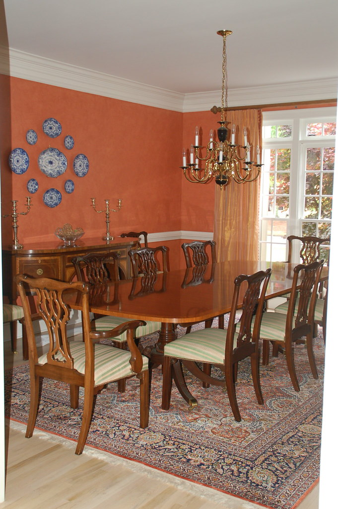
Thank you for the wonderful comments on my post about my dining room chandelier decision. If you have not read the comments, they are quite interesting and entertaining to read – click here to see them. I would also like to thank the many readers who sent me great “off the beaten track” antique chandeliers sources.

As always, I read each and every comment, and I also received dozens of emails from readers with more lengthy thoughts.

I have decided to go ahead and put ‘dining room chandelier’ high on the list of items that I will work on with my designer in early 2013, when we do phase II of the design work.   Ultimately, knowing both myself and my husband, I am aware that whatever goes in my dining room will be there for a long time, so I have to select a fixture that I really love.  And, as many of you suggested, such a key design element really needs to be found with my designer’s guidance, especially since she selected all of the other lighting fixtures in the house.   We will get something that works with the style of the house, the room, and the budget.  If that’s an antique, great.  If that’s an amazing new lighting fixture, that would be great too.  But I do think it is time to find a beautiful fixture to put in the dining room.

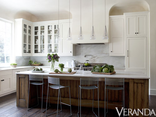
Many of my readers were shocked that I have a naked bulb in my dining room, after spending so much time and effort working on the design and build of the house.   If you have ever built a house, or gone through a major renovation, you can understand the mental and financial fatigue that sets in at the end of a project. That’s why I still have my old beat up reproduction French country kitchen table and 1980s style barstools in my kitchen – which are definitely at odds with the architecture and style of the kitchen -  and will be replaced next year.

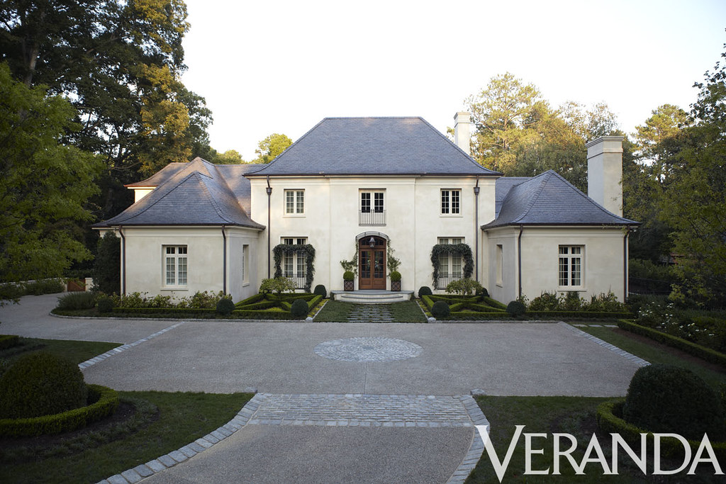
But – rest assured – I do have some beautiful lighting in other areas of the house, and here are a few glimpses (taken with an iphone camera this weekend).

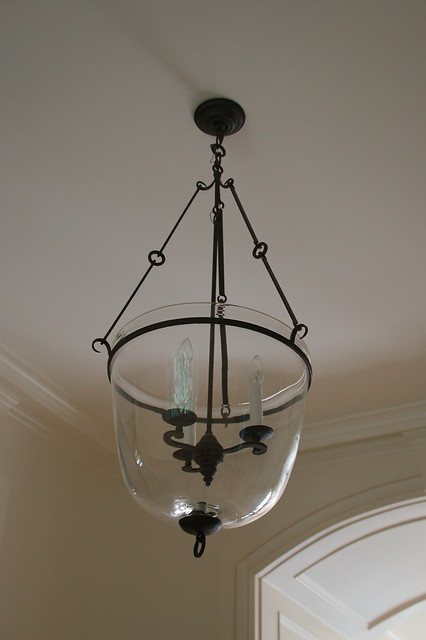
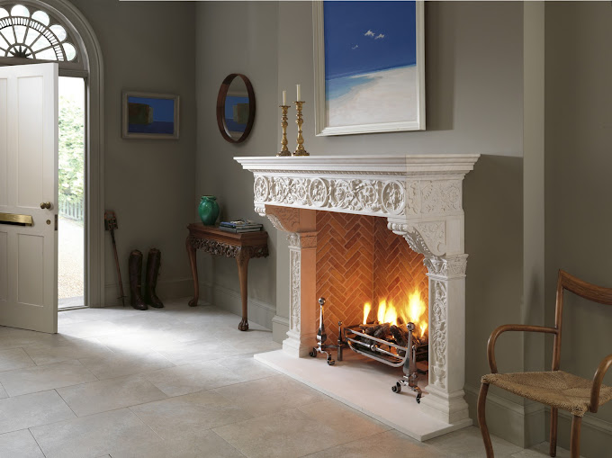
A simple bell jar lantern graces the front hall.

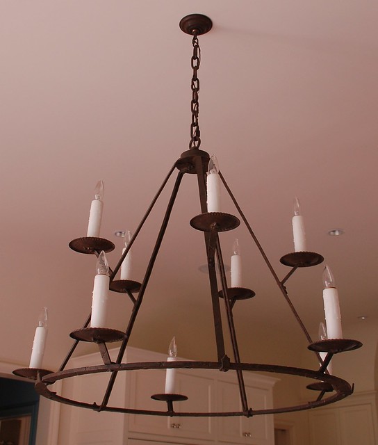
I love our kitchen light fixture – it is grand in scale, which works perfectly in my kitchen. The iron of the fixture works beautifully with the steel windows in the kitchen.

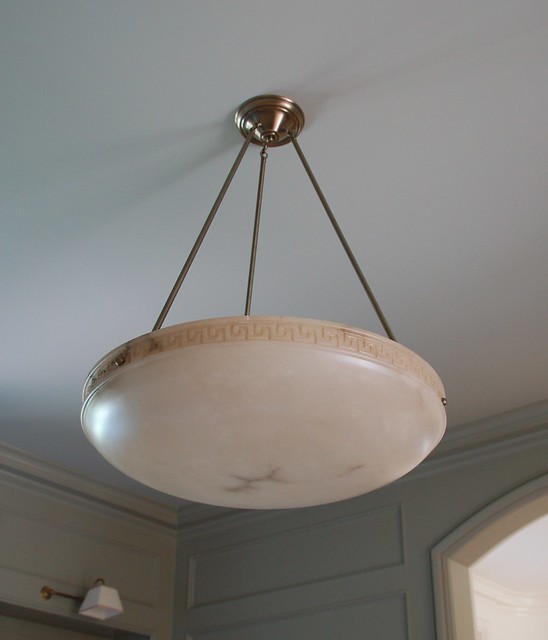
The library light fixture is alabaster and has a subtle Greek key pattern etched into the side.  It has a lovely glow at night, and truly ‘makes’ the space.  I never would have selected this fixture on my own, but my designer thought it was the perfect touch for the room – and that has proven to be the case.


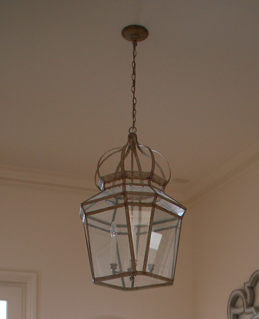
The lantern in my stairs is also large in scale, and looks great from all angles, particularly important as it is often seen from below.

My favorite lantern – the Mizner by Niermann Weeks – I had my eye on this lantern for years (I would often go into the Atlanta showroom and visit it), and I love seeing it every day.

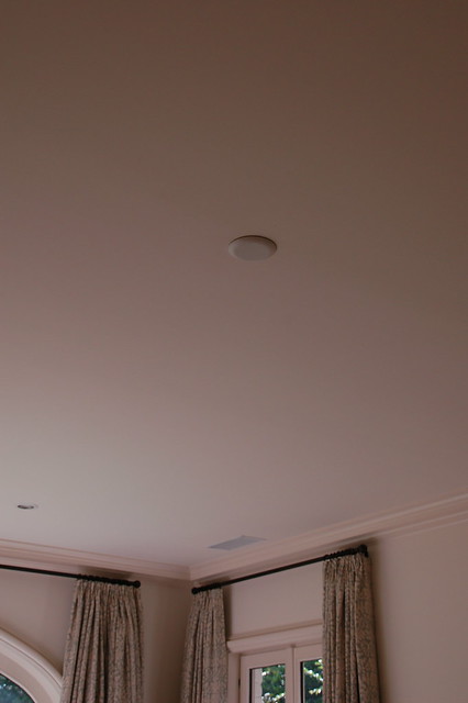
I do have one other bare bulb to show you – in my groin vault hall.  My designer wanted something very special for this place, and she has never found just the right thing.  We will find something when we do phase II.

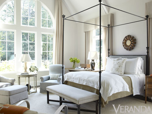
And finally, my master bedroom.  We put a cap on this one!  We looked at a few options, but again didn’t find just the right thing.  Maybe because it is capped, or maybe because I had a ceiling fan in my old master bedroom, but I don’t miss having a chandelier in my master bedroom.  Right now the room is lit by lamps and a few small targeted recessed lights, and it works just fine – although it would be nice to find a pretty chandelier to finish off the room.

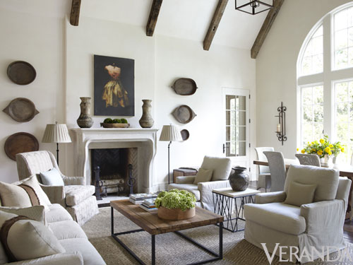
It’s interesting to see these fixtures in isolation, because I was not aware that we had so many iron fixtures in the house!  They work well with the architecture and style of the house, and are spread throughout the house, so they are not seen at the same time. There are some key rooms that do not have fixtures at all because of the design of the space– like the living room, because centering a light fixture would not make sense for the furniture arrangement given the architecture of the space (and two chandeliers would not have worked either).

Writing this post brings back memories of all the time and effort that went into selecting light fixtures – not an easy task when building a house from scratch!

Email subscribers, click here to comment.

To subscribe to my blog by email, click here.
To follow my blog on Facebook, click here.
Twitter: @TTIBlog
Pinterest: http://pinterest.com/ttiblog/
Visit my online store, Quatrefoil Design: www.quatrefoildesign.com
To see design, architecture, art, and decorative books that I recommend, please visit the Things That Inspire Amazon store.


Friday, September 21, 2012

Entertaining with Style

One of the unexpected results of building a new house is that I am now asked to host all sorts of events.  Although my husband and I did not expressly build the house for the purpose of entertaining, the layout works well for events.  We took about 6 months to get used to the house then had a few functions in the spring and early summer.  There has definitely been a learning curve – there is an art to hosting a successful event, and I am a bit of a novice!

In a few weeks, my husband and I will be hosting a parents dinner for our middle child’s grade.  I have been told to expect about 120 for a light cocktail supper.   It will be catered, and someone else is taking care of the food planning, which means all I need to do is have the house ready and plan where things will go. The previous events I have hosted were for around 25-40 people;  hosting an event for 100+ people is going to mean that what worked before might not work for this event.  

As I was mulling this over, I realized that Veranda special editor and entertaining specialist Danielle Rollins has a daughter in the same grade and same school as my child.  She has a book coming out on October 3 – Soiree: Entertaining With Style (click here to purchase on Amazon).  I sent her an email to see if she would be willing to come over and help me think through logistics for the party, and she gladly agreed!

Many of you are probably familiar with Danielle’s house – it was much blogged about when it was featured in Town & Country.

Here is a picture of Danielle in the foyer of her beautiful home, with interiors by Miles Redd.

Danielle’s amazing living room…

Her one of a kind bar…

And her beautiful library.  Note the details in this room – the brass inlay on the cabinetry is my favorite.  Also note the window covering, which appears to tuck up into the molding at the top of the wall. 

Danielle told me that her library was modeled after Brooke Astor’s library (seen above) –  Habitually Chic posted this week on the upcoming Brooke Astor auction, which features items from this library.


Danielle is well known for her legendary parties.  Although my event is a school sponsored affair that will be simple and low key (with a modest budget), Danielle was up for the challenge of helping me think through the party and logistics, and her input on space planning and party flow was incredibly valuable.  Here are a few images from several parties that Danielle has planned and hosted through the years.
The tabletop from this exquisite affair made the cover of Danielle’s book.  Source: Soiree: Entertaining With Style


This is one of my favorite images, a long elegant table set and ready in anticipation of a dinner for designer Oscar de la Renta.  Can you imagine the delight of the guests to walk into the back yard and see this view?   Note the candles defining the curve of the stairs and lighting the way for the guests.  I spy Danielle’s son peeking out on the left!  
A night time view of the Oscar de la Renta dinner party in progress. Source: Soiree: Entertaining With Style


Danielle hosted a Great Gatsby themed party on another occasion. Source: luxecrush.com (LuxeCrush  is a highly curated online magazine focusing on the Atlanta lifestyle).


Complete with croquet on the lawn!  Source: luxecrush.com


Danielle recently had an article in Veranda (she is a contributing editor) featuring her secrets to unforgettable dinner partiesclick here for online version.  The article features an event she recently hosted, and it is a great read.


Danielle came over yesterday morning and we discussed the event that I am planning -  which I must emphasize is much, much lower key than any of the events seen in the images above! However, Danielle is clearly experienced at the art of entertaining, and if the weather cooperates we will also use the outdoor spaces as much as possible given the number of people attending.  It was truly amazing to get her perspective on the layout, what would work from a flow perspective, how to think about this party and any future parties we have at the house.  She had so many great tips and recommendations!  I was frantically scribbling notes and will take a day or two to process them into a blog post….

It will also give me a chance to read a special preview copy of her book.  I will report back in a few days!

In the meantime, to see LuxeCrush’s smashing review of Danielle’s book Soiree: Entertaining with Style, please click here.


Upcoming events (click here for full calendar):
Tuesday October 2nd
Sak’s NYC Book Launch & Signing
6pm–9pm book signing
Sak’s Fifth Avenue - 611 Fifth Avenue, 9th Floor, New York

Thursday October 4th
ADAC Book Signing (ADAC will be open to the public as of October 1st – it’s a great time to visit!)
2pm–3pm speaking event
3pm–5pm reception & book signing
351 Peachtree Hills Ave, Atlanta GA


Email subscribers, click here to comment.

To subscribe to my blog by email, click here.
To follow my blog on Facebook, click here.
Twitter: @TTIBlog
Pinterest: http://pinterest.com/ttiblog/
Visit my online store, Quatrefoil Design: www.quatrefoildesign.com
To see design, architecture, art, and decorative books that I recommend, please visit the Things That Inspire Amazon store.

Wednesday, September 19, 2012

Gas log fireplaces

I was planning on doing a post on some of the other lighting in my house – to show that we do have some pretty fixtures that more than offset the naked bulb in our dining room – but it has been so gloomy in Atlanta these past few days that I have not been able to get decent pictures. So, I will post on that later this week.

In the meantime, this moody weather makes me realize that fall is almost here – it is my favorite season of the year.  I love the beauty of the landscape, with all of the colors of the trees, the cooler weather, the excitement of the holidays season.  When living in Connecticut as a child, I could always tell that fall was approaching when my parents would order several cords of wood in anticipation of the cool weather.  My mother would light a wood burning fire in the den just about every night in the fall and winter.

In our new house, we have three fireplaces – two inside, one outside. We use the outside fireplace frequently in the fall and winter – it has a gas starter, but is wood burning.  The fireplace in our family room is also gas starter, wood burning, but we have found that we would rather light a fire in the outdoor fireplace (which is quite close to the family room) than inside. 

The third fireplace, which is central to the house as it is in the living room, is set up so that gas logs could be installed.  We wanted to live in the house for a while before deciding what to do – whether to install gas logs, or go ahead and use the fireplace as a wood burning fireplace.  As of right now, this fireplace has not been used, and has some birch logs as placeholders.

We have decided to go ahead and get a gas log set.  Since my readers are always a great source of information for me, please let me know if you have any recommendations or insight into this.  My sister is renovating a house in DC and she purchased both a mantel and fire basket/gas logs from Chesney’s, which she thinks has the best looking gas log sets.  I knew about Chesney’s for their beautiful mantels, but they also offer a full line of fire baskets and andirons, and their ‘Alchemy’ gas fires (their gas log option).

Here is a Chesney’s mantel and fire basket shown in a Veranda feature on design tips from Mary Drysdale. One of her favorite sources for mantels is Chesney’s.

Here is the Chesney’s Tyndale fire basket and Bevan andirons set that I really like.  I have a fondness for soft curves and scrolls in design, so this is right up my alley.  I also really like the small logs that are in the basket – which is a style that can be replicated in their gas log collection. Source: http://chesneys.com

From what I understand, if a gas log set is going to be used, then this little panel is underneath the fire basket to conceal the gas input. Source: http://chesneys.com

Here is a quick iphone picture I snapped at the Atlanta Design Center earlier this year, which shows the floor model of one of the Chesney’s fire baskets.  The basket looks like the same design, but the base has a curve that the previous picture does not. The andirons in this picture look slightly different too – I think they are the Bevan andirons. The panel underneath the basket that conceals the gas log connection is seen, as well as an example of the gas logs. (My picture) 

I also like some of the clean lined designs of Chesney’s offerings.  My architect selected this one for a past client (not a picture from the install, this is a picture from Chesney’s).

I am assuming that this image shows the design with gas logs given that the concealing cover is underneath the basket.  I just spoke with my sister, and this is the design that she selected – it’s called the Fibonacci. (Source unknown)

This image is so beautiful, and the diamond detail of the fire basket is wonderful. 
Source: http://chesneys.com

This is another one of my favorites.  I really like the orb detail on both the fire basket and the andirons. Source: http://chesneys.com

Same fire basket and andiron set, but seen with a different Chesney’s mantel (both are from their French and Italian collection).  I like the cleaner lines of the fire basket that provide a nice contrast to the detail of the mantel. Source: http://chesneys.com

Here is a pretty design that combines the curves of fire basket with the orb.  Maybe that is why I like French style – I always like the softness that a little curve adds to a design.  Source:http://chesneys.com

Two different perspectives of the same room.   I love how the curves of the mantel are reflected in the fire box – the combination works beautifully.  I also like the clean lined but curved fire basket (which appears to be the Ducknest) with the slightly scrolled andirons (which appear to be the Burton andirons). Source: http://chesneys.com

So I would have to say that my three favorites are the Morris fire basket, seen above with the Burton andirons (and the gas log set up, with the panel underneath the basket)…

ducknest_chesney
This combination, which appears to be the Ducknest basket with the Burton andirons…

And the Tyndale fire basket, shown with the Newton andirons.  My sister thinks this design is a bit curly, but I like it.

Chesneys_fire basket
I like the Bevan andirons too, which are seen with the Tyndale fire basket in the second picture.

So, what do you think about gas log fireplaces?  Do you have one? In some areas of the country, wood burning fireplaces are not even allowed in new construction, so gas logs are the norm.  
I would be interested to hear if you have any recommendations for other gas logs to consider, or if you have any installation pictures of nice gas log fireplaces or Chesney’s fire basket installations. 


To subscribe to my blog by email, click here.
To follow my blog on Facebook, click here.
Twitter: @TTIBlog
Pinterest: http://pinterest.com/ttiblog/
Visit my online store, Quatrefoil Design: www.quatrefoildesign.com
To see design, architecture, art, and decorative books that I recommend, please visit the Things That Inspire Amazon store.

Sunday, September 9, 2012

The chandelier dilemma–would love your thoughts!


In my old house, I had a dining room that was not used very often, but was central to the house so it was very visible.

I don’t think I have ever shown this picture on the blog (understandably) – I looked!  But this was my dining room (in the old house) circa 2004.  Red dining rooms were quite common back then, but I despise red, so I did a warm orange tone with a bit of glazing based on Martha Stewart paint in ‘flower pot’ color.  The curtains are a similar tone to the walls – a very pretty orange, although they seem a bit lost given the wall color.

When this picture was taken, my mother-in-law had just downsized, and gave me her early 1980s Baker dining room table (it is actually a conference room table, and measures 50” wide and 120” long without leaves!) , 16 Baker chairs, and sideboard.  The table was big for the room, and too big for the rug that I had in there, so I ended up putting the end chairs in my attic.  The piece of furniture that I used to have under the plates on the wall was an antique French enfilade (which was moved to the kitchen), and was taller than the buffet, so the plates are a bit high in relation to the sideboard. They soon came down, and a mirror took their place. 

chand_brass
The main reason I dug up this picture, though, is not to ridicule myself for décor transgressions of the past, but rather to point out the chandelier.  This is the builder grade brass and black chandelier that came with the house.  I lived with it for many years – probably 10 years or more, and I always thought it looked like an insect.

Here is a photo from our real estate listing, when we had our old house on the market last year. I had the walls painted in about 2008 – Joni from Cote de Texas was one of my first blog readers, and when I asked her whether I should paint my dining room, she asked me why in the world I had deep orange walls when all of the pictures on my blog showed neutral or serene spaces.  I had the walls painted (in Farrow & Ball clunch, a great neutral), and it was like a breath of fresh air.  I still love those curtains that I had installed in the late 90s (although with time they shrank up a bit) – I have always been a fan of orange, and I particularly like how orange looks paired with light neutrals.

chand_old
But – back to the point of this post – note how I finally changed the chandelier. I ordered a chandelier from the back of a shelter magazine – from one of those little tiny ads.  I wish I had taken pictures of the chandelier when it arrived.  It was in about 15 different pieces, and the instructions were in Chinese!  The company had sent me the crystals for the wrong size chandelier, so I had to pretty much rework all of the strands to work with my size chandelier.  I smile at the memory now, but it was not fun at the time!  However, the chandelier really brought the room more up to date, and it was less than $300.  It was such a simple fix, I wish I had changed out the chandelier years ago.

Now flash forward to my current house. I love all of the lighting we selected, and we ended up purchasing most of the fixed lighting (sconces and chandeliers) for the house. 
However, we never found just the right fixture for the dining room.  The original intention was a fabulous antique crystal chandelier, but the right one never presented itself, and then my husband hit his financial and psychological limit on the lighting budget.  So this is how my dining room looks right now:

dining room dilemma
I was hoping that the naked bulb would be a constant reminder to my husband that we still need a great chandelier in this spot, but truthfully it does not phase him at all.  We tend to only use the dining room for special occasions (similar to how we used it in the old house – Christmas, Thanksgiving, birthdays, and dinner parties), so he really doesn’t think about the dining room that much.  It is very central and visible in the house, though, so I look at this naked bulb every day. 

If I were to take the approach that I took in the old house, I would definitely get this chandelier that I found on the Shades of Light website.  It would look great in the room, and I love the curvy yet spare style, with the mixture of small ropes of crystal, and the crystal drops. The 12 light fixture measures 46” high by 36.5” wide, which would also work well in room (I think - what is the rule of thumb for chandelier sizing? The ceilings are 11’6”, the room is 14'x18'). And, the price is quite good.  I wonder whether it would take hours to assemble?  I would replace all of the plastic candle sleeves with wax sleeves, use silk wrapped bulbs, and replace the ball at the bottom with something a bit larger and not faceted.

chandelier
When looking through the real estate listings last year (I still like to do that), I came across a picture of a spec house that had been decorated at a minimal level, and had this light fixture in the dining room.  Ignore the table and chairs (which are too small and the wrong style for the space),  and focus on the chandelier.

So what are your thoughts?  Should I get the Shades of Light chandelier as a placeholder until I get the permanent chandelier (which could be years in the future)? Or should I hold out and be patient, and wait to find just the right fixture for this place?  I am not the type of person who does ‘disposable decorating’, so this is a dilemma for me!  If I get this chandelier, there is a chance that my husband will never let me replace it with an antique.  I don’t really have another space where I could use it in the house. But, there is also a chance that I might really like it!

We are going to work on the décor of the house in phases, and do another big round in both 2013 and 2014, but based on everything else that what we need, I don’t think that an antique chandelier will be high priority (given the price point of the antiques that qualify as ‘fabulous’ in my eye). If I don’t do anything, my dining room will more than likely be chandelier-less for many years.

Would love to read your thoughts!  (Email subscribers, click here to comment)
- Holly


Dozens of new Melissa Payne Baker paintings just added to the store, ready for immediate shipment.

Including the very popular 'Itty Bitty' 3"x3" paintings, the perfect unique gift.  Ideal for hostess gifts, small spaces, bulletin boards, cabinet knobs, Christmas trees. Please come check them out!


QD collage

To subscribe to my blog by email, click here.
To follow my blog on Facebook, click here.
Twitter: @TTIBlog
Pinterest: http://pinterest.com/ttiblog/
Visit my online store, Quatrefoil Design: www.quatrefoildesign.com
To see design, architecture, art, and decorative books that I recommend, please visit the Things That Inspire Amazon store.

Thursday, September 6, 2012

"Simply Belgian" interiors by Jim Howard, featured in Veranda

I love it when a house I have personally visited is featured in a magazine. This doesn’t happen too often, but given that Atlanta is known for its beautiful homes and its nationally known designers, it happens on occasion.

When a representative from Veranda contacted me to see if I was interested in featuring a house that is in the September-October 2012 issue of  the magazine, I was very excited to see that it is an Atlanta house that I visited when I was in the early stages of designing my own house.  The homeowner is an acquaintance (our children used to go to school together), and the designer himself, Jim Howard, gave me a personal tour back in the fall of 2009.  The house made a big impression on me – the architecture (by William T. Baker), the landscape (by LandPlus, whom I had already hired to create my own landscape), and the design are nuanced and beautifully done, and all work together in harmony, perfectly reflecting both the taste and style of the homeowners.

Note: all Veranda watermark photos are by Max Kim-Bee and are used with permission.
 

The living room is central to the house, and is a wonderful space both architecturally and from a design perspective.  There was very little styling that needed to take place for this photo – this is how the room looks on an every day basis.  Note the plaster walls, and the curve where the planes of the wall and ceiling meet. The architectural ornamentation is at a minimum, and the lines are clean and spare – the article in Veranda is titled  ‘Simply Belgian’, and notes the Belgian modernism style of the house, and the quietly intriguing interiors that the homeowners requested.

The Dusty Griffith painting to the left of the fireplace caught my eye right away – I would love to have one of his encaustic and mixed media paintings in my library! I have my eye on one of his paintings right now, but have to wait until 2013 to make any more furniture or art purchases, alas.

The article only had one small glimpse of the dining room. I seem to recall a fabulous David Iatesta chandelier in this room…

The kitchen as seen in Veranda.  The clean lined and and modern style of the kitchen combined with the classic touches of the white marble, white cabinets, and glass front cabinets makes this kitchen a favorite.  It was interesting to learn in the article that the stools are from Design Within Reach, and the cabinet hardware from Restoration Hardware.

A head on shot of the kitchen, as seen in Jim Howard’s web site, which shows where the kitchen is located in relation to the living room – the opening to the right of the 27” fridge shows a peek of the living room space.  As with many European style houses, the living room is not only a beautiful room, but a passage from one place to another, ensuring that it is used on a daily basis in many different ways.

The kitchen is open to the family room and casual dining area. The Veranda feature has a double page spread on this room, which provides a wider view, so make sure to check it out in your copy.  This is a space that has definitely evolved since I saw it, with the addition of the Afghan dough bowls that really take the room to a whole new level.  If I am not mistaken, that is an original Todd Murphy piece above the fireplace.

Here is a view of the family room as I saw it three years ago.  The basics are the same, but the furniture has been rearranged, and the room feels much more complete as seen in the more recent Veranda picture.  Seeing this picture makes me appreciate the transformative effect of the Afghan dough bowls on the room, and the fact that a room often becomes more layered over time.

Now, onto my favorite room in the house – the master bedroom.  I remember when seeing this room in person, I was truly struck with its beauty. The views are magnificent, the architecture soars, and the design is so nuanced and elegant. This is such a serene space, and is filled with light. The large arched window faces east, and there are two other windows that face north and south, so there is constant light all day, and in the morning the room is truly filled with light. As a morning person, I love an east facing bedroom – as one of my favorite architecture books (A Pattern Language)  notes, “give those parts of the house where people sleep an eastern orientation, so that they wake up with the sun and light.  This means, typically, that the sleeping area needs to be on the eastern side of the house”.

A view of the other side of the bedroom – such a charming vignette, and love that little pop of orange that the Hermes blanket lends to the space.

Since I have been in the house, I knew that this striking powder room from Jim Howard’s portfolio is also from this house. A little peek of a Carolyn Carr painting can be seen in the reflection – in my own house, I have a wall that I am saving for a Carolyn Carr painting. I love her work!

This is a teenage daughter’s room (not pictured in the Veranda article – this is from Jim Howard’s website) – with the endearing and fresh combination of bright orange and pale blue.

When I had the chance to look through all of the beautiful pictures that were part of the article (with photography by Max Kim-Bee), I was surprised that an exterior picture of the front and back were not included. To me, the exterior and the landscape tell an important part of the story of this house.  I asked my Veranda contact if any exterior shots were taken, and after he pulled a few strings he was able to get me these exclusive pictures that show both the front and the back.

The front of the house is beautiful – the article refers to it as a ‘French style manse’.  The mellow stone-like color of the stucco and the steely gray of the slate work beautifully together.  One of the front wings is a library, and I seem to recall that the other is a garage.  Look at the beautiful landscaping, designed by Alec Michaelides of LandPlus.  The relative flatness of the lot (not the norm in Atlanta!) lent itself well to the parterre composed of tightly clipped hedges and boxwoods.  I love the creeping vines that grow over the front door and the French doors to the left and right of the front.

The back of the house is just as beautiful. The three doors in the center are part of the living room; the window to the right (on the main level) is the window over the sink in the kitchen. The large arched window on the right is the family room, and the arched window on the left is the master bedroom.  This is truly a beautiful back yard, with the accent colors of the lounge chairs and outdoor furnishings matching the color of the pool perfectly.

bill_baker
Here is a gorgeous picture of the house that is on architectural designer William T. Baker’s website.

I hope you enjoyed this glimpse into a beautiful Jim Howard designed home featured in this month’s Veranda!  To read the designer’s perspective on the house and its décor, and to see the other wonderful features in this issue of Veranda, check your local newsstand. It is a great issue!  Cote de Texas did an in depth feature on the townhouse by Jane Moore that is featured on the cover of this issue – check it out here. Finally, follow Veranda on facebook here - http://www.facebook.com/VERANDAMagazine – it is a great place for behind the scenes information and more information on current and future features.

What is your favorite aspect of this house?  I love everything about it – and seeing the pictures and reading the article makes me remember the way in which I felt when I saw the house in person. The architecture of the spaces, the beautiful light in the house,  and the style of the décor - and the way all three of these interact - are hard to put in words or capture in images, but I think that the Veranda article and the photographs by Max Kim-Bee came as close as you can get without actually visiting the house in person!

P.S. - many of you have asked how I came to be asked to feature houses from recent magazine spreads on my blog. I simply commented on posts of others who had featured different articles - and the magazines looked at my blog and thought it might be a good fit for additional features they had coming up - clearly the magazines are reading the comments!  


Things That Inspire Favorites: Cape Cod Metal Polishing Cloths

Things That Inspire Favorites: Oz Naturals Vitamin C Serum

Things That Inspire Favorites: Thera Breath Oral Rinse


QD collage


To see my latest blog post, click here.
To subscribe to my blog by email, click here.
To follow my blog on Facebook, click here.
Twitter: @TTIBlog
Instagram: http://instagram.com/ttiblog
Pinteresthttp://pinterest.com/ttiblog/
Visit my online store, Quatrefoil Designwww.quatrefoildesign.bigcartel.com
To see design, architecture, art, and decorative books that I recommend, please visit the Things That Inspire Amazon store.

LinkWithin

Related Posts with Thumbnails