.}

Monday, April 27, 2009

Square Art

On a recent visit to the Metropolitan Museum of Art, I thought about painting sizes and shapes. In one of my favorite sections, impressionist art, I can't recall seeing many square canvases. And yet, especially over the past few years, I have seen literally hundreds of square paintings a year in my work with emerging artists. I personally gravitate towards square canvases because I like the balance, and because a square canvas can fit in virtually any space.

This painting by Dusty Griffith is one of my all time favorites (interior design by Suzanne Kasler). The square shape works perfectly in the space above the mantel. I recently visited the house of an acquaintance for the first time, and she had the most beautiful Dusty Griffith painting I had ever seen. It was great to see one of his works in person in an actual home, as I had only seen his work in the Lowe Gallery and in magazine photos.


bbarry

This painting, in a McGuire furniture ad, has always been a favorite. It has all the hallmarks of an Elliott Puckette painting - the calligraphic swirls are a favorite motif of mine (take one look at my header and you will see the inspiration!). I love the look of a square painting above a sofa.


bremermann_CDT

A square contemporary painting is the perfect balance for this traditional dining room by Gerrie Bremermann. Joni from Cote de Texas pointed out the Bremermann has been using contemporary art much more frequently in her designs. The look of contemporary art in a traditional setting is one of my favorite looks.


diningroom_500

This dining room, from an Atlanta real estate listing, features a beautiful square painting by artist Haidee Becker. I always appreciate the look of contemporary art in a dining room, and Becker's art works beautifully with its rich colors and balance between the contemporary style and traditional subject matter. Becker is represented by a great gallery in Atlanta, Timothy Tew.


HBdJodiMacklin1

This image is from a House Beautiful from several years ago, and the painting had such an impact on me that I actually visited the gallery that represents the artist on a recent trip to Washington D.C. All of the works by this artist were square, interestingly; it was a good juxtaposition with the circle theme of her art. The artist is Mira Hecht, and the gallery is the Ralls Collection in Georgetown. When looking up the website for this post, I saw that Hecht has an upcoming show that begins May 7. The show runs through early July, and since I have a trip to D.C. planned in late June, I will be sure to see the latest and greatest by this talented artists (it looks like some of her new works are not sqaure!). Interior design by Jodi Macklin.


HouseofT_MetropolitanHome

I don't think that I have ever posted a picture from Metropolitan Home, as much as I admire the work in this magazine. However, this painting really captured my eye with its beautiful shapes and colors. I also love the painting light that is wired into the wall, and the sconces that flank the painting. In my next home, I would like to plan the perfect locations for art and have the walls wired for painting lights. I think that great lighting really enhances art and makes it a focal point in a home. Image via House of Turquoise.


FR Western Interiors AugSept08_willwick_kd

This painting translated as square to me when I saved it, but now I am not so sure. It makes a beautiful and dramatic statement, whatever shape it is! This image has an element that I admire in a room: neutral upholstery, with the color from the art. Via Western Interiors, August-September 2008.


arthanging

I like how the square painting is balanced out with smaller pieces of art. Via Domino magazine.


3

I have no idea where this image came from (I think the picture is from the 90s), butthe large dramatic square painting is truly the focal point of the room. I like how the pillows match the colors in the painting - true art aficionados would frown on this, but I think it is so pleasing!


404629206_dNFFp-L

What a lucky child to have exposure to great art from the cradle! Another situation where the art matches the decor - and it looks great.


arsl04_wiseman_designsmack

I love this bold square painting above the fireplace - it defines the room. Interior design by the Wiseman Group.


domino_square1

I saved this picture both for the ethereal color scheme of the room and for the beautiful square painting above the fireplace. Image via Domino.


swedishinteriors3_amandatalley

This is my favorite Amanda Talley paintings; it is the perfect shape and size (not to mention color) for the spot. This image appeared in the book Swedish Interiors; I would love to see the rest of the house! Her more recent paintings seem to be looser in style than this one.


vpstreetloft_mnh

Contemporary art in a bedroom always catches my eye, and the large square painting works beautifully in this bedroom with its tall ceilings and dramatic gray accent wall. I love how the pillows, the wall, and the art all have that great shade of gunmetal gray.


5438

One of my favorite artists, Rana Rochat, frequently paints in a square format, especially for her smaller pieces that look good hung as a series.


janshowers_wi

This Jan Showers' project is a home in Dallas that was featured in Western Interiors October-November 2007. Showers chose to keep the room largely neutral, and brought in the colors through the art and accessories. This is another situation where the art translates as square to me, but I can't quite tell because of the angle of the shot (and perhaps because of the lens used).


front_hall_triptych

I have quite a bit of square art in my own home. My favorite is this triptych (a piece of art that consists of three parts) by Atlanta artist Holly Golson Bryan.


As you can see, all of the square paintings that I have featured in this post are contemporary and abstract in style. I don't know if this is because the square format is more modern, and contemporary art is better suited to the square shape, or if it is because I do not gravitate to images of traditional art and didn't have any to feature in this post. I also see many, many pieces of traditional art in my work in the art world, and I occasionally see some traditional pieces that are square. However, I see this much less than the square contemporary pieces. I wonder whether the dominance of the square format is waning a bit; this year at the art markets that I have attended, there have been far fewer square pieces than in the past. I know in my own house I have so many square pieces of art that I am purposely avoiding the square format unless a piece really speaks to me.

To subscribe to my blog by email, click here.

To follow my blog on facebook, click here.

To visit my online store, click here.

Restart Fine Art (a smart way sell your art)

Some people change their pillows or lamps when they want to freshen up their interior. I tend to move around my art, or even rotate out certain paintings and hang new or different paintings. As a result, I have a storage room full of paintings and framed prints that are beautiful, but no longer suit my home or my style.


You can imagine my delight when I heard about ReStart Fine Art. ReStart Fine Art was started by two Atlanta art collectors who had lots of great art, but a surplus of paintings in their collections. They wanted to make room for more art and also wanted their art to find new homes. Since they knew many others in the same situation, they decided to have an 'art on consignment' show a few years ago. Art collectors from all over Atlanta now participate in the show; you simply set up an appointment with the owners, have a meeting to discuss pricing and suitability of the art that you want to sell, and hope that someone will buy your paintings during the show! What a smart way to both clear out the extra art in your own home, as well as find new art pieces at great prices.

Stephanie Wheeler, an Atlanta artist participating in the show

Now the Restart Fine Art show has grown to such an extent that a gallery space is rented for the spring and fall shows, and (in addition to the art on consigment) a select group of local artists are invited to participate and sell their latest work.

The ReStart Fine Art spring show is this week: Tuesday, April 28th from 5-9pm; Wednesday, April 29th from 1-8 pm; and Thursday, April 30th from 1-7 pm. The show is located at 3057 Paces Mill Road in Vinings (the NW part of Atlanta), at the Pace House (a white house across from the Piedmont Physicians Building). Parking is available at Vinings United Methodist Church before 5 pm; after 5 pm parking is located at the Piedmont Physicians Building. For more information, call 770-436-7527 or visit the website.

Friday, April 17, 2009

A charming French style home


I walked my dog in a new area yesterday, and enjoyed exploring a few cul-de-sacs that I had never seen before.  At the end of my walk, I passed by this charming home and snapped a quick picture with my iphone (hence, the less than average quality of the picture).  

In a city filled with large homes, more and more I appreciate the charm and appeal of a house that is just the right size - not too big, not too small.  This house really appeals to me, not only because of the French styling, but also because of the scale and proportions of the home.  The paved (or pea gravel, I can't quite tell) area in front of the house, the French doors, the sculpted trees in planters, all contribute to the charming French feel of the house.  Although I am usually not a fan of mansard roofs (where the upper slope is steeper than the lower slope), it is perfect in this particular house. Mansard roofs are very French in style, and traditionally allowed for usable living space on the second floor of a one story home.   

Although this house appears to be fairly small, it is actually about 5,800 square feet.  I love homes that look small on the outside, but are actually quite spacious on the inside; this is a real testament to the skill of the architect who designed the home.  

To see more French style homes in Atlanta, click here  and click here for French style homes from around the world.


To subscribe to my blog by email, click here.
To follow my blog on Facebook, click here.


Beautiful framed intaglios, available here:

Unique architectural renderings, available here:

Whimsical original crab and lobster paintings, as seen in House Beautiful, available here:


Monday, April 13, 2009

Dining Room Decor Part 3: Collections on the Wall

Thank you to the Washington Post for including this post in your Blog Watch, April 16, 2009!

When I posted my dining room wall decor posts in the fall of last year, I had a three part series in mind. Part 1 (mirrors) and part 2 (art) were posted in short order. Somehow, though, I never got around to part 3! I think this is because I temporarily solved my own dining room dilemma when I purchased a pretty reproduction Louis Phillipe mirror from Eloquence.

The third category of dining room wall decor that I have seen time and time again is a collection - whether it be a framed series, plates, or a collection of related objects. Hanging a series of framed art or a collection is a great way to fill a wall that is usually large and windowless, as is often found in a dining room. There are some really stunning examples of this look, and I think a series on the wall of a dining room would work beautifully in a dining room that is central to a home and has a big wall that can be seen in its entirety.

I love the wall sculptures in this dining room, by artist Carrie McGee. It is an incredibly dramatic and beautiful focal point to the room.

david_netto_hb

A room by David Netto - wish I had this for my blue and green post! I love the way that the collection of blue vases look against the green wall, and how the blue is pulled in through the chair cushions, settee, and hurricane lamps. I even like the little burst of orange in the cord cover, although I have never been a fan of cord covers.

bwestbook_housebeaut

Barbara Westbrook designed this dramatic dining room in an Atlanta home. Note the framed sketches on the wall over the sideboard. Via House Beautiful.

bhg6_series

The framed sketches are lined up in the wall moldings of this room. It gives the room a clean art gallery kind of a feel. Image via Better Homes and Gardens.

q

NATURAL6

I saw this image on Visual Vamp, and like her, I was struck with the fact that the framed botanicals go so low to the floor. It makes the room, though. Note how the frames are lined up perfectly with the moldings in the wall (I also just noticed how the black frames are repeated in the black frame of the window in the room to the right of the picture).

bremmerman_cdt6

Gerrie Bremermann used framed panels in this dining room, via Cote de Texas.

3479633_4

This dining room is from an Atlanta real estate listing, so it is not as polished as the other pictures on this post, but I think the arrangement of framed items has a charm to it.

1936939.09

I remember seeing this picture in an Atlanta real estate listing many years ago, and thinking that the arrangement was quite beautiful.

annehepfer_ds

Architectural prints are used in this dining room by Anne Hepfer. I would love to see more of this room! It looks like Anne's website is not working right now.

AnneHepperdesigns

Another use of a framed series in a dining room, also by Anne Hepfer. These framed items are placed very closely together. I prefer a bit more spacing, but it is hard to see the subject matter of these items. Perhaps it makes sense to have them viewed more cohesively.

diningroom_06_rodmickley

I like this little banquette tucked into the niche in this dining room. The small framed series is the perfect touch. Interior design by Rod Mickley.

chandy_thumb3_CTD

I have always liked this collection of busts; it certainly makes a dramatic statement! Via Cote de Texas.

Phoebe and Jim Howard used a collection of botanical prints in this dining room (and a small mirror too).

burgess_sa

At the far end of the picture is a beautiful dining room by one of my new favorites, Betty Burgess. This is her own house in Atlanta; she framed a series of architectural prints (seen in the dining room) with a lilac matt. The results are really dramatic and memorable. Again, interesting to note that the framed series are centered on the millwork on the wall. Image via Southern Accents.

veranda_bettyburgess_dr

Another dining room that Betty Burgess designed, in the current issue of Veranda. This is one of the most beautiful and dramatic dining rooms I have ever seen. Note how the background of the framed intaglios are very similar in color (lilac) to the matting that Burgess used in the framed prints in her own home. I particularly like this look in this dining room because it combines both a mirror and framed prints - the best of both worlds.

bremmerman_cdt4

Gerrie Bremermann uses the mirror with framed items in a dining rooms.

DP01_19

Phoebe Howard has four charming framed sketches on either side of an oval mirror in her city apartment.

arranging4_l

I saved this picture because of the interesting mirror (the room is not really my style), but I also like the way the designer has balanced the mirror with three framed botanicals on either side. I almost wish, though, that they were not positioned in the same height as the mirror. Four on either side in a square shape might have looked better.

ann_coyle_cdt

Another example of a mirror used with framed prints, this time by Anne Coyle.

Dining room wall decor must be a topic of interest to some, because every week people find my blog through a google search on 'dining room wall decor'. It has been interesting to look at the many ways that designers solve the architectural and design challenge of a very big blank wall in a dining room. When I first started this series of posts, I thought that contemporary art was my favorite look on the wall of a dining room. Now, I am leaning towards the mirror with framed items on the side, or even just a dramatic framed series. I think it ultimately depends on the placement of the dining room in a home, and the architectural features of the room.

Which look do you like the best - art, mirrors, framed series, or a combination? Or something different altogether? What do you have in your own dining room?

Subscribe to my blog by email

Wednesday, April 8, 2009

One Picture: My Personal Design Style

Recently Brooke from Velvet & Linen challenged me to pick one picture, and one picture only, that represents my design style.  Given that I have over 4,000 images of interiors and exteriors in my flickr account, I thought this might be a challenge!  I eventually narrowed it down to seven pictures.  All of the pictures were of light, airy, neutral interiors with beautiful architectural details.  Most of the rooms had big windows or French doors that allowed plentiful light.  The pictures represented virtually every room in a house: two bathrooms, one bedroom,  a home office, a kitchen, a living room, and a family room (this could be the start of my virtual home for 2010!).

As much as I loved all of the finalists, it was not difficult to pick just one picture, a bedroom from an Atlanta real estate listing.  This room represents so many things I love in the design.

  • Elements of both the traditional and the contemporary. There are details in the room that are definitely on the traditional end of the spectrum, such as the chandelier, sconces, mantle, and mirror over the mantle.  The monogrammed pillows are a charming traditional touch.  And yet, there are contemporary touches that make this room more transitional, such as the contemporary art, the starburst mirror above the bed that is traditional yet contemporary at the same time, the straight lines and tailored style of the bed and bedding, the tailored skirt on the table under the art, the geometric pattern in the wool rug.  
  • Neutral palette accented with soft color.  Part of what I love about this room is the soft ethereal blue color; no matter what the style of a room, I seem to have developed a personal palette of soft blues and greens.  My own bedroom is blue and white, and has been this color scheme for 15 years.
  • Distinctive architectural details.  Generally bedrooms, as private rooms of the house, do not have as many showstopping architectural details as the public rooms of a house. However, this room has a beautiful and intricate fireplace and nice molding.  If you take a look at the pictures of the other rooms in the house, you will see that the public rooms have an incredible amount of architectural detail.
  • Great lighting.  This room has all of the elements of lighting that I find to be essential in a well designed home: beautiful sconces and chandelier, supplemented by distinctive lamps.
  • Contemporary art.  I truly love the look of soft contemporary art combined with traditional elements in a room.   One of the first things I noticed in this room was the striking contemporary piece on the wall.
  • Mirrors.  There are two mirrors in the room - one over the fireplace and one over the bed.  I really like the use of both mirrors and art in a room.
So what do you think? Based on what you have seen on my blog, does this room look like 'me'?  If you have done the 'One Picture' challenge, please put the link to your post in the comments.  I encourage everyone to do the challenge yourself; it really helps clarify where your style is at this point in time!

This post is part of the Hooked on Houses Friday blog links! Please click the link to visit.

To subscribe to my blog by email, click here.

Thursday, April 2, 2009

New on the Market in Atlanta: the Home of Designers Phoebe and Jim Howard


If you are a regular reader of my blog, you know that I love real estate listings. My absolute favorite listings are those that have been in magazines, as well as those that belong to designers. You can imagine my delight when I learned that a home that meets both of these criteria was just put on the market: it is the city apartment of two of my favorite designers, Phoebe and Jim Howard. Jim was in charge of all of the architectural design, and Phoebe was in charge of the decor, so you can imagine that the apartment is spectacular. The Howards' Atlanta apartment has been featured in both House Beautiful and Atlanta Homes and Lifestyles, and I had the distinct honor of being invited for a private tour of the home by Phoebe Howard herself.

The Howards bought the apartment several years ago, in a building that just celebrated its 40th anniversary. Their primary residence is in Florida, but with the success of their Atlanta stores and a thriving design business in Atlanta, they felt it would be ideal to have a 'pied-à-terre' in Atlanta. The apartment is in an area that is often called 'the jewel box of Atlanta' as it is in the very heart of Buckhead. Phoebe adores the location of apartment, and appreciates the solid construction of the building as well as the sweeping views of downtown to the south (for the sparkle at night), and Buckhead to the north and west (for the sheer beauty of the green canopy of trees and the view of the local landmark, Stone Mountain, on the horizon).

When Phoebe and Jim purchased the apartment, it was fairly nondescript. They loved the light filled rooms, the high ceilings, and the views, but knew that the interiors needed a major overhaul. So, they gutted the entire apartment and remade the space with the best in architectural details and definition in rooms that were previously featureless. They also added beautiful dark stained chevron floors, a new kitchen, and top of the line bathrooms. The architectural details are truly exquisite. Of course, the interiors are amazing as well: English antiques; one of a kind accessories; Vaughan and Charles Edward lighting fixtures; Van Morris hardware; luxurious fabrics for the upholstery, pillows, and curtains; fine rugs and unique artwork all make the apartment a luxurious retreat. This is particularly important to note, because the apartment can be purchased fully furnished! A lucky buyer can not only get a one of a kind city apartment, but also the expertise and trained eye that went into the design of the home. So, without further ado, let's start the tour of the Howards' pied-à-terre in Atlanta.


When entering the home, this is the first view of the apartment: a nice vignette is in front, with a view to the living room and the incredible panorama of Atlanta through the wall of windows in the living room. The first impression is incredible architectural detail; I immediately noticed the intricate pattern in the floors and the millwork of the opening to the foyer. The wall has a antique Regency chest, and I love how Phoebe placed two small paintings over the chest. A larger painting would have overwhelmed the space; this is a very pleasing first impression. The hanging light fixture is by Vaughan.

DSC_0192

I asked Phoebe about the wallpaper pattern, and she told me that the walls in the foyer are actually hand painted by one of the most talented decorative artists in the Southeast. I have a weakness for a beautiful shade of blue, and the combination of the soft color and the design of branches and birds was so pretty.

DSC_0121

In the entry to the living room, I was mesmerized by the beautiful architectural detail in the floor.

DSC_0116

Every room in the apartment was incredible, but my favorite room was the living room. It was filled with light (despite the gray and rainy day) and the peaceful tones in the room made it a very serene space. I am a big fan of mirrors in general, and specifically mirrors over sofas. Phoebe said that she felt that a mirror was the perfect piece to put over the sofa in this room; on the opposite wall is a large painting, and the mirror serves to both open up the room and provide a little bit of sparkle.

DSC_0118

A close-up of the mirror. This was one of my favorite furniture pieces in the apartment. The mirror is perfectly positioned to reflect the art on the opposite wall.

DSC_0120

A view from the living room into the foyer. I admire the way that Phoebe arranged the books - one night, she emptied every shelf and rearranged by color. It took her hours, but she loved the effect. Sometimes Jim Howard will throw things off a bit by taking a blue book out and putting it with another 'color family'; after Phoebe said this, I immediately noticed the blue book mixed in with the black books on the left.

DSC_0119

Look at this architectural detail - the moldings in the apartment are simply beautiful.

DSC_0197

In a perfect example of a room being used to its fullest extent, there is a glass top desk in the living room, with a Mac perched on top. I like the idea of using a voluptuous wing chair at a desk.

DSC_0126

DSC_0112

DSC_0113

A few of the magnificent views from the balcony. Unfortunately, it was a gray and rainy day in Atlanta, and the entire city was covered with a layer of pollen from the pine trees. However, even these drawbacks couldn't detract from the sweeping views.

DSC_0128

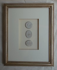
The dining room was also quite striking. I love the contrast between the small and large squares of the framed series of line drawings and the oval shape of the mirror.

DSC_0136

On the other side of the dining room, the table is positioned in the corner to allow for an open path to the kitchen. I asked Phoebe about her thought process behind putting two framed arrangements in the same room. She said that there are no hard and fast rules; framed groupings really appeal to her, and in this room the eye generally does not take in both the wall with the buffet and the wall next to the dining table at the same time. She likes the balance of the framed grouping seen in this picture, and the larger oil painting on the wall. The light fixture is an antique.

DSC_0134

A detail of the curtains in the dining room. It is a beautiful wool sateen, which worked so well in this space; it is luxurious, but more subtle than silk.

DSC_0125

A detailed look at the incredible floors. Jim Howard is known for his expertise in architectural design, and it was clearly evident in this apartment.

DSC_0163

The kitchen was designed in galley style appropriate for the size of the apartment. As with the rest of the apartment, the details were incredible: marble backsplash, high end appliances, cabinetry custom made and finished on site by a furniture maker. All of the hardware, knobs, and hinges in the kitchen and throughout the house are by Van Morris.

DSC_0131

Here is the other side of the kitchen, which also serves as a bar. I thought it was a brilliant use of space. Phoebe said that it is liberating to have such an efficiently designed kitchen; all of the extra 'stuff' that is only used on rare occasions was eliminated, which creates a refreshing lack of clutter. There are no overhead cabinets, and there is a specific place for everything.

DSC_0130

A view of the casual eating area, the perfect place to sit and enjoy a morning cup of coffee or tea.

DSC_0129

A detail of the kitchen floor, which I loved. It is the details like these that makes this apartment exceptional.

DSC_0139

Now onto the private spaces of the apartment. There are two bedrooms, two full bathrooms, on opposite sides of the apartment in order to maximize privacy. This is the entrance to the guest room - a room that will be very familiar to design blog readers.

DSC_0206

Seeing this room in person was like seeing an old friend; I have both posted this picture on my blog, and have seen it in countless other blogs. The bed is a custom iron and upholstered design by Phoebe, available at Mrs. Howard.

DSC_0151

One of my favorite posts on the Mrs. Howard Personal Shopper blog was about Phoebe's guidelines about pillow arrangements on beds (I must look at that post once a week). I thought of it when admiring this pillow arrangement.

DSC_0156

I love soft contemporary art combined with traditional furnishings.

DSC_0152

The closets in the guest room, as in the rest of the apartment, were of the highest quality construction with custom Van Morris hardware.

DSC_0155

This was my favorite detail in the room - one of the closets had a mirror and built in dresser, and the drawers and walls were lined in a Robert Kime paper. Click on the picture to see a bigger view for the details. It is stunning!

DSC_0149

Or maybe this was my favorite detail in the room - the double row of Greek key trim on the curtains.

DSC_0157

The guest bathroom was luxurious with a Kallista vanity, Lefroy Brooks rainhead shower, an antique mirror, and marble floors and shower.

DSC_0158

A detail of the guest bathroom floor. This is more true to color than the previous picture.

DSC_0160

The bathroom was designed with an open sink, and the storage is in the built in cabinets; the towels are stored in the open shelving, and closed section is designed for the 'stuff' that often clutters a bathroom.

DSC_0171

On the other side of the apartment is the entrance to the master bedroom. I paused to admire the vertical grouping of paintings.

DSC_0173

The master bedroom is also iconic in the design blog world. Phoebe is truly a master at creating beautiful bedrooms! I was pleased to confirm that the sheets, shams, and duvet cover are by Matouk, as I had guessed. The headboard was custom designed by Phoebe, and the headboard, bedskirt, and accent pillow fabric are by Fortuny.

DSC_0180

I love this arrangement on the bedside table, and the wool carpet is perfect in the room.

DSC_0176

A charming Charles Edwards light.

DSC_0213

The trim detail on the curtains in the master bedroom.

DSC_0181

The entrance to the master bathroom; closets are on either side of the hall, and Jim put a light fixture big enough for three bulbs to ensure ample lighting in what serves as a dressing area.

DSC_0183

Here is the same area, but the pocket door is closed - and there is a full length beveled mirror on both sides (the reflection of the bed is seen in the mirror)! This is a well thought out detail, one of many that make this space so exceptional.

DSC_0188

The master bathroom is quite luxurious, and features marble mosaic floors, countertops, and shower. The bathroom fittings are Lefroy Brooks; the vanity and medicine cabinets are Urban Archaeology, and the sconces are by Charles Edwards. Phoebe swears by the lighted makeup mirrors by Waterworks.

DSC_0189

As in the guest bathroom, the master bath features cabinets with open shelving on top and a closed section on the bottom. Look at the marble trim at the base of the wall - such great details in this home.

DSC_0208

The detail of the floor in the master bathroom; this is true to the real color.


DSC_0194

As I was preparing to leave the apartment, I took a quick picture of the entry; I was so focused on seeing the apartment that I had neglected to study this lovely space when I arrived. Note the walls - they are hand painted in a geometric pattern by one of the same artist who painted the foyer. I love how the vertical mirror and horizontal paintings balance each other out.

Having the opportunity to see this beautiful apartment, and getting a personal tour from Phoebe Howard herself, was one of the most interesting things I have ever done as a result of blogging! Chatting with Phoebe about the meaning and motivation behind her design decisions for the apartment was like talking to an artist about the inspiration behind their paintings. The apartment reminded me of a lovely flat in London; the layout is wonderful, and every square foot of the space is used and is very efficiently designed. More and more, I see the beauty in residential spaces that are of wonderful proportion and size, and whose rooms are truly used every day; I would rather have a small home that is of great quality and architectural detail than a large home with featureless rooms that are only used for special occasions. Phoebe and Jim's apartment truly exemplified the ultimate in architectural quality and design in a space that is the perfect size for the people who live there.

The Howards' city apartment is currently for sale, but it is a private sale and not listed with a realtor. For more information, please contact Leah Kennelly (lkennelly@jmhoward.net).

All pictures in this post (with the exception of the first and second pictures) were taken by me. Please visit Phoebe's website to see professional pictures of the apartment. Many thanks to Leah Kennelly (author of the Mrs. Howard Personal Shopper blog) for arranging this wonderful visit with Phoebe!


To visit my store, Quatrefoil Design, click here.

To subscribe to my blog by email, click here.

To follow my blog on Facebook, click here.

http://www.quatrefoildesign.com/


LinkWithin

Related Posts with Thumbnails