
As I was reading my People magazine this morning, with its year end recap and the favorite movies, music, and shows of the year, I was inspired to come up with my own year end favorites list of blog posts (I did not discover design blogs until this summer, so the list only reflects postings from June-December).
These are a few that come to mind right away, without any research or review. There are many blogs out there that I read every day, and all of them are inspiring in so many ways. The following posts are but a small sampling of the many wonderful posts I have read this year.


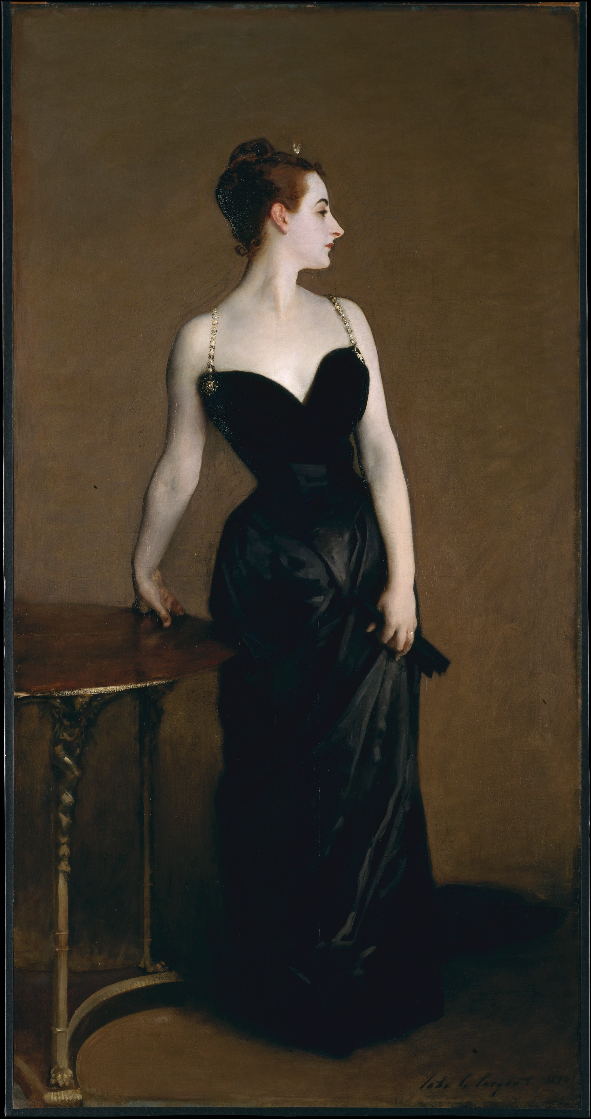
La Dolce Vita did a great post on the Sex and the City girls and the decor of each character's apartment. She combined two of my favorite things: Sex and the City, and interior design! I loved this post SO much.
 Miranda's apartment, Sex and the City
The Peak of Chic did a great post on something that I have seen in homes, but never knew the name of: the jib door. Read the post to learn more about this intriguing architectural element.

These are a few that come to mind right away, without any research or review. There are many blogs out there that I read every day, and all of them are inspiring in so many ways. The following posts are but a small sampling of the many wonderful posts I have read this year.
◊
Patricia Gray Interior Design did an amazing post on the color gray, which is so chic right now. Not only did she have wonderful and varied pictures, but she also explained the psychology of the color and other practical ways to incorporate the color into one's decor.
◊
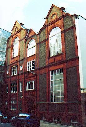
Brilliant Asylum did an amazing post on the stately home that served as one of the sets for the movie Atonement. I had seen the movie the day before she did the post, and it was very much on my mind. I am also an Anglophile an an architecture buff, and love to tour the stately homes in Britain that are open to the public. BA's post really struck a chord with me.

◊

◊
Me, Myself, & I did an amazing post on the color turquoise. Her examples were varied: art, jewelry, accessories, fabrics, interiors, architecture. It was truly a magnificent post, and probably took a lot of time to create! Well done, Me, Myself, & I.

◊
La Dolce Vita did a great post on the Sex and the City girls and the decor of each character's apartment. She combined two of my favorite things: Sex and the City, and interior design! I loved this post SO much.
 Miranda's apartment, Sex and the City
◊
The Peak of Chic did a great post on something that I have seen in homes, but never knew the name of: the jib door. Read the post to learn more about this intriguing architectural element.

◊
Peak of Chic also did two fantastic posts on tablescapes - part I and part II. I liked these posts so much that I did my own tablescape post this week!

◊
Maison21 did an informative post about the proper lighting for a successful party. I truly learned a lot reading his post, and when thinking about all of the holiday parties I attended this month, realized the truisms that he shared.

I thoroughly enjoyed the post that Jackie Blue Home made about 'snaking': the process of copying a design in its entirety. Jackie posted pictures from a Domino feature on the home of Barrie Benson, then posted pictures of the original design by Tom Scheerer. The comments on this post were so entertaining!

◊

 The second post that comes to mind is the slipcover post. I truly saw slipcovers in a whole new light after reading this post!

Finally, I loved the post on the hallmarks of true French style. This post had such a big influence on how I see French stule, and I am thankful to Cote de Texas for sharing her vision.

◊
Mrs. Blandings did a wonderful post about the first impression of a home: the entry. In the post, she had some beautiful and unique pictures of the entries that have inspired her through the years. It was the right post at the right time for me, and was possibly nudge that got me to refocus on my own unfinished entryway.

Another post that had a great influence on me this year was from The Inspired Room. It was a post on 'Authentic Living', and in the post Melissa says, "One of the things I crave most of all in my home is a cozy atmosphere for my family. A respite from the outside world where we can be together. I like comfy places to sit down with a book, places to light a fire or a flickering candle, inviting places to dine together and play games. Yet even if I find the time to create those surroundings, the reality is I need to set aside time to actually use them. That is the heart of authentic living for me. I need to create the spaces I want to use, and then I need to carve out the time to live in the moment. Otherwise the moment will pass on by in the blur of my to do list". Great words to live by.
 From The Inspired Room
◊

◊
Maison21 did an informative post about the proper lighting for a successful party. I truly learned a lot reading his post, and when thinking about all of the holiday parties I attended this month, realized the truisms that he shared.

◊
I thoroughly enjoyed the post that Jackie Blue Home made about 'snaking': the process of copying a design in its entirety. Jackie posted pictures from a Domino feature on the home of Barrie Benson, then posted pictures of the original design by Tom Scheerer. The comments on this post were so entertaining!

◊
I could not pick just one entry from my favorite blog, Cote de Texas, so I picked three! One of my favorite posts was on sconces. I had begged Joni (via e-mail) to do a post on sconces, because so many of her own designs had such wonderful sconces featured. She did an excellent post on the topic!

 The second post that comes to mind is the slipcover post. I truly saw slipcovers in a whole new light after reading this post!
Finally, I loved the post on the hallmarks of true French style. This post had such a big influence on how I see French stule, and I am thankful to Cote de Texas for sharing her vision.

◊
◊
Another post that had a great influence on me this year was from The Inspired Room. It was a post on 'Authentic Living', and in the post Melissa says, "One of the things I crave most of all in my home is a cozy atmosphere for my family. A respite from the outside world where we can be together. I like comfy places to sit down with a book, places to light a fire or a flickering candle, inviting places to dine together and play games. Yet even if I find the time to create those surroundings, the reality is I need to set aside time to actually use them. That is the heart of authentic living for me. I need to create the spaces I want to use, and then I need to carve out the time to live in the moment. Otherwise the moment will pass on by in the blur of my to do list". Great words to live by.
 From The Inspired Room
◊
Edit: How could I have forgotten Style Court's magnificent posts as a guest on Design Sponge? They were among my favorites!!! I loved the post on Betsy Burnham; it was great interview with a great designer, written and researched so beautifully. (The Louis XV post was also fabulous!).
 ◊
◊
Finally, my favorite post from my own blog this year. I would have to say the art and design post, because art and design are two of my favorite topics and I love it when the two are combined beautifully. The pictures in this post are so inspiring to me, and I remember being particularly proud of that post.
Thank you to all of the readers out there who take the time to read my blog! I hope everyone has a happy and safe New Year's Eve, and best wishes for health and happiness in the New Year.
◊Finally, my favorite post from my own blog this year. I would have to say the art and design post, because art and design are two of my favorite topics and I love it when the two are combined beautifully. The pictures in this post are so inspiring to me, and I remember being particularly proud of that post.
Thank you to all of the readers out there who take the time to read my blog! I hope everyone has a happy and safe New Year's Eve, and best wishes for health and happiness in the New Year.


.webp)


